Home Contests & Challenges Archives

UC 2009 'END GAME' | Echo | 2D

Hey folks! I've been aware of Polycount for a long time but I decided to finally join when a friend urged me to join this challenge. So here I am, my
team is made up of one person, me, so I'm team Echo!:thumbup:
Echo+logo.jpgEcho+logo.jpgEcho+logo.jpgEchologo.jpg?t=1255576505
Echo+logo.jpg
This is a compilation of my early roughs, I try to stay very loose with these...
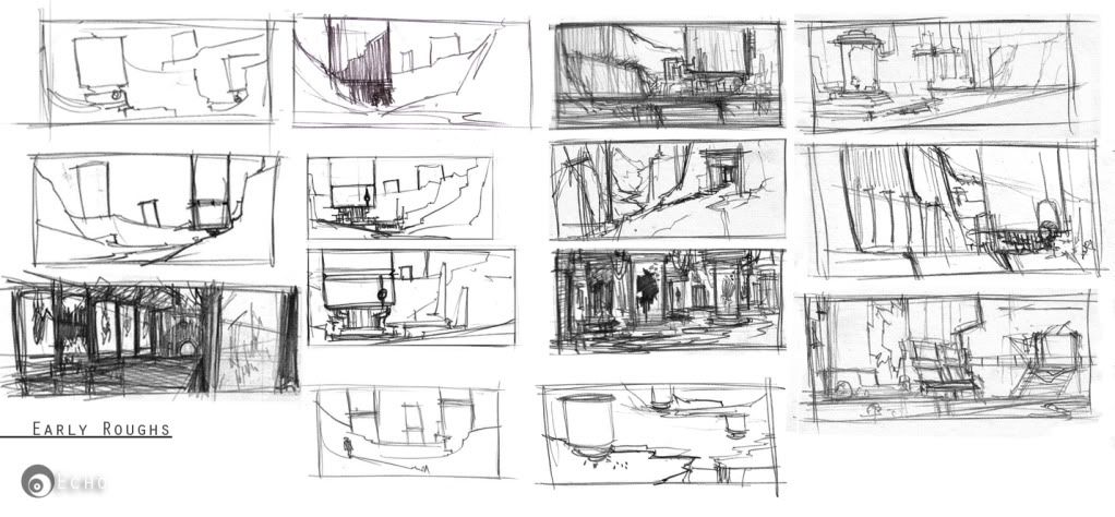
UEChallengeearlyroughs.jpg?t=1255579733

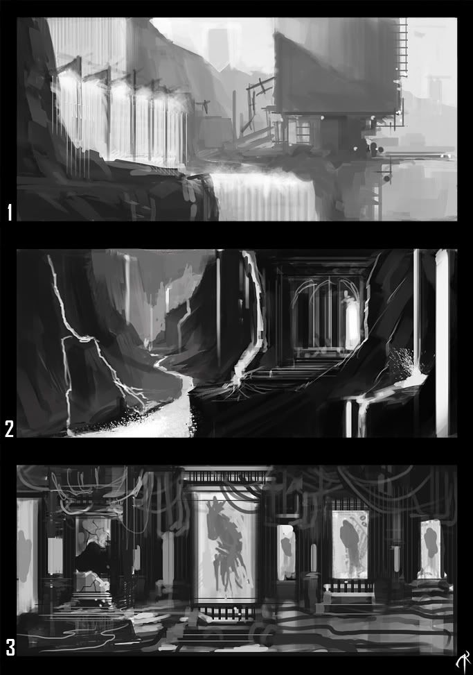
After I did those some story ideas started developing so I chose three and took them further.

Here are the descriptions for each environment…

1.In the future, mankind has created machines to filter out the waste that’s been deposited into the earth’s waters for centuries. But when civilized society collapses, maintenance of these great machines comes to a halt. As the decades pass, these machines that were once meant to cleanse the earth are now depositing hazardous waste into the earth, killing off what is left of humans as well as all other life on earth.
2.A great and ancient evil dwells in the depths of this valley of Volcanoes. Here we see the entrance to this wicked temple.
3.Bio-containment facility created to house biological experiments, while these experiments are considered dormant and not a high threat, underestimating the diversity of this new species will prove fatal.

UE+challenge+roughs.jpgUE+challenge+roughs.jpgUEchallengeroughs.jpg?t=1255576729
UE+challenge+roughs.jpg

Replies

  • Echo
    Oops, I just realized I put in "3D". Can a moderator change that to "2D" please? Thanks.
  • maltuna
    Nice Ahed! I'm really like the first shot and scenario. I am excited to see what you come up with. :thumbup:
  • Echo
    Thanks, yeah there is still a lot of fleshing out to be done, but I'm clear on the premise for each concept so that should make the process easier.
  • doomstagg
    dang. Looking cool. I dig the compositional thumbs.
    #1 is my favorite, but its lacking the end gameyness.
  • danpV
    The first thumb is probably my favorite, but I'm known to be a sucker for wondrous perspective. The third one has an interesting flow to it, but I don't know if its focal point is working as well as we'd hope it to.

    Post soon and often, I look forward to your next concept!
  • churro818
    awesome stuff echo, your third idea really speaks to me, hope you expand this even more, great start!
  • Echo
    Thanks so much Churro, I'm glad someone likes my third idea!!
  • OrganizedChaos
    Offline / Send Message
    OrganizedChaos polycounter lvl 17
    This is looking really good, I'm a big fan of your 2nd and 3rd ideas, I think it'd be pretty wild if those were the same place
  • Echo
    Hey folks, time for an update! I’m going try to make my updates more frequent, so I can get as much feed back as possible as I go along. Anyway, after my last post I took the first concept and enlarged it and started painting some rough terrain. As you can see I flipped the composition, I do this a lot as I am working to keep the image fresh to my eyes and so that I can catch any mistakes I may have made, I highly suggest anyone who is painting to do this often. After laying out some basic geo I went and started studying up on this sort of environment, looking at photos and just understanding what makes a waterfall look like a waterfall and what sort of rocks and plants grow around waterfalls. I then went back and painted more until I got a lot of it fleshed out. Before I started addressing the silo, I went and did some research and found that the shape ideas that I had in my head were very much grounded in reality since water silos tend to have a cylindrical shape. I couldn’t help but do a few versions of what the silo might look like. This is good to do so you get all the bad ideas out. I’m already thinking about color at this stage but that will wait until I made up my mind on the design of the silo. I still have pipes and foliage to put in, but I wanted to see what you guys have to say. I’m very used to working out solutions on my own but I’d love to hear any ideas or thought you guys may have. You 3D folk know what you want when you look at an environment concept, so please let me know your thoughts. Oh and finally, the issue of scale is nagging at me so I thought I’d put some hand rails and some steps so the viewer knows what the size of everything is, since I can’t put in people. One last thing, I still need to work on the water fall a lot, its no where near being done. Ok, I’ll be sure to post again soon! :thumbup:

    Inspirationboard.jpg?t=1256001444
    concept-1propsheet.jpg?t=1256001454
    concept-1WIP.jpg?t=1256001455
  • BlvdNights
    Offline / Send Message
    BlvdNights polycounter lvl 8
  • OggyOi!
    Loving your take on the silo's.
  • okkun
    Offline / Send Message
    okkun polycounter lvl 18
    I really like the telephoto quality of this. I tend to add way too much crazy fish eye to my stuff. Good inspiration!

    I'm kinda struggling with this too, where's the "end game"?

    Thanks for the reminder to flip the image btw, I keep forgetting :P
  • Echo
    I know it may seem like I was out of this challenge, but when I saw that the dead line was pushed a week, it gave me enough wind in my sails to keep pressing on with my concept. There was something about the first concept that I did that I just didn't like. I now know that it was the fact that the waterfall and the structure were separate, my original composition just wasn't serving the narrative. So I went back to my roughs and started painting over another sketch and it took me in another direction.

    The gray scale images you see below is the progression of my first painting and how far I took it before I decided to abandon it.
    concept-1steps.jpg?t=1258541109


    I solved a lot of design issues in my first painting so getting this new one structured was much quicker.
    newconcept-1steps.jpg?t=1258541133

    Concept1.jpg?t=1258541147

    So as I was putting these images together, I noticed that the composition in the painting was tight, so I decided to pull the camera back a bit and show more...rocks. Well also because I didn't want the painting to be a close up of the structure. I've plenty more work to do on it so I'll be sure to post more before deadline.:thumbup:

    newConcept.jpg?t=1258541148
  • Echo
    Here is where I am now, I need to put in some dead plants and make it seem like something is wrong with that structure, maybe a red ring of death in that circle part (a nod to the xbox red ring of death.) I'd love some feed back on this...

    Concept1inprogress.jpg?t=1258602063
  • Echo
    Hey folks, here is where I am now, nearing completion, just trying to add elements to give proper scale and just push the fact that this structure is killing all life around it with the polluted water. I added the red ring of death, I figured that's a good indicator that something is wrong with this structure. I could use some feed back right now, any and all feed back is welcomed.

    FinalUEConcept.jpg?t=1258697433
  • acapulco
    Offline / Send Message
    acapulco polycounter lvl 9
    You killed your sense of scale in this one. The trees should be smaller, so the building could really look huge.
  • gamedev
    Offline / Send Message
    gamedev polycounter lvl 12
    I think you need a super foreground element, a shadowy figure / element etc. Some additional scale elements would look great too, say a small rode on the right side of the water or a jeep parked at the base of the structure. Something to add a human element and bring it down to earth w/ scale. Looking great!
Sign In or Register to comment.