Grims Rat Rod
So, new project in school. My idea is to build a 1932 Ford Sedan as the Grim Reapers car. And if the Grim Reaper would have a car it would probably be built with old evil parts. And it would probably look pretty bad ass. Ol' Grim sure don't have time for car maintenance so it would most likely look pretty worn and torn too.
So I put some pictures together to get some idea of what car Grim would have.
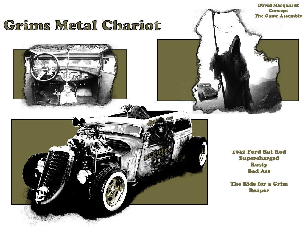
I then started looking for some evil parts and got hold of pictures of these:
1. Headlights from Mercedes Benz 770K Adolf Hitler.
2. Steering Wheel from Enola Gay.
3. Dashboard Instruments from Ted Bundys VW 1500.
4. Rims and Tires from 1962 VW Herbie.
5. Engine from 1969 Dodge Charger General Lee.
6. Supercharger from To The Fast and the Furious 1970 Dodge Charger.
7. Sideview Mirrors from Bullit 1967 Mustang Fastback.
8. Grille from American Graffiti 1932 Ford Deuce.
That the parts i have thought of so far. If someone has any idea for any other that would fit a car like Grim's post them.
Anyway, to the 3d modell. I have started blocking out the highpoly. Nothing is finished so far, everything is work in progress so please comment. Will post wires later on when i get more finished.
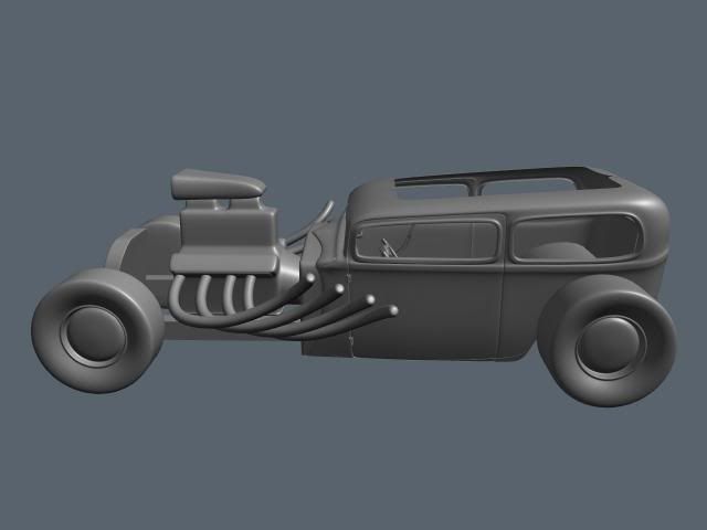
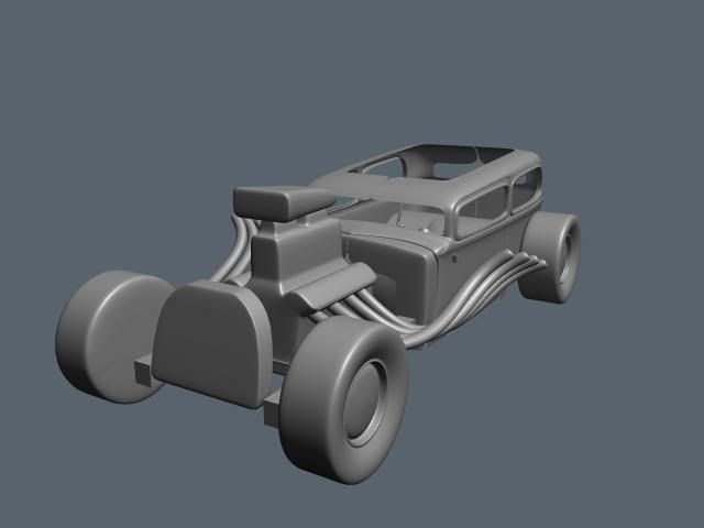

Details will be added, just wanted to block out general part sizes and see if it works.
So I put some pictures together to get some idea of what car Grim would have.

I then started looking for some evil parts and got hold of pictures of these:
1. Headlights from Mercedes Benz 770K Adolf Hitler.
2. Steering Wheel from Enola Gay.
3. Dashboard Instruments from Ted Bundys VW 1500.
4. Rims and Tires from 1962 VW Herbie.
5. Engine from 1969 Dodge Charger General Lee.
6. Supercharger from To The Fast and the Furious 1970 Dodge Charger.
7. Sideview Mirrors from Bullit 1967 Mustang Fastback.
8. Grille from American Graffiti 1932 Ford Deuce.
That the parts i have thought of so far. If someone has any idea for any other that would fit a car like Grim's post them.
Anyway, to the 3d modell. I have started blocking out the highpoly. Nothing is finished so far, everything is work in progress so please comment. Will post wires later on when i get more finished.


Details will be added, just wanted to block out general part sizes and see if it works.
Replies
And it looks like the headers come out of the valve covers. Mke the valve covers larger.
Make the pipes come out lower on the engine.
Oh yeah, scoop out the grill like the ref and add headlights
The engine, supercharger, grille, and pipes are only blocked out so I could get a hint of scale. Will redo them later on.
Good idea about the front tires, give them the drag race look
I'm getting somewhere with the chassis now, think I got the look I'm going for although its something about the side windows that looks off..
Started working on the wheels and rims also. Imagine a raised white Hoosier text on them
Will redo the dash next.
Comments please, don't worry about the engine, grille and pipes though.
Anyway I think the body is looking pretty good.
I think the thing about the windows is they both seem really square (not the corners, but the top/bottom, left/right are square to each other).
The back window in the pic seems to have a square corner at the bottom, but the top back corner is round.
Also, the windows kindof seem to not match the flow of the roofline really well. Looks like you tweaked them some. I think the front top corner of the door window needs to come down a bit, look at both windows as a one piece flow, not as 2 seperate windows. The bottoms line up good but the tops don't.
Also in the pic the roof seems a few inches taller above the doors and has a round edge above them. Yours seems more flattened out and a sharper corner.
And the front window has more of an arch across the top, yours is completely flat.
I like the trim around the windows but maybe it's too pronounced, should be more subtle.
Some of that could just be artistic liscense too so...
Anyways, real good crits. I have tweaked the windows some since the first post but now that I read your crits I now why they still look wierd. Will try to get the flow of the windows correct and sharpen up the lower corners. Will also fix the front window since it looks a lot better with a curve.
Thanks for the crits Baddcog
Did some quick adjustments. Will work on it more later. Also modeled the grill and radiator yesterday before I went to bed.
Made some brackets for the radiator and grill. Also made the windshield and frame, looked up the side view mirrors from bullit and made these as well. Also made the supercharger intake. Have been tweaking the body some as well. Also created the frame. Will be adding bolts for brackets later on.
Threw on some shaders to split the parts up a bit.
Just grabbed a print from Maya with the wires so far. Have tried to keep them as clean as possible but some parts are a little trixy.
Built oil pan, hemi engine block (will add details, ribs and such) and the heads. Also built an ford rear end.
Go at it, attack fellow polycounters!
Your concept is already done - I know ,neverandless I'd like to see it more "sit down" - like that
Am working on detailing the engine block and heads now.
Added some details to engine block, last stuff will be made with photoshop instead. Also added timing chain cover, engine heads and valve covers. Will add supercharger manifold tomorrow.
Hope you like it, Im not sure about the scale of the engine. But it is supposed to be a 426 Hemi, a real large engine.
If anyone have any tips for a good highpoly material that would be great, the screens look kinda washed out.
Also, undo the lowered chassis, it looks stupid and no builder would ever let a ride like that out of the shop for safety reasons. Don't get me wrong, the problem is'nt that you lowered it, its how you lowered it thats wrong. There should never be a bow in the middle of the vehichle, that would be a serious stress point. If you want to lower it then do it properly. The back should be higher than the front and the chassis should be more or less a streight line. You can Z the frame to get it looking meaner but you would have to do that to the frame first and only then add the body and tweak it so it looks right. Its also very ugly when the wheels sit off center to the wheel arches.
Approach this like you are building a real car, one that should be driveable. Take a look at builder sites and take a look at tips and tricks they use when building. Every one of these details you add will make your project feel a little more complete and detailed. Try not to go overboard though
About the chassis, I will try to make it look better with the frame in a more straight line. These cars have a strong frame that the chassis often get lowered onto, meaning you cut away pieces of the chassis to get it closer to the frame. I will try to do this. Looked at this picture of a really lowered rat rod where the rear wheels are above the window line, looks a little wierd but still cool
Will add last engine parts tomorrow and then try to get the front wheel setup done.
Will maybe redo some stuff later on when Im gonna put my portfolio together. Would want to render it in our "in school" engine to be able to use the maps I made. Marmoset doesn't support reflectivity map that I wanted to use so renders are grabs from Maya viewport.
Hope you like it and if you don't hack the shit out of it :poly121:
looks good, about right for a racing game though.
The modeling looks great though, just think you could push the textures alot more
Image wise you only really need three, front 3q, back 3q and side. Plus a low detail greyscale background would help the image to pop more and be less distracting.