Home Contests & Challenges Archives

UC'09 "END GAME" | TEAM UPDRAFT | 3D

1345
polycounter lvl 10
Offline / Send Message
crazyfingers polycounter lvl 10
Hard to believe it's finally over, here's our final shots:

uc09_3d_797_Built-to-Blast_24835_1258709925740.jpg
uc09_3d_797_Built-to-Blast_24835_1258710663950.jpg
uc09_3d_797_Built-to-Blast_24835_1258712678205.jpg
uc09_3d_797_Built-to-Blast_24835_1258709368372.jpg
uc09_3d_797_Built-to-Blast_24835_1258711810282.jpg


First post
Lets do this boys and girls ;)

Edit:

Idea so far: Giant spaceships resembling pirate ships are assaulting Earth, dropping anchors that tear through buildings as they "sail" and shooting red hot glowy cannon balls that break up concrete and possibly cars. Going to be lots of smoke, glowy, and that sorta thing.
3978256633_bae2ffea22.jpg

Suggestions appreciated!

Replies

  • ENODMI
    Offline / Send Message
    ENODMI polycounter lvl 14
    Greentooth pirate ship is terrifying! I like the idea, maybe add a whole feet for intimidation?:)
  • crazyfingers
    Offline / Send Message
    crazyfingers polycounter lvl 10
    Fleet added, also decided city's are overdone so i'm going to do a desert setting with lots of sand and cacti. Doing a mix of future sci fi and pirate/fantasy. Trying to run the gamut with whimsical and high tech stuff.

    Still very much a work in progress! Give suggestions! The crazier the better!

    3978842185_142408ac4f_o.jpg
  • acapulco
    Offline / Send Message
    acapulco polycounter lvl 9
    Where's the endgame?
  • crazyfingers
    Offline / Send Message
    crazyfingers polycounter lvl 10
    suppose i could put a giant nuke like explosion in the background... kinda thought the scene had a doomsday feel to it already, but you guys tell me what you think.

    Update: Added some splosions and fires and other random updates
    3979109323_0416933b68_o.jpg
  • Wahlgren
    Offline / Send Message
    Wahlgren polycounter lvl 17
    Pirates blowing shit up is pretty end game if you ask me! No chance of surviving! :O
  • Bal
    Offline / Send Message
    Bal polycounter lvl 17
    Especially green-tooth pirates. Good start, and good luck!
  • rooster
    Offline / Send Message
    rooster mod
    awesome :)
    much prefer the city version tho, pirates tearing up the desert doesnt seem all that terrible
  • crazyfingers
    Offline / Send Message
    crazyfingers polycounter lvl 10
    Mucho thanks for the feedback guys...

    Decided to try a Bit of desert and bit of city, also decided to make the nuke a volcano since I didn't like the idea of old school pirate ships droping high tech stuff (obviously some placeholder photo reference):

    3980026908_fd4834ce81_o.jpg
    Kinda leaning towards going back to the original like rooster suggested, but tell me what you guys think. I gotta get some sleep, got a lot of stuff to sleep on ;)
  • IchII3D
    Offline / Send Message
    IchII3D polycounter lvl 12
    Looks interesting, will be nice to see what you do to bring it all under a unified style. It will defiantly need one to help ground everything together. Like your tarmac road might end up been a dust road? At least I'm assuming thats your intention with the concept.
  • divi
    Offline / Send Message
    divi polycounter lvl 12
    arrrr, pirates :D you could also have them use their anchors to rip out huge chunks of landmass with the city on it.
    just random blabla.. :)

    like your concept!
  • cholden
    Offline / Send Message
    cholden polycounter lvl 18
    I had a chuckle. Your concept reminded me of this.
    thislookskindashopped.jpg
  • Murdoc
    Offline / Send Message
    Murdoc polycounter lvl 11
    It reminds me of a wacky 80s metal band cover, hehe; needs more musheroom clouds for that though.
  • crazyfingers
    Offline / Send Message
    crazyfingers polycounter lvl 10
    Apologies for the quality, I didn't like how a modern city was clashing with the fantasy type ship, so i covered it in snow hoping to mask it as much as possible. This way you've got mostly just the silllhouette of the city and lots of burning/ destruction. Also makes the project more doable since i just have to nail some snow textures and a few basic building textures, maybe some street signs and a car or 2.

    Added walls of clouds, this'll let me do cool smoke effects with the cannon balls as if they were missles with "cloud trails" as they poke through the clouds. I also plan on having lighting on the clouds to pump up the firing cannons.

    3981531341_ff7e44d62c_b.jpg
  • ErichWK
    Offline / Send Message
    ErichWK polycounter lvl 12
    Hmm. Looks rad, but I will warn you.. Snow is super tricky to get right. At least in my experiences. Actually..it's really hard.
  • kdm3d
    I like the idea of a modern city, lots of glass and steel. I think that mixed with the old school flying pirate ship would be a nice contrast. It would really draw focus to what was different. And why not a nuke coming from a pirate ship? They're already flying;)
  • crazyfingers
    Offline / Send Message
    crazyfingers polycounter lvl 10
    Update!
    3983254426_8bd6fd8689_b.jpg

    Erich, took your advice, i actually got "burned" by snow last time i tried it so i switched it up, just accents of snow now. Much happeir with this direction. The scene looks like a lot of fun to put together and nothing too impossible to pull off. Kinda defined 2 factions, the PC and some "tree huggers", who are very into nature, and very screwed as of this moment.

    I may create a second ship type fighting the green grins, their destroyed hulls can litter the battlefield, but things are filling up fast as is.
  • crazyfingers
    Offline / Send Message
    crazyfingers polycounter lvl 10
    Unless someone wants to make some suggestions this is how i plan on making the anvil... starting on it now :D

    3983457606_a5bf61f5e3_o.jpg
    The PolyShip will follow suit in style. probably going to do a combination of zbrush for the ganley woodwork and high poly modeling for the bits of metal plating and bolts.

    Blockout so far:
    3982886599_5a3253a485.jpg
  • Ben Apuna
    I like the flying green tooth pirate ships with anchors as the main weapons, very creative to say the least. Not too sold on the ground/targets yet, though I haven't got any better ideas for you, sorry.
  • Pope Adam
    Offline / Send Message
    Pope Adam polycounter lvl 11
    In real life, Crazyfingers sounds like a cross between Barry White and Carl Sagan. It's cool.
  • Shogun3d
    Offline / Send Message
    Shogun3d polycounter lvl 12
    Pope Adam wrote: »
    In real life, Crazyfingers sounds like a cross between Barry White and Carl Sagan. It's cool.

    QFT! Good luck man!
  • ZacD
    Offline / Send Message
    ZacD ngon master
    I'd make the ship in the midground since it is the focus/
  • ErichWK
    Offline / Send Message
    ErichWK polycounter lvl 12
    Hey! I sent you a message. Tell me what you think!
  • Heist
    Hey Crazyfingers can't access polycount for some reason, so I'm relaying this message for him:

    Sup Erich, I'd be more than happy to have you on my team! This gives us an excuse to think of a witty team name. Would have liked to have said this myself but for some reason i'm unable to access polycount today. Anyway, think of cool stuff for the scene, particularly buildings (and the subsequent rubble) that could be blown up by the polycount fleet. I dig your style from your portfolio page, would fit nicely in the scene!
  • crazyfingers
    Offline / Send Message
    crazyfingers polycounter lvl 10
    Sup Buddies!

    Erich: It'd be awesome to have someone on the team! Hopefully by the time you get my messages you haven't found a better one :D

    Kaburan: Thanks dude, you too! (if you're entering, and even if you're not)

    Adam: Haha! I'll definitely take that as a compliment.

    UPDATE!

    Anvil's mostly done. Going to do a little more detail work on the wood, but frankly it's not going to be that close to the camera, would rather flush out the scene. I'll really polish this bad boy up If I've got spare time.
    3987310545_f74e337142_b.jpg

    First time trying Linear Interpolations (LERPS) in UT3, they're not nearly as much as a pain in the ass as I thought they'd be and no pixelation! (well ok, kind of a pain in the ass, that's the price you pay for quality! Way harder to retool this stuff with your diffuses and specs spanning like 4 different files per object rather than 1)

    Quick addition, solved the annoying seams i'd always get from normal maps wherever I had UV borders by just putting a thin "dust" mask over those seam edges. Super dark and no spec and bam, seems gone! I think the dust actually makes the prop look better too. Just a heads up to anyone experiencing seams.

    Edit: More updatedness, did more concepting
    3987778362_e83e035333_b.jpg
    Final Note: Totally beat LOoooooong day of artin'!
  • Diwan
    Offline / Send Message
    Diwan polycounter lvl 13
    Damn, this is so you crazy. Can't wait to see how it will look in 3D, GL dude!
  • ErichWK
    Offline / Send Message
    ErichWK polycounter lvl 12
    hey. So I'm the 2nd half of the team and was told to do a concept on how I envisioned it in my head. Kind of a different direction but we're hoping to combine both our ideas.

    crazyfingers_concept.jpg

    This is more of a layout then a beauty. And kept out little details to focus on what the world would be like...excuse my inability to draw. Haha. Looked a bunch of Prince of Persia concepts for ideas.
  • adam
    Offline / Send Message
    adam polycounter lvl 19
    Heya, I can't believe I am going to write this..

    ..but I think the greentooth on the ship like that is hurting the impact of the scene. I am all for having him in the environment, but something more subtle (as a nod to the community) would really help this rather fantastic scene you have going on.
  • oobersli
    Offline / Send Message
    oobersli polycounter lvl 17
    ya I'm in the same boat *no pun intended* with adam. I think having the pc face so large and put like that is a tad overboard *no pun intended again* :)

    maybe put it on a cool long flag or incorporate it into the architecture of the buildings as a sign or carving for some shop?

    also, just a thought, but maybe instead of anchors you could use harpoons that have shot thru buildings to hold the ships in place.

    gl guys.
  • adam
    Offline / Send Message
    adam polycounter lvl 19
    I would nix it from the back of the boat, keep it on the anchor, and if you want.. put it on a flag of the boat. (Like a skull and cross bones, only its greentooths skull).
  • crazyfingers
    Offline / Send Message
    crazyfingers polycounter lvl 10
    Right on Adam and Oobersli, I see where you guys are coming from. I'm just so darned full of PC spirit right now it's easy to throw it on everything, haha, it's only concept after all! (I may keep it but make it only recognizeable if you look really hard for it)

    I'm happy enough with the anchor that i don't think i'll be switching it with harpoons, though that's a great idea and others might want to take it! I know there are several other large ship settings going on.

    I really dig the basic structure of your buildings Cruxel, provides a nice contrast to the ships without going too crazy. I think if we jazz up those canopies we can really kick this scene up a notch, not to mention adding S'PLOSIONS! I'll probably take 'em and give 'em a higher vertical scale to match the feel of my first concept in the city, just make it more dramatic, while keeping the large foreboding tornado somehow.

    I was thinking about the scene as i went to sleep and think a chicken coop is a perfect foreground element to have the anchor slice through, lots of broken eggs and feathers flying everywhere! (no creatures of course)

    Anyway, I tend to get too long winded, time for some art...
  • ErichWK
    Offline / Send Message
    ErichWK polycounter lvl 12
    concepting some stuff for the Floating Pirate ships..

    pirateship.jpg
  • adam
    Offline / Send Message
    adam polycounter lvl 19
    ErichWK, you should label your thumbs with numbers so we can easily talk about them :D That said, I like the bottom, middle or bottom, right the most. Unfortunately, no reason why!
  • ErichWK
    Offline / Send Message
    ErichWK polycounter lvl 12
    You know, Adam..I thought about that as soon as I hit the "post quick reply". But alas... Next time!
  • crazyfingers
    Offline / Send Message
    crazyfingers polycounter lvl 10
    3989054899_534a625aab_o.jpg
    Possible new direction for the scene, based on the initial concept and added some new ship concepts done by cruxel to establish an opposing faction.
    Tell me whatcha think!
  • divi
    Offline / Send Message
    divi polycounter lvl 12
    the chicken thingie idea is sweet! while the concept is still quite loose the buildings feel a bit... underdeveloped. like a slum... destroying a bunch of shacks doesn't necessarily feel all that epic to me. i'd prefer the buildings in ErichWK's sketch.
  • crazyfingers
    Offline / Send Message
    crazyfingers polycounter lvl 10
    Here's where the concept stands right now:
    3990020475_f079dbd356_o.jpg

    Decided to move the city into the actual windmills, each little town sits at the base of one of these giant windmills. Just focusing on general compostion right now. The focus is still probably going to be one large ship towing a couple anchors tearing up the town. Going forward me and Erich are going to need to really think about who lives here, what kind of architecture they use (the stone in place is just placeholder), and that sort of thing. Do they harness electric power? Do they defend thsemselves with cannons? What kind of really kick ass props are going to be in the street? All up in the air at this point.

    Ideas are VERY welcome!
  • sebas
  • crazyfingers
    Offline / Send Message
    crazyfingers polycounter lvl 10
    Actually i kinda like the idea of the polycount fleet being the sinister/ evil ones in the scene ;).

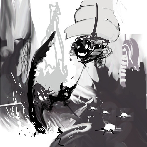
    Anyway, did more concepting, wanted to pull my hair out after 4 hours and thinking i'd gotten nowhere when suddenly things just kinda fell together. Had too many elements, decided to pull back the scope and focus on the basics of what made the scene original. Still a rough composition but I think we have a much better focus now going forward!

    3993157880_fa75dfb655.jpg

    Unintentional likeness to Assassin's creed going on right now, we'll work on that ;)
  • oobersli
    Offline / Send Message
    oobersli polycounter lvl 17
    i'm liking your new concept better. the one before it was getting a tad too much.
  • ErichWK
    Offline / Send Message
    ErichWK polycounter lvl 12
    Rad! Simpler! Less is moar. And means more time to focus on few props compared to lots of props.
  • Peris
    Offline / Send Message
    Peris polycounter lvl 17
    That is sweet! Now add in some cool lighting and you have magic =)
  • Pope Adam
    Offline / Send Message
    Pope Adam polycounter lvl 11
    better sir. awesome: ENGAGE!
  • crazyfingers
    Offline / Send Message
    crazyfingers polycounter lvl 10
    Glad you 4 like it, kinda makes all the hard work worth it *sniff*.

    And don't you worry Peris, we got some glowy planned ;)
  • crazyfingers
    Offline / Send Message
    crazyfingers polycounter lvl 10
    3995178992_4db24eb438_b.jpg
    Tryin' to detail out the city structure. Ceilings will actually be sail-like and made of cloth. Vines overgrow the ropes that hold up these "ceilings", definitely need to flush out the feel of the flora over time.
  • divi
    Offline / Send Message
    divi polycounter lvl 12
    wouldn't the vines grow over the cloth aswell if they actually reached to the ropes? don't forget to have some random stuff like shoes tied together with their laces and clothes hanging on them. no housewives would waste those lines! :D looks nice so far :)
  • crazyfingers
    Offline / Send Message
    crazyfingers polycounter lvl 10
    Haha, this is true divi, we could hang all manner of things from those cables, something to think about for sure. Flora is really just an idea at this point, haven't put any thought into it at all.

    UPDATE!
    Long night of modeling and texturing, nearly done with the first pass on some of the chicken coop objects:

    3995138395_1c9daba72e_o.jpg
    Just gotta finish the pillows that the metal egg holders are going to sit on as well as some eggs. Going to make various egg types for each size of egg for variety. Smaller coops will have smaller eggs sitting on them to imply different types of birds. Going to stick feathers on the top and bottem of the egg holders to jazz 'em up.

    Fairly basic for now, will go back later and polish in more details/ colors once things are more finalized in the overall scene. Just using the same mats that I used on the anchor with unique normal maps for each prop, seems to be working so far, input appreciated :)

    To this day i have no idea how to get rid of the texture seem in UT3 that's created along UV seams with normal maps.
  • Shogun3d
    Offline / Send Message
    Shogun3d polycounter lvl 12
    In the case of normal maps and UV seams, it's always best to place the seams in a non-visible location as normals bake down information and will cause a "tear". I usually try to blend best as possible by going into individual channels in photoshop so you can see the grayscale value range, and matching them as much as possible.

    High poly bakes should always be baked down into maximum range as possible and cutting the seams at corners and hidden locations hidden from it's lit location. Good luck and hope this helps Jeff :)
  • crazyfingers
    Offline / Send Message
    crazyfingers polycounter lvl 10
    Update!
    Shot from UT3:
    3996111533_8ee83f84c2_o.jpg

    You're right Will, I keep thinking i'll figure out how to get rid of those seems so i keep making the same mistake. Best bet is to just put the seam in better spots. Wont be putting any more seams smack dab in the middle any more. I'll probably cover these up with a medallion of some kind, the bird cages can use some spicing up anyway. Luckily the pillows cover most of 'em up.

    Edit: Heavy tweaks to birdcage texture
  • ZacD
    Offline / Send Message
    ZacD ngon master
    I'd make the image wider and make the rest of the image not so cluttered. Maybe a massive army in the distance and this is just the first ship. Landscapes always work better wider.
  • divi
    Offline / Send Message
    divi polycounter lvl 12
    it's also possible that those seems are from the lightmaps. if you have mirrored normal maps and unique UVs for the lightmaps you need to split the lightmap island where you mirrored your normal map and offset it a few texels. might solve the seam problem.
1345
Sign In or Register to comment.