Warzone Environment
Hey guys, I'm currently working on a scene of a stronghold some middle eastern country that has been abandoned due to a tank busting through the walls.
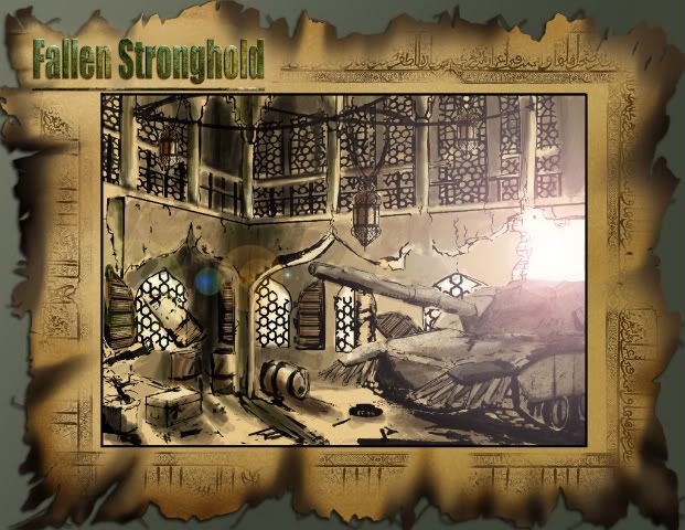
Some 2D shots to give an idea of what I'm going for, very COD and Black Hawk down inspired scene.
Here is some of my progress so far, bake down walls:
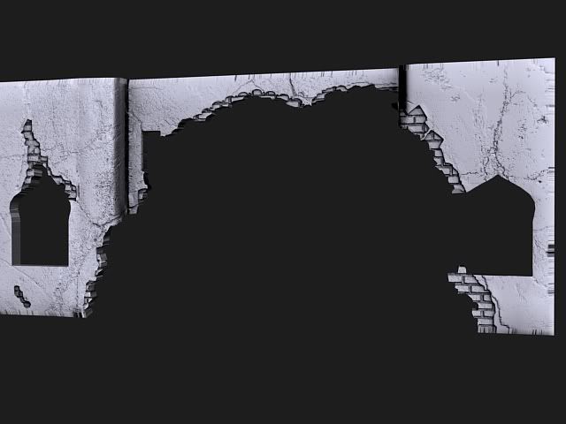
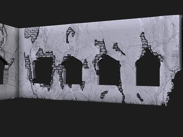
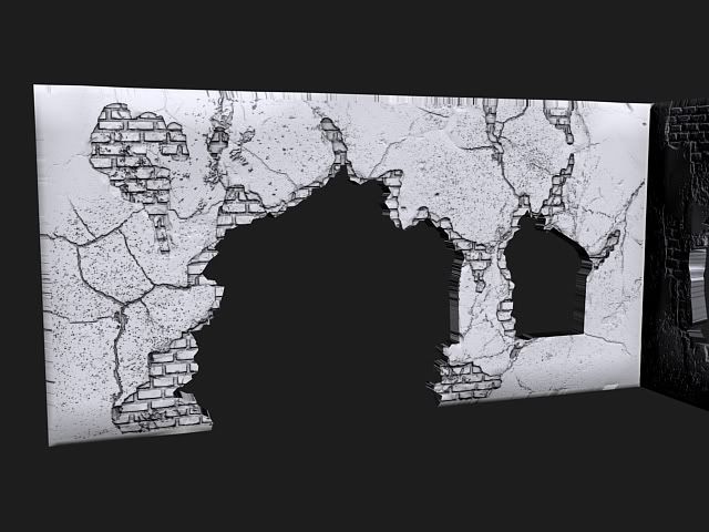
On some areas the bake came out wierd, like on the second picture where it bends. These are all sculpted in zbrush and baked in Max, I could never manage to get good bakes from zbrush, probably cause I was working on a plane. Please feel free to critique and give pointer, really appreciated. Thansk for watching.

Some 2D shots to give an idea of what I'm going for, very COD and Black Hawk down inspired scene.
Here is some of my progress so far, bake down walls:


On some areas the bake came out wierd, like on the second picture where it bends. These are all sculpted in zbrush and baked in Max, I could never manage to get good bakes from zbrush, probably cause I was working on a plane. Please feel free to critique and give pointer, really appreciated. Thansk for watching.
Replies
On the first wall you posted, why is it thinner in the middle? It also looks like it has some nasty smoothing errors?
and uv those edges, waste of a bake imo important to get these things correct befor doing a full bake, otherwise your just wasting precious time with imperfect renders
I think the open area in the wall is set forward a bit if you look at it from the other side. Like ___----___
Could be wrong.
Adam:
crazyfingers: Thanks man, you gotta do what you gotta do right? And yes I will def, add on that.
SHEPEIRO: Good point, I'm gonna try another bake in Xnormal to compare to the max bake.
Right now I'm redoing the broken parts of the wall, got some good crits that they break up in to many angles in the bricks.
Here is some update, did some quick scene placement of the tank and other objects. Redid the broken parts of the wall so the bricks read more.
Any c&c is welcome. Thanks!
Looks good, but the tank is huge.
Wow, way to not be an asshole on your first ever polycount post...
Anyway, blockout looks good Diwan. Off to a strong start.
I read that this is supposed to be a stronghold that was abandoned, but nothing in the concept suggests it was at one time a stronhold...
Consider adding some things to the environment that will tell a bit more story about who was here before the tnak busted thru the walls and what they were doing...
Crates with tactical maps laid out on them? A lantern nearby since they were probably squatters and didnt have electricity? Boxes of expelled ammunition, empty magazines or shells?
A few less barrels and maybe a small gasoline canister for easier portability? Abandoned walkie talkie?
Think about things you could add like that. IN the meantime it just looks like a mosque with a tank that ran into it.
Pope Adam: Thanks man! Awesome pointers, I like the tactical map idea! I'm going to throw on some tarpaulin over the oil barrels, sorta hiding them.
I made a quick ammo crate, getting some wierd shadows on the bake for the hinges, they are just planes at the moment, going to give them sides to see if it helps.
Anyways good start and keep up the good work bud.
Here is my reference: http://www.motionpicturearmourer.com/rpg.jpg
I really wanted to make the holes in the handles where the screws are inserted but I couldnt find a good way to aproach it, I tried to bolean out the hole but it kept messing up the mesh once I smoothed it out.
Again thanks for watching!
The rpg looks tight man. Accurate!
Shep says to not get bogged down making props - i disagree. I know what he's trying to say though. Ensure that you continue to concentrate on composition, lighting, arrangement etc. of the overall environment
but it's very fuckign important that you learn how to do all of the super important modeling tricks like you're pursuing right now.
I did the same process you're doing and I got a job as an environment artist before i even graduated from school.
But yeah, don't waste too much time on high poly stuff if it's going to interfere with your schedule of completing the scene on time and having it not only complete, but looking good!!
too many environments fail becuase the artist get bogged down with prop making, look at the good finished environments on polycount and i would say that 75 percent do not include props, and the ones that do, will not have built there props first
just think of it like a sketch or a zbrush sculpt, BIG shapes first, get those correct (block it out, 1st pass lighting), then medium shapes(texture it, model it out, 2nd pass lighting), then the detail (tweaks,props placement and effects/postfx work)
end rant
SHEPIRO: So building environment first as in just blocking out the props and just finishing the scene? I'm not familiar to this kind of approach, as I've always been taught to model props and then populate a room with it. I guess the way you explain it does make sense after all.
frubes: I'm not quite sure what grey boxing means, I'm guessing it is just blocking in the scene with boxes to get a feel for what everything is going to be placed?
Thanks guys for the feedbacks, really appreciated, I'm going to adjust the scene right away.
If you look at an environment scene as a meal, the main stuff that establishes the space (walls, floors, roof, windows, basic foliage, etc) are the main course and props are the dessert. You can have a great meal without any dessert at all, but the best ice cream in the world won't distract from a badly burned and overly salty main course.
on the crate thing i would suggest making some more color variation. for example, make the two pieces of wood that go across the top be made of the same tree or something, just to have some consistency.
can't wait until you're done with prototyping so you can spend more time on this. i know you'll make it look great.
It just really helps to see potential errors which may arise lateron in the modelling/playing process of your environment. It also lets you know where you need to spend time modelling and texturing, what the player will get close too.
The reason i suggested it was because you may well have seen, from the grey box, issues like the scale of the tank in comparison to the character, the placement of the barrels in the corner behind the pillar (would they really be there? do you want to get behind them?) and could you improve on the concept you are working from in terms of its compostion and visuals?
Anyway, the sculpting is really nice, hopefully you will be able to finish the piece to the same standard. Keep it up
scale's pretty close... i think the tank is just a wee bit large.
frubes: Yeah I totally agree with you, infact thats pretty much what I learned from Marshalls composition workshop. Like Shep says to block out things first in larger scale and then get into details. Funny I never thought about applying that when it came to 3D scenes...pretty stupid hah. But yah, I'm not gonna do to much hi poly I guess and just execute the scene composition. Thanks!
Pope Adam: Yeah almost there! That picture reminds me of those good old days when I was cleaning the tank treads...my commander used to grab his knife and scratch it between the crevises and if he'd find dirt he would call a redo cleaning on the whole tank. Good old days...
Here is some updates, I brought most basic meshes into UT, and played with some lighting and mood. The sphere's are supposed to become middle eastern looking lanterns of some sort hanging from the roof ref: http://farm2.static.flickr.com/1304/834181130_24b1aecbd1.jpg?v=0
I'm thinking of an either early morning shot, or a late afternoon dusk shot.
Any feedback, c&c is always welcome. Thanks all!
what's the purple light coming from?
Anyway, the middle eastern windows and arches are really sellin' this scene, keep it up, great stuff.
This is the Max render.
This is the Marmoset, first time I'm tryint it, gotta say that it was way easier than I thought it would be.
Got some good response on this one at GDC Austin so I'm kinda happy how it turned out
Also I think you should push the contrast of your spec more, make the worn areas brighter to catch those highlights and the overall metal darker with some more random noise in it.
Overall looking real night though.
Main reason I didn't want to grunge up the rocket tube too much is because its a sensitive explosive and I would think that something like that would be much more protected from being beaten up.
http://www.militaryfactory.com/smallarms/imgs/rpg-7_9.jpg
http://www.militaryfactory.com/smallarms/imgs/rpg-7_7.jpg
http://www.militaryspot.com/gallery/data/511/medium/rpg.jpg
ErichWK: ya ure right gonna fix that with the grunge!
Changes that are coming up are new/better textures on the oil barrel, rocket launcher, P90, and changing up the dirt on the ground to make it a little sharper.
Thanks for watching, and any c&c is more than welcome!
I been thinking this for a while.... looking at peoples work here. To build a prop early is to zone in and detail a painting in one area too quickly I guess.... maybe better to block in the whole scene, and build up iteratively? The bazooka will have little impact on the scene as a whole... and this is an environment at the end of the day, not a collection of props.
Keep at it!
Goodluck at GDC!
Some high res shots before GDC...
https://dl.dropbox.com/u/4205656/Highres_Screenshot_00009.jpg
https://dl.dropbox.com/u/4205656/Highres_Screenshot_00010.jpg
At a normal viewing distance though you can't tell, and a normal viewing distance is what we'd have in game anyways.
What are you rendering this in btw? Probably too late, but if you can get it into a game engine I'd try.
I've edited your post to simply link to the image, feel free to add sized-down images back to the thread, and also feel free to keep the links to the mega huge ones as well.
Also, from a purely visual standpoint, i agree that images this high res only make your work look worse, as you see every texture seam etc in massive detail. Its cool for print, but seeing it this huge on a computer monitor isnt doing you any favors.
EQ - Yeah sorry about that, first time posting a high res, wont happen again! Atleast that huge :P
I down res it below 2k wide now.
Thanks again for watching!
This is really REALLY inspirational work man, fantastic job, I'm impressed at the quality level... something that will be in the back of my mind for a long time to come.
Good luck man, as said before, this will surely turn some heads at GDC.