Home 3D Art Showcase & Critiques

Hallway Section

polycounter lvl 10
Offline / Send Message
Axios polycounter lvl 10
Hey, this is my first time posting work here. This is a little project that I started last week, and was inspired by Alien: Resurrection. It's just a modular section of a hallway, and I wanted to use this project to work on a couple skills, mainly texture painting without photo-sourcing.
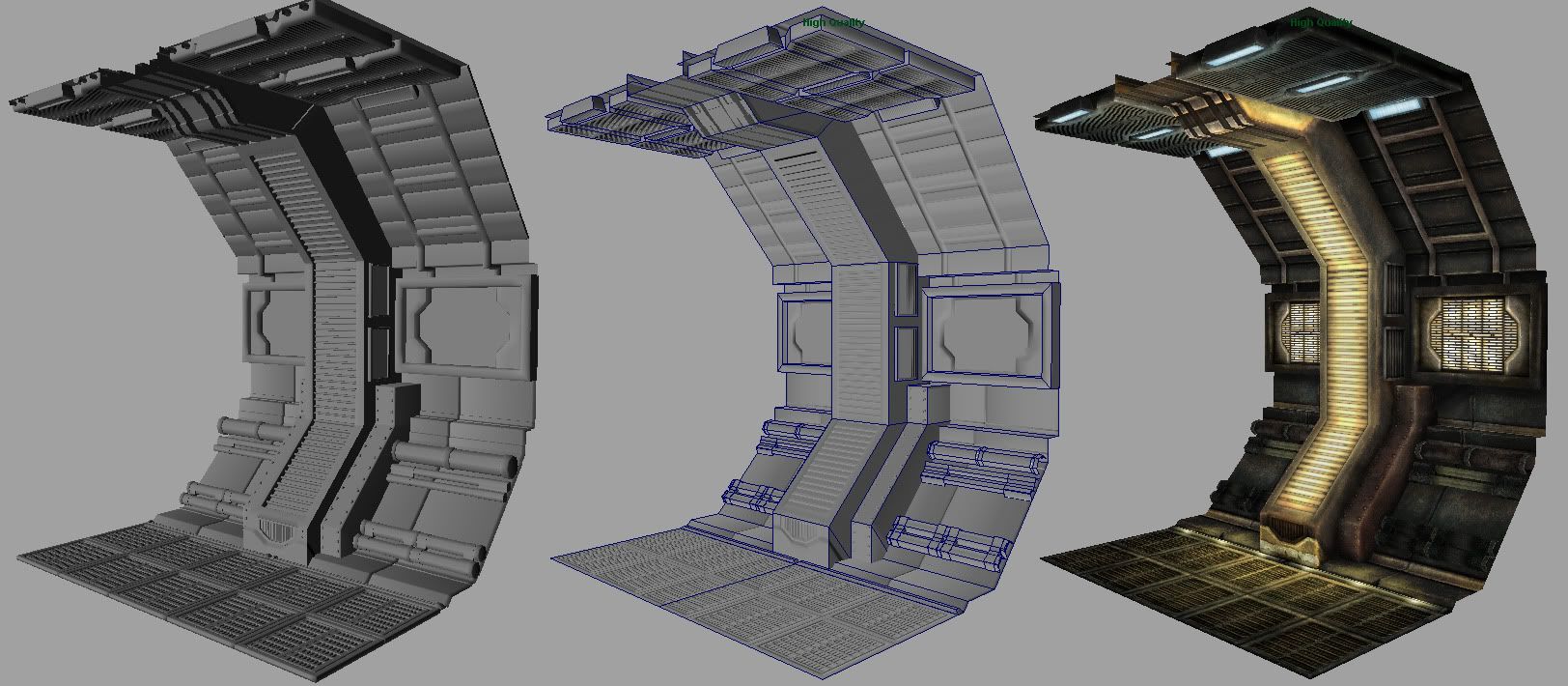
comp1.jpg?t=1250035624

From left to right, high-poly, low-poly (wire), and flat diffuse. It's currently at 828 tris. I'll be working on the spec and emissive maps next before setting it up in Unreal. Comments and critique appreciated, thanks.

Replies

  • Ben Apuna
    Hi there Axios, this is looking pretty good. It's really got that Alien feel to it.

    I think you should bevel the edges I've highlighted here, then rebake the normal map.

    aliens_wall_bevels.jpg

    Then those edges will show up better in Unreal, especially once you've added your normal and spec maps.

    I'm looking forward to seeing more :)
  • Axios
    Offline / Send Message
    Axios polycounter lvl 10
    Do you think the low-poly should be beveled as well or just the high? There's a small bevel on there now, but I'd agree with increasing it. Was planning on rebaking some anyways.
  • Ben Apuna
    Yup, you will need to bevel the low poly as well. You will also need to soften those edges on the low poly to avoid normal map errors. Here's an example of what you can expect in UE3 with normal maps + beveled soft edges vs hard 90 degree angle edges.

    ModobakesinUE3bevelsvsedgesplit.jpg
  • Oniram
    Offline / Send Message
    Oniram polycounter lvl 17
    the texturing is superb! would you mind posting up the diffuse color so we can see your UV layout.
  • Joshflighter
    Offline / Send Message
    Joshflighter polycounter lvl 9
    The pics didnt show up before. But now they are.

    Very nice! Lovely, makes me want to go do some work now. :)
  • Axios
    Offline / Send Message
    Axios polycounter lvl 10
    Thanks, here's the diffuse map so far:

    hall_diffuse.jpg?t=1250117938
  • whats_true
    Offline / Send Message
    whats_true polycounter lvl 15
    Why did you paint in the lighting? This is usually a bad idea, cause what if you want another color for those lights? Diffuse maps should be void of lighting information.
  • Thegodzero
    Offline / Send Message
    Thegodzero polycounter lvl 18
    ...so you have a normal map, and self illumination from the diffuse? you do realize that the normal map is pointless then rite?
  • Oniram
    Offline / Send Message
    Oniram polycounter lvl 17
    nice texture painting. but like whats_true said, dont paint in your lighting. just in case you want the lights to turn off or change color. or even if you have a character in the scene with a flashlight.
  • SimonT
    Offline / Send Message
    SimonT interpolator
    WOw the result looks really cool! About the edge proble: i did a short tutorial on this topic too. Maybe it can help. But i have to say: beveled edges gives a better feel when you rotate around an object and in the current state of the technic it shouldn't ne a problem to use some more polygons for the silhouette.

    tutorial_edge01.jpg
  • Pbcrazy
    I'm curious as to how you created your metal texture. I've been attempting to create some textures in Photoshop, but... they don't turn out so good.
  • Axios
    Offline / Send Message
    Axios polycounter lvl 10
    Thanks for the advice so far. I had to go through reformatting my computer and reinstalling stuff, but I got back on this today. I agree with taking the lighting out of the diffuse map, I just enjoy doing that and having that makes it a touch easier for me when it comes to actual lighting. Anyways, here it is now in Unreal sans lighting in the diffuse texture.

    hall_1.jpg?t=1250411350

    I beveled some edges and did a rebake so it's improved, but I'm still getting some funkiness in a few areas that I'm working on. Plus, the spec and emissive maps need some tweaking in a few areas. I did a quick mockup of a full hallway just to see what it looks like, but this isn't representative of the final environment.

    hall_2.jpg?t=1250411349

    @Pbcrazy: To make the metal, I simply painted a tilable metal texture that I could blend in wherever I needed. It's nothing special, I just used a bunch of varying brushes and slightly different colors to try and match a photo reference. Then it was just about posterize and offset filters and enhancing the colors a bit.

    grunge.jpg?t=1250411350

    Anyways, critiques and suggestions appreciated; I'm hoping to pick up the pace on this now that I have my pc back up.
  • skullsplitter
    Offline / Send Message
    skullsplitter polycounter lvl 18
  • adam
    Offline / Send Message
    adam polycounter lvl 19
    What sort of game is this for? Its mesh could use more details that aren't just baked to the texture. The lights + vent + trim at the bottom of the main support frame could also used geometry to sell their shapes.
  • vladino
    Offline / Send Message
    vladino polycounter lvl 15
    This is so nice! Really nice texture. Just add bit more rust or stains and will be perfect ;) I really like the color mood you got there!
  • spahr
    Offline / Send Message
    spahr polycounter lvl 8
    Hanging cables! If you want to break it up I mean, just dangle a low poly cable from the ceiling lights and the walls here and there. And is there going to be a hatch door? And on thing you could do, turn your floor plate holes into alphas, and have a thread plate or something underneath, could look cool having the 2 planes there, get some POP out of the floor.

    All that said, VERY COOL, looking forward to the finished product.
  • Axios
    Offline / Send Message
    Axios polycounter lvl 10
    Yeah I certainly do I plan on having all kinds of stuff like that once I get moving on the actual scene. Just trying to get this asset right first. All great suggestions though, thanks
  • JO420
    Offline / Send Message
    JO420 polycounter lvl 18
    Really nice piece,love the texturework
  • BradMyers82
    Offline / Send Message
    BradMyers82 interpolator
    The textures do look really cool, but like others have said; your kind of stuck with that lighting setup because of the way you painted the diffuse.
    For example, what if in the game (as in many games) something where to happen and the lights went out, or a red light alert system or something?
    All I'm saying is you don't have much flexibility currently, but it does indeed look nice.
  • Axios
    Offline / Send Message
    Axios polycounter lvl 10
    The last update included no lighting in the diffuse texture. I mostly had that for lighting concepting purposes prior to bringing it in engine. I still have occlusion in the texture, but all the lighting is in Unreal now.
  • BradMyers82
    Offline / Send Message
    BradMyers82 interpolator
    Axios: Oh sorry, my bad then. It looked so much like I would imagine, with the previous texture flats you showed, I didn't think you made substantial changes to the lighting as discussed earlier.
    Any chance we can see the latest texture flats then? :)
  • JohnnyRaptor
    Offline / Send Message
    JohnnyRaptor polycounter lvl 15
    its great dude, a little repetitive, but hey, cant have designer furniture and framed paintings in a deep space cargo hauler:)
  • Axios
    Offline / Send Message
    Axios polycounter lvl 10
    Okay, here's the first shot of what will basically be the scene. I'm still getting some funky edges in the normal map, and I'm not sure how much more I can work with the UVs, given how it's all painted and whatnot. So right now I'm trying to get that map up to an acceptable level, and I'll have to put all this advice more fully into use on future meshes.

    hall_4.jpg?t=1250660635

    I know I've diverged pretty heavy from my Alien: Resurrection references in terms of lighting in favor of color. Couldn't really find a setup as dark as theirs that pleased me here. Anyways, I'm still gonna spend some time tweaking the mesh, textures, and lighting before I move onto some other stuff, such as some wires or cables placed in there. I did add some geometry to the bottom of the main support to try and pop that trim out some, and I hope that's enough because any farther makes it intersect with the track lighting and stretch the texture too much. I already know some key areas that need to be tweaked, but any comments/critique is good (as well as any suggestions for other meshes and features to be placed in here). Oh, and here's my current diffuse texture:

    hall_COL.jpg?t=1250662688

    Oh, and I know it's a bit repetitive at the moment, but that's because this whole thing started as a small project to make a modular hallway section rather than a whole scene. Thus, I'm hoping that some additional meshes will help break that up. Thanks guys
  • Ark
    Offline / Send Message
    Ark polycounter lvl 11
    The lighting looks a bit uniform. Try desaturating the lights that are at the end of the hallway.

    You could also add a bluish light behind one of the pillars to suggest an opening?
  • SHEPEIRO
    Offline / Send Message
    SHEPEIRO polycounter lvl 17
    I like it, very metroid IMO

    could do with being more modular so that you could have different looking sections from the same texture ssheet to break things up

    now make a T/X juction side and a door and you have a level
  • Ged
    Offline / Send Message
    Ged interpolator
    looks good, could do with a point of interest - door/machine or something
  • warby
    Offline / Send Message
    warby polycounter lvl 18
    i think the design is a bit generic but the execution is very solid ! keep on rocking :) !
Sign In or Register to comment.