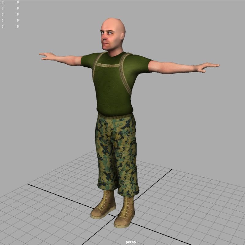
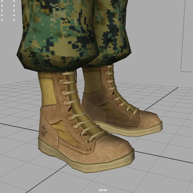
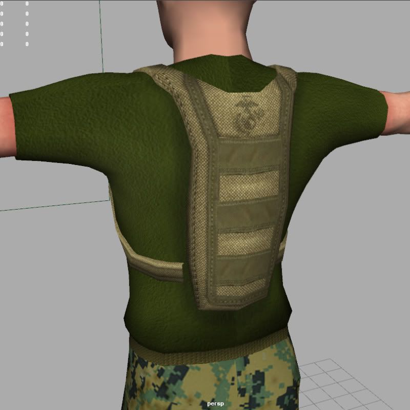
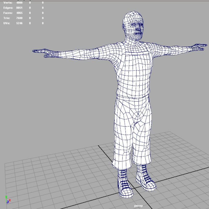
So I am working on a character for a PC demo basically to see how far I can push Unity visually without terribly impacting it's frame rate. It's going to basically be a learning session for me before I attempt to create a full on playable game level. Right now its the basic start of a military type character. Here are some screens of that progress... Note: This model is still very much a WIP right now...both for modeling and textures. I have not started the normal map sculpting either which should really take it where it needs to be. As of now he has a 512x512 head texture and a 2048x2048 texture for the entire body and any accessories. He's also running around 7600 tris right now.
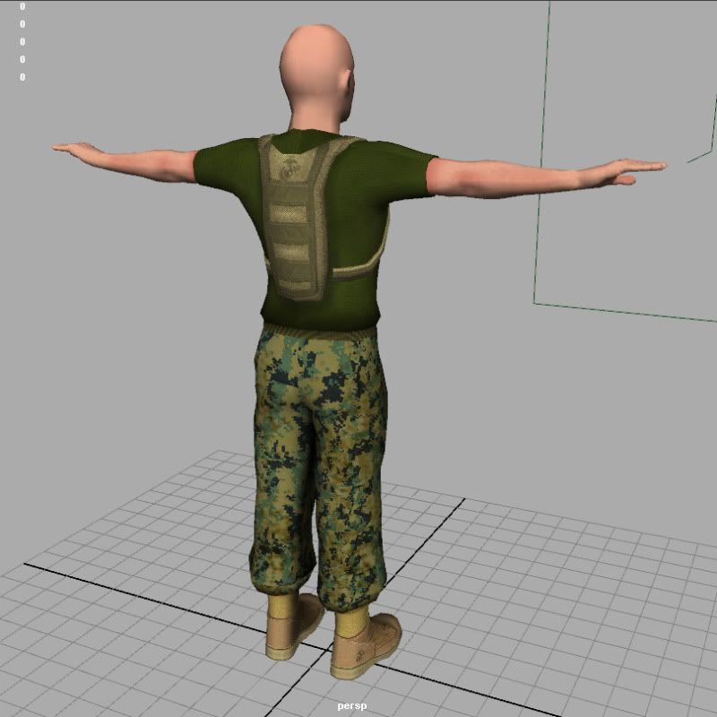
His proportion is a bit off, his head implies he's much younger than i think you're aiming for this character to be. By the looks of it two heads up on this guy from the bottom is going above his knee rather than just below it so i'd recommend adjusting that (even if you're using the academic 7.5 heads as opposed to the artistic 8 heads the top of the 2nd head shouldn't rest above the knee...combat boots being typically taller than a regular shoe would cause this relationship to appear even lower than that if you're measuring from the bottom of the boot).
other than that, you've got very nice edge loops and by the looks of it, this character will deform very well with rather straightforward weighing.
since you're pushing to see how much this engine can take there's no need to talk about optimization.
lastly, i'd like to give kudos to you for recognizing the twist occuring in the forearm when the arm is held in a bind pose with palms facing down. i'd say a majority of people completely ignore that which causes twists in the wrists of their models to look downright bizzare.
1)Proportions are off, search for a good refs, the same goes to overall topology and poly placement.
2)Texture job, it's very flat and undone.
3)UV's, try to plan the uv's better, so the seams would't show up that much.
Thanks for the crits. I do need to tweak his proportions, something always did look a tad odd to me. Textures are very much WIP right now, so no real work into the texturing yet, it's just the laid out flat basics right now. I do need to correct a lot of seam issues all around either by UV adjustments or by painting over some of them. Again thanks for the help on this guy.
1)Proportions are off, search for a good refs, the same goes to overall topology and poly placement.
2)Texture job, it's very flat and undone.
3)UV's, try to plan the uv's better, so the seams would't show up that much.
I think you misread the fact that the model and textures are very much wip.
Can't emphasize the point about reference enough. At the very least have a human in the same pose in your modelling view port and literally line up your model with it.
If the proportions are off at the start everything else is affected down the line if you have to rescale anything
Someone noted that it is very much WIP stage right now and they're right on the money. The proportion issues brought up though are very good observations...better to get that out of the way and fixed before it gets very detailed. It is a CamelBak he's wearing so not a backpack...sorry its missing the nozzle and hose for drinking...it's also not even completely modeled yet as welll. I will beef it up and give it some more volume as was noted. I am going to use the 'heads tall" method that was mentioned to get the proportions right....his legs are too short, his head is a tad too large I think in scale the rest. I used a photo of myself for reference in my uniform, but I made him quite a bit leaner than myself, so I think thats how I lost proportion. I put on some weight after being discharged....so.
To build on what others have said without going over the same stuff and at the risk of sounding like a ranting dick...
- Proportions aren't only about nailing just how many heads tall someone is, its about getting relationship between all pieces to jive. This might help a bit, its at least interesting.
- Photos can make good textures but often with a lot of work. Case in point using a photo of boots that where clearly never worn and not being on a foot when the photo was taken. Lots of shadows where they shouldn't be. Same goes for the wear and tear.
- No excuse for seams in this day and age, there are a lot of them. Quite a few ways to get around that, everything from baking/transferring maps to body paint.
- Boot laces criss-cross from eyelet to eyelet. They aren't isolated laces that bridge from one eyelet to its counterpart on the other side. Take the laces out of your shoes some day and put them back...
- Belts cut into and bunch up the material on both sides of the belt, pants and shirt.
- Belts also have buckles, like pants have pockets and belt loops.
- The pants look to be filled full of helium.
Well the version of the character on right in this image is the one where I took the first step in these crits and corrected his proportions. I did the 8 head high method from just above the boot soles. I also adjusted his head size a tad and tweaked some other areas to make the overall proportions seem more natural. I also tried to lean him out just a hair more.
"Proportions aren't only about nailing just how many heads tall someone is, its about getting relationship between all pieces to jive."
- Yeah I am reworking the proportions in the amount of heads tall and the proportions of pieces of the body in relation to the others...i.e. head and arms/shoulders.
"Photos can make good textures but often with a lot of work. Case in point using a photo of boots that where clearly never worn and not being on a foot when the photo was taken. Lots of shadows where they shouldn't be. Same goes for the wear and tear."
- Yep he's very, very WIP on textures right now, the boots haven't even been touched except to place photos on the boots to have a baseline to start painting on top of. Also no dirt or grime pass yet on any textures at this juncture.
"No excuse for seams in this day and age, there are a lot of them. Quite a few ways to get around that, everything from baking/transferring maps to body paint."
- Mudbox is the tool that helps me cover the seams where I don't want them...not at that point in the process where I was worrying about seams just yet, really I was at the point of laying simple textures and photos into place and begin to work on them.
"Boot laces criss-cross from eyelet to eyelet. They aren't isolated laces that bridge from one eyelet to its counterpart on the other side. Take the laces out of your shoes some day and put them back..."
- Um well finally one I can argue. I was a US Marine for 8 yrs. I wore boots with quicklaces on them. Me and a couple buddies usually ran and wore our laces straight across....I dunno a wierd Marine fashion statement I dunno. If we werent with the air wing I'm sure some SgtMaj would have chewed our asses. So it is correct to a unique way of wearing them as i was used to. I am trying to inflect a little of my little things into this guy.
" Belts cut into and bunch up the material on both sides of the belt, pants and shirt."
- yeah they sure do...have not gotten into any detail texturing yet or modifying the really straight geometry to give more volume to some areas. I am sure I will pinch up and bunch geometry in some spots for these types of things.
"Belts also have buckles, like pants have pockets and belt loops."
- Yep I know I wore a web belt for a very long time...have not even gotten to the modeling of details like that or texturing for those things yet.
"The pants look to be filled full of helium."
- yeah they lack detailed shape or folding right now. Basically they are little more than slightly shaped cylinders right now...it's all coming soon. Looks like I have my work cut out for me.
Replies
other than that, you've got very nice edge loops and by the looks of it, this character will deform very well with rather straightforward weighing.
since you're pushing to see how much this engine can take there's no need to talk about optimization.
lastly, i'd like to give kudos to you for recognizing the twist occuring in the forearm when the arm is held in a bind pose with palms facing down. i'd say a majority of people completely ignore that which causes twists in the wrists of their models to look downright bizzare.
2)Texture job, it's very flat and undone.
3)UV's, try to plan the uv's better, so the seams would't show up that much.
I think you misread the fact that the model and textures are very much wip.
If the proportions are off at the start everything else is affected down the line if you have to rescale anything
Give the backpack some volume too.
Looks more like a camel bag, it holds water. But yeah, could use a little volume.
I checked out your portfolio, gotta say man your characters have a ton of personality to them...awesome work.
- Proportions aren't only about nailing just how many heads tall someone is, its about getting relationship between all pieces to jive. This might help a bit, its at least interesting.
- Photos can make good textures but often with a lot of work. Case in point using a photo of boots that where clearly never worn and not being on a foot when the photo was taken. Lots of shadows where they shouldn't be. Same goes for the wear and tear.
- No excuse for seams in this day and age, there are a lot of them. Quite a few ways to get around that, everything from baking/transferring maps to body paint.
- Boot laces criss-cross from eyelet to eyelet. They aren't isolated laces that bridge from one eyelet to its counterpart on the other side. Take the laces out of your shoes some day and put them back...
- Belts cut into and bunch up the material on both sides of the belt, pants and shirt.
- Belts also have buckles, like pants have pockets and belt loops.
- The pants look to be filled full of helium.
Keep at it, first nail those proportions.
Well the version of the character on right in this image is the one where I took the first step in these crits and corrected his proportions. I did the 8 head high method from just above the boot soles. I also adjusted his head size a tad and tweaked some other areas to make the overall proportions seem more natural. I also tried to lean him out just a hair more.
- Yeah I am reworking the proportions in the amount of heads tall and the proportions of pieces of the body in relation to the others...i.e. head and arms/shoulders.
"Photos can make good textures but often with a lot of work. Case in point using a photo of boots that where clearly never worn and not being on a foot when the photo was taken. Lots of shadows where they shouldn't be. Same goes for the wear and tear."
- Yep he's very, very WIP on textures right now, the boots haven't even been touched except to place photos on the boots to have a baseline to start painting on top of. Also no dirt or grime pass yet on any textures at this juncture.
"No excuse for seams in this day and age, there are a lot of them. Quite a few ways to get around that, everything from baking/transferring maps to body paint."
- Mudbox is the tool that helps me cover the seams where I don't want them...not at that point in the process where I was worrying about seams just yet, really I was at the point of laying simple textures and photos into place and begin to work on them.
"Boot laces criss-cross from eyelet to eyelet. They aren't isolated laces that bridge from one eyelet to its counterpart on the other side. Take the laces out of your shoes some day and put them back..."
- Um well finally one I can argue. I was a US Marine for 8 yrs. I wore boots with quicklaces on them. Me and a couple buddies usually ran and wore our laces straight across....I dunno a wierd Marine fashion statement I dunno. If we werent with the air wing I'm sure some SgtMaj would have chewed our asses. So it is correct to a unique way of wearing them as i was used to. I am trying to inflect a little of my little things into this guy.
" Belts cut into and bunch up the material on both sides of the belt, pants and shirt."
- yeah they sure do...have not gotten into any detail texturing yet or modifying the really straight geometry to give more volume to some areas. I am sure I will pinch up and bunch geometry in some spots for these types of things.
"Belts also have buckles, like pants have pockets and belt loops."
- Yep I know I wore a web belt for a very long time...have not even gotten to the modeling of details like that or texturing for those things yet.
"The pants look to be filled full of helium."
- yeah they lack detailed shape or folding right now. Basically they are little more than slightly shaped cylinders right now...it's all coming soon. Looks like I have my work cut out for me.