Sketchbook: Fleafa
Hi guys. I've been a member for ages but never posted. Been using GA.org to post my WIPs but not getting as much feedback as I'd like. Seems a good community here, so I thought I'd make the effort to maintain two threads!
First, a couple of things I've done over the last few months:
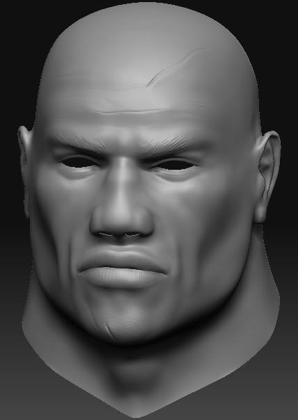
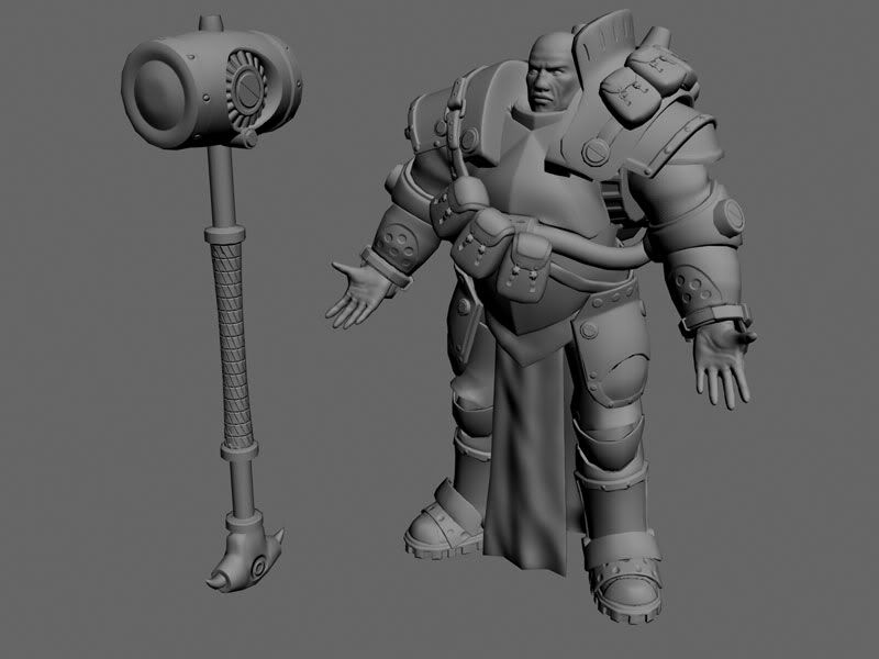
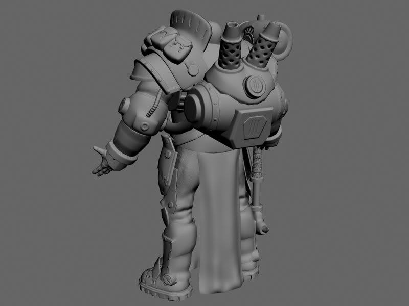
Major Markus 'Siege' Brisbane from the tabletop game, Warmachine (unfinished) :
Old guy head study:
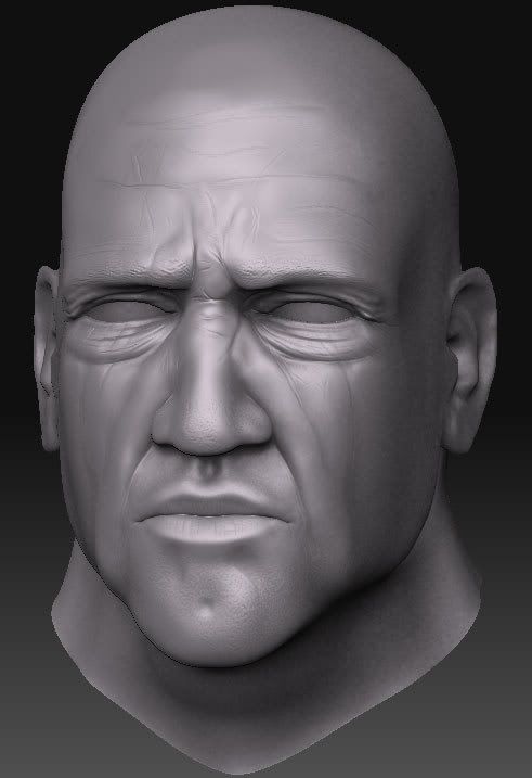
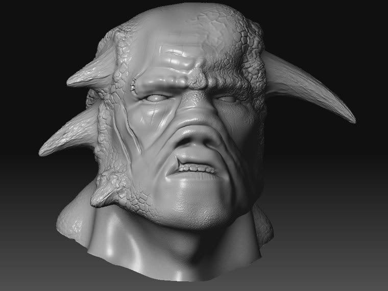
GW Khorne Champion head study:
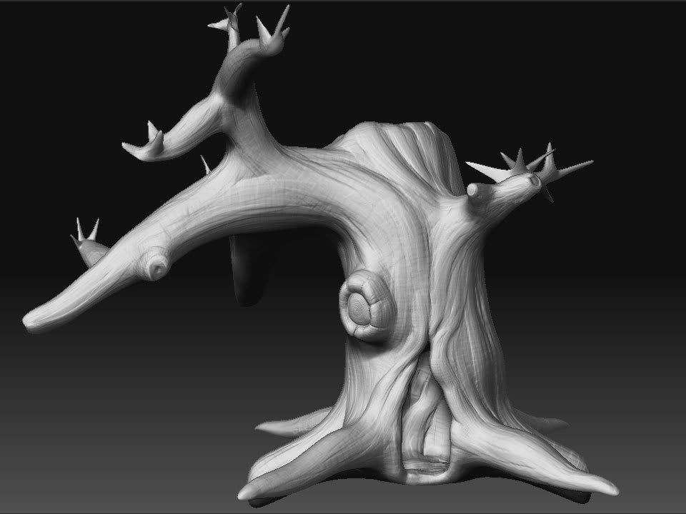
Gnarly tree experiment:
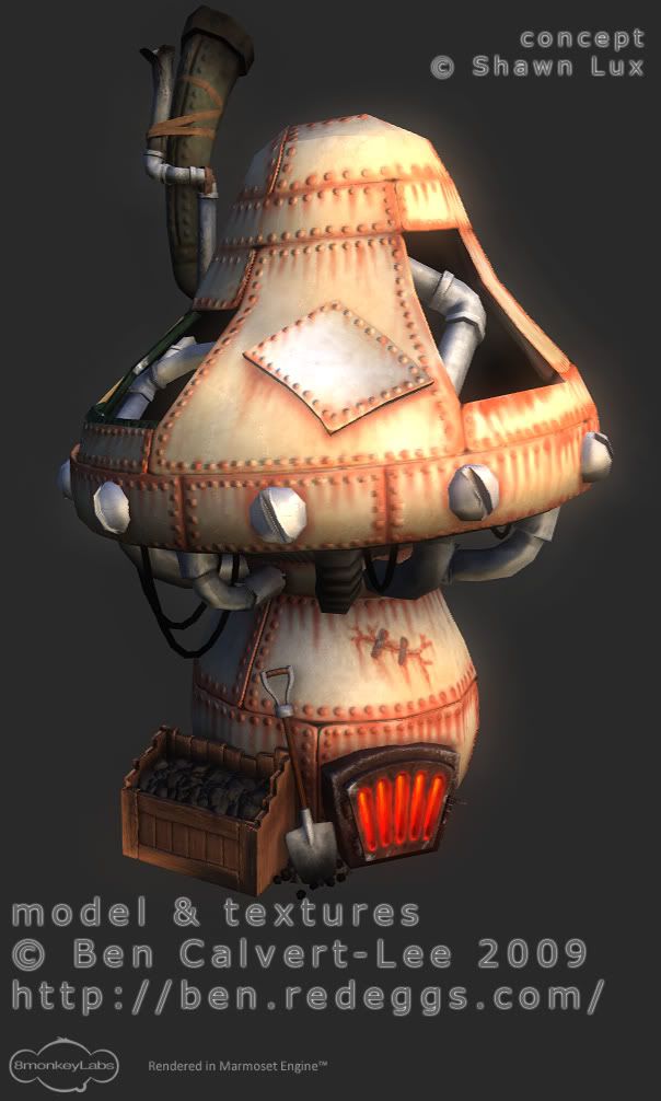
Steampunk mushroom:
First, a couple of things I've done over the last few months:
Major Markus 'Siege' Brisbane from the tabletop game, Warmachine (unfinished) :


Old guy head study:

GW Khorne Champion head study:

Gnarly tree experiment:

Steampunk mushroom:

Replies
Here's some crappy colouring, the only kind I do:
One small crit to concider is on your sculpts. The wrinkles on your characters bodies and faces, (not the clothing) the start and ends need to be softened out. They appear to simply be there. In other words theres no transition from the smooth skin into a wrinkle and then back out.
Other then just that your doing good, keep up
Unwrapping up next. May play with texture more once baking is done.
i would cut some polies from hat and put them on hands and feet
also great mushroom! don't give up and keep posting.
best regards, Askhat.
conte - Cheers dude! Redistributed some tris now. The hat was way too heavy.
NAILMASK - Cheers! Mushroom wasn't my concept. Found a photo of a miniature sculpt for wargames here. Credit for the concept is given to sculptor Shawn Lux on the Marmoset render. The ugly smurf is mine and I winged it from references.
[ame="
Specular next. I'm not too hot on spec maps; does anyone recommend a particular technique/tutorial?
[ame="
Just started rigging and not done any tests yet. Do have poly budget to spare for this sort of thing...
[ame="
Next up I want to try to submit a Comicon entry over at Game Artisans. Saw someone's already doing The Comedian from Watchmen, so I'm not sure... the options are:
Confederate Civil War Comedian
Rorschach
Damian Wayne as Batman
Jason Todd as Batman
With the faces, pay more attention to the planes of the face, as it feels like you are putting all the ettention on specific features. While the structiure of the face is lacking.
And tighten up those edges on the smurf guy. I can tell you aibrushed his colour on
Good crits; the smurf was polypainted in Zbrush. I'll be going back to tighten him up once Comicon is all over. Then I'll add him to the mushroom in a simple environment for a render.
Working on a 3D version of Rydia from Final Fantasy IV:
Finished sculpt:
Game mesh progress:
Added her head brooch-decoration thing. Up to 2,950 tri's now.
OK. Some stuff:
1. there are too many colors in use here. use this site for deciding color.
2. The brown thing on his head clashes too much wth the turquoise.
3. its all too saturated.
3. blue eyes, i hate.
5. pink? r u serious? maybe in little doces like in the nostrils and the lips. other than that, i recomend you use a different shade fo turquoise.
this will be very helpfull. its what i use to determine my color pallet.
http://colorschemedesigner.com/
i especially love the batman
and the character modeled in #21
There's only 4 colours in use really. I don't consider that too many.
The brown thing is meant to be a bony shell-like plate and was intended to stand out. You may be right that it is too saturated, though I disagree with you stating that it clashes. Using the Colour Scheme Designer (which I knew about, but thanks for the link), brown is actually a complementary colour for the turquoise.
Blue eyes, I like.
Pink. Yes I am serious. Maybe it is a bad choice but I like it!
Thanks for the feedback though, I do appreciate you taking the time to comment.
@indian_boy: Thank you very much.
Vrav was kind enough to PM me a quick paintover addressing some of the same issues raised by roosterMAP. I will certainly be going back to this despite the bust only being a speed sculpt which I took too far! But first I must install my new shiny copy of Windows 7 as this beta has run out.
Finally managed to sort my PC out and get back to unwrapping the hunter.
Made a slight redesign in the process. Didn't like the satchel so gave him a water bladder instead. Seemed to fit with the concept better.
Here's the first test bake from xNormal. The new feature of reading the polypaint from .OBJ then baking to diffuse is absolutely amazing.