@skayne: Really glad to hear that, that was one of my goals with that one
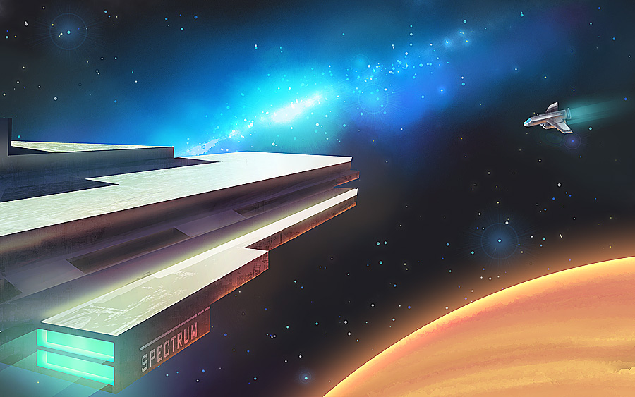
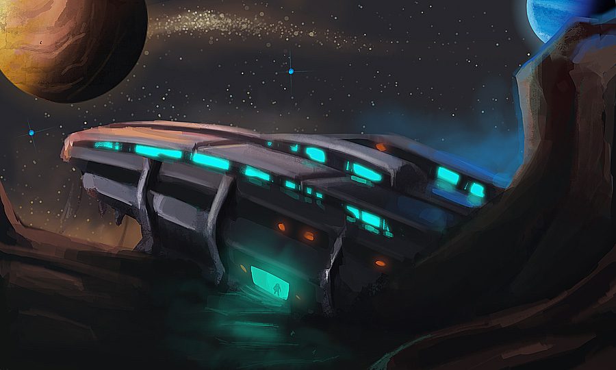
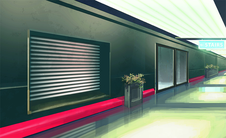
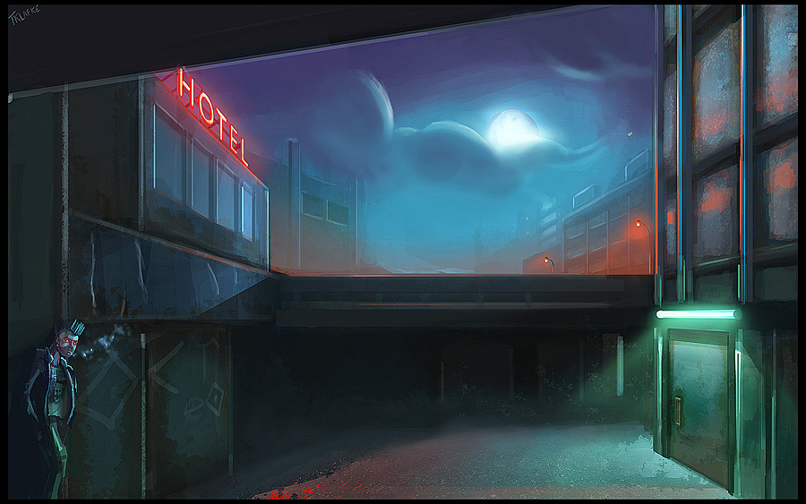
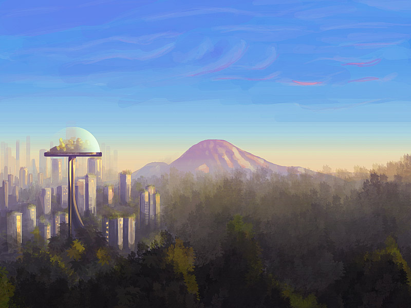
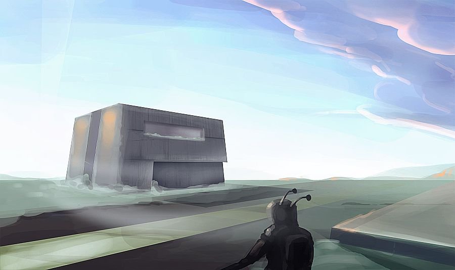
Aiight, tonight's sketch. I decided to do a series of speed paintings to try new compositions and color palettes. I'll also try to be as loose as I can, to get a better sense of big picture rather than focusing on tiny little details. There's no point in going micro if you can't get the basics first
This is the first one. It's called Strange Planet and it took about 2H
My main focus here wasn't the subject itself, but shadows and scale, as I felt I'm kind of lacking in these areas.
One thing that I think would help these is the amount of detail in specific areas. Right now it looks as though you kind of have the same level of detail thought the image and that's fine but unless everything is all rendered and polished it makes them look kind of noisy.
What you could do is spend less time on some areas and more time on others. This would make certain things look better and draw the viewers eye to important structures and details in addition to giving the viewer a chance to see what it might look like if you really pushed the entire image without having to do all that work.
Clever use of this idea will have great results, you see it all the time in concept art.
Also, put more STUFF in the environments. A few clean ones are fine, but all your environments seam so sterile. You even managed to make that creep alley way one clean. Some junk and random props would help fill out the scene and make for more interesting composition. You could even put some stuff in the foreground to cover up parts you don't want to do.
Aside from that I agree with the comment made earlier about the colors, they are great. You have a good thing going keep making more.
Thanks a lot for the crits man, prioritizing certain areas is definitely one thing I should do more!
I often get too carried out with small details before settling a good composition. I know that's an amateur'ish mistake and I'll be doing my best to avoid in the next paintings
New one! Quick sketch for a UDK scene I'm working on. This is more of an attempt to set a mood rather than defining shapes (which are already modeled and placed in UDK).
Replies
now do more
@skayne: Really glad to hear that, that was one of my goals with that one
Aiight, tonight's sketch. I decided to do a series of speed paintings to try new compositions and color palettes. I'll also try to be as loose as I can, to get a better sense of big picture rather than focusing on tiny little details. There's no point in going micro if you can't get the basics first
This is the first one. It's called Strange Planet and it took about 2H
My main focus here wasn't the subject itself, but shadows and scale, as I felt I'm kind of lacking in these areas.
Alright, here's a WIP of something I want to work on more and possibly make a scene in unreal based on it.
What you could do is spend less time on some areas and more time on others. This would make certain things look better and draw the viewers eye to important structures and details in addition to giving the viewer a chance to see what it might look like if you really pushed the entire image without having to do all that work.
Clever use of this idea will have great results, you see it all the time in concept art.
Also, put more STUFF in the environments. A few clean ones are fine, but all your environments seam so sterile. You even managed to make that creep alley way one clean. Some junk and random props would help fill out the scene and make for more interesting composition. You could even put some stuff in the foreground to cover up parts you don't want to do.
Aside from that I agree with the comment made earlier about the colors, they are great. You have a good thing going keep making more.
Thanks a lot for the crits man, prioritizing certain areas is definitely one thing I should do more!
I often get too carried out with small details before settling a good composition. I know that's an amateur'ish mistake and I'll be doing my best to avoid in the next paintings
My homage to the 40 years of the first lunar landing
Based on this picture of Buzz Aldrin assembling some experiments.
You can find other Apollo 11 pictures here.
Make sure to check out other Apollo missions pictures as well, they are awesome! I specially love the ones with the lunar vehicle.
about 1.5 ~2 H
Last night's sketch: Trying some different techniques and palette.
Thanks for sharing.