My First Post. . .
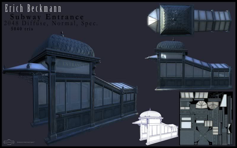
Howdy. I would like your guys input on this subway entrance I created. I would like to get better and hopefully one day get a job somewhere once I graduate school so anything you guys say really really helps.

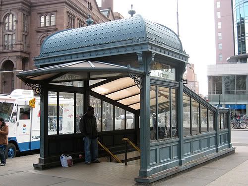
This is the original Concept.

My design is taken off a schematics I found off the Internet and is a little bit smaller and thinner. Also I took some tiiiiny liberties on the design. .
Once Again, thanks again for spending even the time to look at my stuff. <33

This is the original Concept.

My design is taken off a schematics I found off the Internet and is a little bit smaller and thinner. Also I took some tiiiiny liberties on the design. .
Once Again, thanks again for spending even the time to look at my stuff. <33
Replies
You deffently followed your reference very loosely. As there is quite bit that you did not stick too; mostly proportions.
Good work though, I think it came out well. Good bake, diffuse and modeling. Did you do any crazy high poly modeling for this, or anything? If so, post it! Some higher res close ups would be nice next time too, just to get a closer look at your textures.
props!:thumbup:
This is a shot of my hipoly roof.
so now that you're making decent art can you stop writing totally homo love songs and putting them on facebook? lulz
Naw. Just playing. About time you put some of this stuff on PC. Turned out great man. You going to post your other projects?
Anyways... keep up the good work bud.
I did the same theory but in Maya uses animation tools like Bend. If I need a little more control on a simpler mesh I would just bind the object with bones.
Thats really the only method I know of using Maya. . .if anyone has anything better/quicker/easier/sexier I would love to know! I'm still learning. Anyways. here are some better shots I just took of my model in Marmoset.
Once again thank you for the quick replies and critiques. I'm going to get on this fixing it in about 2 weeks (once finals are done), I can't imagine I need to do too much more. my oooooonly concern is I don't really know what else I can do to grunge it up without looking obnoxious. . Personally I never liked grafitti on my models. . maybe I'm too attached to them, haha. I could add some posters! Maybe more dirt. I didn't see too much rust in my references . Any ideas, adam? You're the badass now with a studio job. . . </jealousy>
Haha. Thanks! Any more questions or renders ask and I will post!
I dig the bird sh*t at the top, it adds character, but as a portfolio piece, you want to put it in areas you'll see in your best render angles.
A few "tags" on the windows, done with a magic marker or something does wonders to make something look lived in. Sure it's overdone, but it's overdone because it works.
Just an idea, maybe put a half cleaned window and a bucket and sponge next to it? Put some bird sh*t on the other windows?
Like most have said just grundge it up it's coming along great, the what would be windows on the top of this structure look as if they have a tinted tan or brown highlight to them add that and see how it looks.
Add metal scratches chipped paint <so it's more noticable, little more faded paint, maybe if it's not too much trouble some broken or cracked window panes.
GJ.
Crazyfingers: Love the bucket idea. I totally have room on my UVlayout to make a bucket and rag. I think I will try that out and see what I can do. And I can probably chip the paint underneath the windows, where people would lean against, along with some taggage. Once I'm done with school (2 weeks) I will get back on this. I would really like to use this in a portfolio.
Thanks again, everyone!