sketchbook:SHEPEIRO
well just wanted to start one of these, im doing quite a bit of work, but most of it short and test like in nature. so heres my sketch book
been making bones, not sure if its going to become a full level or not yet
lightmapped
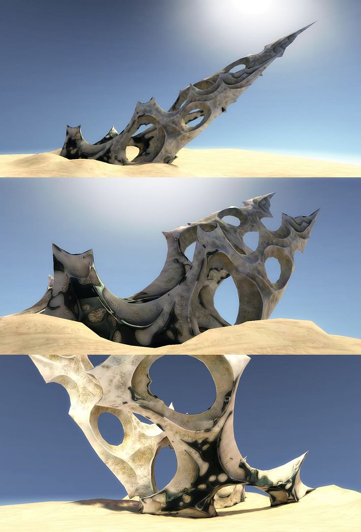
and in marmoset
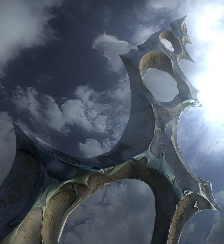
removed the metal shit, couldnt get it loooking like i wanted
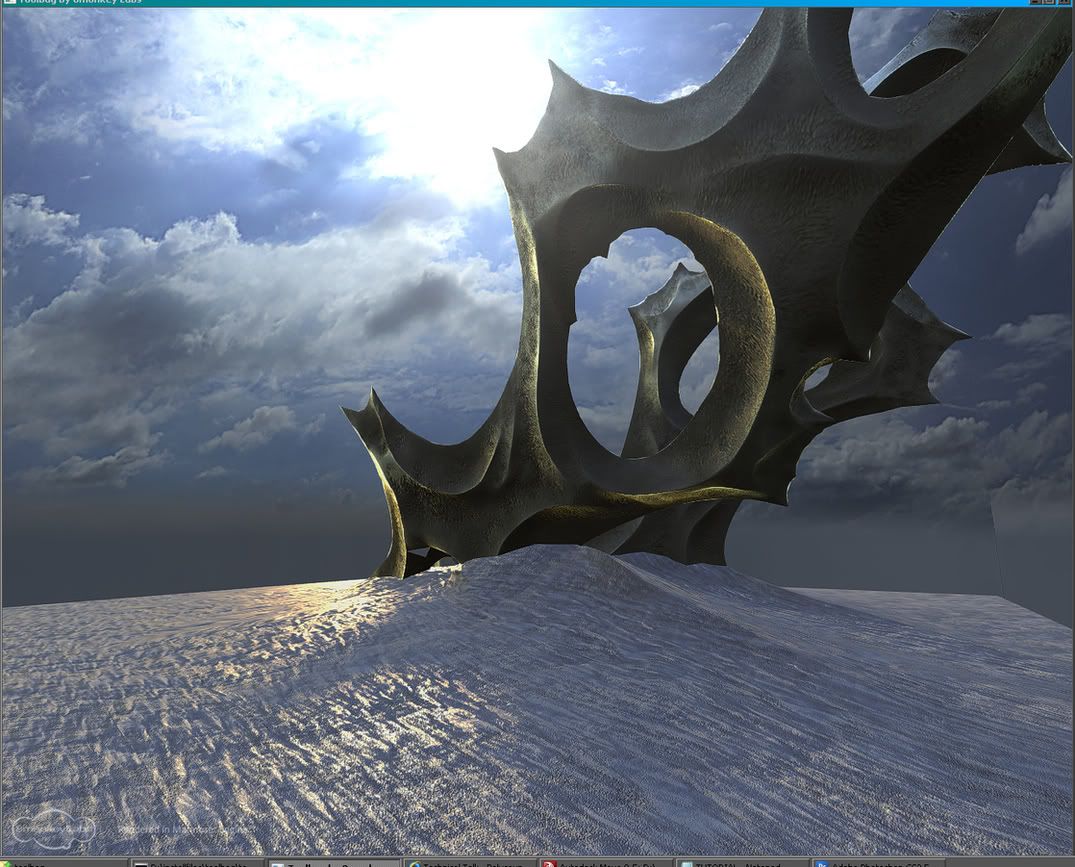
been making bones, not sure if its going to become a full level or not yet
lightmapped

and in marmoset

removed the metal shit, couldnt get it loooking like i wanted

Replies
this is my latest a small ceremonial sacrifice hut, thinking of having some standing stones circling it.
maybe situated in something like this
Cool stuff so far, I personally think its all a tad too surreal for my tastes. i want to see something in there that I can understand. The bones are really wonky and strange and I cant tell what they came from. The huts the only think im instantly familiar with, which is cool, but super basic. And I personally dont like how it looks dug into the ground, makes it difficult to get a cool shot of it.
Don't get me wrong, its all seriously nice eye candy and looks amazing, I just dont get it, or get exactly what your trying to accomplish. Definitely something completely different from your bath house.
Anyways those are my thoughts! Keep it up! Im interested to see where your going with all this.
For the sci-fi enviro are you thinking something unrelated to these pieces or connected in some way? I like the idea of it being 2001-esque
I like the fishy temple too, I can't imagine how you worked those stairs out. I'm definitely curious about that aspect. It looks like an Escher drawing in that wire shot. It seems a little claustrophobic which might go well with that sort of underwater fish tank feel.
Sweet stuff though, can't wait to see where it all goes.
anyway, decided to make a ship thats based in the 2001 universe but not from the film, so it this ship, a battle ship, did quite alot of research on the web about 2001 and future "real" ship designs and think ive got somethign fairly genuine, it will be a small environment peice, with and exteroir and interior, much more compact than the ship in 2001, more like the craft that they take to the moon, only with a bit more fuel and solar panels and heat radiators that can be folded away for combat and fast manuveures.
gonna work out the interior next week, should be fun
little fun with shapes at lunch
some real times, and a pretty crappy lighting test, need to nail that
i kind of want a mix of realtime and directional lightmapping....roll on unreal update please, maybe ill give crysis befor i sit back and wait though
The small differences between the ceiling/floor and the walls work really great too.
game engines just are not really suited to this type of lighting and these types of clean clear surfaces with no detail to hide the artefacts, so this should be fun
more marmoset progress
planning on either crysis engine or unreal, gotta play with both, but think crysis may be better suited looking at the styles of stuff produced
Looking forward to more original stuff, keep it up!
lighting quality is low cos its too late.
yep but not at the moment, i had half an idea then came to halt, so im just waiting for the thing to mature a bit in my head befor i do more, talking about the bones thing anyway, the hut is a a quicky as im interested in doing that sort of architecture modular style
just need to model a couple of better branches with uv's then its on to the fun bit, trunk and roots
Then again i was making it for a realistic FPS not an RTS view...
the normal maps on these suckers comes out much better when oversizeing and stylizing than when at realistic scale
charcoal pencils were a bit scratchy for my liking
my besty mate Syd Mead made this awsome dropship concept, and i basically stole the image for the texture, mapping bits of the image to a model then baking that across to a another model with decent UVs, been cleaning it up and creating an underside, not quite finished
pished around with a basic env for it, buts it Pish, gonna change it up for something a bit more concepty, a hand drawn stylee with the textures getting more line drawn and "not there" like a concept sketch gets draws you to the focus by increasing the solidity around the important shit (play area)
its designed around a magnetic feild style AG system with jets
old concept
new sketch
recent model variations
current status
alot of redbulls 2010 car in the nose
still very early, photoshops for assets, temp floor tex no furniture...pretty damn early actually
some low polys from some HP zbrushy malarky