Home 3D Art Showcase & Critiques

Cover Art Dump

13
ae.
polycounter lvl 12
Offline / Send Message
ae. polycounter lvl 12
I Was going to post this in the waywo thread but decided not to because it would clutter it up.

Cover is a little mod i started for ut3 and ive been busy working on level assets and such.

In the waywo thread i showed you guys the fish model, the normals were lacking and so was the color variation so i tweaked the Normals and color of the piece and reimported it into unreal.


SFwip13-1.jpg

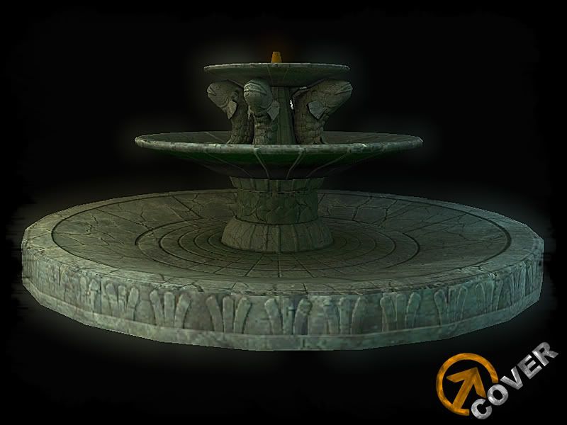
also that bloom effect only effects the borders :P so no im not trying to cover anything up just looks nice :P

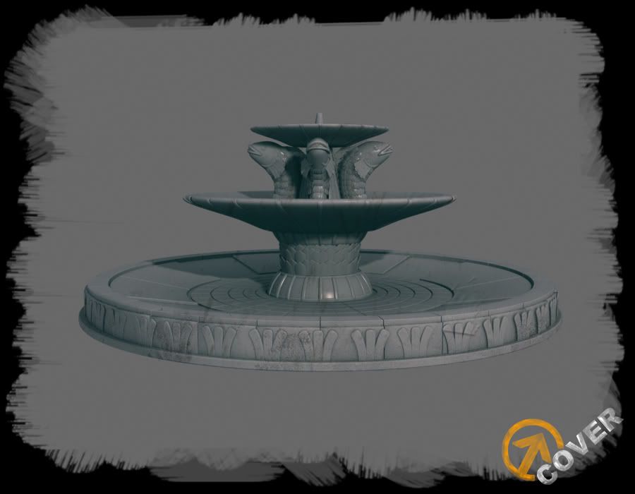
Here was the high-poly sculpt:

SFwip9.jpg

im calling it done if noone has any huge crits.

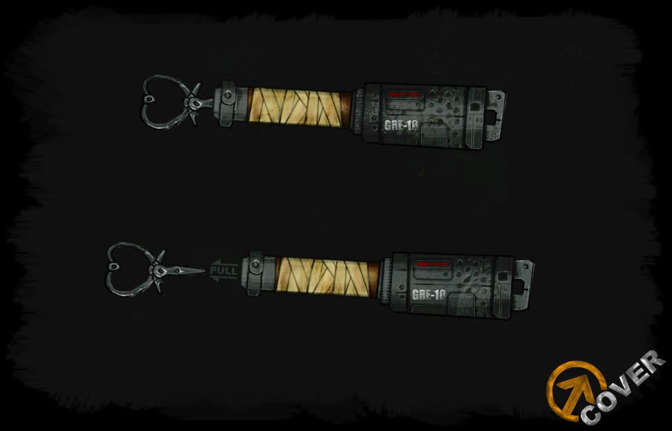
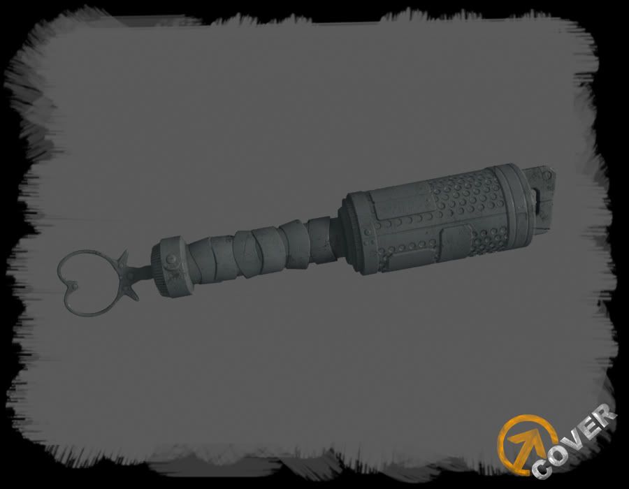
Also started work on this i drew the concept for a grenade and now im making highpoly sculpt my only question is being a third person weapon should i waste the time and throw it in zbrush? to add scratches or should i just crazybump them in?

g10finalcopy.jpg

SFwip15.jpg

Replies

  • SHEPEIRO
    Options
    Offline / Send Message
    SHEPEIRO polycounter lvl 17
    Nice fountain, but you have a serious difference of pixel density on the side of the thing,

    i would fix this by re- baking as there is no need for a seam here, also there is a seam on the next shelf up, if you just added a few more edge loops to the top side there would be no seam ( or at least you would have to look upwards when under the fountain which wont happen very often. not sure if you did this slready but you could have quartered the whole thing to save texture space.

    other main issue i have is the material doesnt read very well, not sure if its cracks or marble. its also very consistent across the model when it should show different marbles, wear and water damage.

    its not bad, its just the bake and texture work are not up to scratch of the original HP

    really like the HP and your weapon concept.
  • Pope Adam
    Options
    Offline / Send Message
    Pope Adam polycounter lvl 11
    Nice artwork ae. cool sculpt on the fishes mang.
  • Mark Dygert
    Options
    Offline / Send Message
    A fountain with no drains!? No wonder they haven't filled it. =P JK looks great, really cool stuff with tons of character. Gotta get that pixel density under control tho =/
  • Mark.N
    Options
    Offline / Send Message
    Really diggin' that grenade, reminds me of one of those old German stick grenades from WWII. As for adding scratches and whatnot, I'd say just go ahead and texture them in, chances are with a 3rd person camera they'll hardly be noticeable anyways.

    As for the fountain, I think it looks great, other than the critiques others have already pointed out.
  • fmnoor
    Options
    Offline / Send Message
    fmnoor polycounter lvl 17
    That fountain looks nice (aside from the blurry sides which I'm sure you'll fix), but that bottom pool could really use some drains, or made a bit deeper so it could hold more water.

    Cool hand grenade though!
  • A.Kincade
    Options
    Offline / Send Message
    A.Kincade polycounter lvl 9
    I agree with what everyone is saying about the fountain. It did turn out very nice just needs a little more.

    As for the grenade... I like it but I do believe you could do more with the taping area. Looks a little odd.

    Overall some cool pieces. Keep up the good work.
  • torontoanimator
    i LOVE that fountain, the glow especially :D id love to see it with some water in it
  • Killaball
    Options
    Offline / Send Message
    I like the grenade, and the fountain is really good! Could grunge up the textures a bit, show weathering and wear.
  • ae.
    Options
    Offline / Send Message
    ae. polycounter lvl 12
    Gotta put this on hold while I fix my computer:(
  • Pope Adam
    Options
    Offline / Send Message
    Pope Adam polycounter lvl 11
    booooooooo hisssssssssss
  • ae.
    Options
    Offline / Send Message
    ae. polycounter lvl 12
    Yeah sucks balls I actually fixed the issue with the fountian and started the grenade diffuse before my comp crapped out ;)
  • fast1
    Options
    Offline / Send Message
    nice artwork but are you going to add more details?clear.gif
  • ae.
    Options
    Offline / Send Message
    ae. polycounter lvl 12
    Third-Person Weapon, so i didnt try to get to crazy with the details. this is a combat shotgun something you would see in a ratchet and clank game or jak and daxter game.


    coverwip1.jpg
  • ae.
    Options
    Offline / Send Message
    ae. polycounter lvl 12
  • SHEPEIRO
    Options
    Offline / Send Message
    SHEPEIRO polycounter lvl 17
    nice, cant see much on the black background though, it looks as if your using a low res metal texture on your diffuse as it has harly any of the res that the nrm has,gonna give those holes some alpha?
  • PixelMasher
    Options
    Offline / Send Message
    PixelMasher veteran polycounter
    the design of the gun is alright, feels a bit too stumpy and the handle looks awkwardly implemented. also, the design is quite different from the grenade style wise so maybe rework one or the other to fit an overall look.

    in terms of texture, I dont think the style really fits the design, the thing that made R&C guns so delicious to the eye was the combination of clean metal and painted surfaces flowing along the awesome curves of the designs.

    the texture itself is pretty blurry, even though its a 3rd person gun, you could probably get more out of it,if the barrels are not using the same uv space I would do so with that, and then just rotate each one a bit so it looks different.

    im super interested to see a fully composed scene with character and environment to see where the art direction is going. cool work man, looking forward to updates.
  • ae.
    Options
    Offline / Send Message
    ae. polycounter lvl 12
    im using a 512x512 map on that gun, maybe thats why is blurry? ill try to fix that and also still need to fix a few issues with it.

    Art direction wise the game is a cross between gears of war and ratchet and clank :P wierd combo i know.

    the grenades design will change also.
  • ae.
    Options
    Offline / Send Message
    ae. polycounter lvl 12
    I looked at the level im building right now and the Character art style and decided the gun was way to grungy for its own good so i did a complete 360 something youd see in R&C and the vibrancy from Bionic commando rearmed.

    What do you guys think of the change:

    BAAAM! SHOTGUN!


    coverwip3.jpg


    Note:All previous work on this thread i will not be using, im going for a complete different art style.
  • Cody
    Options
    Offline / Send Message
    Cody polycounter lvl 15
    Hell ya! Love it man! Is this a one man mod? Or are you on a team of sorts?
  • Adam Curtis
    Options
    Offline / Send Message
    Adam Curtis polycounter lvl 16
    Hey man, liking the stuff so far, the funky gun's pretty cool.

    Grab me on msn later, we'll talk rhino's.
  • carlo_c
    Options
    Offline / Send Message
    Colour change is looking a lot better :) Does this shot have a normal map? If it does it's looking a bit flat, you could push them more I think.
  • PixelMasher
    Options
    Offline / Send Message
    PixelMasher veteran polycounter
    muuuch better. I don't know if you have a spec on there yet, but reflection tied into it would look dope, thats why KZ and R&C's metals seem so alive.

    just add a blurred cube map and a reflection vector to the spec and maybe to the diffuse and control them with a multiply and constant combo, looks money most the time and its fairly cheap.
  • SHEPEIRO
    Options
    Offline / Send Message
    SHEPEIRO polycounter lvl 17
    much better, and yeah the last diffuse had low texel textures or painting in it didnt hold up to the normal map.
  • ae.
    Options
    Offline / Send Message
    ae. polycounter lvl 12
    added a reflection mask on the spec i think im down with the weapon gonna start working one some prop assets for the level :)

    coverwip4.jpg
  • ae.
    Options
    Offline / Send Message
    ae. polycounter lvl 12
    This is just a level art style concept:

    level1copy.jpg

    nothing too fancy, I grabbed some inspiration from Joe (obson) Keller his site is over here he has some sick work one of my fav artists!: http://joekeller.net/index.html

    i want to go for a stylized blocky look to the geometry while have a lot of interesting shapes in some of the set pieces * not shown * the concept is just a basic outline on what kind of shapes i want.

    basicallythe first level will be a mix between metal and grass. its going to be in a canyon where they are pumping oil. right now im just trying to plan it out and been playing around with a ideas in unreal.

    I was thinking of make the cliffs from either bsp brushes or modular rock formations?

    ill see which one is more piratical.
  • JasonLavoie
    Options
    Offline / Send Message
    JasonLavoie polycounter lvl 18
    Oh AE, you make my heart sing, ha ha.

    Good stuff man, I think you should go with modular rock formations, bsp = poopy, and plus you'll have much more control with how the rocks look if you did them as modular static meshes instead, maybetake a peak at how TF2 did some their stuff?

    You already know I'm looking forward to this, but this is sick :P

    Obson's work is fap-tastic too!
  • bluekangaroo
    Options
    Offline / Send Message
    bluekangaroo polycounter lvl 13
    sweet shotgun....the new Diffuse works a lot better with the shape and style of the gun
  • ae.
    Options
    Offline / Send Message
    ae. polycounter lvl 12
    working with rocks :P what do you guys think?

    I should turn down the bloom:P

    coverwip5.jpg
  • Adam Curtis
    Options
    Offline / Send Message
    Adam Curtis polycounter lvl 16
    More colour I reckon.
  • SHEPEIRO
    Options
    Offline / Send Message
    SHEPEIRO polycounter lvl 17
    well its doesnt suit the style, maybe look into making some HP rocks with funcky shapes etc (check airborns) and bake them down into a section that tiles.
  • Adam Curtis
    Options
    Offline / Send Message
    Adam Curtis polycounter lvl 16
    rhino.jpg

    Soo Ae sketched up a character for his mod (i'll put the image in the thread later) and asked if i fancied making it. It's about time i did some work at home so here is the start!

    Not worried about mesh flow or details, just blocking it out at the morment, been playing with the proportions and the like. Need to resolve the head / neck / shoulder area and how they combine.

    Going to go back to it a bit later tonight, so will update later :)
  • ae.
    Options
    Offline / Send Message
    ae. polycounter lvl 12
    Heres the concept i drew if anyone would like to see it :)

    Main Concept:

    rhinofinalcopy-4-1.jpg


    Player colors:

    rhinocolorsamples.jpg
  • Microneezia
    Options
    Offline / Send Message
    Microneezia polycounter lvl 10
    This looks good!

    Im definitely with you on Obson's work, hes amazing. The thing about Obson's work though is that his maps are hand painted color maps... or so it would seem.... Ive been trying to fake that look for a while now with photo-sourcing before finally giving in and learning how to paint a few days ago :P

    I did find a way in PS that gives an aproximation to color hand-painted maps for environments...though and its pretty obvious, but ill spill it here anyways;

    Take your texture from CGtextures (of course)
    Do your normal business to make it tilable ect or whatever sharper / pixel boogie ect..

    Then copy it twice.
    The top copy run the "cutout" PS filter on it.
    Make the top and bottom slider maxed out and the middle slider zero'd out.

    The copy underneath gets the watercolor PS filter on it. Adjust to like thick lines and watercoloryness.

    Now I lower the fill percent on the cutout top copy and let the watercolor layer bleed in from below.

    The watercolor layer I usually leave at 100percent.

    If you are doing this for grey stone you can throw in a slight sponge filter as well...

    This is what I was doing anyway, and was accepting of the results, just thought I would share here... Heres an example of what I came up with using this technique!

    images removed by request. :poly122:

    EDIT: i didnt do this on purpose, but now that I look i think this is the exact same texture you are using on your stone wall? huh. wurd!
  • ae.
    Options
    Offline / Send Message
    ae. polycounter lvl 12
    lol yeah totally the same one :P

    coverwip6.jpg

    I did another format i like this one alot more, works more with my art style.

    what you guys think?
  • SHEPEIRO
    Options
    Offline / Send Message
    SHEPEIRO polycounter lvl 17
    go- on try hand painting
  • nrek
    Options
    Offline / Send Message
    nrek polycounter lvl 14
    Hey ae. this is a pretty cool project you have going here, the gun turned out really nice and the concept for the rhino guy has a really cool style to it. But to be honest those rocks still are not doing it justice. The flat top and the toxic green grass really kill it more then anything, but the texture also looks too low rez and doesn't seem to fit well with the geo. Here is a link to an animation called burning safari. Take a look at the gallery and the chase scene, there are some cool rock formations in there. I also did a quick paint over for ideas on how to maybe break up the wall a bit while still keeping the simple style. Hope this is of some help.

    http://www.burningsafari.com/index.htm

    and here are 2 post by warby that might be good to check out.

    http://boards.polycount.net/showpost.php?p=898579&postcount=866

    http://boards.polycount.net/showpost.php?p=898682&postcount=877

    paint over

    http://img10.imageshack.us/my.php?image=aepaintover.jpg
  • ae.
    Options
    Offline / Send Message
    ae. polycounter lvl 12
    Hey nrek love the paint over I'll make another set of rocks with your style when I get home from work :)
  • PixelMasher
    Options
    Offline / Send Message
    PixelMasher veteran polycounter
    Yea, nreks got the right idea, breaking the flat top silhouette and also breaking up the walls mid level with outcrops will make it look more organic.

    I would model a modular section that has some more depth variation as it looks way to flat right now, then make some seperate outcrop meshes that you can crash through all over the place and get some nice variation. when its lightmapped you should be hard pressed to find a noticeable seam, thats how all the gears cave sctions where done, tons of pieces crashed through each other.

    most importantly though I think you need to find a unified art direction, the mix of photosourced textures on cartoony geo doesn't really jive i think. I try some hand painted textures as it should give you a more cohesive look. also its good to have some in your portfolio to show versatility.
  • nrek
    Options
    Offline / Send Message
    nrek polycounter lvl 14
    Cool dude glad you liked it. I was watching a new vid of star wars: the old republic this morning and saw some cool rock formations, took some screen caps for you.

    http://img74.imageshack.us/my.php?image=rocks.jpg
  • ae.
    Options
    Offline / Send Message
    ae. polycounter lvl 12
    nrek thanks for the help man, one of my biggest downfalls is that i have never really gone out of the realistic look, so when it comes to stylized things im still learning how to do them properly thats one of the main reasons i changed the art style of the mod from gritty real world to stylized because i want to push myself and expand my artistic skills.

    As you can tell im still learning but its alot of fun and it really helps when you guys do paintovers and give me ref cause then i can use those as building blocks for my art.

    just want to say thanks for putting in the effort and showing me.
  • ae.
    Options
    Offline / Send Message
    ae. polycounter lvl 12
    i tried handpainting it?
  • nrek
    Options
    Offline / Send Message
    nrek polycounter lvl 14
    Looking good man, I think its already 10x better than the old one. I would say play with adding some colored bands running horizontally through the rock. Mess with making a few custom brushes using squares rather then circles they can create some nice effects. And then maybe get rid of some of the smaller hairline cracks and add in slightly bigger ones, the thin ones look kinda noisy, but it might also be because of the small render. here are some examples of stuff.

    In this picture you can see how the rock has various layers of subtle tans and browns and slowly transitions to different shades of grey as it goes up, this might be a cool look for you rocks.

    http://www.jessstryker.com/national-parks/zion/photos/great-white-throne.jpg

    another cool one

    http://www.takemytrip.com/nvazut/_448_DSC00501.jpg


    here is another example that shows a good use of colors in the grass and how working with bigger shapes of color can still give the impression of cracks.

    http://www.skyland.free.fr/images/wallpapers2.jpg
  • ae.
    Options
    Offline / Send Message
    ae. polycounter lvl 12
    coverwip9.jpg

    yeah the grass needs work, gonna try to fix that but im pretty happy with how it came out, thanks for those ref picks ill do another pass. Im slowly getting the hang of things.
  • ae.
    Options
    Offline / Send Message
    ae. polycounter lvl 12
    last update for tonight :)

    coverwip10.jpg
  • Cubik
    Options
    Offline / Send Message
    Cubik polycounter lvl 18
    Try to paint in some more of the grass climbing up the walls as in nreks paintover, this might soften the hard edge you have there.
  • rawrsie
    Options
    Offline / Send Message
    you've come a long way since i first saw your work, loving the new project, did a quick paintover of a section of your rocks.

    messing.jpg
  • ae.
    Options
    Offline / Send Message
    ae. polycounter lvl 12
    rawrsie wrote: »
    you've come a long way since i first saw your work, loving the new project, did a quick paintover of a section of your rocks.

    messing.jpg

    i been played with the grass texture all night how do you go about makeing the grass and what kind of brush are you using?
  • ae.
    Options
    Offline / Send Message
    ae. polycounter lvl 12
  • ae.
    Options
    Offline / Send Message
    ae. polycounter lvl 12
    Worked on the level a bit more need to fix the grass texture that's repeating on the ground. and then get to work blocking out the whole level.

    coverwip12.jpg
  • Adam Curtis
    Options
    Offline / Send Message
    Adam Curtis polycounter lvl 16
    Cover_rhino_wip_01.jpg

    Managed to work on this guy at the weekend, still just messing about with the low poly.

    Necklace / dog tags / watch thing are all place holders.

    Had a chat with Ae. gonna droop the eyes a bit more to give him that innocent and dopey kinda look - also going to square off the front of the mouth and nose area to fit with the concept style a touch more.

    Ae. - the rocks are coming on :D

    Oh ignore the big ass seam down the middle :P
13
Sign In or Register to comment.