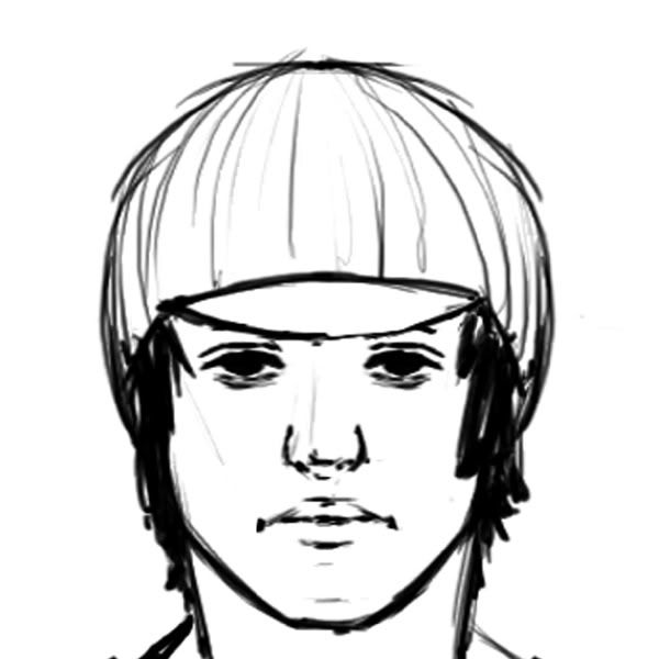
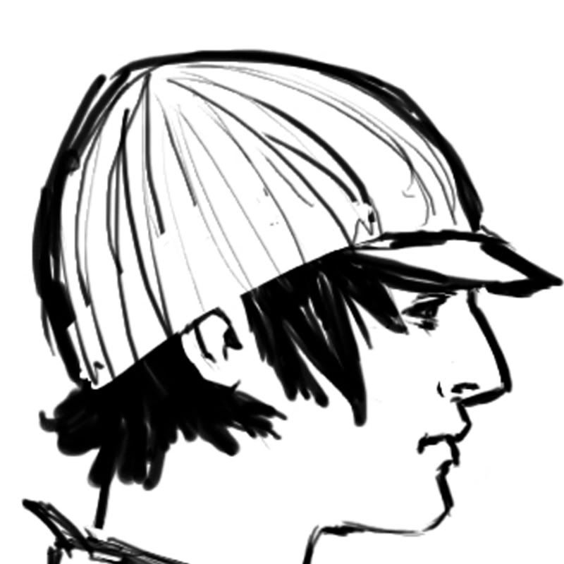
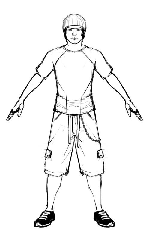
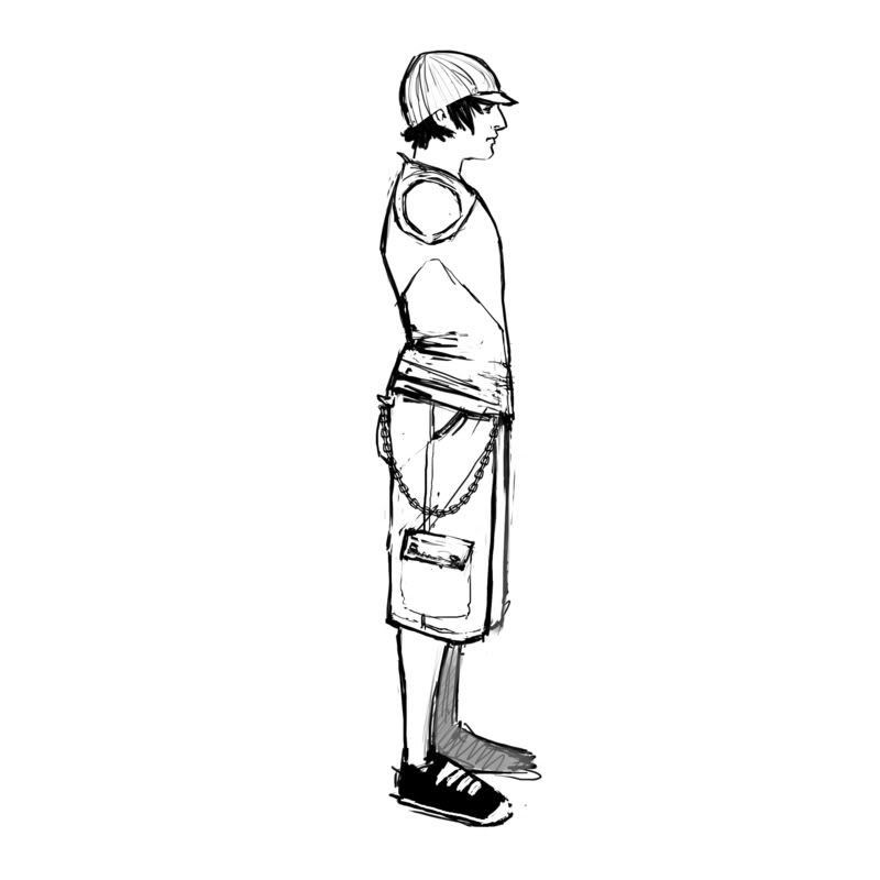
This is a great quality concept to work from! The profile is great.
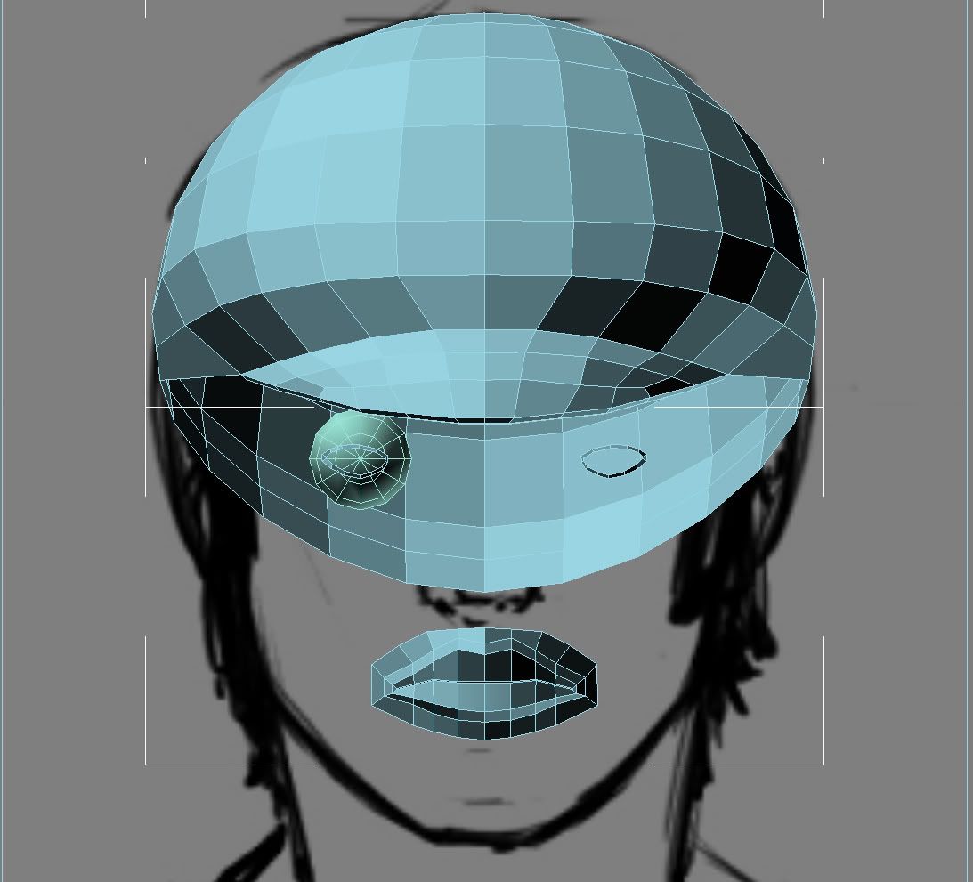
However try to not rely on ortho views to model this up. From the WIP eye mesh it is already obvious that this is misleading you. Keep the image planes in your scene for the occasional proportion checks, but avoid tracing them (you're not modelling a car!!)
You could also ask your friend to draw you the facial plane of the character. Start modelling thoses, then cut details in.
Def a great concept to work from, I agree with pior don't rely to heavy on the orthos.
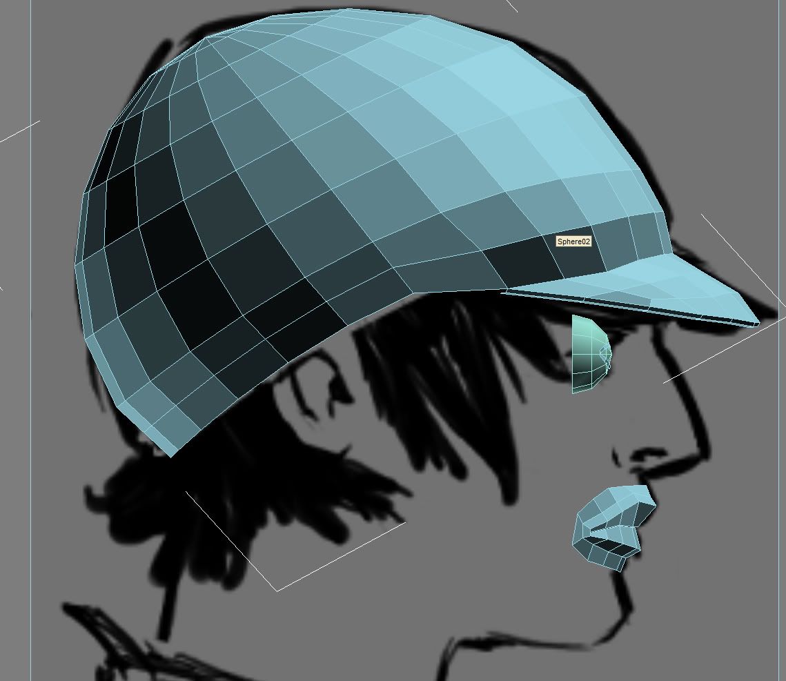
Though you just started take note the way you have the mouth so far is going to look like it's pasted onto the face like mr.potato instead of actually being part of it. make sure to take those corners and tuck them underneath the upper lip. Can't wait to see this come together!
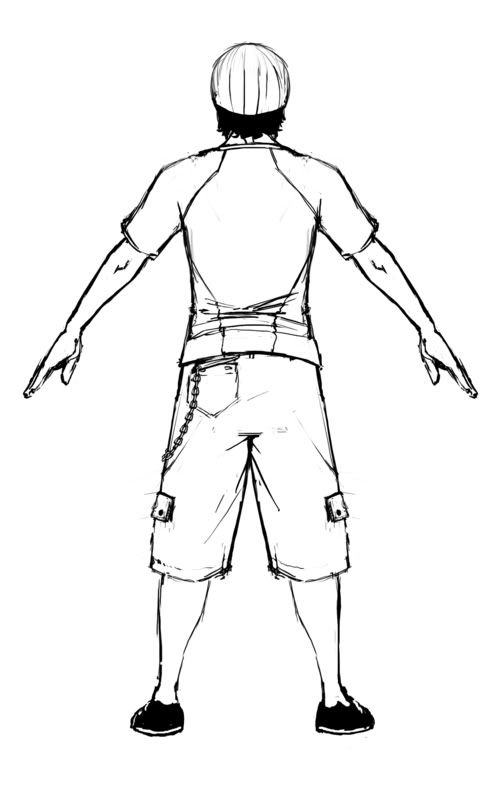
Just a few notes on the actually concept. To start, I've been skating for over 10 years and i can tell you this guy doesn't look like at skater, his torso is a little more modern while the lower half looks like its from the 90's. Take out the chain wallet, it will take away all creditability of the character. Also, The t-shirt's design is too complicated, most skaters go out in a logo T, the shirt is also tight and would constrict the skater too much. The head and face look perfect though. The way he is right now he looks like a anime skater with a football players body, change up the pose and add some feeling, he is supposed to be a little rebellious. Changing these things will defiantly update his look to a more modern one that thus will read better.
Yeah I wouldn't worry too much about what he's wearing. If you think about it, in most any modern day skating game, the player will be able to mix and match their clothes to suit their own personal preference.
Good start and yeah it would be pretty neat if you could get him posed inside of Kincade's warehouse, even if it is just a photoshop composite with the render.
The concepts good, what are your intentions for the use? Are you going to take this into zbrush? At the moment it seems like you've modelled a mask, try to ignore the concept because you have the face modelled from a front on view. Usually people's faces aren't that flat. You can see a gradual progression from the front of a face to the ears/end of jaw. Depends on the build of the person though.
Its for my animation class. We're supposed to have 20 animations done by the end of this quarter (3 months). I might take this into zbrush since i do have a zbrush class on saterdays.
So with what i have done ... is it fixable? to make it look more like a face rather than a mask?
Just a few notes on the actually concept. To start, I've been skating for over 10 years and i can tell you this guy doesn't look like at skater, his torso is a little more modern while the lower half looks like its from the 90's. Take out the chain wallet, it will take away all creditability of the character. Also, The t-shirt's design is too complicated, most skaters go out in a logo T, the shirt is also tight and would constrict the skater too much. The head and face look perfect though. The way he is right now he looks like a anime skater with a football players body, change up the pose and add some feeling, he is supposed to be a little rebellious. Changing these things will defiantly update his look to a more modern one that thus will read better.
Yes, the truth is every skater is exactly the same because they are all clones with the inability to adjust to different style. /sarcasm
In terms of the model you seem to be on the right track. Areas like the eye sockets seem a little small. It may have benefited you from getting a real face that's close to what you want instead, so you can see things like where shadows are falling..etc to help you determine where the cheek bones should be and how pronounced.
You mentioned he is going to be used for animations? If there is lip syncing involved, I would recommend reevaluating your edge loops. You would benefit from having a loop come around the mouth and over the nostril into the nose.
Yeah there will be some lip syncing involved. I dunno how much of it exactly since thats going to be discussed in next weeks class. So, you recommend me adding another loop around the mouth then for better lip animation?
Did you ask your friend about the facial planes reference? It is very off at the moment.
Also really. don't trace in ortho views. Think about it : people naturally draw in perspective, so even if you trace 1 to 1 in a front view, the 3d model will never look right. Just think of it that way : you know how in zbrush models look weird when perspective mode is not on? Well your guy will end up like that even when viewed in correct perspective if you keep on tracing (it will have a boxy extruded look)
Good luck
Nah I haven't asked him. Right now I am trying to model it in perspective like you mentioned and fixing him up.
The style of the concept has some interesting and very pleasing line work. The face also looks very "soft". I would like to see more of that linework and softness in the mesh (edgeloops and whatnot)
Replies
However try to not rely on ortho views to model this up. From the WIP eye mesh it is already obvious that this is misleading you. Keep the image planes in your scene for the occasional proportion checks, but avoid tracing them (you're not modelling a car!!)
You could also ask your friend to draw you the facial plane of the character. Start modelling thoses, then cut details in.
Good luck!
Though you just started take note the way you have the mouth so far is going to look like it's pasted onto the face like mr.potato instead of actually being part of it. make sure to take those corners and tuck them underneath the upper lip. Can't wait to see this come together!
Good start and yeah it would be pretty neat if you could get him posed inside of Kincade's warehouse, even if it is just a photoshop composite with the render.
Its for my animation class. We're supposed to have 20 animations done by the end of this quarter (3 months). I might take this into zbrush since i do have a zbrush class on saterdays.
So with what i have done ... is it fixable? to make it look more like a face rather than a mask?
Yes, the truth is every skater is exactly the same because they are all clones with the inability to adjust to different style. /sarcasm
In terms of the model you seem to be on the right track. Areas like the eye sockets seem a little small. It may have benefited you from getting a real face that's close to what you want instead, so you can see things like where shadows are falling..etc to help you determine where the cheek bones should be and how pronounced.
You mentioned he is going to be used for animations? If there is lip syncing involved, I would recommend reevaluating your edge loops. You would benefit from having a loop come around the mouth and over the nostril into the nose.
Yeah there will be some lip syncing involved. I dunno how much of it exactly since thats going to be discussed in next weeks class. So, you recommend me adding another loop around the mouth then for better lip animation?
Also really. don't trace in ortho views. Think about it : people naturally draw in perspective, so even if you trace 1 to 1 in a front view, the 3d model will never look right. Just think of it that way : you know how in zbrush models look weird when perspective mode is not on? Well your guy will end up like that even when viewed in correct perspective if you keep on tracing (it will have a boxy extruded look)
Good luck
Nah I haven't asked him. Right now I am trying to model it in perspective like you mentioned and fixing him up.