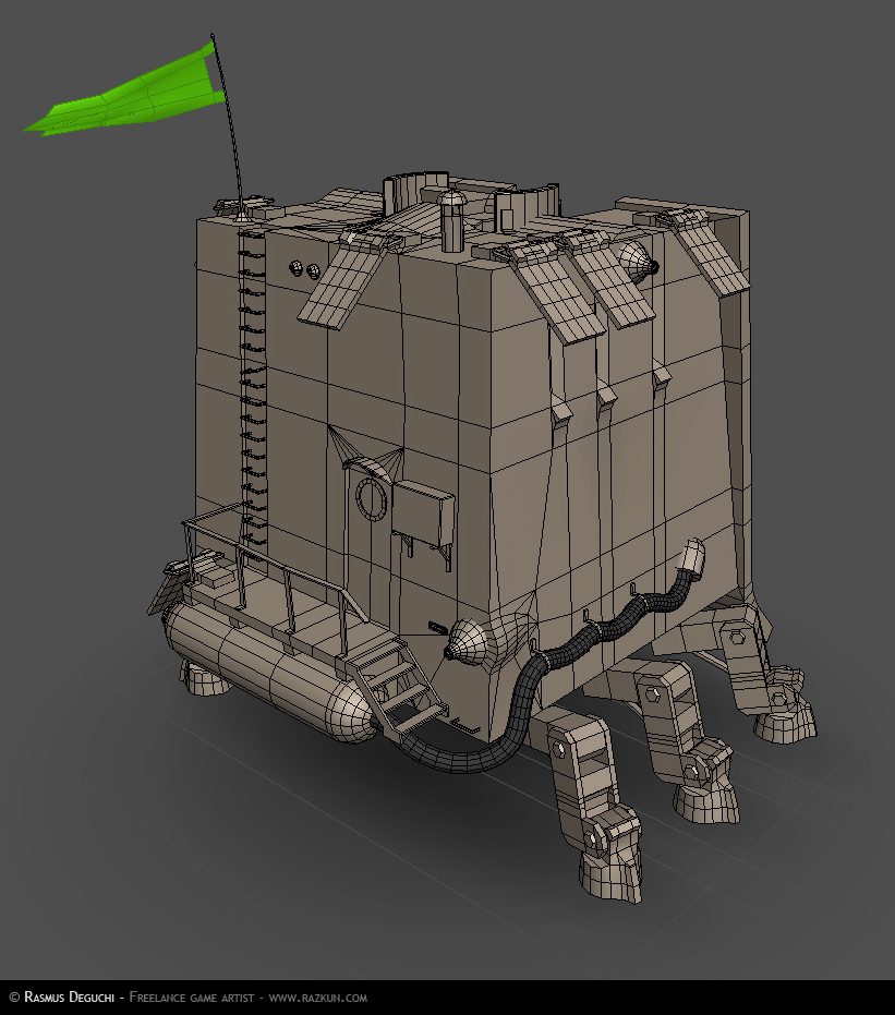
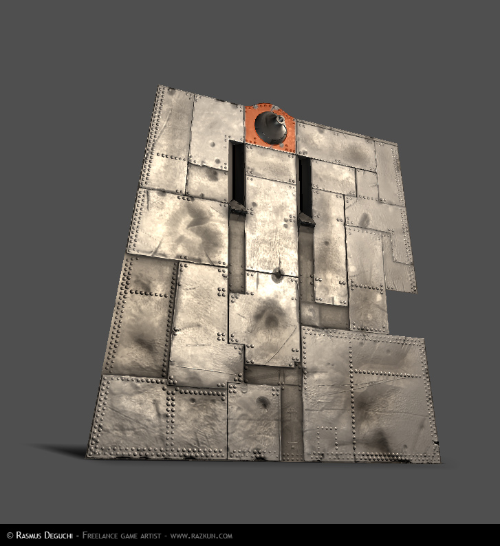
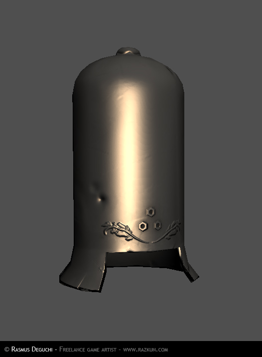
Ahem. So here's my stuff, a 50-ton lump of walking death, straddled by arch leader of the robot army, General Krank, at whose fingertips this beast lets its 50-inch Howitzer do some loud loud talking. Right in the heat of battle, at the very front of the frontlines, this thing is crunching along on the skulls of it's foes, stopping momentarily to viciously urinate crude-oil on the fallen!
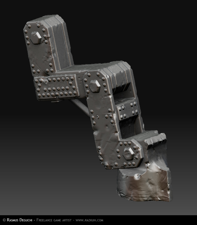
Basic modeling pretty done, some material/baketests and a little dented metal a la ZBrush:
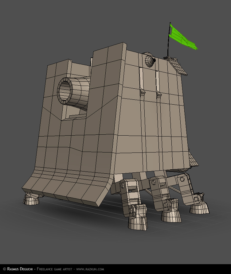
I want to see a bit more thought put into the leg mechanics though. you could take it a lot further, and these current legs are pretty much useless in an engineering sense, as the joints wouldn't be able to support the weight.
Just as an idea, because this is a crawler the legs only have 2 functions to them, lower and raise the leg, and more it forwards and back, so the leg should be designed in the best way to support these 2 motions.
As something interesting you could try a 4 bar system for lowering the leg.
I just want to see some thought put into the mechanics :P.
It might be a little too vehicle-like though. You're allowed to have a mechanical mount but not an actual vehicle. It's one of those weird rules that always crops up in Dominance War.
Awww, now you made it sad! *Pets 50-ton lump of walking death* Shame on you... Lumps of walking death have feelings too you know.
this kinda reminds me of your last piece of a giant armored thing with a huge basic shape (last time it was cylinder, this time cube-ish, both are mech-like with a whole lot of circlular-bolt/screws )
Giant robot!!
Only critique is that the legs are chamfered to softly. makes them look a bit like a plastic model.
Want more! and looking forward to general Krank. I like his hat
HAHA thats great man glad to see your still in it! cool piece love the style! the armor plating and double riveting in certain areas works super well. With some proper textures and a really good spec this will be rockin!
Oh! Such a great piece!
I love your moving tower with all
those scratches and impacts on the steel sheets.
You definitely have to finish it. Not showing the
general keep your thread a high tensioned one
Can't wait to see more.
Still amazed with this design. One thing though, I think Muzz has a point, you should make simpler legs. The ones you have now are fine, but Muzz is right, they wouldn't support the weight very well.
Yeah, I thought the legs were too small at first too.
But you can imagine there's a powerful hydraulic pump system inside.
Besides, the humourous feel may be wasted if you destroy the contrast
between massive tower shapes and rather tiny legs.
I'm not certain about it, but I'm under the feeling that it works
well without changing the legs.
Go go go Rasmus!
looks great!! GO KRANK!
and I don`t think you need to re-design the legs.
I like the fact that the whole thing looks like it`s designed by some mad scientist.
But ill still have to say that the legs dont actually work mechanically and that was my point, and that hurts it for me . there are no pistons attatched to the hinges.
Muzz: Thank god you're not on the judging panel then There's pistons for the lower legs, but the hoofs move as if by some dirty machine magic, you're quite right.
Though with the general i think he is lacking a huge amount, nothing makes him stand out from the greebling. he needs to have some contrasting shapes and colours otherwise he will jsut blend in, as it is im having a hard time seeing him. I think it also has to do with the dude sitting down. i think it would work better if he was standing , almost as if he is riding the back of a giant beast, it would make him seem more dominant, and make his shillouete stand out. (one does not simply sit on the back of a sand worm :P)
WHOAAA- Such a strange entry. I under stand that the general and box tank are one and the same, but it might be cool to make the general gold or some other metal so he stands out on his gray backdrop. (*edit thought I bet spec will be a big factor in this)
really bad ass idea and execution. I really like the way you've treated the ground too.
Yeah cool!
I like the ground-pedestal.
Will the guys inside throw boiling oil
from the narrow embrasures?
I can imagine opposing party trying
to climb on the tank tower. Don't let them in!
Wow, bakery's been busy! hilarious, this thing is impenetrable! I can't think of a single Dwar character who could defeat this guy in a fight, haha. Can't wait to see some scratched up metal color and spec. Looks coooooool!
has to be my single most favorite entry in that competition just because it's so much different than anything else. additionaly to being executed incredibly well of course
cheers
--
i miss spooning and eating tuna right off the ribs at the tsukiji fishmarket
Awesome dude, pure awesome. When you get to the beauty shots and stuff it would be sweet to see some thick black smoke particles spewing out of those vent things. And I second Muzz's shoulder pad idea .
Very cool and unique idea. Good sense of scale with the general on there. I'm assuming the red light is for his eyes, but I kind of enjoy him more if I imagine it as his mouth and the circles are 3 small eyes with a yellow moustache
Only thing is that the black border seems to be messing witht he composition a tiny bit for me. Almost like it is making it feel a bit clostrophoboic, perhaps make it thinner?
Replies
keep going :P
So are you making General Krank too?
Especially the rear part with all the little details.
Will you do the same on the front side near the canon?
I want to see a bit more thought put into the leg mechanics though. you could take it a lot further, and these current legs are pretty much useless in an engineering sense, as the joints wouldn't be able to support the weight.
Just as an idea, because this is a crawler the legs only have 2 functions to them, lower and raise the leg, and more it forwards and back, so the leg should be designed in the best way to support these 2 motions.
As something interesting you could try a 4 bar system for lowering the leg.
I just want to see some thought put into the mechanics :P.
Also a link that i have been throwing around alot in the mechanical threads. http://izmojuki.blog.shinobi.jp/Category/1/
It might be a little too vehicle-like though. You're allowed to have a mechanical mount but not an actual vehicle. It's one of those weird rules that always crops up in Dominance War.
Awww, now you made it sad! *Pets 50-ton lump of walking death* Shame on you... Lumps of walking death have feelings too you know.
look forward to seeing more
It still is very cool though
Only critique is that the legs are chamfered to softly. makes them look a bit like a plastic model.
Want more! and looking forward to general Krank. I like his hat
Thanks for your comments everyone! I appreciate it. Fresh from the bakery:
[img]http://www.razkun.com/DWIV/Bakepose 01.jpg[/img]
[img]http://www.razkun.com/DWIV/Bakepose 02.jpg[/img]
[img]http://www.razkun.com/DWIV/Bakepose 03.jpg[/img]
[img]http://www.razkun.com/DWIV/Bakepose 04.jpg[/img]
[img]http://www.razkun.com/DWIV/Bakepose 05.jpg[/img]
[img]http://www.razkun.com/DWIV/Bakepose 06.jpg[/img]
*CRAWLS BACK INTO HOLE*
-Woog
I love your moving tower with all
those scratches and impacts on the steel sheets.
You definitely have to finish it. Not showing the
general keep your thread a high tensioned one
Can't wait to see more.
garagarape: Thanks - keep your expectations low!
coldkodiak: Thanks
ZStuff:
But you can imagine there's a powerful hydraulic pump system inside.
Besides, the humourous feel may be wasted if you destroy the contrast
between massive tower shapes and rather tiny legs.
I'm not certain about it, but I'm under the feeling that it works
well without changing the legs.
Go go go Rasmus!
and I don`t think you need to re-design the legs.
I like the fact that the whole thing looks like it`s designed by some mad scientist.
But ill still have to say that the legs dont actually work mechanically and that was my point, and that hurts it for me . there are no pistons attatched to the hinges.
Thanks everyone, textures soon!
Oh, and say hi to General Krank Think of him as your mechanical mix of Dick Dastardly and Kim Jong-il, but with a bigger willie.
Yeeha!
will look awesome when the specmap is in place judging from your previous work, Panzerwurst anyone?
Though with the general i think he is lacking a huge amount, nothing makes him stand out from the greebling. he needs to have some contrasting shapes and colours otherwise he will jsut blend in, as it is im having a hard time seeing him. I think it also has to do with the dude sitting down. i think it would work better if he was standing , almost as if he is riding the back of a giant beast, it would make him seem more dominant, and make his shillouete stand out. (one does not simply sit on the back of a sand worm :P)
Muzz: Yeah, you're absolutely right - he needs poppage, and I'll even try standing him up Thanks!
Good luck finishing!
really bad ass idea and execution. I really like the way you've treated the ground too.
konstruct: Thanks. Strange? Probably
Here's lookin at you, Muzz:
Surfin' that shit.
I like the ground-pedestal.
Will the guys inside throw boiling oil
from the narrow embrasures?
I can imagine opposing party trying
to climb on the tank tower. Don't let them in!
cheers
--
i miss spooning and eating tuna right off the ribs at the tsukiji fishmarket
literally just screamed "YEAHHH!!!" at work when I saw the updates.
Just bump up some of the colours on him!
Perhaps some of those gold shoulder thingos you see on generals coats?
http://howardlanham.tripod.com/link28.htm
Well done man .
Only thing is that the black border seems to be messing witht he composition a tiny bit for me. Almost like it is making it feel a bit clostrophoboic, perhaps make it thinner?