Environment Work: Asian City
I really need fresh eyes on this. Been staring at it to long hehe.
The synopsis is, a "Shadow Bomb" just went off in a small city district of Japan. The bomb was sent by the United States of Korea (yes, they are united :P ), as a preliminary test weapon to use in full force against a more promising city. The bomb destroys the flesh, leaving a smoky ash residue behind (kinda like Abomb, but less messy). All other non living tissue are kept intact, leaving behind clothing articles, cigarette butts or newspapers.
Since I'm still in the heat of things, their is not a whole lot of this story presented in the piece itself other then the environment at hand. My main concern right now is to get these buildings done and reworking some some texture mistakes (yes, I'm looking at you curbs!), then next quarter texturing all of the props, and possible adding more.
So, the work flow is bigger forms first then the details.
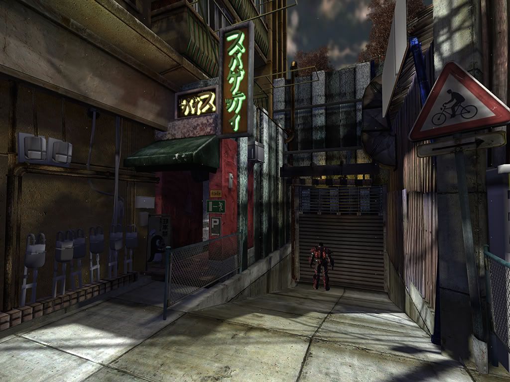
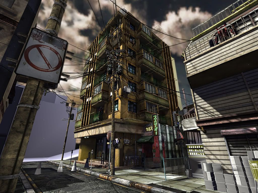
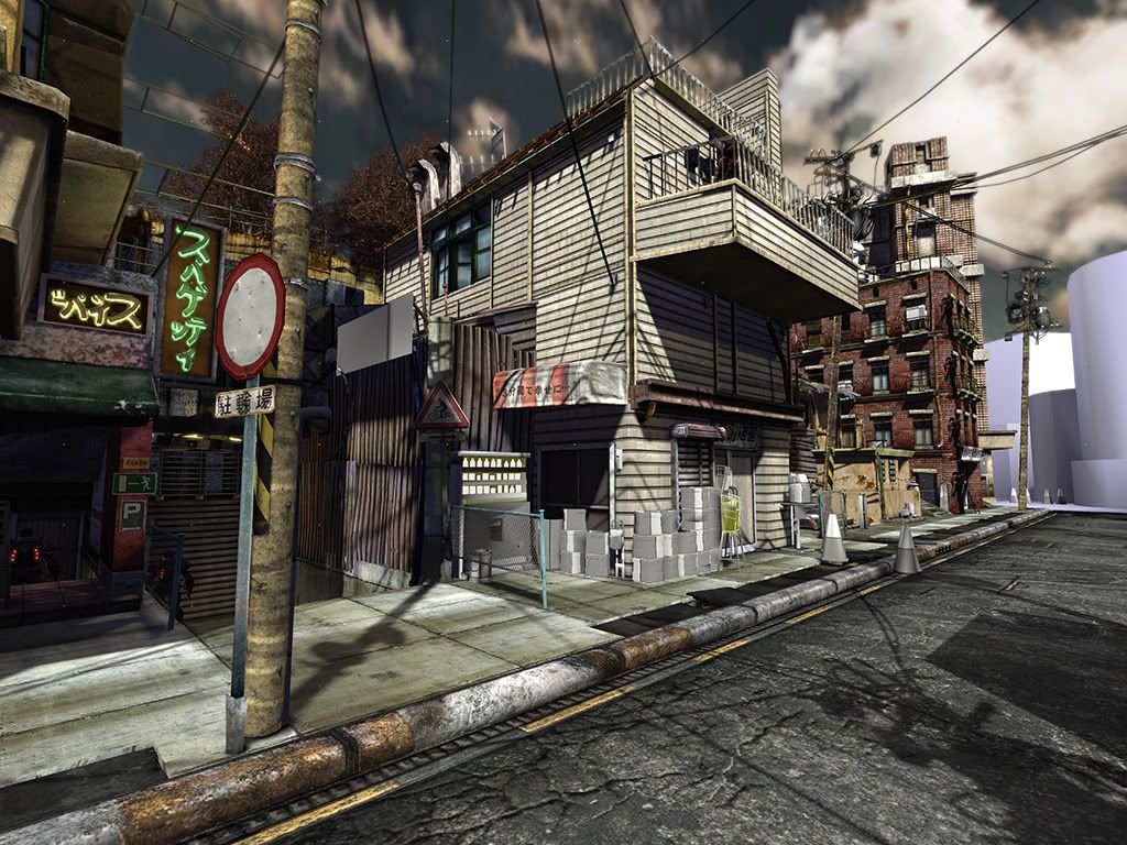
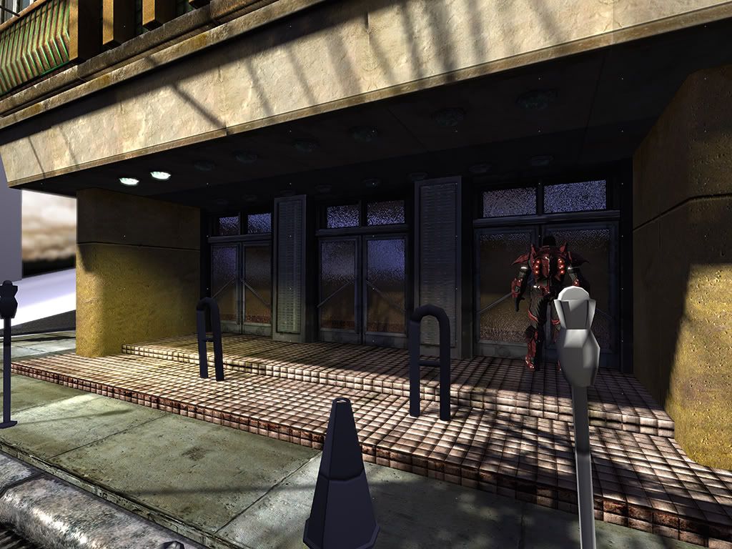
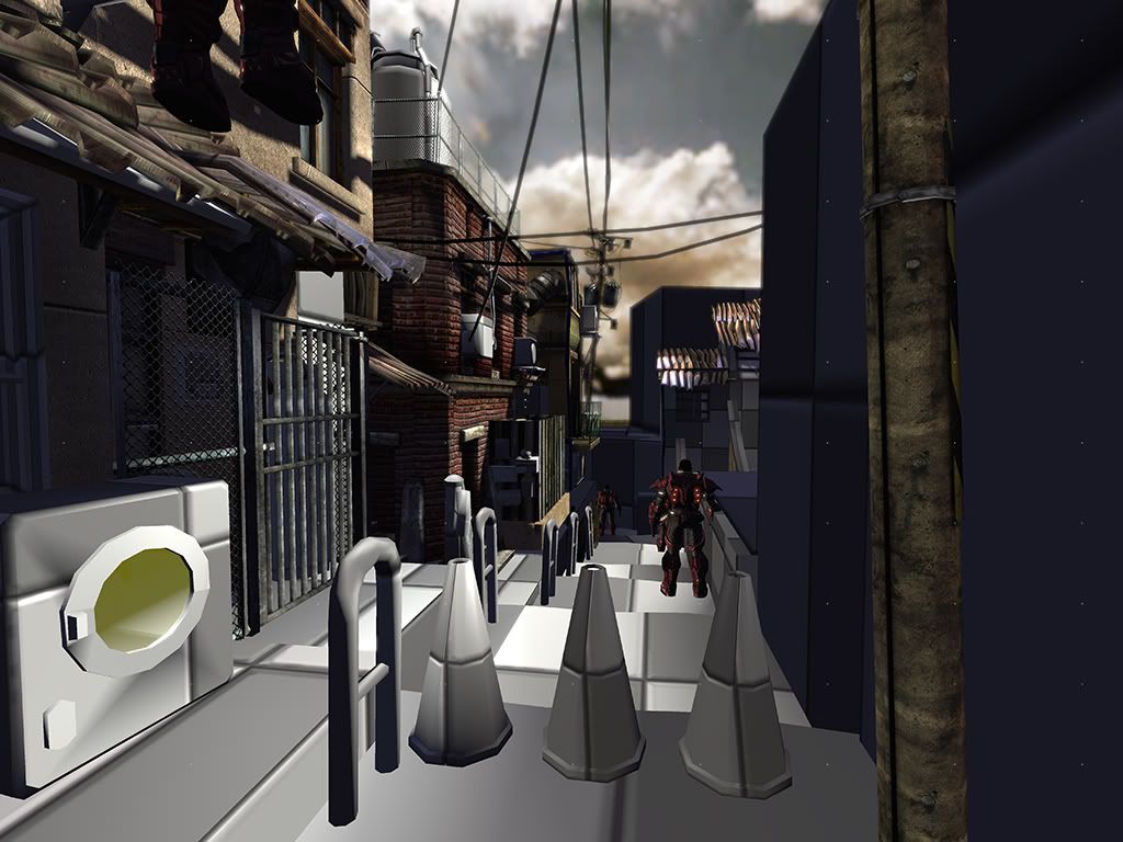
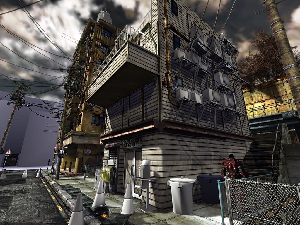
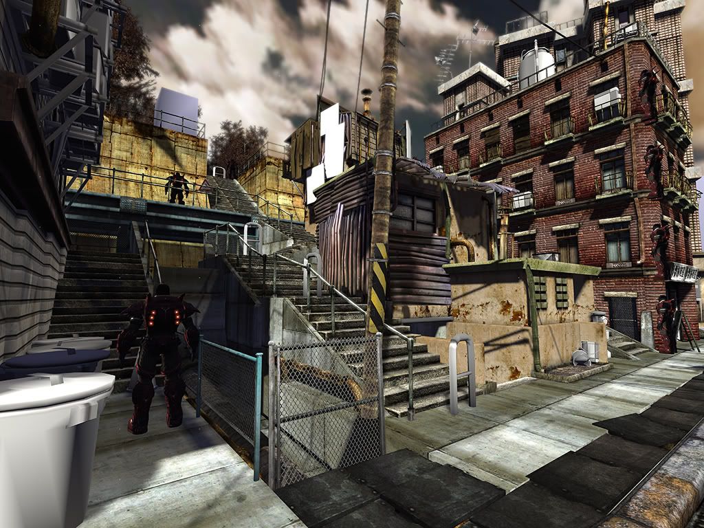
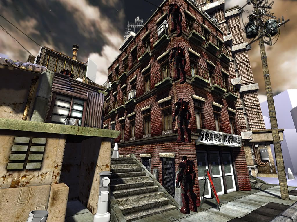
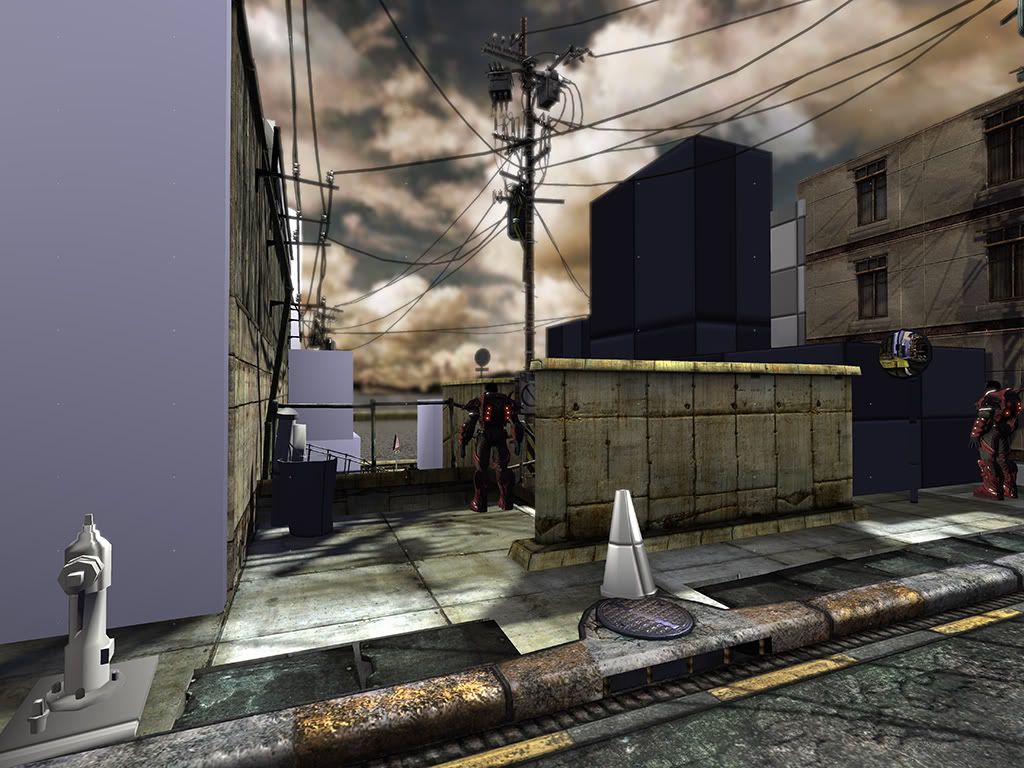
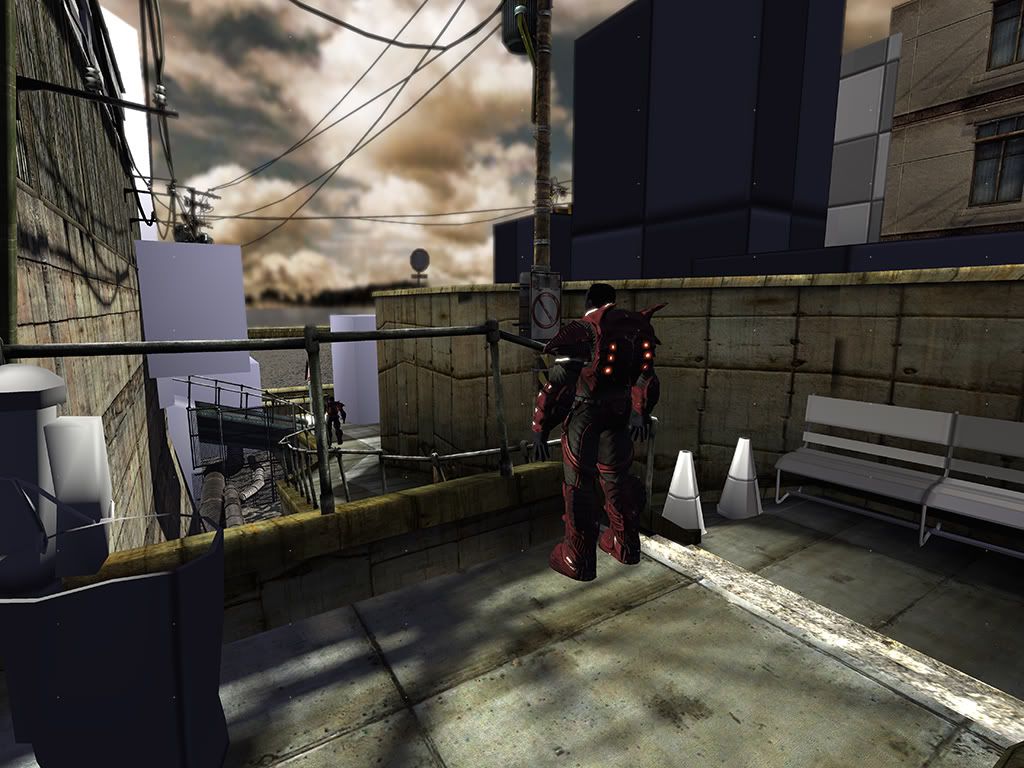
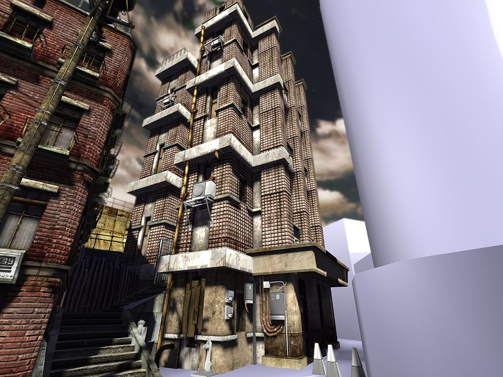
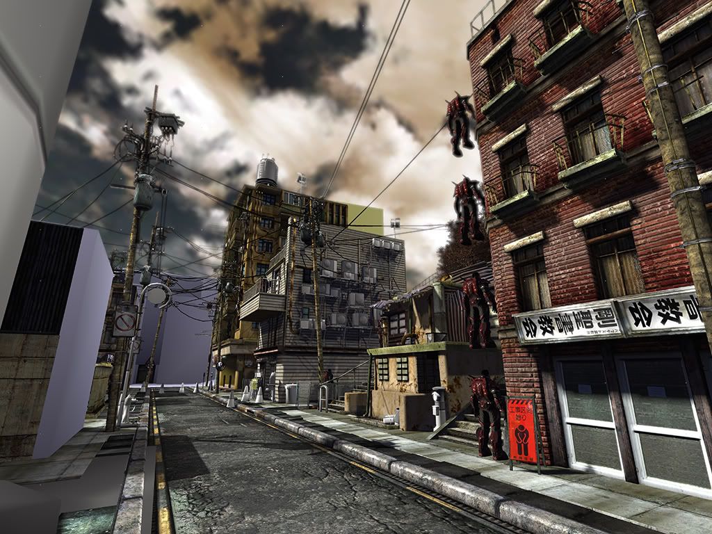
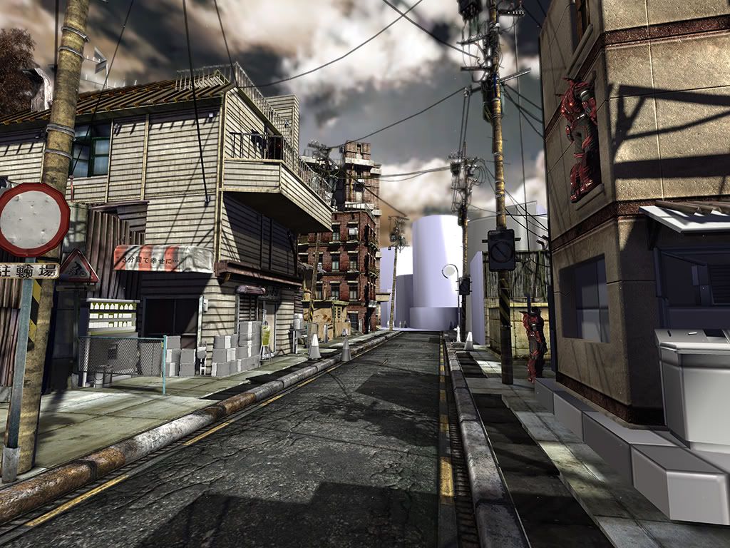
Do I really need to say the UT3 characters aren't mine? lol
Anywho, this is my senior piece for college (graduate in one more quarter) so, feedback would be highly appreciated. If you want a better shot of something to, just hit me up and I'll try to get a better angle for yeah.
The synopsis is, a "Shadow Bomb" just went off in a small city district of Japan. The bomb was sent by the United States of Korea (yes, they are united :P ), as a preliminary test weapon to use in full force against a more promising city. The bomb destroys the flesh, leaving a smoky ash residue behind (kinda like Abomb, but less messy). All other non living tissue are kept intact, leaving behind clothing articles, cigarette butts or newspapers.
Since I'm still in the heat of things, their is not a whole lot of this story presented in the piece itself other then the environment at hand. My main concern right now is to get these buildings done and reworking some some texture mistakes (yes, I'm looking at you curbs!), then next quarter texturing all of the props, and possible adding more.
So, the work flow is bigger forms first then the details.


Do I really need to say the UT3 characters aren't mine? lol
Anywho, this is my senior piece for college (graduate in one more quarter) so, feedback would be highly appreciated. If you want a better shot of something to, just hit me up and I'll try to get a better angle for yeah.
Replies
the tan building with the tile looking material seems a bit strange, like those tiles dont really fit.
you can definitely make the lighting/atmosphere more moody, like something happened here but you cant quite put your finger on it. some kind of slight fog would definitely help.
im guessing thats gonna be a powerstation in the distance?
red brick building seems a bit too saturated now. maybe.
i really like the yellow building.
the sky doesnt match the lighting well. its dark like night, but the clouds are light up like its sunny. if its sunset, you need more of a gradient going from sunsetty colors to night.
a tiny bit more bounce light in certain places would also help.
overall really good.
everything else I see looks nice, but damn
Also the sign on the (sort of out-of-place) red brick building is tilted 90 degrees
Here's my theory. Keep working the scene till everything is done, so that later on I'm able to readjust it and do changes to it when everything is in place and I can see, as a whole, what it will look like when it comes together.
Can anybody give me another way or explanation to this? I'm very skeptical about putting in Fog, atmosphere and the works, without having even everything textured yet. Seems to me like that's something that would be done last, not in the process?
And I try to mean that in a honest way :] Just want some questions answered that no ones told me yet.
The sky, yeah, I see your point. X[
I blurred it out intentionally so you wont know the low res of it (I did it using the Focus blur). I hear two comments on the thread to make it less bury, but then another that says the focus blur should be closer. Um...which would be better? I personally like it blurred out a little bit in the distance~ Any other opinion on this?
@00Zero
"im guessing thats gonna be a powerstation in the distance?"
What are you looking at mate?
Rest of your comments are noted though.
And the sign....Yeah. Guess I cannot get away with that then lol
Will change.
Thanks ALL of you guys. You peeps rock! Will get working on this as soon as I get the chance.
i do believe he is looking at the last pick at the unfinished buildings. they look roundish as if they will be water holding tanks for a power plant or something. I think its a good idea >.>
Great work, it has an intense atmosphere.
i did you a little overpaint which might help you with lighting the scene. its not great but it might give you a few hints.
-Stefan
It's coming later one me hopes. Still in the texturing stage.
@timwiese
I don't like the side walk either. I think it's just grown on me and I never got around to changing it. Will give it a try.
Oh, and baking out the lighting is like, an all day even for me, so for me to do ANY color changes, garr....takes a while -_-
Just saying lol
@StefanH i
I took your paint over, and messed with the FX and Focus a little. The color adjustment is a bit foreign to me. I over all desaturated it to and added a little bit of Fog. I think your paint over looks like a dust boll has come in X] but i understand were your going.
@imb3nt & parasite7 & Vig
Thanks a whole lot mates! Appreciate it greatly.
@easterislandnick
That makes a lot of sense now that you mentioned it. Will take that into advise as I continue to fiddle with the FX.
@Reich
Hey, Steve!
Oh boy, that was never my intention. Was going to make it a round building
@HAL
That was what I was trying to hit on the most! Still think I have a lot more to go to really nail it.
anyway, if youre having trouble baking the lighting, you could either bake only selected assets. or, you can seperate your level into different levels and then stream them in. that way you can bake a little section at a time.
Actually i live right next tot he Long beach DWP (Department of Water and power) So i'f you'd like i could head over and take some pics...not sure if I am allowed to...they might think im going to blow them up or something.
Oh and thanks to google i found some.
http://latimesblogs.latimes.com/photos/uncategorized/2008/07/30/long_beach_power_plant.jpg
http://cache.gettyimages.com/xc/52198075.jpg?v=1&c=ViewImages&k=2&d=17A4AD9FDB9CF1939847EC77F5F8D1CED356CA562905904CA40A659CEC4C8CB6
http://cache.gettyimages.com/xc/52205004.jpg?v=1&c=ViewImages&k=2&d=17A4AD9FDB9CF1939847EC77F5F8D1CEC231F0406DB4FCADA40A659CEC4C8CB6
I can go over and take more. But that's what it looks like.
Possibly have vehicles crashed off to the side. Ash residue permeating the air like show flakes. I would imagine that the power lines would have snapped from the force of the bomb. This is more a personal opinion because by snapping the power lines you could lose the look of Tokyo which you have depicted accurately.
I would add a fogVolumeActor in the scene if nothing else to soften the harshness of the sky texture. Even a height fog could with a brightness of like 0.5 or 0.3 could do the trick. The scene seems to lack a focal point of interest outside of the sky which robs the viewer of truly appreciating the environment. In the latest screenshot the fog doesn't add to the scene at all. Where have you place the fog?
http://imageshack.dk//viewimage.php?file=/imagesfree/4Kq27956.jpg
May I suggest having flashy, neon signs that don't blend in as much as the ones you have. ...And vending machines, don't forget vending machines!
Here some more shots I took. Hope you dont mind.
http://imageshack.dk//viewimage.php?file=/imagesfree/LoX28760.jpg
http://imageshack.dk//viewimage.php?file=/imagesfree/fV628608.jpg
http://imageshack.dk//viewimage.php?file=/imagesfree/MhH29283.jpg
A good way to make skies is to use a tool like vue or terragen to make panoramas for the sky.
http://img387.imageshack.us/img387/7762/98698534kg0.png
http://img165.imageshack.us/img165/7451/overcastms9.png
Nuts, forgot about that concrete! Will get to it soon!
@00Zero
So far, I'm baking what I'm working on then moving on to the next piece. Levels would be ideal, but, it would take just as long. If it crashes though, then levels would be best, so I can do blocks at a time.
@Reich
Nice man. Thought you mean like, power plant or something. I think they are to close to the street for me to do that though. Will stick with a building, maybe an apartment or something. Just cannot envision it in that type of area.
@deazar
Yeah, the new picks are the same sky, but shaded differently. What do you think? I think if this doesn't work out, I'll stop beating the dead horse and just go for a new sky. Trying to make it work with what I got.
@Taizy79
I tried the fog, but, I just don't like it to be that foggy. If I turn up the density any higher, it gets to thick, and creates the wrong feeling I'm trying to go for. I like the fog volume idea. Haven't thought of that. Will have to figure out how to do that again.
I'll more then likely add a vehicle to the road. Right now, it's to straight of a line of sight. Need somthing to break that up. don't know if it will be crashed, but it will be their for certain.
@nkoste
Good to know that I'm on the right track then hehe. Cool cone!...but its as ugly as sin lol. I didn't want to go the whole "flashy" part of the Japan area, so purposefully omitted those neon signs and parts. It would take away from what I'm going for i think.
And I'm having a hard time with the vending machines haha. Trying to see were I can stack a dozen of them together like that. Had no idea when I was design this that they had so many.
@easterislandnick
Oh dude, you got to be more specific then that, cause I have a lot of them hehe.
@timwiese
^_^
@DEElekgolo
Cool! Thanks a ton! They are quite small though for this me thinks. and were can I find Vue or terragen?
Anyhow, thanks for the comments mates. On a side note, kineseology homework sucks. Just throwing that out their.
Your environment is coming along really well, since the last time I saw it.
Given the scale and complexity of the entire city street, I would say you did a phenomenal job in putting everything together. (trust me, I know)
I like how you added the air conditions on the outside of the apartments, can't wait to see the textures on those things.
A quick feedback, the white tiles on this building doesn't seem to match too well. I am not too sure if they are bricks or actual mosaics that are used to overlay on the outer walls of the building (very prevalent on asian apartments).
If those are mosaic tiles, I would suggest you tone down the contrast (or normals)
Also. I noticed that the wording on one of the buildings are flipped. They are kanji(Chinese)
Overall, awesome progress. keep it up
i also think some fog would help. the goal is not really to make it foggy but to give some sense of distance. so if you make quite bright fog which is very subtle this would look cool i think.
kinda like here:
http://features.cgsociety.org/newgallerycrits/g71/147471/147471_1222710295_large.jpg
I think it might be the normals (i have them bumped up real high in the UT3 editor). Will relook at the texture map just to be sure.
I kinda didn't want any "real" Asian words tbh. I could have a sign that says "americans suck!" on a cross walk sign and not even know it
Any help from a gringo like me would be great.
@StefanH
OOOOOOOOOOOhhhhhhhhhhhhhhhhhhhhhh
*clicks*
THATS what you cats are talking about! Ok, will work more to get that type of feeling! Thanks for the ref mate!
http://i44.tinypic.com/ibctuh.jpg
http://i44.tinypic.com/mm39g4.png
^This one I used in a halo map I made a while back. Your free to use it.
Vue can be found here. Its not free but I use it to make almost all my skies.
Terragen can be found here. This is free but a lot harder to use.
It occurred to me, that it looks a bit more foggier in-game then in the renders~~?
mehh I say, MEHH!
Changed the sky texture all around. Its wayyyy bigger now with less cloud coverage. You can even see a sun!
Added that foggy depth of field thing. Desaturated it ever so slightly more. I kinda like it. What are your cats thoughts?
@DEElekgolo
Oh cool man, thanks!
@killingpeople
Thanks dude as well!
I think the fog looks fine, not to thick but you can still notice it. And it probably looks more foggy in game because you have been moving around in it for god knows how long =P
As for the sky it looks much better maybe a very very desaturated purple overlay on it to give it that hazy doomy feel.
The shots where you don't see the blue sky feel right to what your going for , the one shot with the blue peeking through looks to much like a normal sunny day imo.
(and what did you need help with in class today. Completely forgot you asked~)
Btw, you lit your scene using lightmaps or dynamic shadows?
if it is the diffuse lighting toning it down can help keep the detail, but allow the contrast to come from the larger shapes which helps it read well, a bounce light may be needed to help surfaces in shadow not appearing too flat
looks sweet btw
Thoughts Shepeiro?
74% done. Will be modeling buildings like a mo-fo this week. Then 3 days to UV them all. Then one week to texture them all. Then one week to "glamorize" it and adjust lighting (takes 51minutes to build~~). Then faint on the bed because it will be done, and so will school!!
Then repeat it all again on another scene ^_^
I'm thinking crysis engine this time.
/me is one of a big fan!
And thanks chaps ^_^