Kid Knight
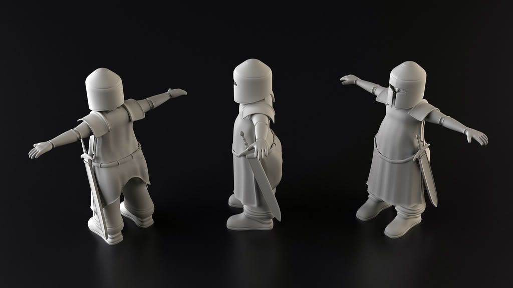
Hello I am grad student at the Savannah College of Art and Design. I am in a character modeling class and this is my character I have done for the class. I am not a character modeler. I am a level and level asset modeler but I had to make a character for the class. I would like feedback on him. Thanks
Short story on the character. His name is Billy and he is a overweight 10 years old kid. He has to save his sister in a cartoon Medieval style world from the bad guys that took his sister from the real world we all live in. I am trying to make him look like he is in grown up armor and clothes. I was trying to make it really large but it looked strange. I am going to make a low poly model for in game later and have it running in UE3.


Short story on the character. His name is Billy and he is a overweight 10 years old kid. He has to save his sister in a cartoon Medieval style world from the bad guys that took his sister from the real world we all live in. I am trying to make him look like he is in grown up armor and clothes. I was trying to make it really large but it looked strange. I am going to make a low poly model for in game later and have it running in UE3.


Replies
Here is the character over 90% finished. Please tell me what you think. Thanks
http://i188.photobucket.com/albums/z220/Hunter_May09/Billy_Kelt_Knight_V20_1024.jpg
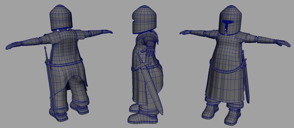
His arms are really thin, they seem about half as thick as they should be without armor. They also seem pretty straight, tube like almost. It seems like the armor was just extruded from a few loops without much planning or research into what medieval armor looks like or how it attaches. If he put his arms down would the armor tubes slide off?
His legs are spaced pretty far apart, like two straight pillars. As fat builds up in the thighs and between the legs the pelvis doesn't separate and move the hips farther apart, but the feet do rotate away from each other, like the Da Vinci pose.
Think of this kid more of a starfish.
The feet cave in on the outside arch of the foot, like they would on the inside. Kind of odd. Also fat gathers in key areas, it seems to have fallen down into his ass and feet. Dig up some pictures of fat kids, do some studies of where the fat is on the body and how it effects things.
Cloth bits, you have a lot of polys in the wrong places. You kind of cheaped out on the hanging areas and really beefed up the upper torso that is going to be pretty solid. The hanging parts, depending on how you rig them up are going to be asked to do a lot. They need to collide with the legs and behave like cloth, that could be hard to pull off with very few polys.
Cloth tends to preform a little better if its Delaunay triangulation and not quads. More random edges that it can fold along, and sometimes with less tris. Looks crazy, works great and most of the time it optimizes better then quads.
I think you have a few changes to make, but you definitely could have a really great piece. The idea is there, and there's a lot to hint that you can pull it off really well, so keep at it!