Sketchbook: DeusExMatteo
Yo, I'm from Sweden and I've been doing things in Maya for about a year. Curently attending The Game Academy in Malmö where I spend my time studying Modeling and texturing.
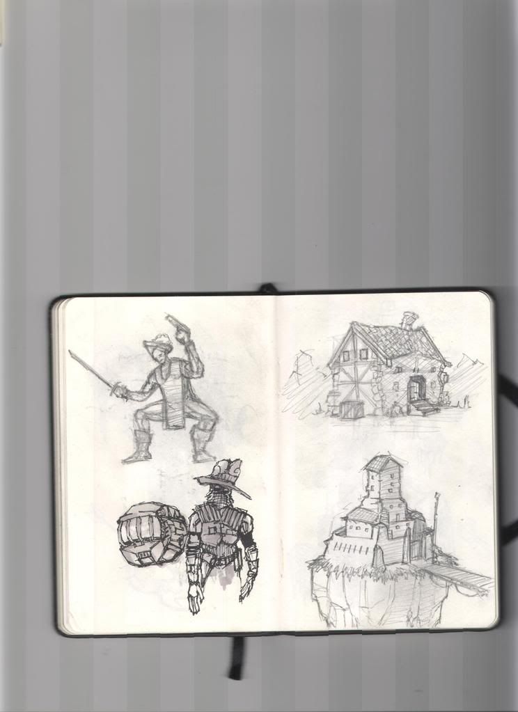
This is from the DoodleBook - pretty happy with the houses on the right, but the dudes on the left are pretty wack! Dont like em. Trying to get better at anatomy, but then again, arent all artists?
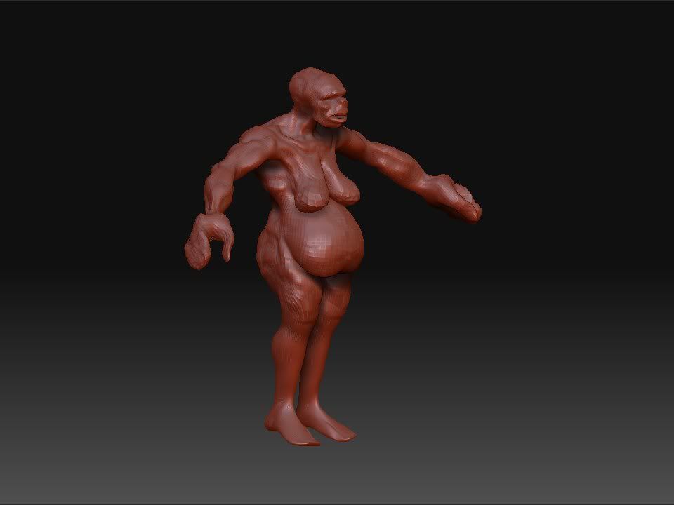
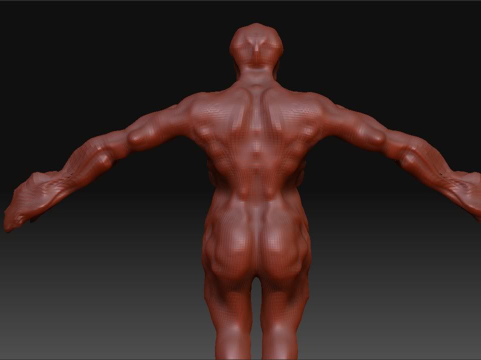
Well, the anatomy I was speaking about in the first post, here it is again. Not my strongest side but I guess it will come along if I just keep looking at references and drawing.
Well, those are my first doodels

This is from the DoodleBook - pretty happy with the houses on the right, but the dudes on the left are pretty wack! Dont like em. Trying to get better at anatomy, but then again, arent all artists?


Well, the anatomy I was speaking about in the first post, here it is again. Not my strongest side but I guess it will come along if I just keep looking at references and drawing.
Well, those are my first doodels
Replies
So this is what I'm doing right now. It's an asignment for school and we're going to present it tomorow. The final result is to be presented next week, with normalmaps and stuff. So I think it's gonna be pretty easy to make the deadline even if I take som time to work on our gameproject as well. Going to see Dead Prez in Lund tonight together with teanker here at polycount- gonna be awesome. :thumbup:
We just had a realy great lecture in school about how to make houses and other structures in a simpler way. It was inspiering and I have decided to start over with the house project, considering the new teqnicues I have learned. they mostly have to do with UV-Mapping and how to save time doing that. The trick to it is to make the structure as a simple form at first, a polycube with a couple of divisions deviding it's surface into squares. Then you make your Texture map and make parts of it into square pieces of texture. then you use Unitize under the Polygon menu in the UV-Texture editor. This will give you the ability to just drag the UVs of the squares in your cube to fit the square pices of texture in your map. I will try to illustrate this when I begin work on my next house. Next friday is the deadline for that so I'll have it up here by then.
See ya!
It worked as it was suposed to and didn't take alot of time. I think it took about five hours of work all in all, and I'm new to this aproach.
Did a 2D doodle when I was watching Mallrats with taencer and Eddie here at school. It's suposed to be three heroes from a RPG. Warrior, Elf, weird Mage and a sneaky gun character.
Matteo Out
Speedpainting in 25 mins.
Started working on another house today. Finished the modeling and began working on the maps for it. Supeosed to have Normal, Specular and Occlusion.
Did this when I was drinking tea in the school cafeteria. Been reading some Lovecraft and was thinking about some kind of grotesque creature, feeding on and nourishing somekind of humanoid creatures. I'm pretty tired after trodays work, creating content for the game. Did some buildings for one of the towns on the island where the story is set.
Scetch!
This weeks and next weeks asignement is to model a vehicle from a concept made by one of the artists at Massive Entertainment here in Malmö. So this monday we received a couple of very nice drawings made by Pär Green (probably made for the game Ground Controll 2) and now we are going to model and texture the one we like best in Maya.
I started modeling this car yesterday. I'm using the tecnique that Rico Holmes from Costume Red in Karlshamn taught us last week. The trick is to start with the UV-mapping early on so that you don't have to worry about doing it on the high-poly model. It saves time and I like it.
Usualy I try to start UV-mapping just after I have roughed in the main shapes. If you try to change the vertexes around after you have mapped the UVs (with projections or otherwise) there is going to be warping becaus you are changing the geometry but not the coresponding UVs, so I try to delet and make new edges/verticies instead of moving them around.
Well, anyway - it's a pretty nice tecnique.
I tried to render the pictures to BMP beacus I saw some compression flaws on the JPGs, but this is even worse. No more BMP!
Pleas give me feedback if you feel like it. Credds to Per Green at Massive Entertainment who made the original concept scetch for the model.
Peace Out.
Add to YouTube? Video clip of particle effects = 3x the awesomeness compared to a render imo.
lol, never heard of a 'quick' matte painting.
You show a wide array of skills, and that's good. But you might want to a focus a bit, and get really good at a couple things, instead of everything.
Then go back and focus on other things when you feel you've wrangled a skill set.
Thank you. That is actually a realy great piece of advice. I will definitely try to keep it in mind.
[ame]
It contains some glitches, like the small jump between two frames in the beginning of the clip. It's becaus I batch rendered the animation in two different parts at two different times. Probaby this didn't work well with the particles and field becaus they have some quite random parameters that changed between the two renders.
Well, aside from that I'm quite pleased with the result myself.:)
I'm quite pleased with the end result.
Critique is, as always, more then welcome!
Allso, I've entered the "Scene from a movie" competition over at gameartist.com - here is a link to my progress thread
http://www.game-artist.net/forums/scene-movie-competition/9206-sfam-great-machine.html
Critique is of course very welcome
Sitting at home sketching.
Speed modelled this during my lunch break in school. The weather here in Malmö is getting nice and spring-ish, so I can feel my inspiration returning. Nice nice
Have been checking out some of my books from the PnP-RPG "Mutant", one of the classics in the Swedish roll playing hobby. So thats kind of what inspired me to do this. It's suposed to be an abandoned car factory somewhere in Sweden. Talking about RPGs, next week it's time to go for the anual trip to Gothenborg (Götteborg in swedish ^^). Awesome!
Allso I was thinking about this thread http://boards.polycount.net/showthread.php?t=61622. Seems appealing to me
Well, this is my entry to the concept art challenge. The theme for the drawings where "Warrior God". I tried to work away from the typical picture of a big muscular guy with a sword and instead focus on a broader defenition of what war is. Usualy people talk about how war doesn't have a winner, so I thought I would try and make something out of that.
My idea was that the warriors of the world I was making this concpet for are worshiping a giant snake creature that eats the fallen soldiers from the battlefields. The act of killing ones opponent in combat is a sacrefice to the god of war that dwells beneath the ground.
I made this after wathching a DVD with feng zhu today. Not there yet, but it felt like I learned a lot from it and I'm looking forward to doing more of these:)
Have been doing the animation assignment we have for this friday this morning, and spent some time in the middle of the day with the feng zhu video. It's great and I want to stay focused, so I want to try and only wathc it when I feel like it and when I'm not stressed. Well, today has been a pretty nice day actualy. It feels like I have gotten a lot of things done, and thats allways nice.
Anyway, here is the first boss for the Shot em' Up we're doing for school.
Lol lol lol, I just learned how to make animated GIFs. If I had only known this before flash and youtube took over the makret for online animations I would have been soo king
Well, anyway - if you ignore the weird alfa in this one it's a pretty accurate depiction of the animation for the 1st bos in our game project.
I allso drew a couple of concepts for hand guns during my lunch break.
Tried a couple of new enviornment-texturing techniques I picked up from a tutorial at game-artists.net earlier today, it's not perfect in any way - but I feel I learned at least a couple of things by doing it. :poly121:
I continued working on the castle wall from yesterday and made an attempt at improving the structure by sculpting and exporting a new normal map from z-brush. I think it turned out quite well, but I would sure like some feedback on it, if anyone would care to
Note that only the middle part (in the vertical direction) of the wall is normal mapped so far.
Just noticed a huge miss in the texture work on the wall - the diffuse and normal maps doesn't match up very well. It's pretty obvious because of the cracks in the texture for the brick wall doesn't match the cracks in the normal map, you can see right away that something is wrong. Well, anyway - I'll have to work more on that tomorrow.
WoW concept study
Photo studys
Stuff from school
Ged: word!
WIP gun
concept art, larva transporter.