Human/Scorpion Hybrid (WIP)
Hey folks, im currently working on a fairly large project that will go towards my dissertation at uni. The focus will be on a custom character that can be taken and put into Unreal 3, so im going to need to create a custom rig and have a tri count of around 15k.
Iv already started bashing out a rough base mesh that will be then taken into zbrush to create a normal map. The model currently sits at around 6.6k tris.
If you have any suggestions and/or criticisms please fire away, all are welcome.
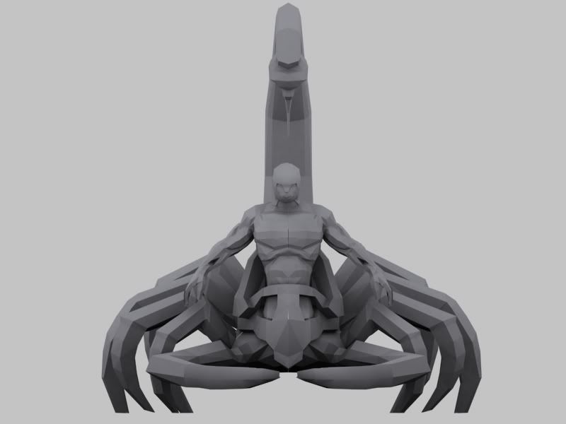
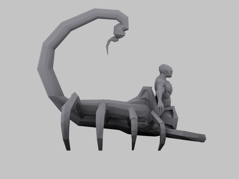
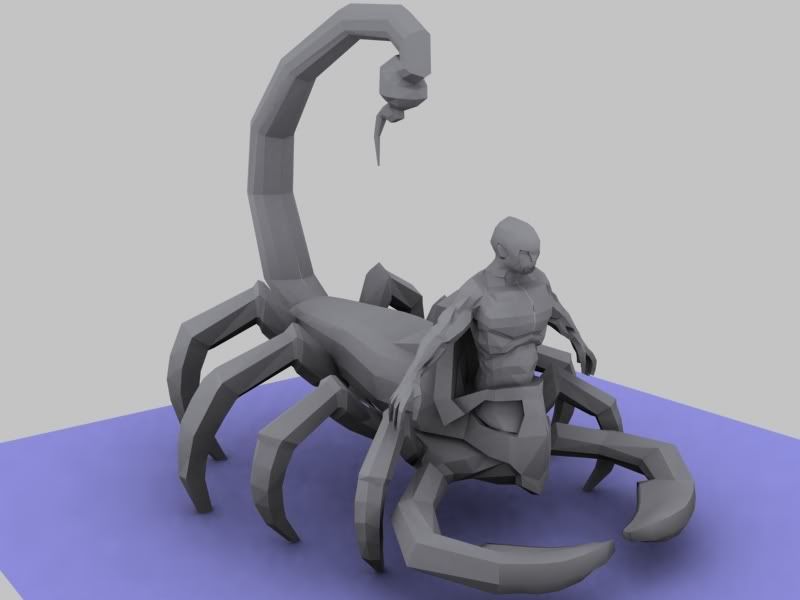
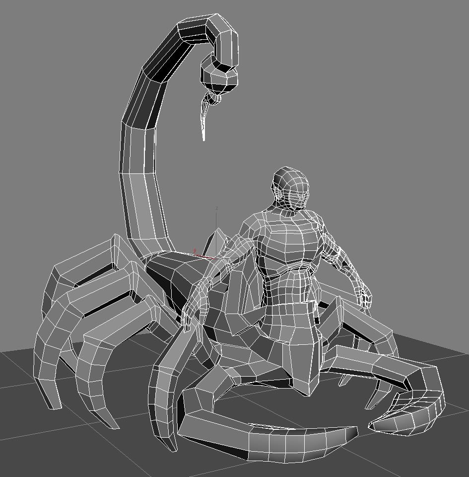
On a final note, rigging for Unreal is a bit of a dark area for me so does anyone have any ideas/ large a finger that could point me in the right direction for creating a custom rig for this creature.
Thanks
- Ryan
Iv already started bashing out a rough base mesh that will be then taken into zbrush to create a normal map. The model currently sits at around 6.6k tris.
If you have any suggestions and/or criticisms please fire away, all are welcome.


On a final note, rigging for Unreal is a bit of a dark area for me so does anyone have any ideas/ large a finger that could point me in the right direction for creating a custom rig for this creature.
Thanks
- Ryan
Replies
its been a while since i last updated this but the time has come to show the final finshed produce with the renders being produced from Unreal Engine 3.
i would greatly appreciate any feedback no matter how small, and for all you passersby just post Yes or No in terms of whether you like it or not.
I really like the legs
My only crit is that his fore-arm seems too short and his bicept seems too big.
Good work anyway.
Again all feedback is welcome.
http://images.google.com/images?hl=en&safe=off&rlz=1G1GGLQ_ENUS323&um=1&sa=1&q=scorpion+pincers&btnG=Search+Images&aq=f&oq=
-The textures are looking a bit muddy. I would try to get them reading a bit better. Look at real scorpions and try to figure out where they have color variation and detailing and why. Then work this into your diffuse. At the moment, it seems that you overlayed random details and color in some areas.
Did you do an AO bake? This might help make the forms pop out a bit more if you didn't already overlay AO.
Can we see the textures, and list the tri count and map size? It would definitely help with crits.
It looks like you have a flat specular on him, and I think if made a specular map it would also help the character read better (make edges more shiny so they pop out more and some areas more wet looking).
While I think the color scheme is cool, there is still a disconnect between the character and the scorpion parts. I think you could mesh the two together better. Also, I think if you added a bunch of detail in the normals and texture where the scorpion and character connect, it would also help a lot.
Again, nice work; but don't call this one done yet. Your almost there!
By the way, for future reference. If you explain what your goal is, show some concept art, and give a little history to the piece you will surely get better feedback. I see you started to do this in your initial post, but not quite. The only reason I mention this is from your second post you seemed a bit desperate for crits, ha ha.
Pretty much what Brad said lol.