new models for student game
Hi dudes, want to open a thread for some of my newer models im working on for a game project at a game dev school here in Berlin. Started to train me much more in high poly here some results of the last days  will work on some models a little bit more i think hope thats not to much pics and hope you some of them
  lot to do like everytime. see ya
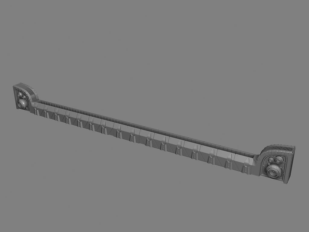
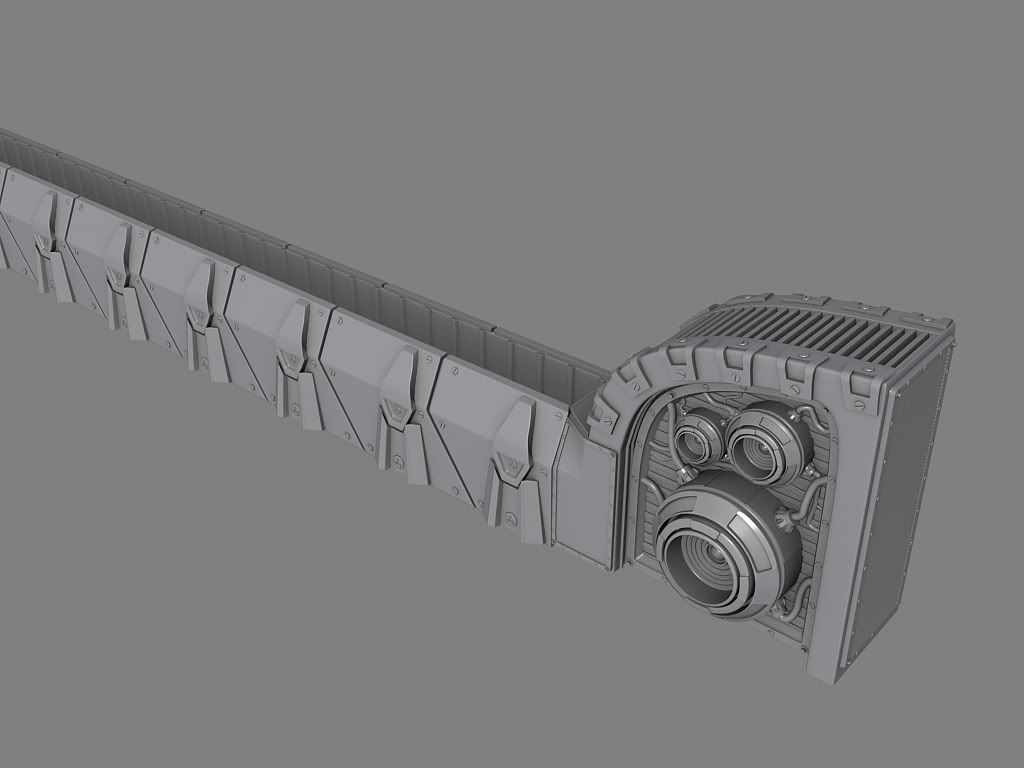
a holographic tv/advertisement for houses...
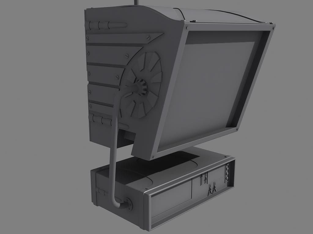
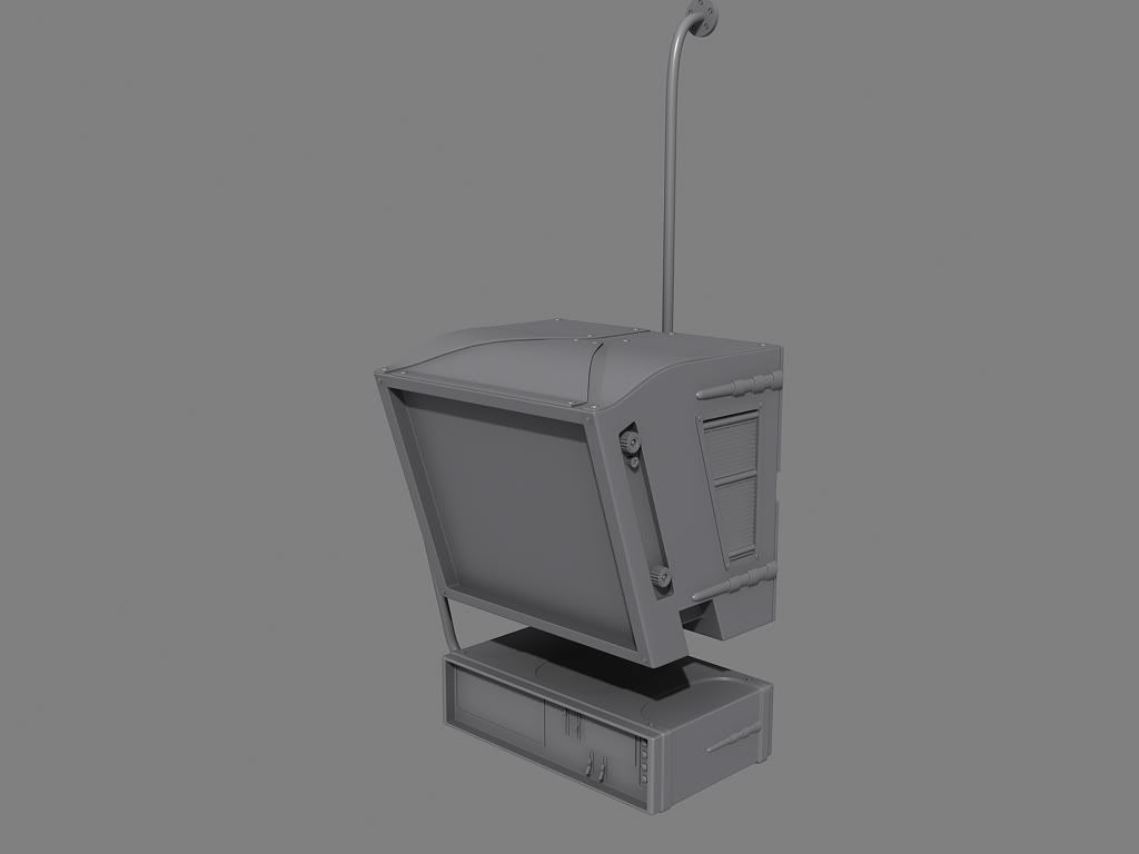
monitorstuff...
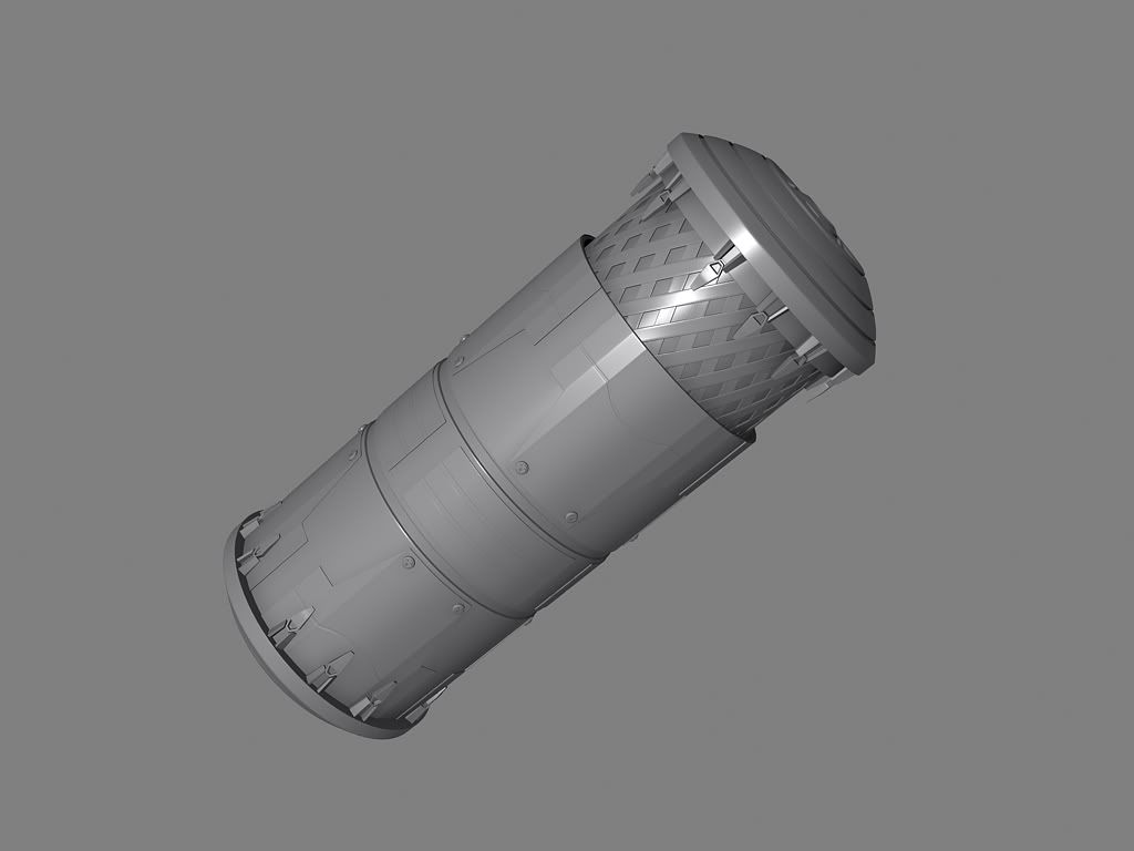
an idea for a smokegrenade...
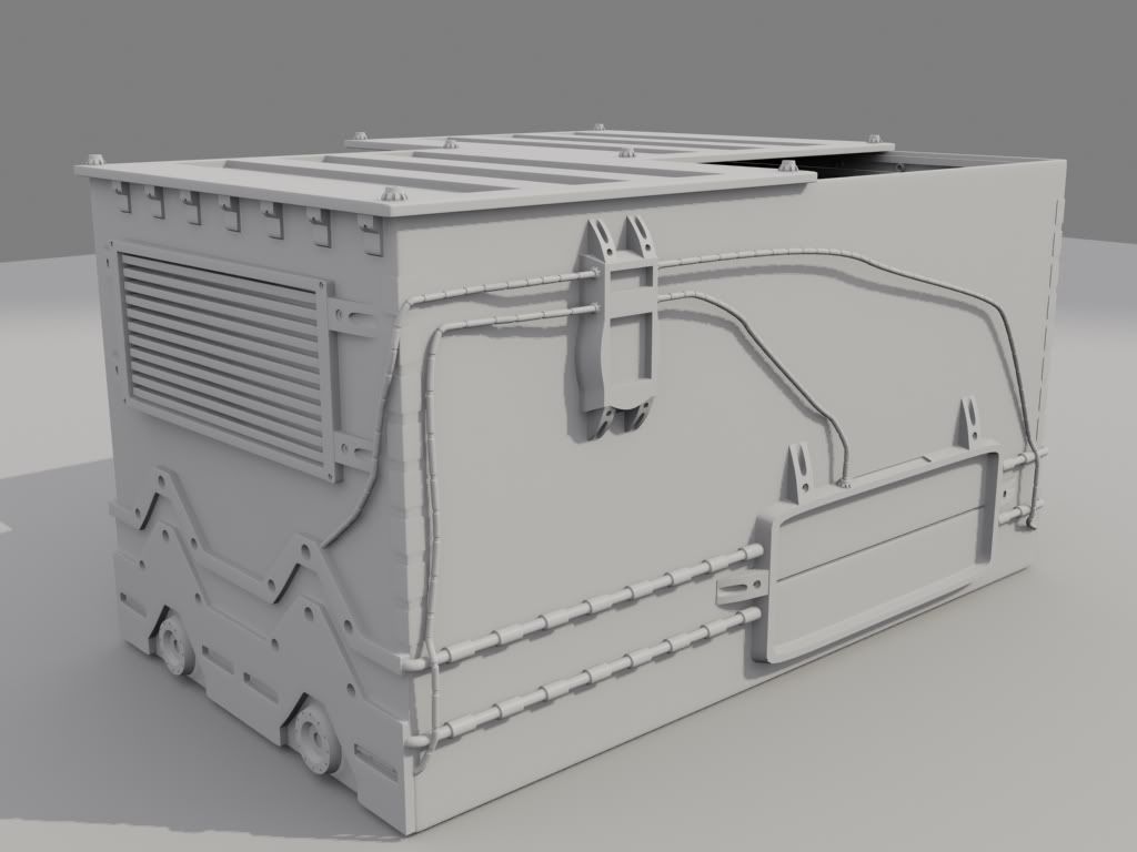
a dumpster...
a holographic tv/advertisement for houses...


monitorstuff...


an idea for a smokegrenade...

a dumpster...


Replies
The smoke grenade, and the dumpster both seem to have a lot of very sharp angles that won't translate as well to baked down normals. Sometimes, especially when given a realistic game budget, you really want to emphasize the edges to get an improved normal result.
If that dumpster gets a 1024, and you want to give unique surfaces to each side, the pixel density won't be enough to get every single tiny edge and and bevel unless you really try to exaggerate it a little more.
Good stuff though, I really like the top one.
Vj
http://www.acetylenegames.com/artbymasa/tuts/tut-modeling_for_next-gen_games.jpg
From the right side the montior looks completely different and a hell lot better to me.
The dumpster is super boring and just wrong in tention of elements- you have some big empty spaces and smal stuff that is cluttered together. The industrial repeating elements dont make much sense- looks random to me.
now what I like:
I really like the smokegrenade- it has a very interesting shape,- the first element looks also very interesting though a bit to much repetitive and to long. add 2 - 3 more tower or interrupting elements in the middle or 2/3
Agreed with renderhjs about the right side of the monitor too - that looks much better.
Keep going - as the others have said, your designs just need a few tweaks and also to be more 'normal map' focused.
It's a dumpster.
Most of the details of a dumpster would come from its construction, not it's function. Basically Its large pieces of sheet metal held together in some way (bolts, welding, etc.) Unless its a super self-compacting dumpter that warps it's garbage to a landfill planet far far away, it doesnt really need any kind of technology outside of being able to hold huge amounts of heavy trash and being able to be lifted by a garbage truck ( or future equivilent thereof )
The monitor to me is looks fine as well, feels like a model out of fallout 3. Continue the great work and hopefully we can see some of these normal mapped and textured out!
ok this model is from gears of war screens i have taken and modelled then. think i do it right... think so... screens were dark
door + frame (maybe a bit to much screwdetails) but i like it
a stair... needs a Zbrush pass.
isnt finished
this isnt finished too