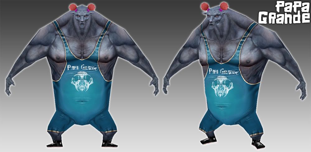
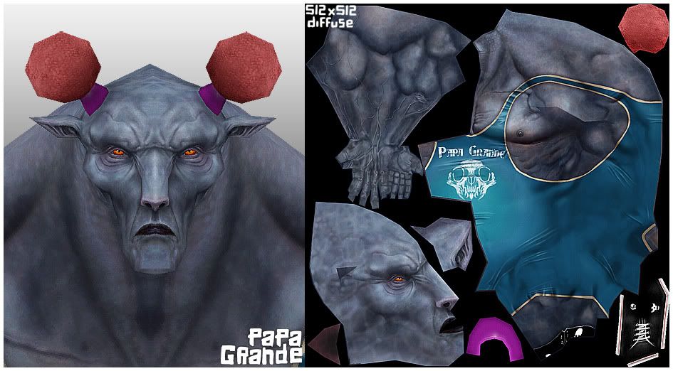
Nice work again - sharp texturing, interesting idea and nice use of colour!
My main critique of this piece would be that the arms are really straight in silhouette, they look like they could use a bit of variation (for example, slightly thinner elbow, fatter forearm). Might just be my taste though.
haha awesome wacky great texture!
kind of upsetting that the head has great detail with more polies, where as the arms and feet have so few, but still, fun to look at
great skin texture, very interesting stuff, only crits
1 looks like he has a lil tail in the texture flats, can we see a side or back shot? also the stomach looks a bit aquard right now like you were between fat and athletic. but overall its very nice love the proportions! and the shoes make me happy.
MoP, Yozora : Thanks for comments. I would agree with you on the arms, they are a bit tube like I suppose. On reflection I might of given him 'Popeye' arms.
Pope Adam: Thanks, Wireframe coming up as requested....
Blaizer: Hey thanks Blaizer. You got the famous British wrestler I was hinting at with the Spanish name.:)
steady: TA! As you can see from the wireframe, not many polys in his body.
konstruct : I think I must of got the idea for those pom poms from Dennis Rodman or someone similar.
woogity: Hey cheers, yeah he's got a little stump where his tail should be as he's been docked!
El Scorcho: Thanks El Scorcho, while I purposely created his head and hands to be small, I think, if I went back again I would of still kept the head small, but given him large hulking forearms and hands.
Daaark:pfffff, he'd eat Gronda for breakfast.:)
Chai: Ta!:) It all honesty I did start this off as a model as a doodle, so it's quite simple mesh wise, but it needs more work perhaps on edge loops before handing it over to any animator.
It may just be me but I feel that it's damn a shame to have such a beautiful texture on such a boxy model. The texture is painted to perfection and the model looks unfinished. Either way the model definately needs some love. There are a few spots where there are wasted polys that could be utilized to define the silloette better. I included a pic of what I'm trying to explain. Basically, pushing and pulling a few verts will create a better shape. On the arm and the leg the circled verts are all straight and doing nothing for the model. The verts on the arm can be adjusted to round out and define the arm muscles and the leg could be rounded out as well. Of course the UV's would need to be move a bit as well. With that said, I'm super jealous of your painting skills! Just beautiful!
Im pretty sure the "boxieness" was a style choice and intentional. I dont really see too many wasted polys, as those edge loops are probably there for better deformation when animated
DarkAlleyEthics: Hey, thanks for taking the effort to help us out with the pics. Appreciated!:)
I think I could of matched the edge flow better on the arms and legs. I perhaps might not of cut into the polys on such a low poly mesh such as your second picture suggested, but would certainly keep this in mind for any other characters that I did.
EricV: Hey thanks EricV, low-poly was the aim of this one, like I said above, I perhaps could of distributed the polys to match the flow of anatomy on the texture. But you live and learn!:)
Daaark: HA! Shirley Crabtree! aka Big Daddy!
Well, he was inspired a little bit by him, especially the name. But mostly he was inspired by Mexican wrestlers.
In earlier versions of the texture he was masked....
Replies
My main critique of this piece would be that the arms are really straight in silhouette, they look like they could use a bit of variation (for example, slightly thinner elbow, fatter forearm). Might just be my taste though.
Can we see a wireframe? He looks like a pancake from the front shot, I'd like to see a more dimensional shot of him.
Rock!
kind of upsetting that the head has great detail with more polies, where as the arms and feet have so few, but still, fun to look at
Still a cool character though
The face details are very good, nice work!
Looks awesome
is this just for the model, or do you want to him to be animatable ? might be worth posting wires if you do, so you could get crits
1 looks like he has a lil tail in the texture flats, can we see a side or back shot? also the stomach looks a bit aquard right now like you were between fat and athletic. but overall its very nice love the proportions! and the shoes make me happy.
-Woog
Pope Adam: Thanks, Wireframe coming up as requested....
pliang, DrillerKiller, Dekard, Slipstream, misterboogie, redmond_david :Thanks
Blaizer: Hey thanks Blaizer. You got the famous British wrestler I was hinting at with the Spanish name.:)
steady: TA! As you can see from the wireframe, not many polys in his body.
konstruct : I think I must of got the idea for those pom poms from Dennis Rodman or someone similar.
woogity: Hey cheers, yeah he's got a little stump where his tail should be as he's been docked!
El Scorcho: Thanks El Scorcho, while I purposely created his head and hands to be small, I think, if I went back again I would of still kept the head small, but given him large hulking forearms and hands.
Daaark:pfffff, he'd eat Gronda for breakfast.:)
Chai: Ta!:) It all honesty I did start this off as a model as a doodle, so it's quite simple mesh wise, but it needs more work perhaps on edge loops before handing it over to any animator.
Here are the wires as requested.....
I think I could of matched the edge flow better on the arms and legs. I perhaps might not of cut into the polys on such a low poly mesh such as your second picture suggested, but would certainly keep this in mind for any other characters that I did.
EricV: Hey thanks EricV, low-poly was the aim of this one, like I said above, I perhaps could of distributed the polys to match the flow of anatomy on the texture. But you live and learn!:)
I can't get over how great that texture looks.
Daaark: HA! Shirley Crabtree! aka Big Daddy!
Well, he was inspired a little bit by him, especially the name. But mostly he was inspired by Mexican wrestlers.
In earlier versions of the texture he was masked....