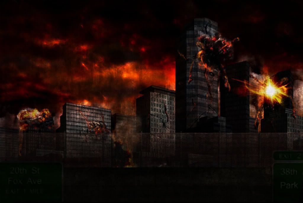
Hey guys, just looking for some C&C's on some concept work I did last weekend. It's my first successful stylized realism pieces, and I'm wondering how to make it and future ones look better. Any tips are appreciated.
Scene lighting doesn't make sense: There's a city-wide fire so large it's reflecting in the sky, but there is no rim lighting behind the buildings to show this. It's all black.
Also, what is this key light (main light up front)? The sunset? But there's also all this smoky cloud coverage?
There should also be lights around the explosions. Similar to a lightning strike, an explosion initially creates a blinding bright light, so the surface it's happening on shouldnt be completely black.
Remember 9/11? There should be some serious black smoke billowing up from these buildings or at least the background to show depth
Speaking of depth, your scene has none. It's a three layer parallax (foreground fence, mid building line, and background fire sky). The camera orientation to the buildings shows it ups in the air at least 6-10 stories. According the bridge, the camera is floating in the air just above and behind the bridge. Both of these set up a weird angle that the viewer can't relate too. If there was a ground near by or some visible break between the city and the camera it would make sense. Such as a few blocks of smaller buildings between the city and the camera suggesting the camera eye is someone on top of one of the buildings looking back at the city.
Building destruction is just overlayed cracks. Their silhouettes as still untouched buildings. Take large chunks out of some of the buildings, make the destruction CHANGE the skyline.
For reference, I suggest the fallout 3 concept art and this video
Thanks for the tips. With that in mind, I definitely see how it is lacking. I appreciate the honesty and bluntness - even though it's morale boosting, if comments are flattering but useless, they're still useless. Ill get to work on the changes soon and post it back up here.
Replies
Also, what is this key light (main light up front)? The sunset? But there's also all this smoky cloud coverage?
There should also be lights around the explosions. Similar to a lightning strike, an explosion initially creates a blinding bright light, so the surface it's happening on shouldnt be completely black.
Remember 9/11? There should be some serious black smoke billowing up from these buildings or at least the background to show depth
Speaking of depth, your scene has none. It's a three layer parallax (foreground fence, mid building line, and background fire sky). The camera orientation to the buildings shows it ups in the air at least 6-10 stories. According the bridge, the camera is floating in the air just above and behind the bridge. Both of these set up a weird angle that the viewer can't relate too. If there was a ground near by or some visible break between the city and the camera it would make sense. Such as a few blocks of smaller buildings between the city and the camera suggesting the camera eye is someone on top of one of the buildings looking back at the city.
Building destruction is just overlayed cracks. Their silhouettes as still untouched buildings. Take large chunks out of some of the buildings, make the destruction CHANGE the skyline.
For reference, I suggest the fallout 3 concept art and this video
youtube.com/watch?v=R3lRn58AhtI
Ben