I believe there is a beautiful piece of art hidden in this huge piece of crap you posted. I honestly hate sounding like a dick here because I see it. Your foliage is fantastic, your ruins might be nice, but there is no way to tell based on your noisey composition. Please consider cleaning this scene up and reposting it. PLEASE.
maybe you should have some sort of fogging in there to help us distinguish depth. The layout looks like it could be good, but some fogging or something needs to be added so we can see better.
I agree with most of what was said above. Mainly I'd say take out some of the background trees/foilage, as the sky would add depth and break up the green a bit.
what is it with scenery these days either being so disgustingly desaturated or so blindingly oversaturated? HDR effects aren't all that cool and is already this generation's lens flare.
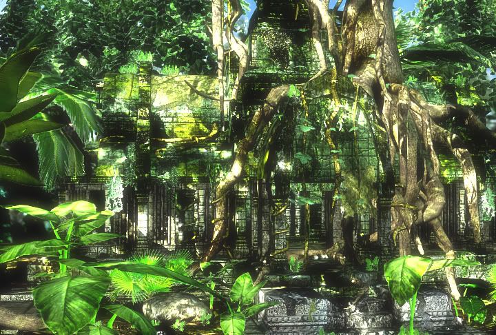
Everything is so equally so overexposed you can't even see that there are ruins of a temple in there. Maybe there could be some depth of field lens effects, or maybe some desaturation/fogging the farther you go back to bring out some depth.
Even the camera angle/composition is a bit suspect here. If I look hard enough, I can see the temple, but the angle you've presented it at is just so plain and doesn't do it justice.
brutal contrast and overuse of blooming. Thr colors build to much contrast they dont blend well with each other - each face or color seems to scream at its own.
Smal size and a bit random composition.
This image gives me a headache. I can see some nice looking work if I try but otherwise my eye is drawn all over the place because the lighting combined with the bloom and oversaturation is horrible.
yeah, please, please, please don't call this done. this could be great with some decent lighting. try lighting the interiour of the ruins more blue, and the foreground more warm. get some value contract in there as well. do some research for lighting and color theory.
right now this is soooooooo flat and muddled i can't tell what's going on. you've got a lot of great detail in here and allllll it would take to make this awesome is some great lighting.
hmm.. also, those white alpha halos aren't doing you any favors. just take the color channel and paint the leaf green color to replace the white along the boarders.
the contrast and bloom are right, ok, maybe a little to strong!
The problem is, that just the midscale detail ist contrasty, the big scale detail has no brightness difference at all and therefore makes it nealy impossible to read the image.
The focal point of the scene should be the temple entrance, try to give it some light and darken the other places.
Light is perfect to guide the view through a scene. Try to make the top left corner of your scene pretty bright, to make it easier to "enter" the picture. The other three corners and espacially the bottom right corner should be pretty dark, to keep the view in the picture as long as possible.
Ok, people tell me how you really feel. I think alot of you were to nice haha. I am kidding, I understand where alot fo you were coming from. Here is an update. Please let me know if this is an improvement or if I should punch myself in the nuts repeatedly. Remember this is my first time ever lighting an outdoor environment.
haha no, but the interior being lighter is wrong daken it down, it is looking alot better, but i think making the interior much darker than the exterior will pull your eyes into it. here the foggy thing is fighting with the super bright exterior
Yeah, I'd agree. Generally the rules are when you're outside, interiors are dark. When your inside, exteriors are usually overexposed and really bright.
With your image, you are outside and inside is bright, so it looks like there is a light on the inside - ie it doesn't really make sense to the viewer.
I also think the lighting doesn't really make sense. It's hard to tell what is actually lighting the scene. How many lights in the scene? I think there is too much ambient light because I can't really tell where the sun is positioned.
Try keeping the sun, then deleting the rest of your lights and start again. I don't want to be harsh, but it might be best if you start your ambient lights again from scratch. Try a bit simpler method as mentioned before with just a sky light (blue) and the sun (orange/yellow). The current ambient light looks too white which is causing a lot washing out and colorless light and it's a bit confusing.
have you considered using a Indirect illumination rendering method instead of the standard shadowMap pass it seem to look right now.
If you use max or maya try Mental Ray with FinalGather a daylight system and logarithmic exposure control- it should give you already a nice lighting based a natural values.
example tutorial http://masteringmentalray.surpass.nl/content/view/25/10/
(search for mental ray and daylight for this one)
It would create more soft shadows without those extreme contrast parts you had in the first one.
Render I tried before using the MR Sky and what not and it gave me horrible results. I just tried it again and it gave me horrible results. I followed the Max tutroial with my scene and the one you had a link to.
I will darken the interior of the temple and see what i come up with.
already that's a massive improvement. i think you can keep going and make it awesomer though. yeah, do darken the interior. also, that blue might be a tad.. much. it looks like earie blue fog or something.
Yah looking good. just darken the interior sections and that background needs some help. It needs more distance between the background and the foreground.
Thats much better, but now that background is killing it more then anything. Not enough difference between the foreground and the background, plus the scale is way off. The leaves on the right look bigger enough to make a house out of.
Plus it could really use some softer shadows, some of the shadow lines are just to crisp and are killing the depth
Try playing a bit with depth of field and some fog. Use your lighting and post effects to draw the eye where you want it to go. A very dirty paintover to show some quick ideas.
While this is a very big improvement over what it was originally, I still think the lighting needs work.
The plants in the foreground are working well, but parts of the tree root are blooming out 100% white - possibly your direct light is too bright?
It also seems like the tree should be casting shadow onto the front of the building, but I can't see any shadow - is the angle of the light really weird (like coming from behind the building?) or is your ambient lighting too strong?
Either way, it's improving very rapidly, I think if you just delete all the lighting you have, add a single Direct light (not a spotlight, since it's meant to represent the sun, essentially a parallel point light), if you're using Max just turn on Advanced Lighting, set the "Samples" down to 25 for a quick test render, bump up the "Bounces" to 3, and increase the "Color Bleed" and the other value below that up nearer 2.0, and try rendering that.
Even without any other lights in the scene I think it should produce a fairly believable result.
Its definitely getting better but take a look at these shots here, and try to experiment and make some decisions that will get it too look as close lighting and texture wise:
looking at your peice again id say your plant positioning is WRONG, they seam spread out equally, plants like freinds so i would bunch yours up at the edges of the frame, will help composition no end and get rid of some of that pesky detail frequency in the middle fore-ground.
Ok, I adjusted the textures color and some details. I took the shadow map projection on my main light source off, I moved the lighting a bit. I also adjusted the composition and moved my foilage around so they have more friends.
Discuss, feedback, thanks.
I commend your effort! I keep coming back to this and feel I should do something about it. Keep in mind I'm not the best at lighting, but here's my 2 cents. Your image is still too busy IMO. Everything is a little to green to me, but I think that's more personal preference than anything. When I squint at the image I can't really make out any shapes or contrast, everything is pretty much blending together. Part if it is lighting, I think, and part of it is your texture work like katzeimsack mentioned. I checked it as a grayscale image and it's mostly dark and gray. Dropped it into photoshop, cooled it down a bit, darkened the outer parts and lightened what I assume is the focal point (the temple). It's a little washed out, but you get the idea. Hope it helps! Gotta go!
that 3rd pic indecom posted was real nice, for lighting ideas, i thought.
perhaps something more akin to that, with "god beams" shafting (oo er.) to accentuate the focal?
not at a pc right now so cant sketch. also look maybe at earlier crysis shots? (the ones that were a little too ambitious)
Replies
background objects less colours and less detailed
Everything is so equally so overexposed you can't even see that there are ruins of a temple in there. Maybe there could be some depth of field lens effects, or maybe some desaturation/fogging the farther you go back to bring out some depth.
Even the camera angle/composition is a bit suspect here. If I look hard enough, I can see the temple, but the angle you've presented it at is just so plain and doesn't do it justice.
Smal size and a bit random composition.
right now this is soooooooo flat and muddled i can't tell what's going on. you've got a lot of great detail in here and allllll it would take to make this awesome is some great lighting.
hmm.. also, those white alpha halos aren't doing you any favors. just take the color channel and paint the leaf green color to replace the white along the boarders.
the contrast and bloom are right, ok, maybe a little to strong!
The problem is, that just the midscale detail ist contrasty, the big scale detail has no brightness difference at all and therefore makes it nealy impossible to read the image.
The focal point of the scene should be the temple entrance, try to give it some light and darken the other places.
Light is perfect to guide the view through a scene. Try to make the top left corner of your scene pretty bright, to make it easier to "enter" the picture. The other three corners and espacially the bottom right corner should be pretty dark, to keep the view in the picture as long as possible.
haha no, but the interior being lighter is wrong daken it down, it is looking alot better, but i think making the interior much darker than the exterior will pull your eyes into it. here the foggy thing is fighting with the super bright exterior
With your image, you are outside and inside is bright, so it looks like there is a light on the inside - ie it doesn't really make sense to the viewer.
I also think the lighting doesn't really make sense. It's hard to tell what is actually lighting the scene. How many lights in the scene? I think there is too much ambient light because I can't really tell where the sun is positioned.
Try keeping the sun, then deleting the rest of your lights and start again. I don't want to be harsh, but it might be best if you start your ambient lights again from scratch. Try a bit simpler method as mentioned before with just a sky light (blue) and the sun (orange/yellow). The current ambient light looks too white which is causing a lot washing out and colorless light and it's a bit confusing.
Hope that helps.
If you use max or maya try Mental Ray with FinalGather a daylight system and logarithmic exposure control- it should give you already a nice lighting based a natural values.
example tutorial
http://masteringmentalray.surpass.nl/content/view/25/10/
(search for mental ray and daylight for this one)
It would create more soft shadows without those extreme contrast parts you had in the first one.
I will darken the interior of the temple and see what i come up with.
Plus it could really use some softer shadows, some of the shadow lines are just to crisp and are killing the depth
While this is a very big improvement over what it was originally, I still think the lighting needs work.
The plants in the foreground are working well, but parts of the tree root are blooming out 100% white - possibly your direct light is too bright?
It also seems like the tree should be casting shadow onto the front of the building, but I can't see any shadow - is the angle of the light really weird (like coming from behind the building?) or is your ambient lighting too strong?
Either way, it's improving very rapidly, I think if you just delete all the lighting you have, add a single Direct light (not a spotlight, since it's meant to represent the sun, essentially a parallel point light), if you're using Max just turn on Advanced Lighting, set the "Samples" down to 25 for a quick test render, bump up the "Bounces" to 3, and increase the "Color Bleed" and the other value below that up nearer 2.0, and try rendering that.
Even without any other lights in the scene I think it should produce a fairly believable result.
Changed the composition a little bit.
lighting is getting there
Discuss, feedback, thanks.
perhaps something more akin to that, with "god beams" shafting (oo er.) to accentuate the focal?
not at a pc right now so cant sketch. also look maybe at earlier crysis shots? (the ones that were a little too ambitious)