WIP Modular Game Environment [ Roman Piazza ]
Hi everyone!
Working on this environment to take the place of my first one which died a horrible death through poor planning and a shaky concept. Trying to build it modular as I only have about a week and a half to get it all done. Want to get this main building, another smaller one (which if I have time will duplicate with colour/detail changes to fill out the rest of the square) and a fountain/statue in the middle of the piazza.
I have some questions about how such environments are normally put together. In a game engine I assume the pieces would all be separate, but how would seams be dealt with? In Maya the only way I've been able to stop the seam from being visible was to either offset the UVs at the borders or merge the different parts into one piece. The first solution results in it looking ok from far, but on closer inspection the seam is quite obvious. As for the second... I think that's kinda removing any performance benefits that modular design brings to the table..
I'd really appreciate any advice and critique you guys might have. Been looking through everyone's environment threads, about time I added one of my own. Thanks for looking!
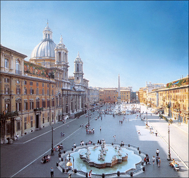
Reference
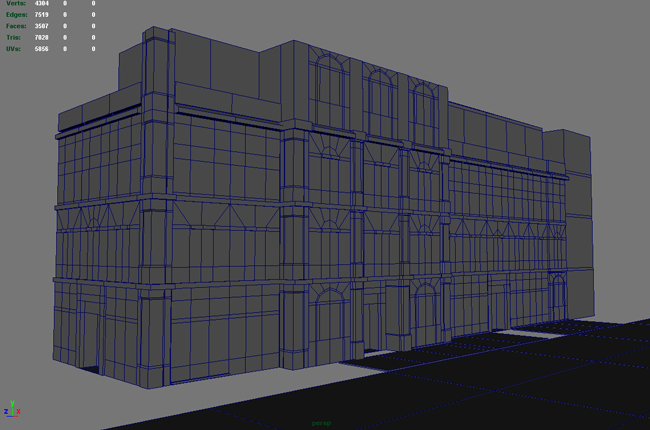
First day's work. Base model. General noodling around deciding on design. All are instanced from about 7 original pieces.
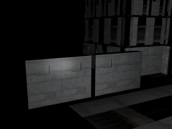
1st two unmerged blocks with seam problem. 2nd two merged..
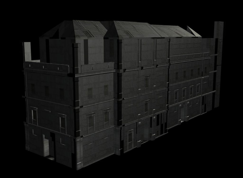
Larger view. Ugly placeholder textures and simple lighting. Viewport render using a CGFX shader from the Kjapi Engine. Right now this building stands at 12059 Tris / 5978 faces.
Working on this environment to take the place of my first one which died a horrible death through poor planning and a shaky concept. Trying to build it modular as I only have about a week and a half to get it all done. Want to get this main building, another smaller one (which if I have time will duplicate with colour/detail changes to fill out the rest of the square) and a fountain/statue in the middle of the piazza.
I have some questions about how such environments are normally put together. In a game engine I assume the pieces would all be separate, but how would seams be dealt with? In Maya the only way I've been able to stop the seam from being visible was to either offset the UVs at the borders or merge the different parts into one piece. The first solution results in it looking ok from far, but on closer inspection the seam is quite obvious. As for the second... I think that's kinda removing any performance benefits that modular design brings to the table..
I'd really appreciate any advice and critique you guys might have. Been looking through everyone's environment threads, about time I added one of my own. Thanks for looking!
Reference

First day's work. Base model. General noodling around deciding on design. All are instanced from about 7 original pieces.

1st two unmerged blocks with seam problem. 2nd two merged..

Larger view. Ugly placeholder textures and simple lighting. Viewport render using a CGFX shader from the Kjapi Engine. Right now this building stands at 12059 Tris / 5978 faces.

Replies
512 faces / 1005 tri. Still have a lot of optimisation to do. So far I've unwrapped 1 window panel and a column. More updates to come, just not tomorrow. I'm going fishing!
Your arch above the windows also interest me. Not sure what your final product is going to be like, but it looks as if you could have that arc be covered by the normal map. would save a bunch of tris too! But, depends on what your doing.
Cool stuff dude. Cant wait to see more!
Small update this time.
mikezoo - Thanks! Yeap.. definitely can clean it up a lot more. For this doorway I cut the front piece this way cause the vertex lighting was making it look really weird before Zbrush, but after it's not so bad.
As for the arch, this doorway is an example of the kind of detail I'm going for in Zbrush. Trying to make the most of my normal maps. This one came out a little blurry though, could be the stucco texture that I added in Photoshop with the Nvidia filter.
Cody - Thanks, I do have some references that I'm working from. Gonna establish my normals/sculpting first, then get to the textures. Still some problem areas left to model, like the roof of the first building, need better reference than what I have right now.
Will be attacking a few more panels tonight, keep the crits coming yeah! Thanks!
id say you need to go back and give it another go if it is.
firstly if your going to spend that many polys on pulling the stone out then that arch is woefully low polys add two extra spans at least.
secondly- get rid of all those 90 degree angles pull the exterior surface in to do this you will then be able to produce a component with a single smoothing group which will render faster and bake much better
thirdly the zbrush itself isnt very good i could acheive the same thing with nvidia filter in about 5 minutes. if your going to make normals this way, make sure it counts, that doesnt mean loads of details that means good shapes, take a bit of time, if i was to do this peice i would subD most of the bricks then just add some cracks and wear in Zbrush.
ive said this too a few people on these forums but remember normals work on angles height differences generally look crap its the angle between these which is important, so make the craks between the bricks like a chamfer/bevel and it will catch the light great, also if you offset the rotation (very slightly) of each brick that will also look great.
keep it up youve given yourself quite a task here but im sure you will learn from it ;-)
Thanks for the crit Shepeiro! Your posts are always inspiring.. Took a look at some environment wires, Strangefate, Cholden and yours to get some insight on this.
Haven't thrown it back to Zbrush yet, spent an hour cutting the geometry to help the normals, improve silhouette and such. Yeap, I know the normals are pretty weak now. At 4 am they seemed fine but thanks for bringing me back to my senses. I think my main problem is judging how many polys are necessary for the detail, always feel like I'm wasting too many on inconsequential details.
When you say one smoothing group, do you mean every edge in the object being smoothed? Not sure about how to connect up the faces to avoid ngons, seem to get lots of smoothing errors all over the place. It doesn't seem like the normal maps can get rid of these totally, or can they?
youve gone very high, with this now, when i said about adding the groves between the bricks i meant in ZB, i reakon you could getthe same shape (minus corner sillohette) with a better rounder arch for half the tris.