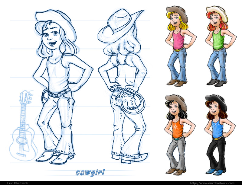
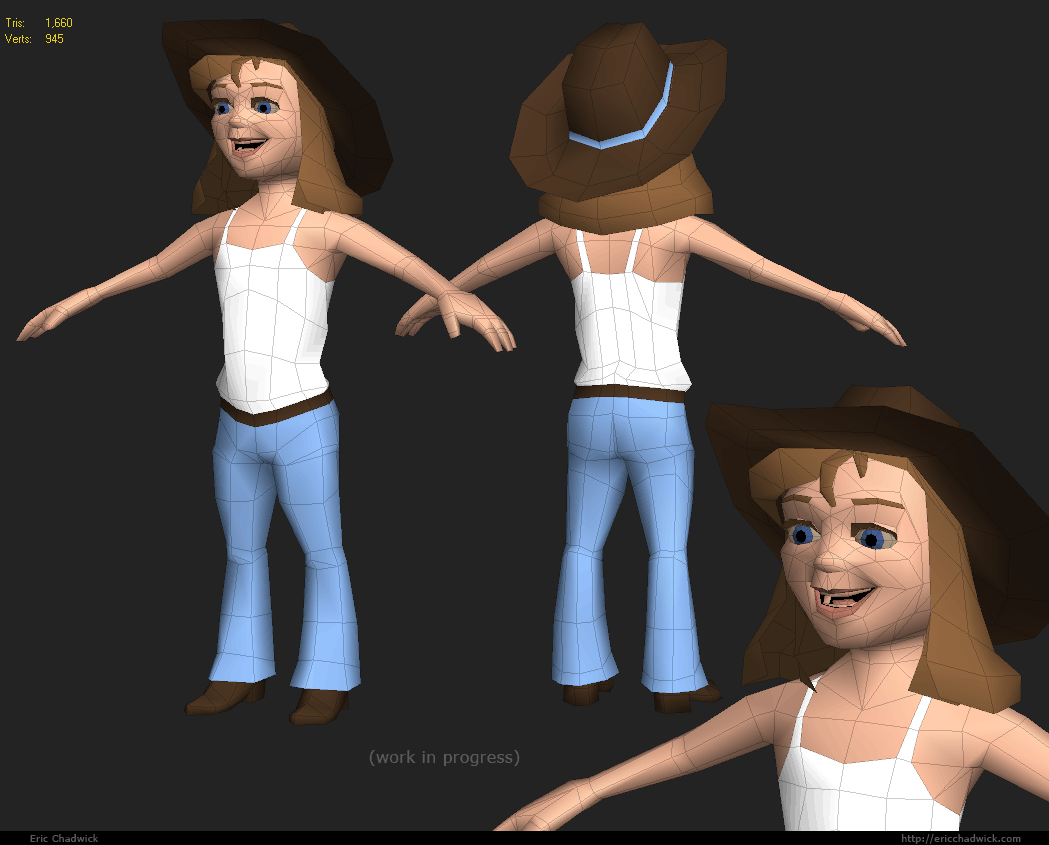
Something I'm working on for the iPhone/Wii crowd. Nice change of scene from normal mapping. Thinking about straightening out the UVs for the lips, too jaggy.
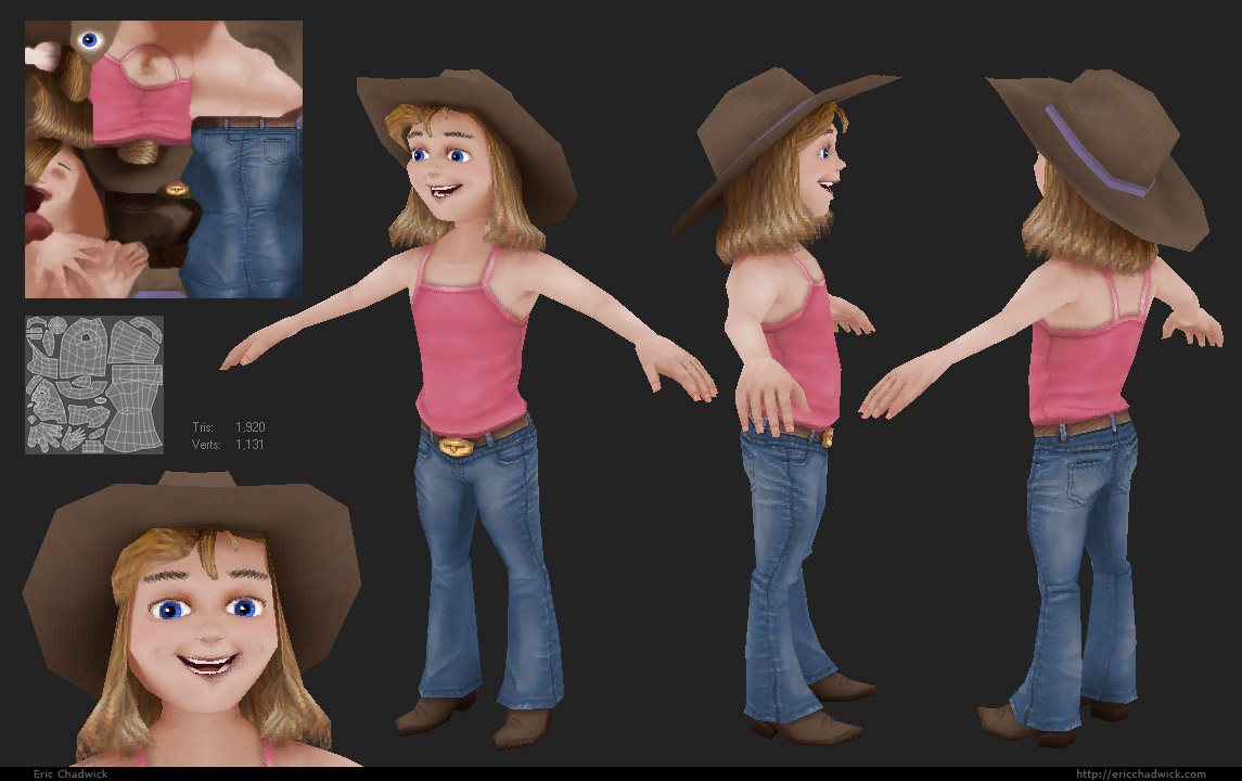
hehe, nice. That has tons of character. Maybe more shadow under the bangs/hat? Some painted spec on the boots could look nice too. The chest and shoulders look a little beyond tomboy, into manish territory
loved this. only thing i could say is maybe a little more work on the hats texture (a little too flat) and looking at her from the front theres an edge that sticks out from the crowd right at her cheek.. at 45 degrees and from the side her face's siluete is looking great.
made me wanna try something like this. pure diffuse.
Cute character, full of personality some slight shadowing could be used as said above but it all depends on how it looks in the intended game engine/format tbh.
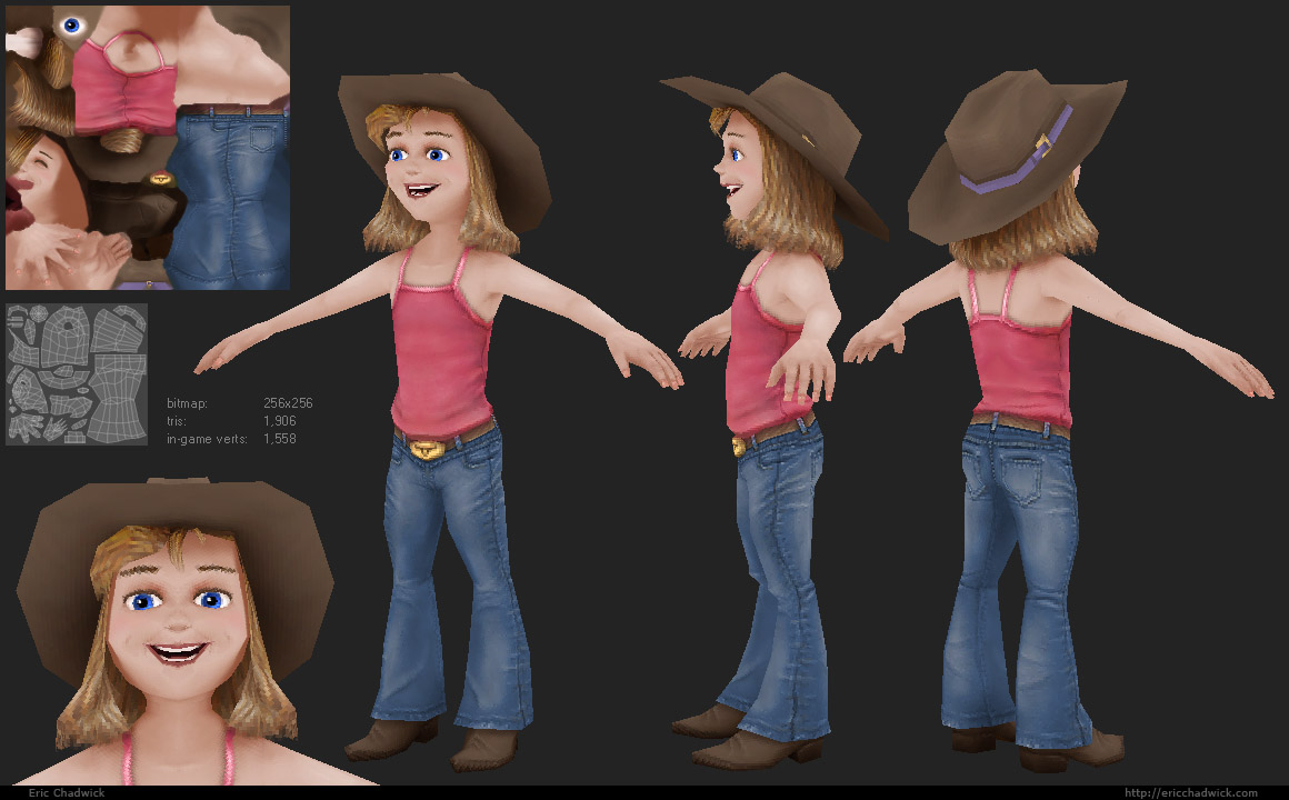
Thanks again for the comments and crits. Straightened out the lip UVs, some hat details, tweaked proportions. Going to learn me some rigging techniques before I pose it.
That jeans-texture is really nicely done! Personally, I'd do something with her skintone though. As it stands it's overly bright, and seems a bit bloodless. If you darken it a bit with a light pink/tan colour and add some redish tones at the edges of the shadows (and amp up the shadows as well, certainly under her armpits), I think it'd look a lot more lively.
Her hands also come off a bit manish due to the size, but that might just be me. I imagine if you'd make those any more slender, you'd lose the child-like feel to them.
edit: oh, you posted an update! The new lip is much better.
Thanks guys, great crits. Messing with the jawbone now, looking much better. Also able to shave off some redundant loops. Reduced the hand depth some, it helps. I don't think the skin will look as vibrant with darker shadows, but I'll try it out.
Damn I love those jeans, and nice colors overall.
Agreed with MightyPea about the skintone.The shoes could use some painted spec too, if they're leather. Also the silhouette of the arms look a bit plain, some thickness around the elbow and fatter palms might fix that.
nice presentation, maybe some move uv space could have been given to the hair but thats really nitpicky. other than that, the skin could maybe use another pass to add some depth and forms.the clothes look really awesome man.
Now that I see the uv's: didn't you put quite a lot of space between uv-islands? Not only is it diffuse-only (making bleeding slightly less of a problem), but you're only on a 256. I imagine you could have scaled everything up by a bit before you'd run into any problems, right? Just wondering, really. I'm mostly just curious if there was a specific reason for it, that's all.
About the UV space, I've been bitten before, so I made sure to have at least 2 pixels around each island. The average width in the tightest spots is about 4 pixels. Actually there's a mistake on the inner hair piece, that's the leaf-shaped UV in the middle, it's too close to the island below it so I'm getting a hair-thin dark brown edge. But it's pretty minor.
I'm point-sampling in these shots, so I could probably just get away with a 1-pixel space around each (2 pix total). But I wanted to make sure it would also work when mipped and filtered. Makes a difference when the character is smaller on screen.
nice modeling and texture work, eric! the fabric and wrinkles on the jeans is very nice. and i really get a playful feeling about the character!!
on posing... if she's leaning back that far, then you might want to add some twist in her spine and hips and definitely some side rotation. also - i think that her shoulders are tilted, but it's kind of hard to tell... maybe more tilt? the rope, her pulling arm and her shoulders will pretty much be a straight line if she's pulling hard enough to be leaning like that. and angle the back leg outwards a bit.
with the playful look of the character, i feel that the pose should be at least a bit exagerated. i would tie a rope to something and pull on it like you have her posed.
Replies
made me wanna try something like this. pure diffuse.
even 10 year old girls have boobs nowadays.
and either her arms are too short, or her hands are too big.
still very nice though
- BoBo
-Woog
Cute!
Her hands also come off a bit manish due to the size, but that might just be me. I imagine if you'd make those any more slender, you'd lose the child-like feel to them.
edit: oh, you posted an update! The new lip is much better.
Agreed with MightyPea about the skintone.The shoes could use some painted spec too, if they're leather. Also the silhouette of the arms look a bit plain, some thickness around the elbow and fatter palms might fix that.
GG on the texture and modeling.
Really fun stuff!
-caseyjones
About the UV space, I've been bitten before, so I made sure to have at least 2 pixels around each island. The average width in the tightest spots is about 4 pixels. Actually there's a mistake on the inner hair piece, that's the leaf-shaped UV in the middle, it's too close to the island below it so I'm getting a hair-thin dark brown edge. But it's pretty minor.
I'm point-sampling in these shots, so I could probably just get away with a 1-pixel space around each (2 pix total). But I wanted to make sure it would also work when mipped and filtered. Makes a difference when the character is smaller on screen.
on posing... if she's leaning back that far, then you might want to add some twist in her spine and hips and definitely some side rotation. also - i think that her shoulders are tilted, but it's kind of hard to tell... maybe more tilt? the rope, her pulling arm and her shoulders will pretty much be a straight line if she's pulling hard enough to be leaning like that. and angle the back leg outwards a bit.
with the playful look of the character, i feel that the pose should be at least a bit exagerated. i would tie a rope to something and pull on it like you have her posed.
overall, a great character. keep it up!!
I added it to the website, http://ericchadwick.com/img/cowgirl.html