Chaos Axe
Ok, so I've been posting a couple pics in the WYAWO thread, but I'm looking for some help on texturing at this point so I thought I'd make my own thread so that this can get cut up.
It's still WiP. Obviously there are still parts untextured. But I'm not happy with the direction of the pieces that are textured.
I haven't done much for specular other than copy the diffuse and lighten it up. So I definitely understand there needs to be more contrast there.
The reference is the Chaos Axe from Mythic here.
http://mythicmktg.fileburst.com/war/us/home/images/conceptart/CAT_0407_09.jpg
The low sits at 3500 tri's down from 4200 from a few days ago. It still might be a bit much but I'm less concerned with a few hundred tri's and more concerned with making it look proper and good.
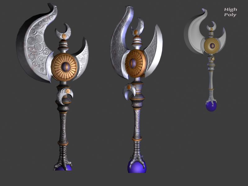
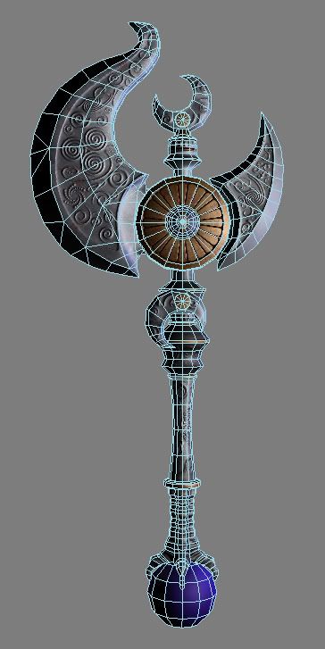
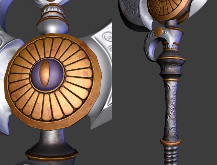
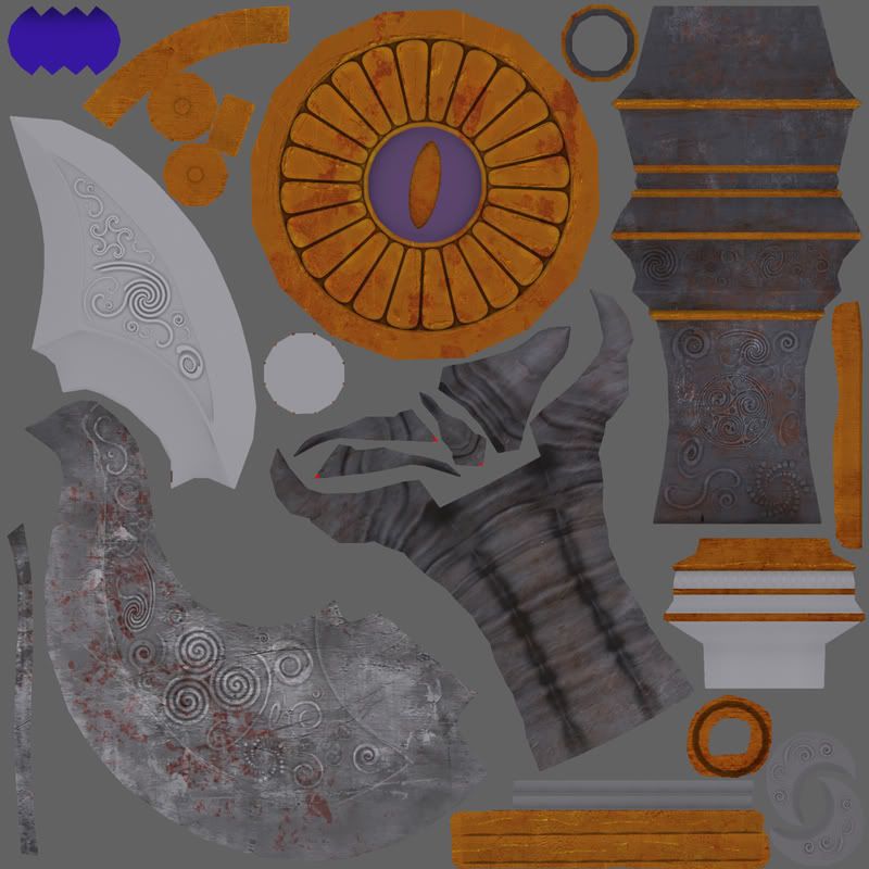
I want it to be noisey but I'm not sure if I'm getting the look I want. Trying to balance the noise with the shine of a forged metal blade...
I'm also not happy with the scratches on the bronze layer. They are too random.
I also think I should add more swirls and spirals to the normal map.
And I still have to paint in those black square divets into the base of the axe heads.
It's still WiP. Obviously there are still parts untextured. But I'm not happy with the direction of the pieces that are textured.
I haven't done much for specular other than copy the diffuse and lighten it up. So I definitely understand there needs to be more contrast there.
The reference is the Chaos Axe from Mythic here.
http://mythicmktg.fileburst.com/war/us/home/images/conceptart/CAT_0407_09.jpg
The low sits at 3500 tri's down from 4200 from a few days ago. It still might be a bit much but I'm less concerned with a few hundred tri's and more concerned with making it look proper and good.


I want it to be noisey but I'm not sure if I'm getting the look I want. Trying to balance the noise with the shine of a forged metal blade...
I'm also not happy with the scratches on the bronze layer. They are too random.
I also think I should add more swirls and spirals to the normal map.
And I still have to paint in those black square divets into the base of the axe heads.
Replies
Well, it's based on a concept which I linked to and is following the warhammer mythos. Judging from the shapes I would say this is based on the Warhammer Chaos God of Tzeentch, or Slaanesh.
Great job keeping the original design. Looks like you got your base textures painted, but now, you really need to dirty it up. Dirty. Scratches, blood, ect. At the moment, its looking too clean.
Keep it up!
Kawe: Yeah I knew about a bit of that blobby top area, I was having problems with sub-d modeling of it. It was pinching in really bad spots every time I tried to make it thinner, so I just stuck with this design even though its a bit wider. The modeling aspect won't be changed much at this point, until the textures done anyways I can remap the uvs and textures after its done on new geo if it really ends up being bad.
I'm not sure whether I'm making progress on this thing or not. I finished the blades but I still think its wrong. I mean it looks ok, I think, but I also think I'm just flooding it with light and spec to make it look shiny.
I think I'm gonna go back to the drawing board for some of these metals. I'm happy with the handle area, and I can tollerate the bronze part, but the blades look like poo I think.
I tried to dirty the rust a bit, not sure if that came out too well.
But I cut out the AO on the main rust areas and also masked out the normal map. And painted the normal in a little so the rust would sink in a bit.
Just zoomed in here because I didn't tweak the other metal parts.