ok something that i have been posting in the "what you workin on" thread for a while, decided to stop spamming the thread and create its own.
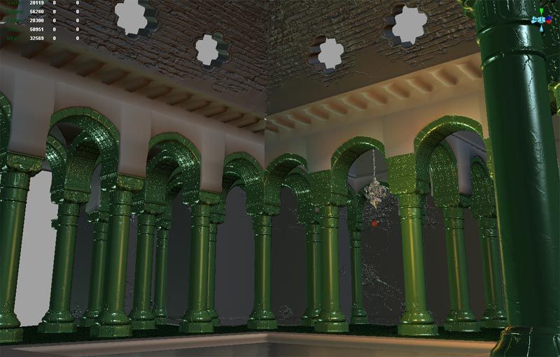
its a turkish/moorish style bathhouse, based on 360-highend pc specs, so it should end up pretty shiney.
so ive made a few of the highpoly assets for the more generic components of the room, got quite a bit to go, but im feeling i might even get this done ;-)
any crits are welcome, esp on the layout, not entirely happy with that at the moment.
Looks pretty good man! Solid stuff. On the layout, it's actually pretty decent, you have a nice grid and functionally it's pretty sound too.
Though your not making a mosque, the typology and building methods may apply: http://www.islamicarchitecture.org/architecture/themosque.htm
Two little crits on the last picture, square domes are pretty uncommon in that type of building. Around the central dome you have some crazyness in span direction, I can imagine your using wooden beams to span it, and you know, connecting them like you have now just isn't going to work.
cheers for that
this is the dome i will be going for: http://www.flickr.com/photos/xanthias/1182495125/sizes/l/
i hink they are fairly common, ive seen a couple like this in morroco
completely agree about the rafter structure round the main dome, needs plenty of work to solidify the design
You're off to a great start, SHEPEIRO. I'm currently building a ut3 level, and I'm building it almost exactly the same way. So I agree with your technique.
cheers,
proxzee- my work flow is to blockout, HP model and bake each compontent, add spec maps, add diffuse then light. this is why everything has and will have the same material (norms, and ao as spec map) until i get a much more completed scene. this way i feel you can make a much better job of the forms in the norms befor creating the feel of the surface type with the specular, then finally add the diffuse (i much prefer adding the diffuse last, then your not in danger of duplicating effects in the diffuse that are acheived in shader)
ah porco rosso, well its on indefinate hold, the programmer i was working on it with and me never seem to have time to work on it at the same time, and i really have to spend my free time looking towards the next gen shit.... not that im looking to pastures new at all ;-)
small update work is going slow on this, ive made some low poly changes to level but nothing worth showng, so in the mean time heres a massage table i made, damn shame it had some little toes at the end of each leg but zbrush crashed on me getting rid of those and to be frank i cant be bothered to do them again tonight.
yeah this is lookin pretty cool man- reminds me of that scene out of baron von-munchousen by terry Gilliam.
you sculpting is real solid, but I feel like you would get WAY better results if you modeled some sub-D stuff first, then banged it up from there. Like your roof pieces would look way more kick ass, if you actually modeled out a grate, the stone piping up the sides. and the bricks, then used your sculpting program to smash it all up.
This is looking good! I'm liking this so far, the floor in particular. The environment is very POP: Sands of Time, exactly my kind of thing.
I can't wait to see a decent lighting in this.
Edit: By the way, have you seen this website? He was the Art Director for pretty much all the POP games, and he has some excellent matte paintings and concept arts of various locations (with pillars). His colours and his mood is usually always spot on, definitely some good inspiration in there.
cody- mostly masks made in PS, then alot of stamping and a little propper scultping
Konstruct- your right, the pillar top was done that way, but boy does it take a bit longer, so Ive gone down the more sculpted route, also to try and improve my sculpting. but im gonna model the low poly a bit more and then you should see a bit more of how 3d the sculpt is ;-)
marcon- cheers, wont be going for a POP look, but nice lighting in all those concepts, i have an idea for the lightingof this scene already, but thanks for the inspiration
first attempt at the main dome, not really happy with it. going to add some plaster round the bottom to link it with the ceiling section better and get a little more shape into a few of those particularly flat bricks. also got some crappy issues on a few of the window sections
while the models and normal mapping certainly are ok I absolutely dislike the shader and material. Its obvious that you used the warm/cold contrast (to obvious) maybe add a 3rd light (greyish/ neutral) so that it looks more natural. Because right now everything looks like copper with extreme bump mapping (because of the very strong reflections and shadow color).
Well I am sure you'll be yet working on the material - just wanted to point out that I dont like the way it looks right now.
fair enough ;-)
all lighting so far is temporary, just a couple of low strength directions (green and blue) and warm point, when i finish the modeling i will lightmap the level, as i work i just want something that brings the normals out better than standard maya lighting.
again shaders are all temp as well, just normal map with phong and AO in specular slot. again just to help me while im working on the normals, when i finish those i wil do a shader pass on the whole level and get all the materials roughly right, I.e simple flat spec maps, spec focus values and reflection maps. after that diffuse and lighting. although i may do a quick lighting pass during roughing out the spec so i can get better values.
updated the last image plus a couple on the first page, got bored and had a play with some of the spec and diffuse values just to get more of an idea for it.
hope the shaders are slightly more towards your licking ;-)
yeah i would ad some sharper edges on those supports also that specular thingy is still hurting the image but i really like the direction you are taking with this , keep at it man.
cheers ged- any in particular, its all norms and ao bakes at mo
slight update, couple of new assets, the small dome, quite simple, as i plan to do more in the diffuse on this one, and a plaster joining peice, which i might give another go so that it joins up to the tiling of the pillar better.
another small update, damn that facebook, was distracting me all night.
last ceiling section done, all i have to do now is a couple of doorways and re-do that plaster join section, then i should be able to get on some fun stuff
yeah I just meant its gonna look great with the diffuse colours in there too. Now that I think about it, it would be really nice to see how your split up this scene into parts, how many normal maps and how many objects on the maps etc or is it all unique parts so that you can build new areas easier?
its all tilable to an extent, will show my peices once i get the last few blocked out.
that roof is tiled three times for example, the main dome is made of two halves, the dome support structure is tiled 1 & 1/2 times across each side etc etc
Pixelpusher- that lantern is the correct scale, i measured it ;-) i could oversize it but, that may be done when stuff is more finished
been watchin' this thread since ya started it. Its looking really nice right now. Im interested to see how you solve the seamage in that latest pic where the tiles meet the plaster. I love how you have the ceiling mold into the wood, makes it seem likes its ment to be there.
ok been on holiday from this for a while to build up a bit of steam for it again, so i started back on something nice and simple,
a fix for the plaster tile join in the form of some candle holders that nicely solve how im going to light this area. yay animated candles, no flames yet but the candles themselves have a secondary additive layer that has animated UVs so they flicker nicely
wow, could you say how many textures are you using for the whole level? It seems you are making batches of models with texturing instead of using default tileable textures.
ok been on holiday from this for a while to build up a bit of steam for it again, so i started back on something nice and simple,
a fix for the plaster tile join in the form of some candle holders that nicely solve how im going to light this area. yay animated candles, no flames yet but the candles themselves have a secondary additive layer that has animated UVs so they flicker nicely
bugo- roughly 8 1/4 x 2k peices for the main construction and a few odds and sods for some of the smaller bits (lantens candles grate), some of those space on have space on them for variations like the pillar and arch peice only uses half as i will do a more damaged variation. think i have 3 more main peices to do(bath, main entrance and steam room doorways) and a couple of smaller peices (a door and a hanging cloth for the steam room entrances) plus i still need to come up with some ideas for props.
all in all its pretty expnsive in memory for the small space but im going for something to show off sculpting and it will deffinatly run in game, plus im thinking once i get all these components done creating some offshoot rooms could be free
I have a question about going from the high polys to the low polys. Specifically for the archways and the plaster pieces above them. When you made the layout did you make the low poly meshes fit perfectly together? When you sculpted them, how did you sculpt them without moving those outer edges that fit perfectly together?
Or did you make the low poly, and then sculpt away knowing there would be a bit of overlap? It's one of the things in my workflow I'm a little unsure about. When making a modular enviro like this how much overlap are there to the pieces you make? Does it even matter? I find if I make pieces larger than they should be I have a headache trying to line everything up to the grid.
when i create the low poly i use instances, so that i can make them perfectly match across the border, then i would combine them with the conecting bits of the other instances and delete everything beyond 1 or two polys from the actual piece. hope that makes sense
basically makinf sure there is a poly extra to take up the slack but that poly is in exactly the same place as the next component would be when they are finally sloted together
with something like the peice above the arch i actually make an extra section for zbrush it then when i render out i have two lowpoly meshes the main one, then the edge bits from the the main one placed together in the same pos as the extra zbrush section, its then a case of rendering this oui=t seperatly and pasting it ontop in PS and erasing masking out the edges.
but there are many different ways of doing this it depends on the shapes you make
Replies
Though your not making a mosque, the typology and building methods may apply:
http://www.islamicarchitecture.org/architecture/themosque.htm
Two little crits on the last picture, square domes are pretty uncommon in that type of building. Around the central dome you have some crazyness in span direction, I can imagine your using wooden beams to span it, and you know, connecting them like you have now just isn't going to work.
this is the dome i will be going for:
http://www.flickr.com/photos/xanthias/1182495125/sizes/l/
i hink they are fairly common, ive seen a couple like this in morroco
completely agree about the rafter structure round the main dome, needs plenty of work to solidify the design
Loving the detail at the top of the pillars.
proxzee- my work flow is to blockout, HP model and bake each compontent, add spec maps, add diffuse then light. this is why everything has and will have the same material (norms, and ao as spec map) until i get a much more completed scene. this way i feel you can make a much better job of the forms in the norms befor creating the feel of the surface type with the specular, then finally add the diffuse (i much prefer adding the diffuse last, then your not in danger of duplicating effects in the diffuse that are acheived in shader)
didnt take my own advice and made a quick diffuse and spec for this one.
will probably split the glass onto another material with a reflection map and a bulb
On a side note. What ever happened to that awesome Porco Rosso project you were working on? I loved that stuff.
you read my mind, Shepeiro your thread was closed becasue noone posted for a year:(
I wana see my Porco Rosso!!!
small update work is going slow on this, ive made some low poly changes to level but nothing worth showng, so in the mean time heres a massage table i made, damn shame it had some little toes at the end of each leg but zbrush crashed on me getting rid of those and to be frank i cant be bothered to do them again tonight.
you sculpting is real solid, but I feel like you would get WAY better results if you modeled some sub-D stuff first, then banged it up from there. Like your roof pieces would look way more kick ass, if you actually modeled out a grate, the stone piping up the sides. and the bricks, then used your sculpting program to smash it all up.
I can't wait to see a decent lighting in this.
Edit: By the way, have you seen this website? He was the Art Director for pretty much all the POP games, and he has some excellent matte paintings and concept arts of various locations (with pillars). His colours and his mood is usually always spot on, definitely some good inspiration in there.
http://www.raphael-lacoste.com/Matte_Paintconcept/dossiers/matte_SITE/index.htm
Konstruct- your right, the pillar top was done that way, but boy does it take a bit longer, so Ive gone down the more sculpted route, also to try and improve my sculpting. but im gonna model the low poly a bit more and then you should see a bit more of how 3d the sculpt is ;-)
marcon- cheers, wont be going for a POP look, but nice lighting in all those concepts, i have an idea for the lightingof this scene already, but thanks for the inspiration
Looking for a job doing next-gen environment art?
You know where I am...
MOP- i do ;-)
Well I am sure you'll be yet working on the material - just wanted to point out that I dont like the way it looks right now.
all lighting so far is temporary, just a couple of low strength directions (green and blue) and warm point, when i finish the modeling i will lightmap the level, as i work i just want something that brings the normals out better than standard maya lighting.
again shaders are all temp as well, just normal map with phong and AO in specular slot. again just to help me while im working on the normals, when i finish those i wil do a shader pass on the whole level and get all the materials roughly right, I.e simple flat spec maps, spec focus values and reflection maps. after that diffuse and lighting. although i may do a quick lighting pass during roughing out the spec so i can get better values.
hope the shaders are slightly more towards your licking ;-)
antone know a good technique for cutting normalmapped objects without fucking up the normals on the cut polys (corner of roof support section)
slight update, couple of new assets, the small dome, quite simple, as i plan to do more in the diffuse on this one, and a plaster joining peice, which i might give another go so that it joins up to the tiling of the pillar better.
last ceiling section done, all i have to do now is a couple of doorways and re-do that plaster join section, then i should be able to get on some fun stuff
that roof is tiled three times for example, the main dome is made of two halves, the dome support structure is tiled 1 & 1/2 times across each side etc etc
Pixelpusher- that lantern is the correct scale, i measured it ;-) i could oversize it but, that may be done when stuff is more finished
a fix for the plaster tile join in the form of some candle holders that nicely solve how im going to light this area. yay animated candles, no flames yet but the candles themselves have a secondary additive layer that has animated UVs so they flicker nicely
gonna do the bath tommorrow
all in all its pretty expnsive in memory for the small space but im going for something to show off sculpting and it will deffinatly run in game, plus im thinking once i get all these components done creating some offshoot rooms could be free
I have a question about going from the high polys to the low polys. Specifically for the archways and the plaster pieces above them. When you made the layout did you make the low poly meshes fit perfectly together? When you sculpted them, how did you sculpt them without moving those outer edges that fit perfectly together?
Or did you make the low poly, and then sculpt away knowing there would be a bit of overlap? It's one of the things in my workflow I'm a little unsure about. When making a modular enviro like this how much overlap are there to the pieces you make? Does it even matter? I find if I make pieces larger than they should be I have a headache trying to line everything up to the grid.
Can't wait to see this textured man!
basically makinf sure there is a poly extra to take up the slack but that poly is in exactly the same place as the next component would be when they are finally sloted together
with something like the peice above the arch i actually make an extra section for zbrush it then when i render out i have two lowpoly meshes the main one, then the edge bits from the the main one placed together in the same pos as the extra zbrush section, its then a case of rendering this oui=t seperatly and pasting it ontop in PS and erasing masking out the edges.
but there are many different ways of doing this it depends on the shapes you make