The BRAWL² Tournament Challenge has been announced!
It starts May 12, and ends Oct 17. Let's see what you got!
https://polycount.com/discussion/237047/the-brawl²-tournament
It starts May 12, and ends Oct 17. Let's see what you got!
https://polycount.com/discussion/237047/the-brawl²-tournament
Punk Rock Robot - DS Specs
After making my little pottery shop DS level and thoroughly enjoying low-poly, I've decided to do an animation for DS spec for my Character Animation class. It's going to be a punk rock robot doing a wicked solo onstage; for the animation I will probably mo-cap it myself (my school has a Vicon mo-cap studio). I'm really interested as to how motion capture will translate to a low-poly character. I would really appreciate critiques on his topology and whether I should lower or raise his tri-count since he's being animated.
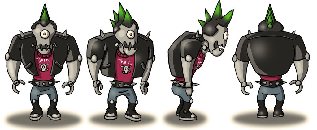
Here's his model sheet:
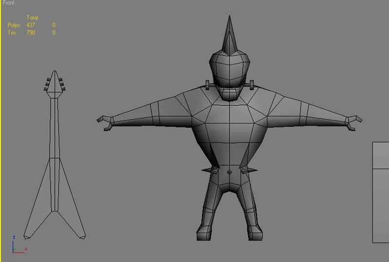
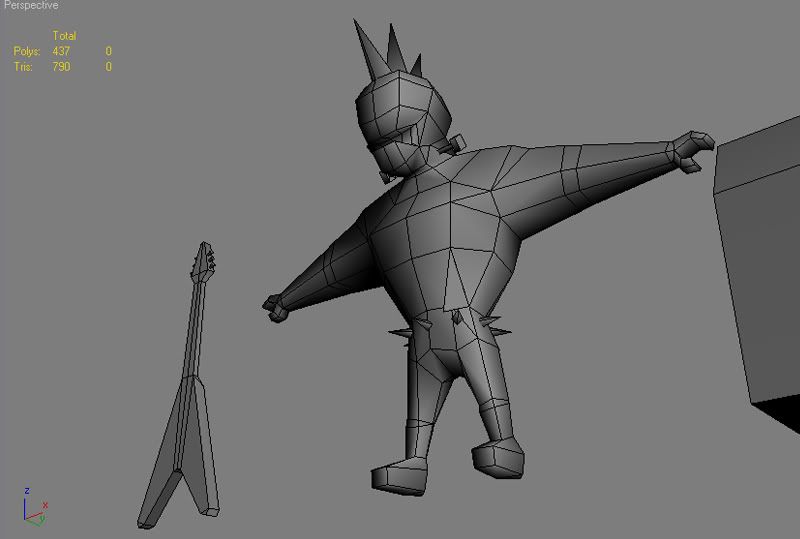
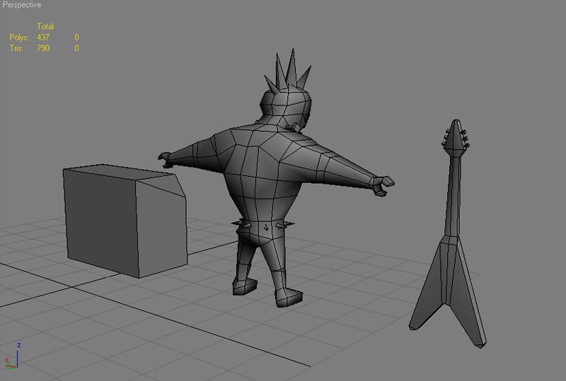
And here's my progress so far, he's ready to be unwrapped I'm just curious on his topology before I do so.
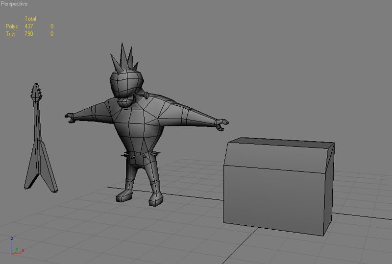
Thanks!:)
Here's his model sheet:

And here's my progress so far, he's ready to be unwrapped I'm just curious on his topology before I do so.


Thanks!:)
Replies
Looks like the deformations might be good.
I'd say the guitar has too many polys up the mid though. I don't think they will show and I think you could get by just fin NOT mirroring the neck texture. Would only take a few more pixels to paint the whole neck., the back won't be seen at all probably and the frets on the front could stretch striaght across and probably not be noticable.
The Mo-Cap studio sounds really cool, you should deffinately take advantage of that.
I very much doubt you'd see the spikes and bolts all that well though, at best they'll be a scintilating mess as smaller objects are fighting to be displayed within a couple of pixels- best bet is to take a screenshot without AA at DS resolution
If you want to keep them, I'd recommend exaggerating them some more so when the character is on screen you can make out the silhouette much clearer from mid distance
I think looking at his character design the spikes make him look to Kiss-like and not enough punkrock so I'm gonna delete the spikes to save polys and make less jumbled (thanks for the idea Chunkey:)). I'm gonna' give him a studded belt instead that's just textured on.
I've been studying the amazing low-poly characters on here and they're quite inspirational, that's why Polycount's the best! I'm still open for more critiques!:poly142:
looking forward to the texture!
After rigging him I realized that mo-capping on him will be impossible so I'm gonna' have to hand animate his little solo. His proportions, such as large chest and small legs, would be quite troublesome for motion capture.
I still have to build a stage for him but I am unsure as to what to do for it. Anyways, any comments or crits will be greatly appreciated!
I think you should add an elbow joint though just like the wrist. He's kindof plain on the arms and that would explain how he bends too.
To also get a better idea of how he'll look on the DS make sure to turn all of your image filtering off. You can do this in your viewport and when you render. That will really help. It's looking great, keep up the good work.
yeah this really depends on the game though, I know with Guitar Hero DS we use much higher polycount for the characters, around 2000 tris actually. however, there's not much else on screen showing at once outside of the one character and the venue behind it. so while it is possible to have much more, it really depends on the circumstances.
I like what you've come up with quite a bit but I'm curious as to what texture sizes you are using. Also - how're you liking it there? I graduated last december.
As for the character above, 700 tris is feasible as long as everything else is pretty low poly. The problem is that your polygon usage isn't very efficient. The tuning pegs, for instance, could be done with a single quad with an alpha running through the neck of the guitar. You'd never notice the difference on the DS, and it's entirely possible that you wouldn't see the pegs at all. Likewise, you don't need the geometry that raises the strings above the head of the guitar. The belt spikes are a similar case, though it looks like you've already removed them in the texture version.
What's your texture resolution? Everything looks pretty sharp.
here's my reference, at least.
http://multiplayerblog.mtv.com/2008/04/15/developer-guitar-hero-ds-almost-had-five-or-six-fret-buttons-successfully-breaks-the-rules/
"Technologically, this game marks a highwater mark for Vicarious Visions, a studio that has already pushed the DS harder than most studious outside of Nintendo. Each character is around 2200 polygons, Bala said. The most-detailed character Vicarious Visions had previously rendered on the DS were 600 polygons."
I know he slides a bit but I didn't have much time to animate him. I rendered him out in smaller actual ds dimensions and you don't notice the sliding much.
The whole scene is 840 tris so it's under the limits and if I wanted I could make a little scene on the bottom screen for controls.
Here's the master page for it. I goofed on the wireframe render though, the guitar is supposed to have a plane for the tuning knobs up top instead of modeled knobs like the old post.
The texture maps are 256x256 since there isn't too many of them. The textures are self-illuminated and the video has no lighting, I simply linked a shadow plane/card on him and animated the opacity.
Anyways, lemme know what you guys think.
The model itself is pretty bad ass, good character to him. Maybe you can add a bit more to the scene though, some loose wires, maybe some posters in the background. I've never played on an empty stage like that.
Keep it up man, looking awesome (FIX ANIMATION!!!!!)
As for the model I really have to give thanks/credit to Xavier Coelho-Kostolny and James Stout for being generous enough to post their awesome SDKs on Polycount. They were a great inspiration and reference for Punk Rock Robot. It's surprisingly difficult to build a lowpoly character that articulates so well, but checking out their models was a huge help when I wasn't sure. Thanks guys!