First Hi poly model, could use some advice
I'm a long time lurker on here, posted once or twice, but in general a little scared to put my work up most of the time :P
I've done a few low poly dbz models in the past, but I wanna get into the high poly modeling scene, recently discovered the joys of Zbrush.
Anyhow, I quit wow 2 months back, but I've had problems controlling my urges, so I decided a way I could settle them and get back into modeling would to be design my own Paladin tier, and model it. So I came up with some concepts, finalised one, did a painting to work out the colours, and started the struggle to create a high poly model. I've not finished his sword yet, but I wanna get him into zbrush asap, but before I map him fully I wanted to know if I'm going wrong anywhere. I've not made a high poly model before, so I'm unaware of all the pitfalls I may come across, I've played around in Zbrush and got down with the controls, but that's about it. Parts of the model I'm concerned about are as follows:
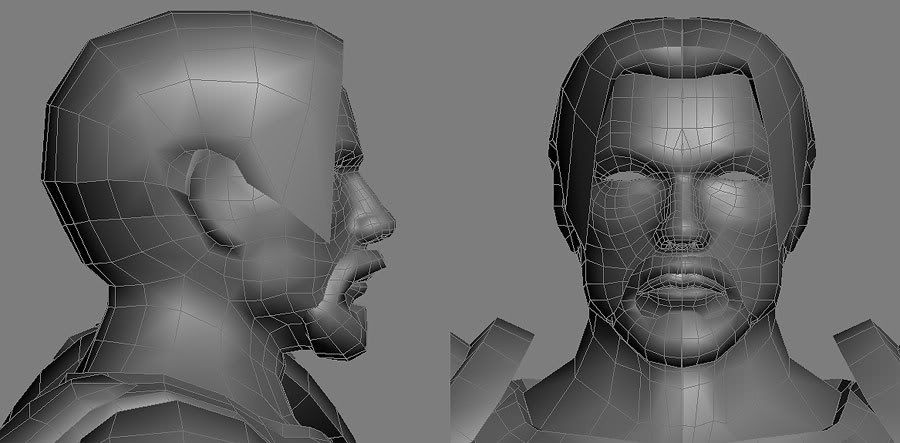
1) Hair: will it be ****ed? will it do as it is or is there a better way of modeling the hair I'm unaware of? I've only really done anime hair before, so this is new teritory for me. I dont know how normal maps and alpha maps can work together, so I'm pretty scared
2) Where I have 2 objects intersecting so I didnt have to model connections (like the beard on the face and the belt around the waist) does this cause any problems with normal mapping/sculpting, or is there a nice way of getting it to work?
3) IM SCARED
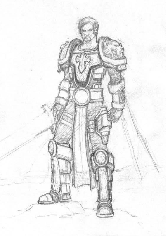
anyhows here's my concepts, my final pencil sketch and a pimping scene of him fending off undead with his holyness
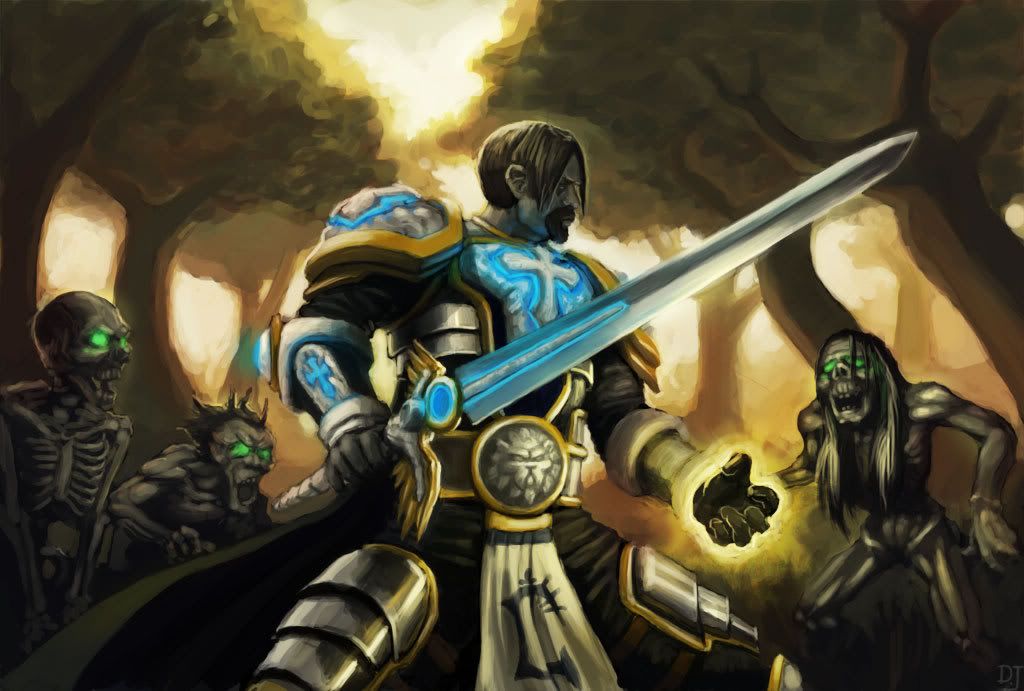
I know the sword is fudged, but after 16 hours working on that i cba to do anymore
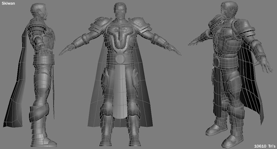
and here's the model, sitting in at 10610 tri's without the sword. Is that bad :S?
anyhows crits comments and advice are extremely appreciated
I've done a few low poly dbz models in the past, but I wanna get into the high poly modeling scene, recently discovered the joys of Zbrush.
Anyhow, I quit wow 2 months back, but I've had problems controlling my urges, so I decided a way I could settle them and get back into modeling would to be design my own Paladin tier, and model it. So I came up with some concepts, finalised one, did a painting to work out the colours, and started the struggle to create a high poly model. I've not finished his sword yet, but I wanna get him into zbrush asap, but before I map him fully I wanted to know if I'm going wrong anywhere. I've not made a high poly model before, so I'm unaware of all the pitfalls I may come across, I've played around in Zbrush and got down with the controls, but that's about it. Parts of the model I'm concerned about are as follows:
1) Hair: will it be ****ed? will it do as it is or is there a better way of modeling the hair I'm unaware of? I've only really done anime hair before, so this is new teritory for me. I dont know how normal maps and alpha maps can work together, so I'm pretty scared
2) Where I have 2 objects intersecting so I didnt have to model connections (like the beard on the face and the belt around the waist) does this cause any problems with normal mapping/sculpting, or is there a nice way of getting it to work?
3) IM SCARED
anyhows here's my concepts, my final pencil sketch and a pimping scene of him fending off undead with his holyness


I know the sword is fudged, but after 16 hours working on that i cba to do anymore
and here's the model, sitting in at 10610 tri's without the sword. Is that bad :S?


anyhows crits comments and advice are extremely appreciated
Replies
I can't see much wrong with the model tbh, the polycount is just about right if he's some sort of hero character.
You can bring the different parts of him into zbrush as different subtools, I'm not really very clued up on zbrush though, someone who can explain it properly to you will post I'm sure or have a search for zbrush subtools.
As for alpha and normal maps, I've not heard anything which would say they can't be used together. If anything would be an engine dependant thing.
Where are his eyes lol, just noticed. This is looking great though, looking forward to seeing some updates!
But overall I think he's pretty decent.
The polycount really depends on what it's for. I know Morrowing had suits of armor that ran upwards of 10,000. The characters (naked) were at least 5,000. It all got rendered together. Plus weapons of a couple thousand polys.
Oblivion probably doubled that easy.
As for your mesh, I think the face looks really good. The only complaint I have is that the knees look low to me. And the pelvis belt area is kindof weird.
Realistically the belt would probably be thinner in the back and higher on the butt which it looks like he really doesn't have. Then the lower belly dseems out in front of the hips too much. Obviously he isn't the beer belly type of guy.
Edit-
A second look made me think the side view ofchest is a bit weird to. It looks fine below neck and above armor. But then the armor sticks out reall far, and at bottom of chest plave his upper body seems right there. hmmm, looking again I think maybe the chest plate just sticks out so much .... I think there's too much of a dent under his neck. Maybe proportionately it's correct, it might just be that the armor would be better without so much shape on the top.
I agree with Baddcog about some of your proportions tho. The legs do look a little off, but they are very close. The thing that grabs my attention, however is the feet. I like your design a lot, but they just look too big compared to the rest of the mesh. I would say you could scale the feet down some, or you could compensate by making the hands bigger, and go for more exaggerated proportions which could certainly look very cool also.
Overall tho, You have a great model going, I cant wait to see it finished!
-N
I'm still really concerned about the workflow, on another forum somebody told me I've made this too detailed and I should have started on a low poly version, sculpted then create a mid poly model to project the sculpt onto. Can somebody please give me some advice towards the working process that's best? I'm aiming for UT3 kind of quality, if that helps at all. Also, how much does it matter when I do the UV's?
Would really appreciate the help
btw, I'm much more into my drawing/painting than modeling, but i've always been really interested in modeling, and I like doing it for fun
A lot of people like making a basemesh (what you call lowpoly) first cause it probably feels more creative since they can make up the details as they go.. and add last minute details when needed without.. without affecting the in-game mesh since it doesn't even exist yet.
So I'd say if you are confident in your concept and skills you could do it either way.. maybe even the way you are doing it is better since it'd limit how far you can stray from the original concept.
Now as always.. I'm far from pro but I hope my brain works well enough to be of help
i think there is something lost in translation between the concept and the model, face wise.
the concept has this fierce grit and determined look, which the face is somewhat lacking... i can't put my finger on it though, i think it's the forehead and brow area.
other than that, it's friggin sweet. texture it!
Thanks for the advice and crits guys, you've been a really big help so far, after some troubles uvmapping decided to say fuck it and get it in zbrush and see if i can use the damn program
my first real attempt, ignore the beard its kinda a place holder, if anyones got some recommendations go for it, I'd really appreciate it
get the most you can out of the lowest layers, then move to the next layer and do the same. really push each subdivision for as much as possible before moving forward.
other than that, he's looking a bit more fierce =]
Nice paintings!