Killaball's portfolio/wip
Hi I would love some critiques on my portfolio work and on my wips that will come shortly.
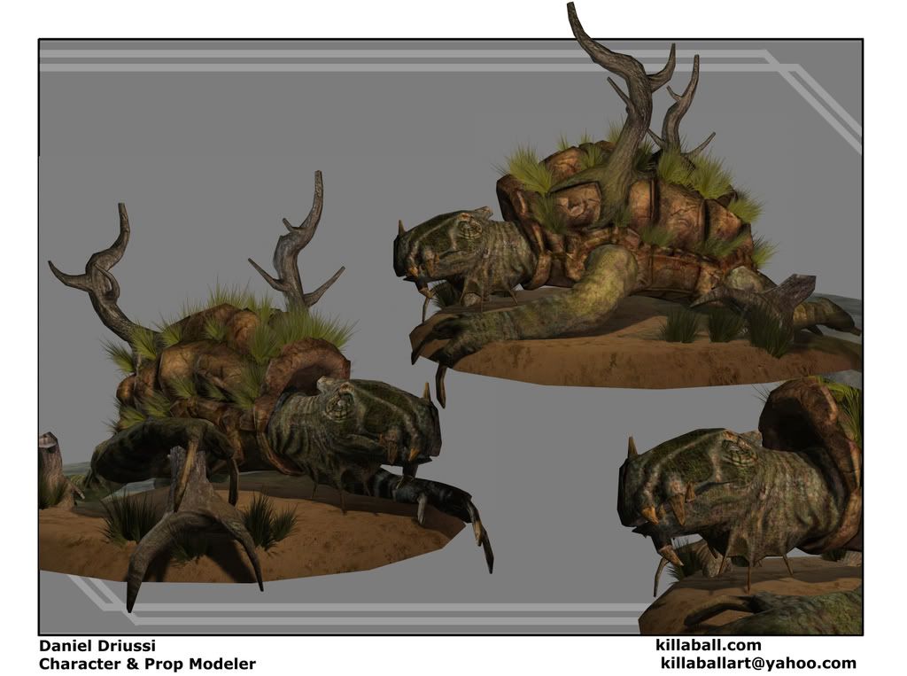
The turtle is just over 5k tris and with the trees and grass on it's shell its pushing just under 8k tris.
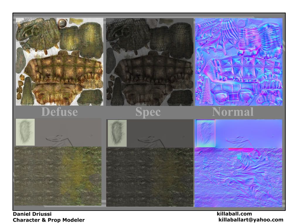
All textures are 2048X2048


The turtle is just over 5k tris and with the trees and grass on it's shell its pushing just under 8k tris.

All textures are 2048X2048
Replies
What's that bottom texture? Seems like a lot of wasted space as well as repeated texturing.
Also it's called diffuse and not defuse.
I kind of like the turtle. The hands don't seem to follow the concept though however I think it looks nice cause this version is more treelike
And thank you I did not catch the diffuse misspelling.
Anyway.. I think this looks good and I like your creativity. You're good at going from concept to finish, however.. if I were to be picky, I'd say I like your concept art better than your model. Specifically how the turtles face is a bit flatter.. it doesn't protrude out as much.
Oh, and before someone else says anything.. post your wireframes if you got 'em.
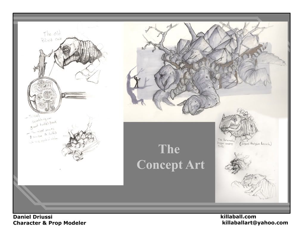
Ah here is the concept art for it.
He is suppost to be older then I drew him in the concept art so I made him a bit thinner and less buff.