The BRAWL² Tournament Challenge has been announced!
It starts May 12, and ends Oct 17. Let's see what you got!
https://polycount.com/discussion/237047/the-brawl²-tournament
It starts May 12, and ends Oct 17. Let's see what you got!
https://polycount.com/discussion/237047/the-brawl²-tournament
Abdallah - Iraq themed level
Hello.
Have been lurking around polycount for quite some time but never posted any work. So it's about time I do so!
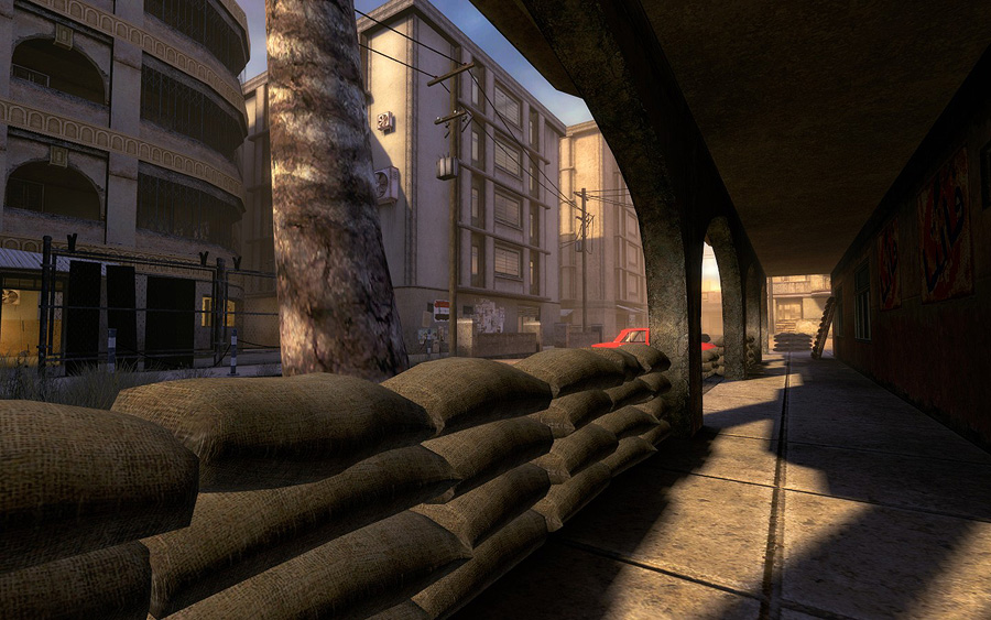
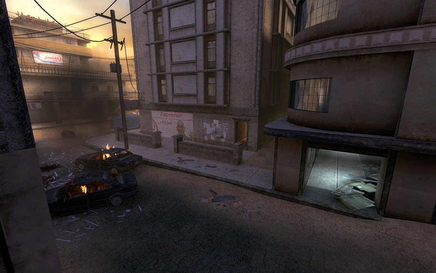
This is a level called ins_abdallah for the Insurgency HL2 mod. I have been working on this level for over a year now. I was responsible for nearly everything in this level: Concept, layout, brushwork, environment art (save by the vehicles, foliage and other minor assets), optimizing and lighting.
I tried to step away from the obvious and overdone "shades of brown/yellow" look, and went for a more colorful one, despite the war theme.
The map was just released to the public and you can grab it in the official site: http://www.insmod.net/
Screenshots:
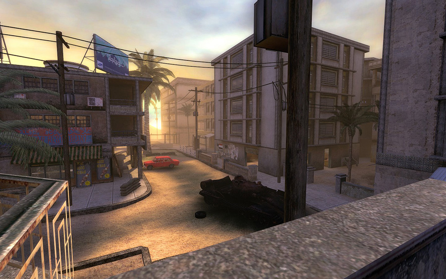
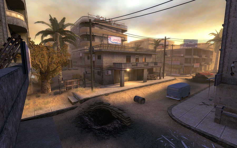
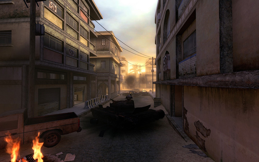
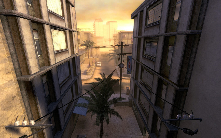
Credits:
Additional textures: Insurgency team (most notably: ooghi, spine and union)
Additional models: PhilipK & Insurgency team (most notably: steppenwolf, pericolos0, skybex)
Soundscapes, Ambient sounds: Stringed_Evil
Overhead map/loading screen: Spielmann
Special thanks:
My girlfriend (for being so patient over the year), Skjalg, Stringed_Evil, endless, brooker, spielmann, 2d-chris, Bluestrike, steppenwolf, the entire INS staff, helpful community members, anyone I may be forgetting!
Download:
INSURGENCY: Modern Infantry Combat (it's included in the latest release)
About Insurgency:
Insurgency (INS) is a total conversion mod for Valve Software's Half-Life 2, powered by the Source Engine. INS immerses the player in an intense online combat experience. Set on the modern battlefields, Insurgency simulates infantry combat that encourages the use of teamwork and tactics to close with and destroy the enemy.
Have been lurking around polycount for quite some time but never posted any work. So it's about time I do so!
This is a level called ins_abdallah for the Insurgency HL2 mod. I have been working on this level for over a year now. I was responsible for nearly everything in this level: Concept, layout, brushwork, environment art (save by the vehicles, foliage and other minor assets), optimizing and lighting.
I tried to step away from the obvious and overdone "shades of brown/yellow" look, and went for a more colorful one, despite the war theme.
The map was just released to the public and you can grab it in the official site: http://www.insmod.net/
Screenshots:


Credits:
Additional textures: Insurgency team (most notably: ooghi, spine and union)
Additional models: PhilipK & Insurgency team (most notably: steppenwolf, pericolos0, skybex)
Soundscapes, Ambient sounds: Stringed_Evil
Overhead map/loading screen: Spielmann
Special thanks:
My girlfriend (for being so patient over the year), Skjalg, Stringed_Evil, endless, brooker, spielmann, 2d-chris, Bluestrike, steppenwolf, the entire INS staff, helpful community members, anyone I may be forgetting!
Download:
INSURGENCY: Modern Infantry Combat (it's included in the latest release)
About Insurgency:
Insurgency (INS) is a total conversion mod for Valve Software's Half-Life 2, powered by the Source Engine. INS immerses the player in an intense online combat experience. Set on the modern battlefields, Insurgency simulates infantry combat that encourages the use of teamwork and tactics to close with and destroy the enemy.

Replies
Looks great, the buildings are nicely textured and as PeterK said the lighting does it. Seems like somewhere that hasn't seen the worst of the fight yet, there isn't too much damage to the buildings structurally or rubble but whether that was a design decision or not I don't know.
I think if you faded the roads and kerbs and pavements and lower walls into each other it would seem more natural. You could do a lot of that via texture.
I found this image:
The power lines are done ingame, through the use of specific source entities. It's a very nice feature only Source has afaik
Yeah I agree. I'll replace that sign with a prop sometime in the future.
Nice one on seeing through the level for over a year! I know it can be hard to sometimes to keep the drive going.
Yeah there isn't much rubble and destruction indeed. It was a design decision. I always wanted to do a close combat map with nice amounts of details. In order to do that, I had to lay out nice and efficient visibility portals to avoid running into performance problems.
Some other mappers tried to have more debris and destroyed buildings. Those maps have the worst performance so far. Due to its origins (Quake/Half-Life that were about indoor maps), Source can't do open maps very well. Nobody has complained about performance in my map yet, so I guess it was a good design decision
Agreed. The sidewalks are something I really wanted to improve. I'm trying to figure out a way to do that without hitting performance. The only way to have alpha blending on textures in source is through the use of displacements, which don't block visibility and would consequently force me to re-optimize most of the map.
This looks great. I really like that you wanted to go away from the "brown" look of Ins and wanted to make it more colorful and I think you did a great job of that. I really like the 2nd shot. Very pleasing and looks well constructed.
The only thing that bothers me is the sidewalk texture. It's a bit out of place. Other then that, I think you did a great job on this.