Wiimote.
Working on this a little this morning. Just a couple of questions to all of you. As of right now the buttons are all separate objects. I was wondering what would be the best way to make the little bevels for the buttons to sit in. Should I just duplicate the object and Boolean out the duplicated object? Also as of right now on the top and bottom it is a multi-sided polygon(N-gon or whatever.). What would be the best way to take care of that? Triangulate it?
1.
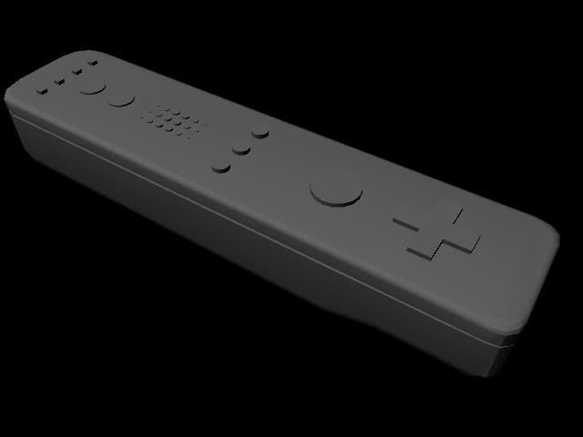
2.
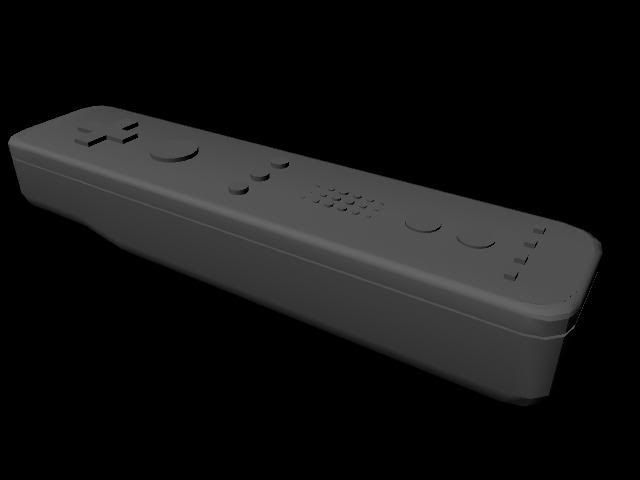
3. What are those weird shadows?
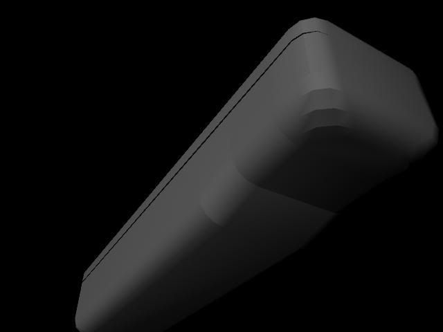
I know there are a few questions, but help would be great! :poly108:
Bye.
Edit: Just wondering, is there a way to make an object in Maya that is the exact dimensions of the Wiimote? Instead of just eyeballing and resizing it to look about right?
The body of the Wii Remote measures 148 mm (5.83 in) long, 36.2 mm (1.43 in) wide, and 30.8 mm (1.21 in) thick
1.

2.

3. What are those weird shadows?

I know there are a few questions, but help would be great! :poly108:
Bye.
Edit: Just wondering, is there a way to make an object in Maya that is the exact dimensions of the Wiimote? Instead of just eyeballing and resizing it to look about right?
The body of the Wii Remote measures 148 mm (5.83 in) long, 36.2 mm (1.43 in) wide, and 30.8 mm (1.21 in) thick
Replies
Quite probably unwelded vertices.
That should remove those shadows, and it will give you a nice smooth look.
And for getting it to be 5.83 in long, 1.43 in wide, and 1.21 in thick, just go into the channel box and set the length (could be either x or z depending on which way you modeled it) to 5.83, yet y to 1.21 and set the remaining one to 1.43.
That will give you perfect dimensions, but you may need to tweak the model a bit after that.
How have you built this, some wires would help give more advice.
1.
2.
How do you create measure tools? Thank you Joopson, I might try this tomorrow.
The speaker is the worst thing there though. The speaker is actually indented in with a hole, it doesnt stick out. So you have a choice. Either model the hole into the base mesh (Correct if you want uber high poly) or just texture the hole on the surface. Given the fact this mesh si so low poly (Just because you throw loads of polies at it, it does NOT make it high poly), I would say remove the speaker surfaces and jsut texture it on.
So how would I do the holes? Just Boolean them out? Someone posted cut your own? Would I use the split poly tool?
I know the buttons suck and are wasteful as hell, just wanted to get an idea or two on how to do the buttons before I started them.
Tried the checker thing, and should I make my own or use the Maya one? I just used the Maya one, and the automatic mapping tool and this is how it looked. How do I align those checkers?
Around the corners, there is a little messing up a bit. I used the Normals>Soften Edge, and it made the edges look sooo much better. Thanks for that tip!
Well the checkered thing looked ok, besides around those edges, so I thought I might try a texture on it, adjust the buttons where needed, but when I scaled down the wiimote texture, the Home, and Power look blah, the holes look ok. Also what is up with those edges? It is the same place they messed up on the corners where the checkered parts were messed up.
If anyone was wondering here is the UV map.
http://i36.photobucket.com/albums/e10/Quok1mb0/Wiimote-1.jpg
Link to the picture I am using as a texture.
http://www.wiichat.com/attachments/nintendo-wii-chat/324-wii-dashboard-wii_remote5view_0501.jpg
It is huge!
Any help? How should I set up my UV's? Should I try to make some geometry to make the dips around the buttons? Why can't texturing be like modeling? It is a pain!
Thing to note: technical accuracy, realistic materials, nothing pixelated. The thing about doing pieces like this, you're either going to get something that looks real or something that looks like crap, and it has a lot more to do with your final materials and render.
http://forums.cgsociety.org/showthread.php?f=132&t=430717
http://forums.cgsociety.org/showthread.php?f=132&t=392794
http://forums.cgsociety.org/showthread.php?f=132&t=168048
And I know nothing about how to render things correctly. I just click the render view button, then the little clipboard in the top left.