Aldo - Work Thread
I guess I'll just use one thread to post whatever I'm working on. Here goes first post:
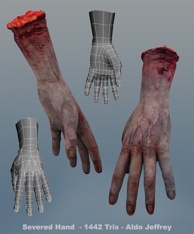
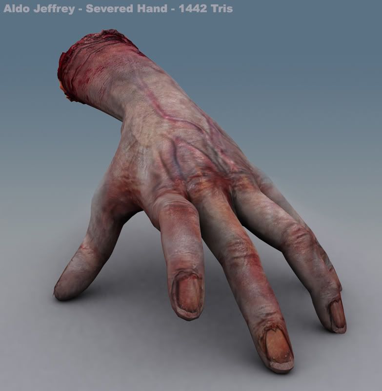
I had to do a 'severed zombie hand' for a freelance project. I had about 3 days to do it, start to finish (including rigging). I had to work at night because I just moved into a house without air conditioning (In Arizona!! like 50 days above 100 degrees so far) and so during the days, my computer would over heat. Fun times.


I had to do a 'severed zombie hand' for a freelance project. I had about 3 days to do it, start to finish (including rigging). I had to work at night because I just moved into a house without air conditioning (In Arizona!! like 50 days above 100 degrees so far) and so during the days, my computer would over heat. Fun times.


Replies
If the colour from the veins was spreading a bit more to the rest of the hand it'd look a bit better, I think. Or if the veins' purple wasn't so pronounced.
but noone wants to implement recognizable gibs...
at a first glance id say the head seems too big compared to the shoulders possibly widen shoulders and hips, fingers seem too long compared to the palm
I then started adding the clothes. Once I'm done, I'll go back and remove all the poly's that aren't seen and then I'll connect it all together. I modeled the hoodie up because even though it will probably be down in the end, it will be easier to unwrap and texture this way. (I think that's the correct way?)
So, here's my concept...kinda:
I like the skirt of the one picture, the shoes, and the green hoodie, but kinda mixed with the the other one...the part that goes over the head will be the same pattern as the shirt...I don't like how they're different colors in that one design (the white/light green one). She'll probably be a sniper who carries her gun in a giant teddy bear. Not sure about that yet...I kinda design as I go...any suggestions welcomed. All that is set so far is...hoodie, skirt, shoes and assassin.
Here's progress.
I didn't change the length of the fingers because they seemed correct to me..here's a closer shot. Also, I did change the size of the head, just not for this update...guess it'll show in the next one.
I was looking at the shoes and thought it was pretty interesting with different shoes. I kind of liked having that white thing while the other didn't. then I read what you actually wrote and was like.. NOO.
Plus it's already unwrapped and symmetried...but I'll try to find a way to make it interesting.
Here's progress. Everything is WIP except for maybe the skirt.
Something seems off about her waistline where her stomach sticks out a bit, maybe a belly button needs to be visible? Someone who knows anatomy better can maybe pin it down.
Hair concept..dreads, with bangs that are not (saw it on some girl). I was also concept some other stuff out just to see how it would look...and then I realized I was concepting a 'user view' render and that made me call it a night.
To Carlo_c: yeah, I kept feeling the same thing about the waist too...and at one point, I did move the white shirt up an inch to show her belly button, but I was yelled by some friends who said it was cliche and I should just give her a 'normal' shirt.
To Ro-Sham-Bo: I raised her skirt a little but you can't tell too much from this last concept - stupid user view:( Also, I alway had planned on her hair matching her boots to some degree, and so I think it balance it out that way, but if you still don't like the saturated boots, let me know.
[highlight]Also, Anyone know what would be an acceptable amount of poly's for hair? [/highlight] Some of the newer games boast that their game has more poly in just the hair than they had in entire characters from the last generation of games...which depending on the game...can vary wildly (5000 - 12,000 tris)..so..anyone know how much is good for a 'current gen' game?
I feel like I'm getting towards the end of working on her. I think I need to make her hair seem a little more 'dread' like...but not sure.
Here's a picture I found to show what I mean: http://upload.wikimedia.org/wikipedia/commons/thumb/9/9a/Man_with_dreadlocks.jpg/520px-Man_with_dreadlocks.jpg
Also don't the lower-arm of wimmens rotate outwards a bit?
Anyway, I took a break from 3d to do some 2D. Here goes:
This one I pretty much re-drew a photo I found on the internet...and added headphones.
Three things that I'm not sure about:
First is down where the legs join the body. It seems a bit weird how they poke out of the body; doesn't seem like the sort of design feature someone would use when they build a droid!
The second thing would be the wire frame; seems like there's some odd joins and n-gons going where the ear pieces connect to that slick looking visor, and the casis around his body.
Third thing would be the texture inside that big barrel; what sort of function would it have? Power source, beam canon, etc? Don't know whether it should be bright and glowing if that's the case, or a bit darker since it's in so deep.
The 'ear' pieces you talked about are just floating geometry...stuck onto the side. Some of the N-gons are actualy where the wireframe didn't render (since I did a wireframe shader applied it to a clone and tried to make it bigger...so some parts didn't show through. I tried to use photoshop to show those lines, but missed some of them. (later on, realized I could have just used the wireframe texture (render my uvw's) and apply it to the model to get the same effect.)
Here's what I made today.
On the building, the quoins on the sides are a really nice touch. Feels like the brackets could cast a bit more shadow right underneath the green bands, though; just for a little extra contrast and to push them out.
Digging the texture on the sidewalk, too.
Anyway, this is taking longer than usual because of me design as I go instead of working from a concept but I think I enjoy doing it that way more than working strictly from concept.
I'm going to start texturing soon...depending on the feedback I get. let me know what you guys think.
Here's the color scheme I'll probably go for. It might change once I start painting.
The Concept:
Renders: