Home 3D Art Showcase & Critiques

My 3D Buzz Unreal Map

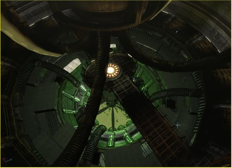
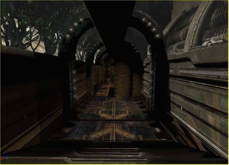
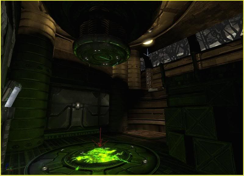
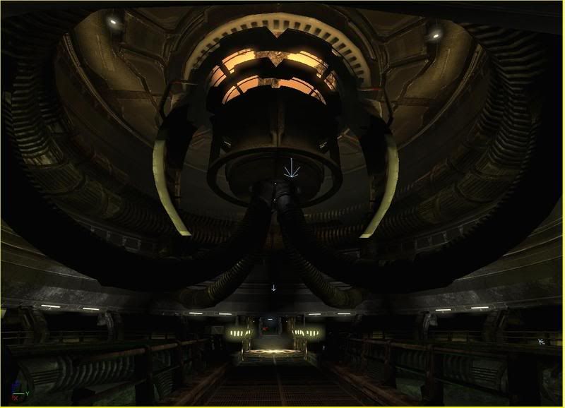
My thread over at 3D Buzz for this map has been lacking constructive criticism, so I have decided to post my work here. The deadline is the 30th, and I have roughly 3 days of work put into the map so far.
DMPitUE3-11.jpg
DMPitUE3-12.jpg
DMPitUE3-13.jpg
DMPitUE3-10.jpg

I'm hoping to keep up this pace and have a nice entry by the deadline, but I have a hard time sacrificing quality for speed and in the end I would like to end up with a nice portfolio piece.

Thanks in advance
-marc

Replies

  • System
    Offline / Send Message
    System admin
    That map looks very familiar, were you inspired by online Doom III by any chance?
    Looking good, only crit is in the EDIT:third picture sorry I was really tired last night. The lights don't seem attached, just hovering and they glow just a tad too much.
  • Mil0
    It is a bit dark and Doom-ish. I have some post-processing going on that doesn't show in the editor shots that seem to help a bit. I will take a look into the arch thing, I hadn't noticed it before.
  • Mil0
    Here is an in-game shot with the post effects
    DMPitUE3-15.jpg
  • Kawe
    Offline / Send Message
    Kawe polycounter lvl 8
    uhm. that corridor where you can see the trees doesn't really make any sense to me.. looking at the other shots that is.

    what is the contest about? make a whole map with gameplay and all or just make something that looks good?

    on the second shot you can see these huge blocks of.. I don't know what. maybe you can get rid of the blockiness?. not that anyone would see it from above when playing the map I guess..

    what is the level about? it is hard to comment cause I don't really know what it is supposed to look like.

    like... would someone put crates next to the green blobish stuff? looks like the green stuff could damage the crates easily. but who knows, I certainly don't.
  • Mil0
    Thanks for the comments. The rules are to design a deathmatch map using only assets provided with Unreal Tournament 3. My map is some sort of green goo processing facility.

    My idea behind the class corridor area was to help give a sense of the map being within a remotely located building. Areas around the edge of the map would have hints of the outside world. If you are in that hallway and look up you can see the massive structure containing the goo-pit with spinning fan of death.
  • SHEPEIRO
    Offline / Send Message
    SHEPEIRO polycounter lvl 17
    2 probs for me,
    1- floor in top down shot is crap, plain and dosmt fit,
    2- hrizontal line in cordor(with trees) dosnt work, would do if it was broken down or something.


    also env is nice techniquly but doesnt have creative catch. something to draw the mind into the space, and give it reason.
  • Mil0
    SHEPEIRO wrote: »
    2 probs for me,
    1- floor in top down shot is crap, plain and dosmt fit,
    2- hrizontal line in cordor(with trees) dosnt work, would do if it was broken down or something.


    also env is nice techniquly but doesnt have creative catch. something to draw the mind into the space, and give it reason.

    Thanks for the crit. Hopefully I can address some of those before the deadline. (I'm down to counting hours now)

    Some updates:
    DMPitUE3-20.jpg
    DMPitUE3-21.jpg
    DMPitUE3-16.jpg

    The last one is a little outdated, there are now hints of an exterior building to help tie in the green room, and that bright area under the stairs is gone.
  • Ged
    Offline / Send Message
    Ged interpolator
    this is technically very very impressive I agree with some of the others points, I cant see anything here that would be very memorable when compared with other UT3 levels.
  • Mil0
    Thanks Ged. My whole "catch" was a giant pit of goo with a spinning fan-o-death as a nod to the old deathfan map in unreal, but I wasn't able to make the deadline anyway. So now that I am not rushing hopefully I can tie up a few of those issues mentioned before. Since I was painfully aware that I wasn't going to beat the clock I started taking "fun" screengrabs in the editor.
    DMPitUE3-25.jpg
    DMPitUE3-26.jpg
  • Lee3dee
    Offline / Send Message
    Lee3dee polycounter lvl 18
    looks awesome Milo :) I couldn't make the deadline which kinda sucks cause i was getting close to finishing it. Then i got pounded with bugs at work. Hope to release it soon.
  • bluekangaroo
    Offline / Send Message
    bluekangaroo polycounter lvl 13
    For critiq one thing thats bothering me is the compression/quality of your images. Theres little artifacts in them making it hard to tell the actual quality of your textures. Other than that...good work! Maybe take like super huge screen-shots then scale em down for your final images that you want to show off
  • Mil0
    EricV wrote: »
    For critiq one thing thats bothering me is the compression/quality of your images. Theres little artifacts in them making it hard to tell the actual quality of your textures. Other than that...good work! Maybe take like super huge screen-shots then scale em down for your final images that you want to show off

    Haha, your right, it has been killing me too. I just received my new computer a few days ago, and until about an hour ago it didn't have photoshop installed.
    Lee3dee wrote: »
    looks awesome Milo :) I couldn't make the deadline which kinda sucks cause i was getting close to finishing it. Then i got pounded with bugs at work. Hope to release it soon.

    Post it up when it is done!
Sign In or Register to comment.