Orc/Ogre-ish Warrior
So I started working on a new character since my portfolio is filled with a lot of old garbage.
I still havent finished the naked body sculpt but it is getting there, so I started doing some thumb nails to figure out the armor to over him. I don't think I like any single 1 of them but maybe parts from separate ones. I will probably do some more thumbs, but anyway, crits/suggestions welcome and needed.
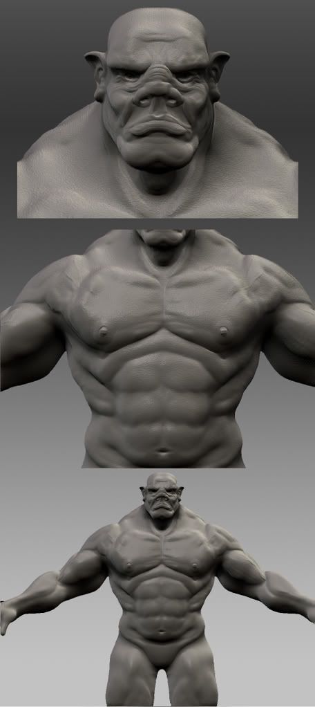
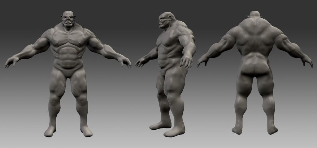
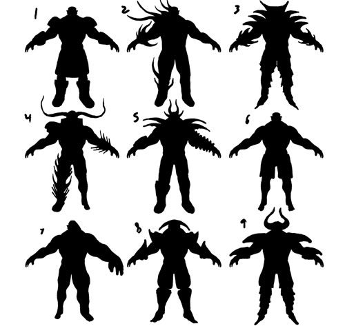
I still havent finished the naked body sculpt but it is getting there, so I started doing some thumb nails to figure out the armor to over him. I don't think I like any single 1 of them but maybe parts from separate ones. I will probably do some more thumbs, but anyway, crits/suggestions welcome and needed.


Replies
As for the silhouette of the body, I think it'd be worth trying and narrowing the waist to emphasize the bulk of his upper body more. It's nice to see that you didn't overemphasize the muscle definition for someone of this guy's bulk. The dip between the upper lip and bottom of the nose is too defined towards the top where it blends into the nose.
Now that I take a second look, it looks like you spent a significantly less amount of time on the legs than you did on the upper body. Whereas the torso looks organic, well sculpted and detailed, the legs still look like a lump of clay sculpted roughly into a leg shape when you compare them.
For the armor silhouettes, number 8 or 9 really sticks out to me. And the more i look at it, the more I'm convinced they're the most attractive ones. This is just a matter of opinion of course.
But yeah, excellent work!
Get some definition in those legs. Good luck looking forward to your progress.
Still very WIP, hands are farther along than that in zbrush but still not done. and obviously still have to sculp the skull, etc.
Another thing. Your project looks good as a whole but lacks fine detail. Try to teach yourself a greater amount of patience when it comes to making those small details and focus on each peace of armor, each finger, each tooth, & each muscle like its the only thing your creating and that should help you greatly! Keep chugging man, self-pitty gains nothing. cheers!:thumbup:
Anyway about the work and the details. I was saving that for the last step. for now it was getting all the major pieces and forms and then I was going to detail everything.