Royal Sentry Cyborg concept
Hey guys, heard from a friend that this was one of the better places to get advice so here goes...
This is a character concept I'll be taking through to completion for an advanced portfolio studio class I'm in over the summer. This was sketched out in Photoshop, and I'll be putting it into 3D courtesy of XSI and Zbrush once the reference pieces are nailed down. For the time being, I'm calling it the Royal Sentry:
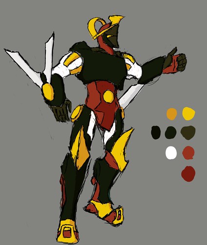
First draft with palette
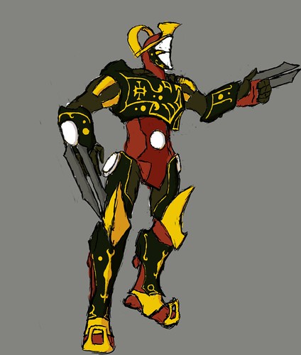
Second draft
And newest draft with a few changes for production art turnarounds:
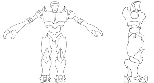
Thanks for taking a look... it'll be fun to see what this evolves into.

This is a character concept I'll be taking through to completion for an advanced portfolio studio class I'm in over the summer. This was sketched out in Photoshop, and I'll be putting it into 3D courtesy of XSI and Zbrush once the reference pieces are nailed down. For the time being, I'm calling it the Royal Sentry:

First draft with palette

Second draft
And newest draft with a few changes for production art turnarounds:

Thanks for taking a look... it'll be fun to see what this evolves into.

Replies
Make sure we can tell exactly what is what.
I big problem i keep having when i look for concept art to model, Is certain parts in the concept seem really ambiguous.
I dont think the orthographic concept survived the transition though. The proportions aren't working for me. The flat shoulders and long arms for example.