Home 3D Art Showcase & Critiques

WIP Ike

polycounter lvl 17
Offline / Send Message
Lord McMutton polycounter lvl 17
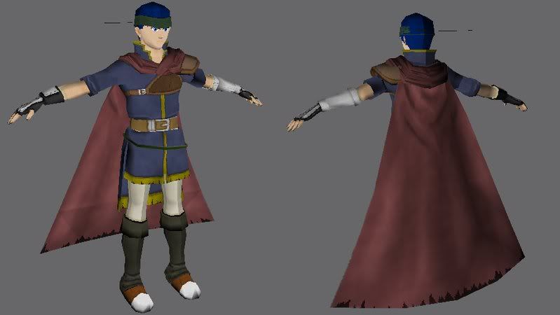
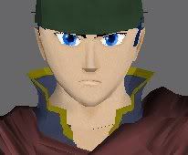
Because I felt like it, I made Ike from Fire Emblem and Brawl. Pretty much done with the textures besides some highlighting and shading, unless anyone thinks otherwise. The texture on the cape around his neck is bugging out, so I'll fix that later. And there's still a bit of clipping here and there. The only problem I'm having is his hair. I just can't figure out how to do it. I planned on using alpha'd planes, but I'm having trouble figuring out how to place them.
ikebifli.jpgikeface2.jpg

Replies

  • Snowfly
    Offline / Send Message
    Snowfly polycounter lvl 18
    Hey this looks pretty good! His right wrist looks like it might be too long or too thin, just needs to be tweaked slightly. Maybe it's down to the style, but would his feet benefit from a little extra shaping so they aren't just identical clubs? I also think his neck goes too wide at the base.

    The seams everywhere are unfortunate, maybe they could have been positioned into more concealed areas.
  • slosh
    Offline / Send Message
    slosh hero character
    i'm not sure how far u are into the texturing, but i think it needs a lot of work. a character for a game such as fire emblem is probably 90% hand painted. There doesn't seem to be any sort of folds or subtle details painted into your character at all. i see a little on the cape but that looks kinda rough and not flowing. i think your model is fairly solid although the wrist does look long and too pinched. as for seams, you should always find a natural way to hide them, the inside of the leg, the underside of the arm, or any where you can use an alpha card to hide it. this is the best way to do hair...having your alpha's cover you seams allows for nice seamless hair. keep at it though cuz with more texture work, this could look sweet!
  • Lord McMutton
    Offline / Send Message
    Lord McMutton polycounter lvl 17
    Added some folds, though they may be too dark.
    ikewrinkle.jpg

    And his feet do have more shape than that shot shows. I think it's just the perspective deforming them.
    ikefeet.jpgikefeet2.jpg

    -And is it his right, or my right?
  • slosh
    Offline / Send Message
    slosh hero character
    alright, ur on the right track! i'm glad you are starting to add more detail but i have to say that now that uve added folds, they aren't looking right. you should probably google some reference images of natural cloth folds. for the shoes, i like the folds above them but it looks like the actual shoe is practically sold colors...i would definitely add detail to depict what the material is....for example, if the white area is metal, add specular highlights, scratches, etc. keep going though!
  • Lord McMutton
    Offline / Send Message
    Lord McMutton polycounter lvl 17
Sign In or Register to comment.