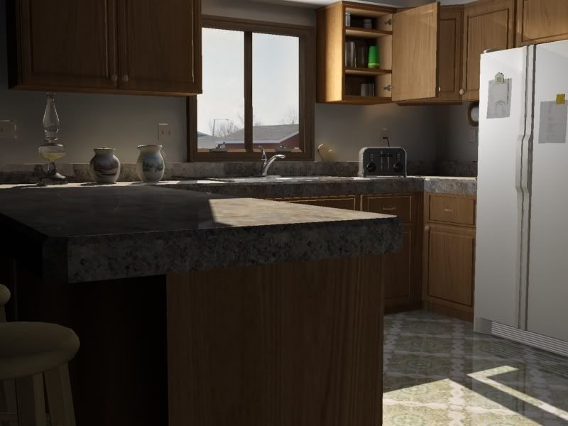
Interior Scene WIP
Over the past few days, I put together a scene of my kitchen. Right now, I'm severely unimpressed with the drinking glass material in the cabinet. I'd really appreciate tips for improvement in any areas, especially with some of the materials.


Replies
I like the left side a lot because you have that strong sense of contrast, while on the right side, you kinda lose it.
You should rough up the textures a bit, especially the parts were dirt and grime usually go to; ie, corners of the floor or under the fridge. Though this might be minor, settle changes like that would help you out.
Not sure what to say with the glass mate. Maybe the change in lighting will make it to were you won't even notice it from this far away. Are you still fiddling with camera angles?
The window cranks also seem a bit large (just the base portion).
Otherwise, I think someone might have thought it was a photo at first glance. Good work
Edit: Ok so I think what's bothering me about the light on the floor, and the cabinet is that when I look at the left side of the image (the first thing I looked at) I see those vases & lanterns, casting shadows toward me, and to the left. That indicates that the sun is outside the window, and to the right (and up), somewhere toward the corner of the room. Now, I look at the sun on the floor, and I think it's coming through the window, but I can't reconcile the shadows that are being cast, with any thing I can see. That would also mean that the sun is more directly in line with the sink/window, rather than the camera/corner of the room. If that light splash on the floor is NOT coming through the window. . . then where the hell is it coming from?
What bugs me about the cabinet in the upper center, is, as has been pointed out, the fact that there's so much light inside the cabinet. However I also feel that the shadow/light on the side of the cabinet facing the window, is far too sharp to just be ambient light from outside. It looks like something is directly casting light/shadow onto that cabinet, hence implying a 3rd major source of light, and confusing me even further.
There's also some wierd lighting being cast across the top right corner of the fridge, as well as the cabinets above that.
I think you have a great piece going here, but you really need to figure out where the sun is, and make sure that all the lighting in the scene cooperates with that sun position.
I'm just unsure of how to keep the scene well lit with a single light source coming through the window.
The area light inside might be ok as a fill, but you might want to play with it's brightness etc.
I might put a light (area, or spot with large, soft cone) on the hotspot on the floor, pointing up.
If you wouldn't mind sending the max file to me, I'd like to try a couple things?
Tumerboy@hotmail.com
I'm getting some weird light bleed through at the back corner, inside and outside on the back of the upper cabinet. I'll take another look later when I have more time, but I couldn't figure out what it was doing in the time I had.
Below is another perspective of the lighting.
Light is piercing through my wall geometry, especially around the cabinet position. Here is another render w/o the cabinet.
The wall geometry is below
Making the wall 2 sided seemed to solve the problem. What do you guys think?
I've been trying to wrap my head around the lighting along with the wall geometry and I'm coming up empty. Is this all a result of light trying to pass through one-sided geometry? I didn't physically add planes on the other side, but instead, just made the texture 2 sided.
Now, for the cabinet...there's light shining directly on it because of an area light on the other side of the room (you can see this a few posts up). Is it bad practice to add lights in an interior scene such as this, when sunlight appears to be the source of light?
[edit]
One thing I forgot to add is that I made the changes to the countertop. The reason it looks flush near the fridge is because the camera is pointing *directly* (almost perfectly) in line with the side of the countertop there.
A polygon facing a light, should always cast shadows, a polygon facing away from a light, shouldn't. So, if you want a room to be in shadow except for a window, make sure you have a box that faces out, around the room.
This is also why I was confused by the fact that the vases were casting shadows as well. It looks much better in your last renter.
Putting in fill lights (like the one inside) is not bad, in fact, it's often necessary, you just have to make sure that any fill lights cooperate with your key light so that it doesn't look like there are extra, unseen light sources.
Did you open the file I gave you at all? I would strongly suggest looking at how I have the lights set up in there.
catch me on aim.
When you put a light facing upward from the floor, can you explain what that's for? Is it just supposed to simulate light that would be bouncing off of the sun's hotspot (the floor)? I would have never thought to put a light there. Like I said earlier though, I have a bit to learn about lighting scenes well.
I'm not saying I'm a great lighter, in fact, I only do it when I really need to.
I tend to approach lighting by looking at the ACTUAL light sources first, and then only adding fills & such where I need them afterwards.
So in this scene, your only ACTUAL light source is the sun, which is coming in the window. That only casts light on a specific spot, but that spot is bright enough in a darker room, that it will reflect a lot of that light back into the room. Putting a somewhat dim, fuzzy light on a hotspot like that will help you simulate reflected light.
Your Radiosity will do some of it for you, but radiosity can only do so much.