The BRAWL² Tournament Challenge has been announced!
It starts May 12, and ends Oct 17. Let's see what you got!
https://polycount.com/discussion/237047/the-brawl²-tournament
It starts May 12, and ends Oct 17. Let's see what you got!
https://polycount.com/discussion/237047/the-brawl²-tournament
Maya/Aztec/Inca Environment WIP
This is my first post here, and I wanted to thank everybody for all the invaluable info collected at this site! I'm currently looking for a job in the SF Bay Area, and this is my first portfolio piece moving away from ArchViz and into Games. I think I've gotten a "correct" start but I would love any critique I can get.
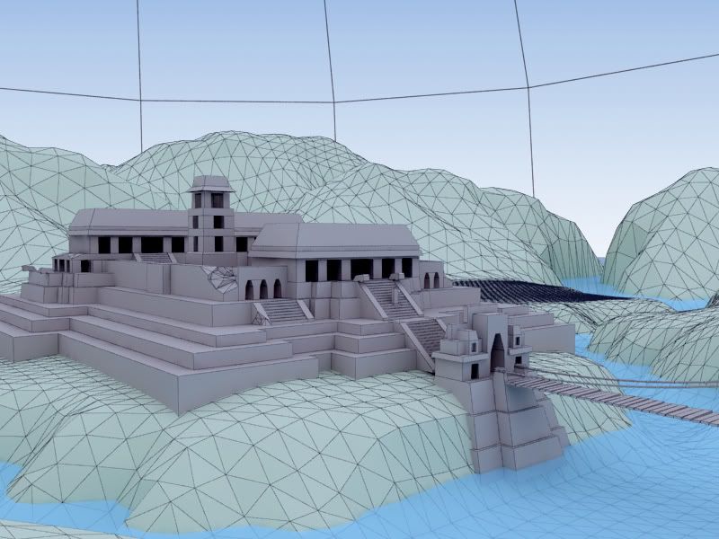
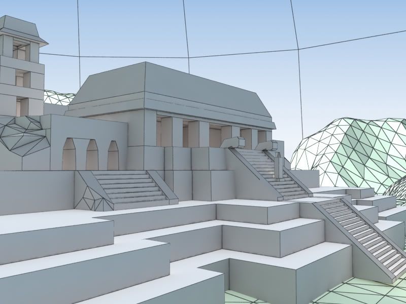
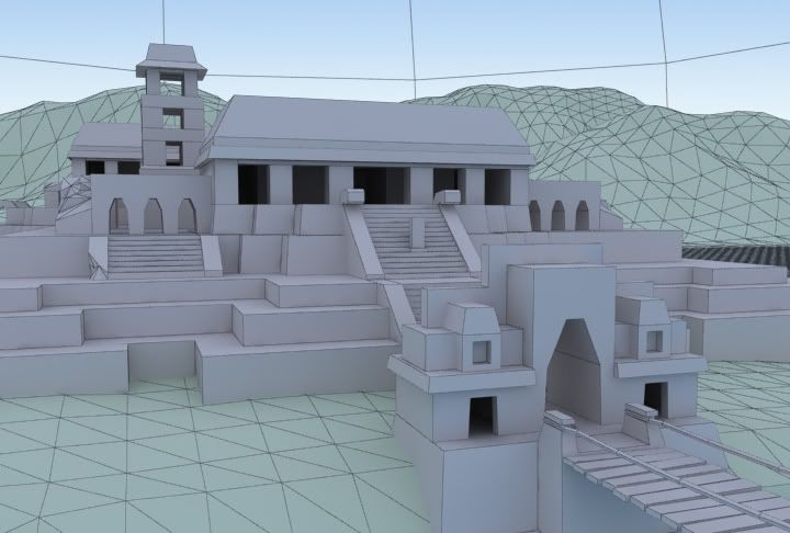
I'm building this in 3ds Max as if it were going to be put into a game engine...I was mainly curious if the mesh density, especially the terrain map, was where it should be.
From here I'm planning on texturing:
- Terrain w/ multiple tiling maps & vertex color,
- Larger "terrace" walls with a single tiling map
- All other meshes are unwrapped
From there I'll add alpha planes for longer grass and plants, possibly trees (or speedtree?), some UV unwrapped rock faces along the riverbank, distance fog, alpha planes for clouds and sunrays, vertical ropes on the bridge, etc... Still trying to figure out how to fade the water edge off without subdividing that single quad water plane.
So does this look like I'm on the right track for something to show to a possible employer? Any criticism would be highly appreciated!
Thanks,
John
Replies
The layout of the buildings is quite nice.
id say you could build:
-wall section
-corener wall secton
-2-3 x arches
-stairs
-flat floor section (with some tiles missing sticking out for detail)
-statue
-2x roof section
-and some rubble.
then youve done the donkey work just tweak and stich together easy
"You could probably put a lot more polys into those buildings..." - I was hoping you would say that!
The plowed field is actually the terrain mesh you see near the foreground as it goes into the distance, before getting reduced where the background hills are (it's a waste, huh). I should just cut out the middle ground and have 2 separate meshes. I was referring to Crysis' level editor, where their terrain mapper actually reduces the polycount of the terrain far from the camera automatically - and tried to copy this in one mesh in 3ds.
I'll add more decoration (bevels too ... maybe?) to the buildings and take some from the hills.
Shepiro - I'm just using this as a single portfolio piece to show off everything else I need to show off like texture mapping, terrain, lighting, etc. but not a whole level. Would an employer see me as an idiot for building it like this? I don't have a lot of time to redo it with repeating modular pieces it unless it's REALLY wrong at this point. Not to say I shouldn't have done it that way in the beginning...
Thanks for the feedback - if anyone else sees anything please let me know
I apologize for the rendering glitches - but otherwise I made the hill mesh a little larger, added details and chamfers to the architecture, and broke everything into little interchageable modular pieces.
Hey everybody -
Sorry to dig up this old post but I finially got some time free to texture one of the wall components. It's made up of a color, normal and spec map.
After realizing rendering out this whole scene might take a little more time than I have right now ( < fulltime job + freelance + family) ... I think finding a good SMALLER prop to model might be more effective for my portfolio... But anyways how does it look?
Thanks for all the help!
Some of the stones in the front of the wall look like they fit too well, they look 'molded' rather than stacked together.
Perhaps start by making a smaller temple, if lack of time is an issue. Or that bridge with the snake head(?) anchors could be kickass by itself.
I'd recommend working on a full scene rather than just small props.
There are also a few other n-siders, such as the handrail that has the big chip in it on the left, the blocks at the top of the handrails on the main staircase, and the top of the arch at the entrance.
I'm a bit curious as to how much geo is being crashed-through each other; it's generally not a problem, but in realtime it might lead to some shading issues, and does contribute to wasted texture space (although with tiling that might be a non-issue).
Those are my only concerns, really - the setup looks very clean and readable; placement is logical but interesting. I'm no professional at this, though - I'm just wondering if you might be using techniques that are used in architectural viz that might not work so well for realtime application.
http://i133.photobucket.com/albums/q70/mesaprs/Tris.jpg
I have geometry crashing through the floor planes mainly with the terracing so that I could vary the height of the same terrace pieces and save polys in some cases - if that makes sense - but the floor textures are all tiled. Should I change that around some or get rid of the overlapping geometry?
CheeseOnToast, thanks - that Incan stonework is so perfectly fitted I've heard you can't even put a sheet of paper between each stone. When I did the texture I was afraid of it looking "painted on" so I made it less perfect, but seriously those rocks got no gaps. In some other places I was going to use Mayan reference where there's mortar and messier stonework ... but I'm paying more attention to looking for a job now...