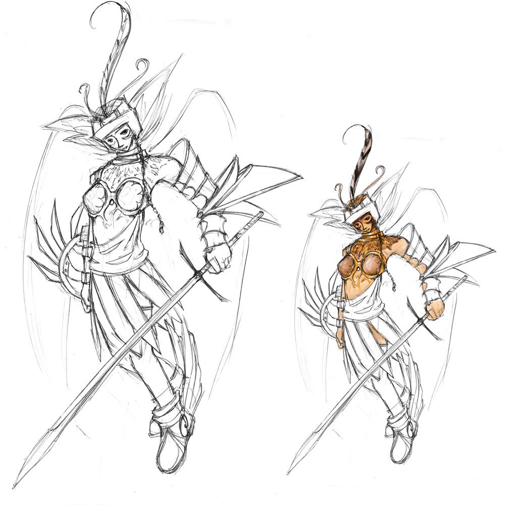
DWIII - 2D - Litening - Untitled

Yeah, so as a newbie to these forums and the DW contests ... well, lets just say I got a better grasps on the concept of everything the second time ^^. A completely new character this time round -- an air immortal (though 'immortal' makes it seem more invincible than it should ... I'll have to look into that). Did a little sample colouring on the smaller version on the side ... I would like to make her armor something other than just gold (as I first intended) so I'll have to work on that. I tried to base the palette on a peregrine falcon--although I wasn't really paying attention to it when I did the face.
The faceshape needs work, as well as the lower body (I got lazy and it looks rather chunky)... I'll get to the shield/sword in a bit.
Replies
http://www.amazon.com/Jeremy-Thatcher-Dragon-Hatcher-Coville/dp/0671747827
maybe that's why the name came to me ...
right. anyway.
WOA!
huge step over what you did earlier. good to see more breakage of silhouette etc. itd be good to see u try out some more thumbnails and play around with shapes a bit more... if u went from the first one to this within one step, imagine what you might come up with 20 ideas down the line?
keep messing with the base ideas before you go too far with one.
oh, and welcome to polycount!
oh oh.. one more thing... try being evil. cuz evil = awesome.
good luck with the comp!
Swords! Aiming for something slender and sleek, sexy, majestic. [1] so far is my favourite out of all of them, and I did a closeup of the hilt decoration in [1B], although I'm positive it can be improved ... [2] [3] and [5] are some other ideas ... and [4] was the original idea. It looked pretty good in the first sketch but after the armor got improved and reworked, it became rather plain.
Shields. The idea was that you can never sneak up behind the people of her race/culture/training without losing something fleshy and important; basically, there would be either daggers or spikes sticking out behind the small buckler ready-to-use in the case of an ambush. [1] & [2]. I like the idea of [2] better, so I used it in some other leisurely sketches as shown in {a} and {b}. Lastly, [3] was another design i came up with; I really liked it, but it doesn't fit the character/style very much ... I decided to throw that in there anyway, just in case.
Armor. [1] [2] & [3] are ideas for helmets, [3] being a more detailed rework of [1]. It looks good, but I still want to put in the 3 ...quail? peacock? feathers (shown in [6]) and it seems like overdoing it ... [4] is for the design on the arm guard, too flamboyant? [5] has nothing new except the skirt/footwear redesign ... I might just scrap it and make a robe-sort of thing, I'll have to test it out. [6] was testing the shield with the general look of the headgears ... not too significant but I threw that in there in case, also.
[X] was a re-amp to the upper-torso armor, and I also threw in [3] from the above helmet concepts to see how it would look. [Y] is of a different angle, and a test on the sincere-and-kind-yet-I-bet-I-can-still-kick-your-ass type of attitude. On the side, I tried out different hawk-like eyes for the character ... {III} and {IV} are softer while {I} and {II} are ... meaner. I prefer the latter, I'll probably try out a few more, or a combination.
AND FINALLY. Just some designs I had to look into for my Design Tech class, and I thought they'd look pretty cool on the armor. I particularly like [6] and the [3] variations.
Yay, that's the end of a really, really long update.
-Lite
#6 is awesome
as is #3a
already talked about shields and swords and stuff, but one thing i gotta say about the helmet:
the huge piece wit the parts goin everywhere... its... er... 'kiddy' to look at.
like sommin out of power rangers or something. thats helmet 1 and 3. 2 just looks to simplistic.
cant wait to see the thing done and ready to kick ass lol
GO GO GO!