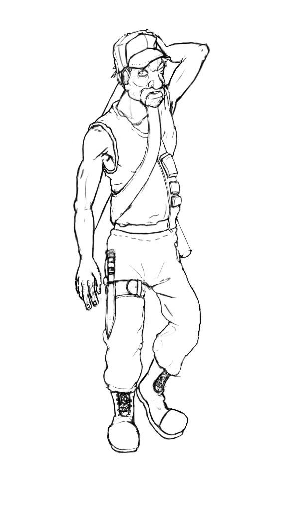
WIP Soldier
I've never really done soldier guys before. But lately I've realized the industry is shifting towards the military style -- Halo, Gears of War, Unreal -- the hardcore stuff. So I went ahead and made this guy:

He's nothing like Master Cheif, but it's a start. He's a retired vet, but still willing to kick some ass.
I think his left arm needs a little work. I was thinking of pulling it out away from him, rotating it a little bit. What do you guys think?

He's nothing like Master Cheif, but it's a start. He's a retired vet, but still willing to kick some ass.
I think his left arm needs a little work. I was thinking of pulling it out away from him, rotating it a little bit. What do you guys think?
Replies
your linework is good, clean and readable, but i'm afraid there's precious little compelling about this character. are you designing him to be a major character in any respect, or is he supposed to be the humorous old coot who fixes up your warthog-alike scifi jeep?
At this early of a stage, I'd try not to focus on posing him. the left arm is enormously awkward, yes, but I think you're just getting yourself caught up in the pose/presentation, and the design has suffered for it. he's really mostly a blank slate right now; not enough detail or personality to really tell what he's about.
say you go for the old coot mechanic look--think about what gear he'd need, the kind of story his outfit could tell, to make who is he is and what he does self-evident long before the character ever opens his mouth. we should be able to look at this image and say "oh, he's the friendly old coot mechanic," or "oh, he's the not-so-friendly psycho vet that I wouldn't feel safe spending any time around."
at this point he's undifferentiated. so work on more of a concept, and less of an illustration--don't worry about the pose, worry about the various details and personality you're conveying through his design.
Anyway, I wasn't planning on him to be a major character. I'd say he's the equivalent of the military guy from Tremors, only older heh. I think it'd be a good idea to add a wrench or two to become a handy man; maybe add some overalls.
Thanks for the input. I'll also work more on the character than the pose.