Rts Game WIP; IMAGE HEAVY

polycounter lvl 18
[Edit] Matt22181 has posted some of the characters for the game below.
So, I'm working on a four person team creating a rts game for Microsoft's 2008 Imagine Cup. I am in charge of all environments, building and props. Matt22181 is doing characters and animations. Maybe I'll get him to post some of that soon.
Short Game Summary: Small planet, two factions. One is new, and wants to use all renewable energy to preserve this planet, unlike the last one, which they jacked up. The older faction crashed landed here generations ago after being lost in space, so they are crazy and don't give a hoot. The name of the game for now is Terranet. By the way, the theme of the game had to fall into Microsoft's sustainable environment theme.
So here is some of what I've created so far.
New Faction Base, about 1000 tris
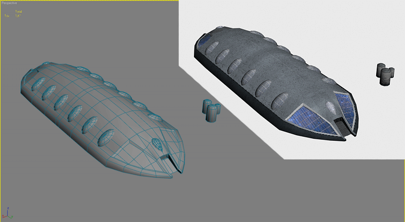
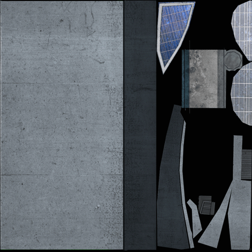
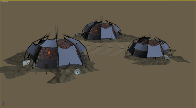
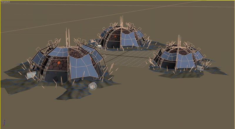
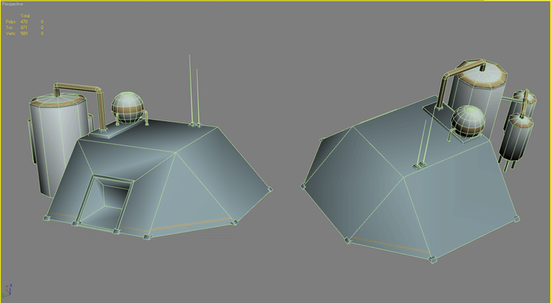
Old Faction Base, about 3000 tris combined (texture WIP)
Wire:
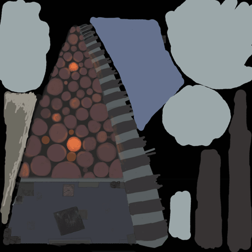
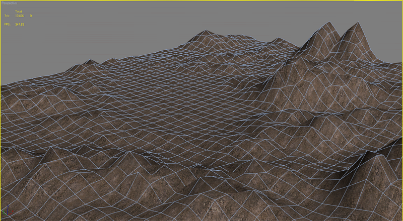
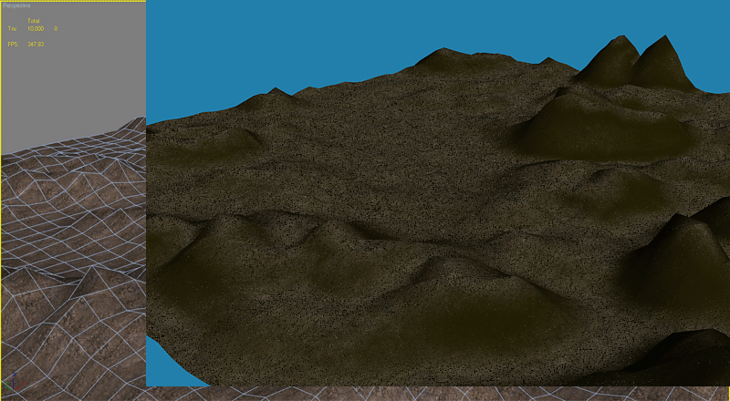
WIP Land
New Faction Research Facility about 850 tris: WIP

C&C greatly appreciated
So, I'm working on a four person team creating a rts game for Microsoft's 2008 Imagine Cup. I am in charge of all environments, building and props. Matt22181 is doing characters and animations. Maybe I'll get him to post some of that soon.
Short Game Summary: Small planet, two factions. One is new, and wants to use all renewable energy to preserve this planet, unlike the last one, which they jacked up. The older faction crashed landed here generations ago after being lost in space, so they are crazy and don't give a hoot. The name of the game for now is Terranet. By the way, the theme of the game had to fall into Microsoft's sustainable environment theme.
So here is some of what I've created so far.
New Faction Base, about 1000 tris
Old Faction Base, about 3000 tris combined (texture WIP)
Wire:
WIP Land
New Faction Research Facility about 850 tris: WIP
C&C greatly appreciated
Replies
Old Faction Base: I like this one. It appears to follow all the rules tossed out by the first. It looks unique, interested, and isn't AS wasteful, but still has a lot of room for improvement. For example, all spikes, rods, etc. have no business being over 3 or 4 sides (depending on purpose). You may consider exaggerating the saturations to push the faction color scheme in a more unique direction, but overall it looks cool.
New Faction Research Facility: This is more on target with how the new faction should come across, but still appear to toss a few extra triangles around it doesn't need
All of your textures seem overly simple at this point, as I have a feeling you're just trying to nail the look so I won't really criticize what you're doing there.
I suppose i could cut down the polycount on the new faction base, even though it is going to be one of the biggest structures, and the angular windows are supposed to be solar panels, I guess that is hard to read.
All the spikes and rods on the old faction base are either 3 or 4 sided, except the spike on the dome itself, which are alpha planed polys.
Old Faction Conscript
Old Faction Heavy
New Faction Heavy
I see what you mean about the Alliance type dude now. Maybe try giving his armor some coloured markings to help break him up?
Thanks guys.
James- Yes, you're definately right. I'm going to have go back to the heavy texture. Its just too boring as it is right now.
Dekard- All the models are already animated. I sort of just treated it as if his legs started at the top of his boots, with rest of his lower half being influenced gradually less and less as it approaches his belt.
I'll post the animations for you guys soon. I am really not an animator so I'd really appriciate lots of crits.
Changed the color schemes of the buildings to match Matt22181's characters so the factions have a consistent color scheme.
GUI
Splash Screen
Texture Progress; Research Building
Texture Progress; New faction Base
Terrain Progress
New Faction Worker
@ el zorr- Good call. I am definitely going to optimize it and add some more details to it.
@ Keen- soon, when we get a playable demo it will be available to polycounters
@ Splash- good call. I'm going to experiment with some painted textures this weekend.
You need to work on utilizing smoothing groups better on your models. Everything looks smooth with no edges, and it throws everything off and makes the models look terrible.
about the env textures, I think the scene looks too noisy- it looks good close but at the average playing distance it merges into a lot of speckles. Consider simplifying the textures and focusing more on mid and large scale details, and less small scale, pixel level details
its good work though keep it up!
Also, a bit off topic, somebody should make a really low poly RTS for the PSP sort of like this. I would love that. xD
Keen-I'm taking a break for the dominance war, but the grammers are still chugging away. Shouldn't be too much longer, it needs to be all done this semester.
Burtzum- Why don't we know you? Did you go to VCU? I checked out your site, lots of good stuff up there.
Remus- That avatar is ace.
congrats on getting through round 1. is this all linked through the school somehow?
Now dont get me wrong what you have done in fantastic, but its fantastic for the wrong reasons. This is what I think anyway, so please, don't hate on me.
Your terrain, first of all, is quite bad. Now only is it very spikey, not natural at all, but its using a crazy ammount of polygons. This can be fixed quite easy by just hitting optimize in max, or using the Direct X mesh tools in Milkshape. To be honest you could get the polycount down by about 10x and keep the same shape.
But thats not my biggest problem. My biggest gripe is that these textures all seem very high res, for what it obviously an RTS. Now, its nice to have your models look great when your up close, but thats not the view people would use most, if at all. Its gonna be up high. And a 512x512 texture on a unit that takes up about 50 pixels on the screen is waaaay too much. In fact, it will look quite pixelated at an RTS style view distance. 128x256 is a max you should really be looking at here, and even that may be a tad excessive.
To be fair, your work is great, it just isn't great for RTS work. You have some good texturing skills that remind me of the old HL/Q2/Q3 days.
Keep it up :P
One thing I feel is important in RTS games is keeping your units readable in all situations - there's nothing more annoying than losing one of your own units when you're not even in battle, because he stopped on a piece of terrain that acts as camouflage. Characters, units, and buildings are what should drive the RTS - terrain, while important, should be a bit more subtle, letting the units take the limelight.
Lowering saturations is a good way to push things back, but your terrain texture is already fairly unsaturated, so I really think it's just that the texture seems too busy. Try to focus more on the RTS view of it - get the base colors down, and suggestive texture, rather than each blade of grass - right now they seem more like detail textures for when the camera gets close, instead of the base texture.
It sounds like you're on a tight schedule, but while the terrain may still be 'in progress', another thing to keep in mind is the positions of the textures relative to the geometry (i.e. it's a bit odd to see grass growing over a big spike). If you render out a depth map from a top view camera, you can use it as a mask for the areas that should be rocky in Photoshop, unless you're using vertex colors for texture assignment (but you might still may be able to use the map to assign the vertex colors themselves).
My two cents. I think it's coming along quite nicely, the issues are minor, and you guys have a direction - it just seems a bit loose at the moment. Again, you seem to have a tight schedule, so don't let this be discouraging; these were just points I felt could really help solidify the feel. Good luck!