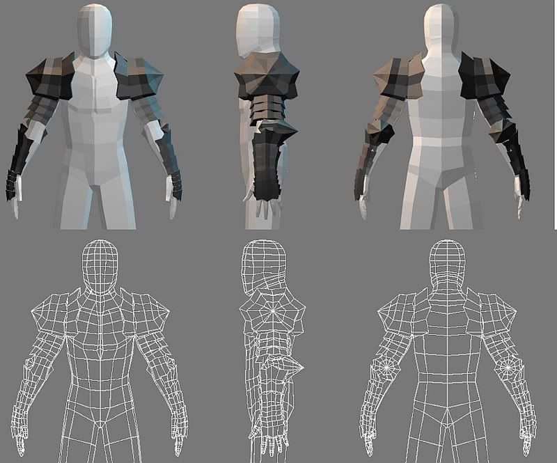
I've started putting armor on that mesh that I made earlier. The design of the armor is inspired by Guts' Berserker armor from Berserk. Just the arms right now. The base mesh is 2078 polygons, the armor is 1484, and the total is 3786.

critiques or comments?
Replies
Also the side profile is really static and linear, try and make it more dynamic. I scanned bridgeman's side profile of the human body for ya. Disregard his arm, I wouldn't model it like that. Also it doesn't have to be that dramatic, just don't make his body go straight down. Hope this helps.
The armor is now 3346 polygons, 5424 total.
Something about him is bugging me, but I just can't place my finger on it. Any ideas?
Any critiques or comments on the design before I continue?
Any critiques, comments, ideas, suggestions... anything? Come on, I'm beginning to feel a little ignored.
Your character looks as though you don't have any smoothing groups applied to it. That's why you're getting that harsh polygonal look to it. More importantly, I would do a search on the polycount boards on how to build a low poly character and start off with a better structure to your mesh. You have way too much polys than you need. Keep researching and practicing, you'll get it.
He doesn't have a distinctive silhouette....Right now he looks pretty flat (this is before the armor mind you) and he doesn't have much definition. Alot of your poly flow is very linear, which isn't good for organic characters. Move some verts down on his torso and legs. His shoulders are too far back and his stomach too far forward, like he's arching his back. His head has a odd shape to it, especially in the side view. The top and sides of his head are way too flat. In the side view, he also doesn't have a neck--it goes right from chin to chest. Overall, this character has a very mechanical look to him from the poly flow and his flat silhouette. The armor makes it look a little bit better, but it still reads mechanical and less organic.
Couple of other things. Are you going to be animating this? If so, you need to fix alot of things about the joints. There aren't enough edge loops for proper deformation. Also, this character bears strong resemblance to the Judges from Final Fantasy 12....if you were using that as reference, make sure you give it credit. If you weren't,then check it out---it might help you go in the right direction. Keep up the work though---don't quit now.
kaoticvisions - I still need to get him more organic, but I worked on it a bit. But does a basemesh really need to be very interesting? Thanks for the information on the Judges, they look very interesting.
Jimmies - what?
Made the pose less dynamic, added more edge loops in the elbows as per ancient-pig's basic deformation tutorial. I also added a face.
I need some help with the polyflow of the neck and jaw, though. I don't think it's very good right now.
And as for the basemesh being interesting.....it doesn't have to be (in theory), but the things you can learn from proper modeling will make it worth the extra time you put into it. Keep it up though.
I think there's something wrong with him on the side view, but I don't know what. Also, I wanted to add some asymmetry by removing one of the pauldrons and giving him a cape that hangs over the un-armored shoulder, but I don't know how to go about doing it.
He had a giant head and is a skeleton under those clothes. Remember, even if your character isn't that big of a dude, he's wearing a few layers of thick clothing AND armor. This stuff isn't painted on his skin it's layers on top of that.
And yes, all my character paintovers look like Telekinetic Frog.
Which makes him look like the type to weild a really big axe
Should I give him some asymmetry?
Anyone have anything to say about him so far?
you also need to look at a lot of your proportions, the head compared to the rest of the body, the legs are too thin, the forearms look too long because of where the gloves end (past the elbow). etc.
Do the textures read as what they're labeled as in this picture?
Gir, could you be more specific? What area of the head are you talking about? How should the edgeloops go?
Did I do alright on the metal?