Character WIP
Hey guy's coming out of lurking to post this character I'm working on, and hopefully get some feed back from you guys. This will be the first time I actually bake normals to a character, so this should be interesting on my part. I have a deadline of one week to get this done(homework), and another week for texturing. I'm not sure if I can do it, but I'm going to try. Anyway here is what I've done since yesterday.
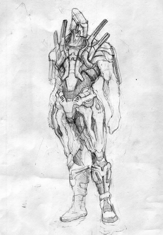
Concept
Helmet
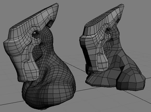
The helmet has been reconcepted since the original concept. Thats why it differs.
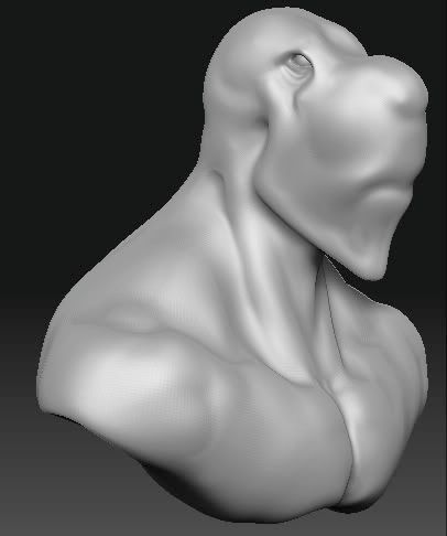
Head Bust In Zbrush
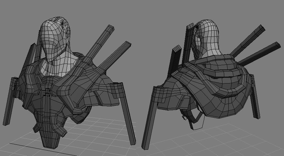
Upper Armor
Concept

Helmet

The helmet has been reconcepted since the original concept. Thats why it differs.
Head Bust In Zbrush

Upper Armor

Replies
Very creative concept. Though, I'd watch out the armor that sticks up on his shoulders, make sure those don't clip his head when you're rigging this up for rotation of the shoulders, etc. They probably won't, but just a remind.
[/ QUOTE ]
Thanks for the tip man, I've never rigged before so any tips are useful.
Anyway here is a little more progress, legs always give me trouble so its like im in slow motion on this thing.
Torso
Unfortunetly you won't be able to see much of those abs.
Leg progress
I had to reconcept the legs, the original design was out of perspective and just didn't look cool modelled out.
Those abs are pretty hot....any way you could get them to show? hahahaha....
But in all seriousness, what kind of movement is your character going to be doing? Will he ever raise his shoulder above his head? If so, you'll have to think of a way for his shoulder spikes to be functional. From the looks of him though, he definitely looks like he'd have more mechanical movement, like that of a cyborg. For the front of his legs, in the concept, there's more of a downward curve---in the 3D rendition, it looks flat. Looking at the shoulders again, they're not very functional. He wouldn't be able to raise his arm. But like I said, if he's not going to be moving that extremely, then the armor works. This would be so much fun to texture---have fun with it man, you can go nuts with this. Keep it up.
@kaoticvisions - Yeah I totally agree with his inability to move and over the last couple weeks I have revised him so many times because I wasn't happy. I've given him better pivotal "fabric" I guess you could say around his joints. I've also tried staying closer to the concept. Thanks for the kind words too.
Hopefully this is better.
Body
Head
Now he can see forward. Helmet will come later. I'm also going to add hair possible on his neck, like the concept.
I am currently working on the low poly. I've kinda gotten to the point where I just want to get him done and move on.
The pivotal fabric idea is pretty solid---alot of games (and military advances) use that so it's not a cop out.
As for the hands looking human, you didn't create a specific design in the concept so it's no wonder you came to a human hand creation. :-) What kind of creature are you going for? You could go gauntlets for his hands, weapons, there are alot of options you could do for the hands. And his arms look pretty short compared to his legs...I'd think that you'd want to make the arms longer (only because I like the long legs of the character---makes him look very statuesque and leering). Keep it up man.