The BRAWL² Tournament Challenge has been announced!
It starts May 12, and ends Sept 12. Let's see what you got!
https://polycount.com/discussion/237047/the-brawl²-tournament
It starts May 12, and ends Sept 12. Let's see what you got!
https://polycount.com/discussion/237047/the-brawl²-tournament
My Armored Werewolf dude *Updated*
I'm creating this model for a uni project, we have to create a full game in a team (we got programmers and shit) and I'm doing the character models. This guy is the main hero.
3959 tris.
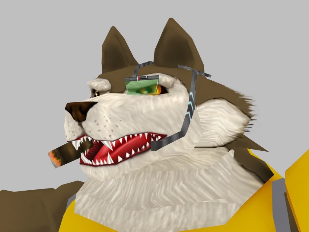
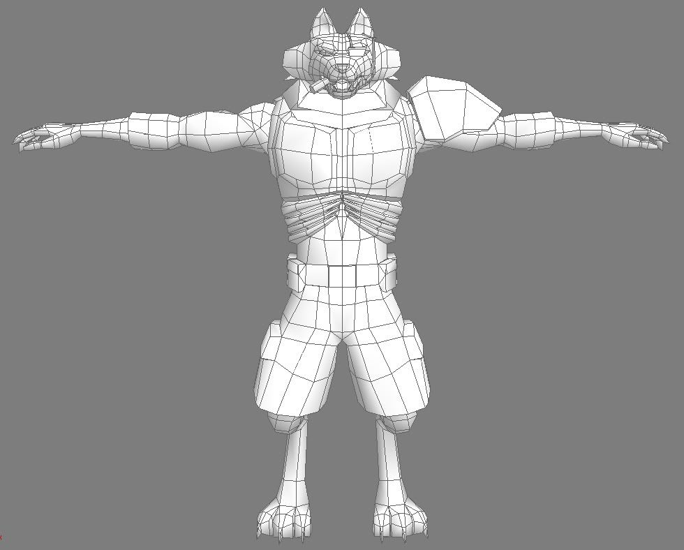
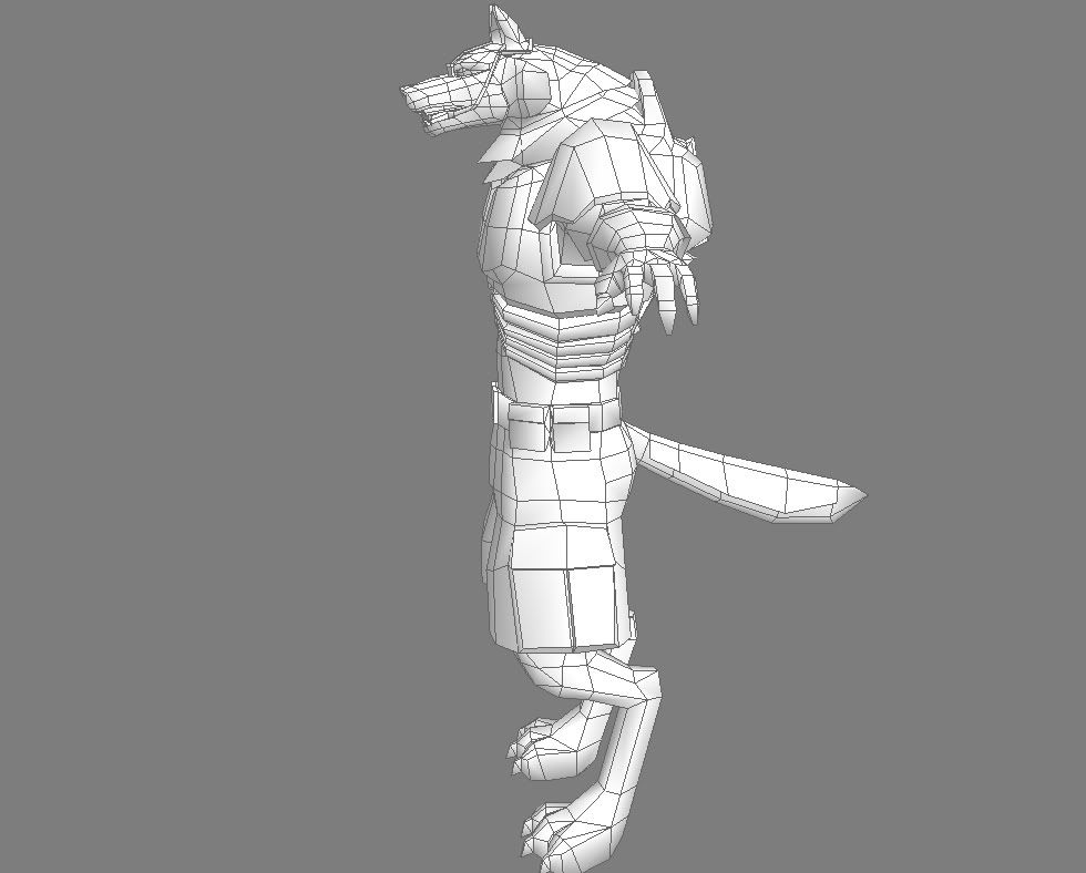
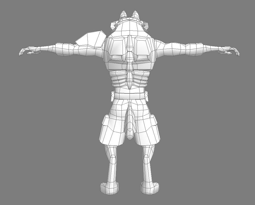
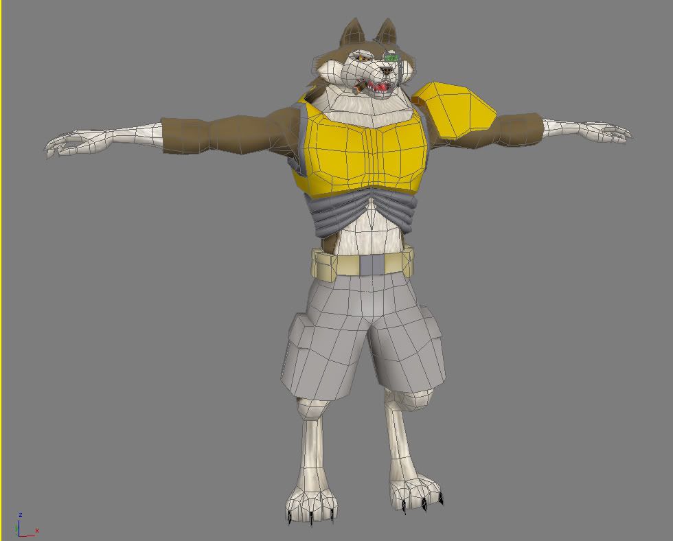
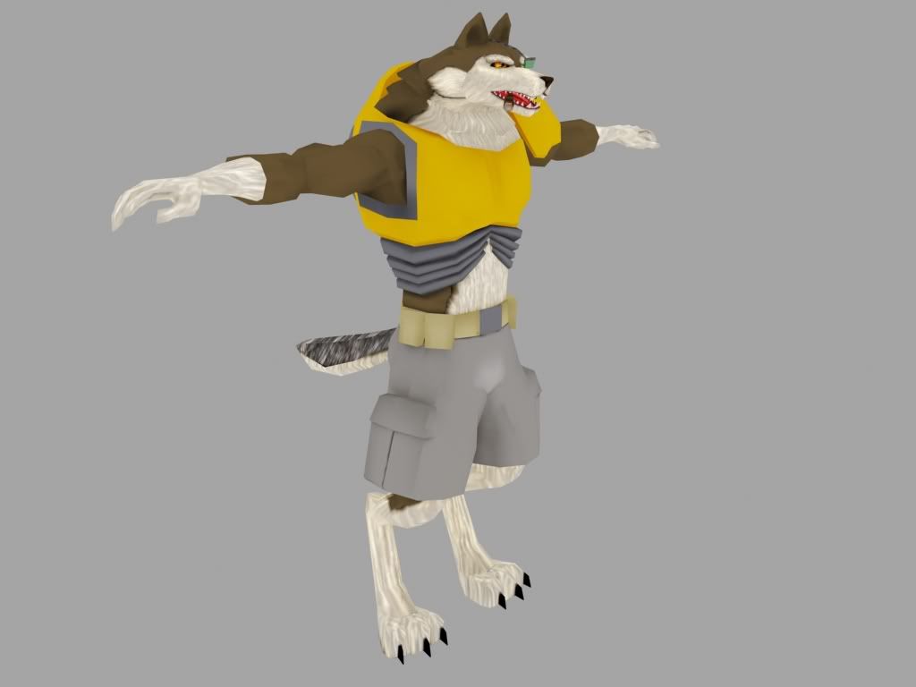
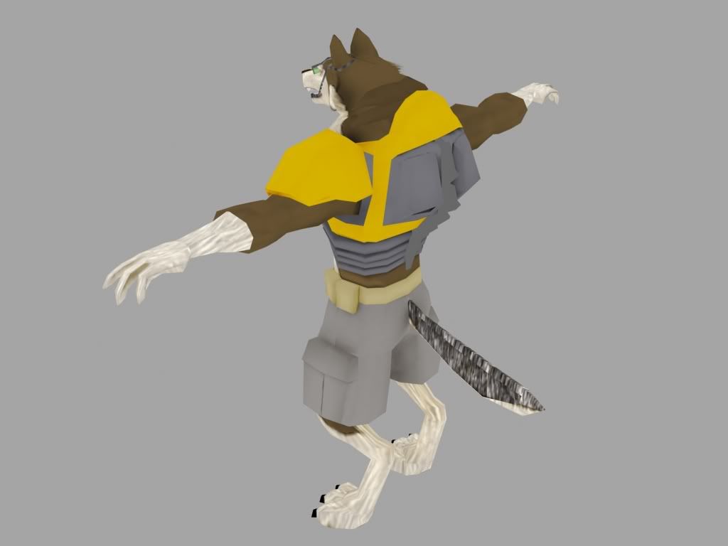
The model is pretty much finished, I might adjust some proportions when rigging time comes, but that's essentially it. I am (obviously) working on the textures right now, which are (obviously) not my biggest strength. I can't create textures with soul or something, they look too generic. Oh well. My biggest concern is the dark fur right now, the tail sucks and ima gonna go with a different approach, probably create some brushes in photoshop and use them to see how it goes.
Criticism would be much appreciated as well as texturing suggestions and especially tips for the fur!
/edit oh, the spelling...
3959 tris.


The model is pretty much finished, I might adjust some proportions when rigging time comes, but that's essentially it. I am (obviously) working on the textures right now, which are (obviously) not my biggest strength. I can't create textures with soul or something, they look too generic. Oh well. My biggest concern is the dark fur right now, the tail sucks and ima gonna go with a different approach, probably create some brushes in photoshop and use them to see how it goes.
Criticism would be much appreciated as well as texturing suggestions and especially tips for the fur!
/edit oh, the spelling...
Replies
I much prefer to paint at actual-res, what you see is what you get and all that.
head seems very wide and flat.
sci-fi with surreal... doesn't explain if you're looking for realistic or cartoony, etc
What do you mean wide and flat? What do you reckon I should change?
And if you would post the unwrap of the character i know sectaurs could definately help you.
I should probably get around to doing the alphas right away, but I'm stuck with the dark fur and can't bring myself to start working on it again...
I'll have some updated pics in a few I hope.
Crits:
- As mentioned previously, the face is too wide. For a "realistic sci-fi feel" the width is telling us Wile-E-Coyote. Check out some proper wolf/dog/coyote reference and maybe do a search for werewolf/wolfman/lycan ref also, then follow it more closely. You can keep the body builder, strong man neck and still have a well rounded dog head.
- Fur texture, is that white faded wood or fur? What about the brown parts? It really bring out the realistic detail if you blend different colors of fur together instead of having large blocks of color with defined borders. Again take a close look at some wolf fur ref, notice how the layers change color and you have a nice blending of pasterns.
- Fur planes, I see the ones on the neck but it looks like you don't have an opacity map on it (yet?), if you do its not doing much. The point is to fake fur depth and give furry edges to the silhouette, not just float a solid texture above your mesh. use it to its fullest or don't.
- The shoulder pad is too far down the arm. When you put the arms down, it will either stick out oddly, or it will follow the arm and turn more into bicep armor then a shoulder pad. Also how does this armor attach to the body? Floating armor is great and all but its even better if you explain how it is attached. Thinking about this can lead you to new details, such as a harness with pouches (also cliche) or modify the chest armor so it anchors the shoulder pad. Whatever you do you should put the pivot point of the shoulder armor where the shoulder will rotate.
- Cliches abound... arrg, a green floating monocle and is that a mic? He's not Britney Spears and this isn't the Disney channel so how did we end up in 1992? A stogie? really? Just because Sarge and Schwarzenegger coined the look (a few millennial ago) doesn't mean every meat head needs one. Seriously check out some modern warfare gear and find something that works better than just sticking something on his face and hoping that a green transparency will carry the sci-fi look.
- The hands could be meatier, since he has slightly cartoonish proportions you can carry that over to the hands and instead of ending in thin, flat, pointy fingers you can give him some thicker fingers and help bring the dog paw look back into the hands. You don't want to replace the hands with dog paws, but meatier fingers will help the tough guy look. Maybe some thick manga workman style gloves? This way the gloves cover the fur not the other way around. Also you won't be trying to manage alpha planes around difficult areas to weight when it comes time to animate.
And yes paint at actual res, you're not nearly advanced enough to get any kind of benefits of scaling, which there really aren't any...
Also, I lmao'd at the Britney Spears comment. Yeah it's a pretty lame attempt at combat equipment, next time I will do some research first.
As for the cig, I won't be changing that man, it's my tribute to both Sarge and the delightful habit of smoking. Stogie stays, no metrosexual health living political correctness here!
/edit Will try changing the hands too.
In brief, I basically create fur on separate Photoshop layers using a standard brush tool set to Dissolve with an opacity set to 10%-20%. I then use the Smudge Tool, set to 1%-5% strength and set to 100% Hardness. Use a large brush and try not to overlap too much when doing your one smudge passes. Then use the sharpen tool. I usually start with black dots on one layer and white dots on another layer then convert them to color using Selective Color. I desaturate the white (and black) because the sharpening can cause unwanted color to appear.
I basically use this technique.
That hurt my brain, TheMadArtist.
I basically use this technique.
[/ QUOTE ]
WHAT THE FUCK MAN! This guy did this thing http://div.dyndns.org/EK/tutorial/froofy/wolf.jpg
by doing every hair separately before developing this tutorial. He's crazy!
The tutorial is excellent by the way. Thanks a bunch!
That hurt my brain, TheMadArtist.
I basically use this technique.
[/ QUOTE ]
Ah sweeeet. Thanx for posting that, I'm gonna try that myself.
Ok, I finished the texture, although I'll be coming back to it in a couple of months to do the fur all from scratch, because I'm not completely satisfied with it.
I changed the face a bit, but in the end I doubt the changes were drastic enough to make a difference.
I added an extra fur plane for the back and front sides of the neck (3 instead of 2) and strapped the shoulder pad (which I also made smaller) to the arm with a military belt thing strap. Or something.
I also considered droping the monocle/microphone thing, but then realized that 3 time oscar nominee Alfonso Cuar
Speaking of those, notice that the evil lion in the Lion King has a darker mane? From the looks of your wolf guy, i would say he has a similarity to Fox McCloud from the starfox series, not to stray too far in the animal kingdom that is. The cigar is an obvious "i am a badass antihero guy" sign, and does not fit his light fur, and yellow armor.
Here is what i mean:
http://www.wsu.edu/~mgorg/werewolves/img/movies_vh-wolf.jpg