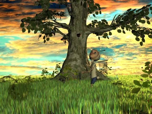
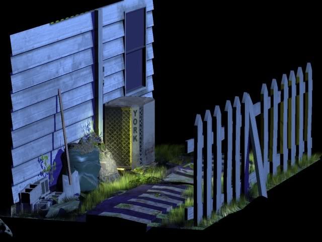
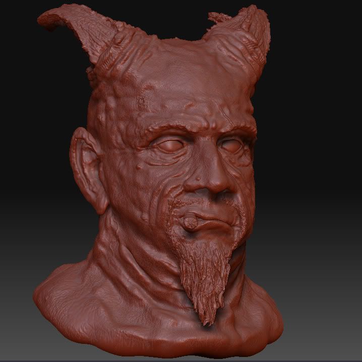
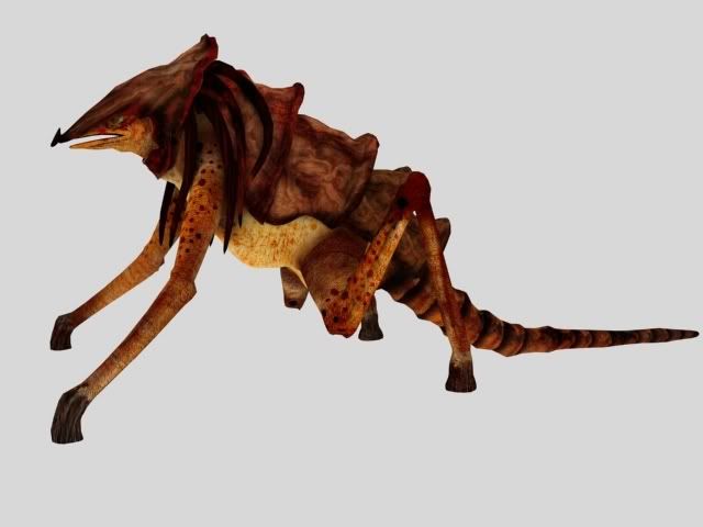
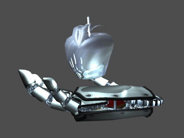
A little about myself: My name is Aldo. I'm currently attending the Art Institute of Phoenix...for Game Art and Design. I'm about 2 years in...about 1 more to go...if I stay on track. I've only ever posted on my school's forum, so this 'bigger forum' thing will be new for me. Hope you guys like.
Here are some past model's I've worked on:
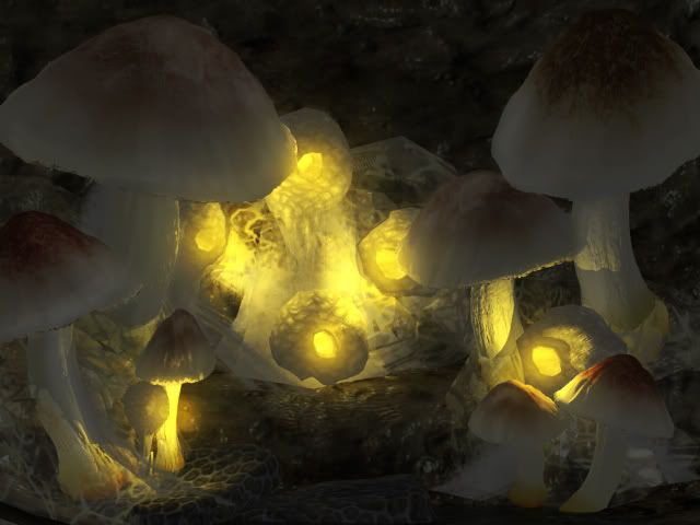
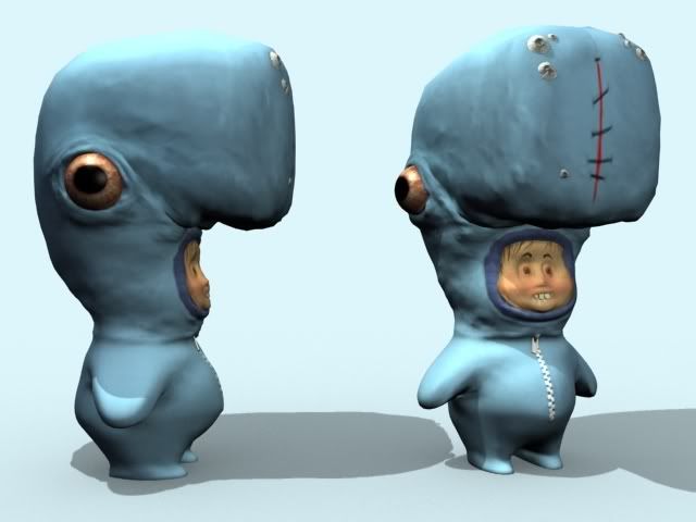
This one is from a concept by Massive Black...
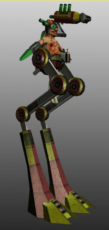
This one is from A painting done of a character from Patrick Morgan
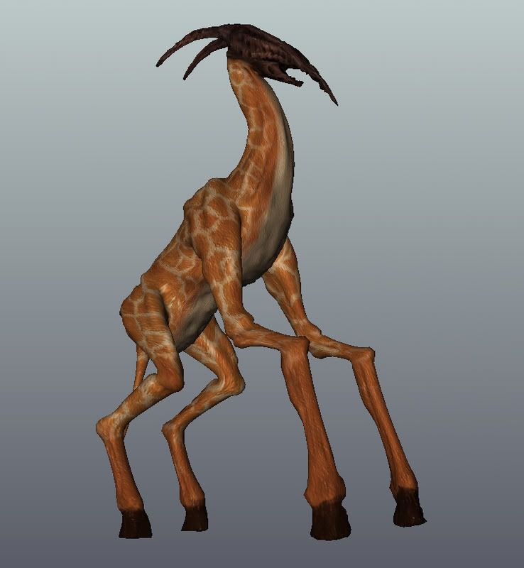
This one is from A concept from Guild Wars.
Well, that's about it...I have some other stuff that are WIP's...or not very good...I'd show those too if anyone wants to see.
**Edit: Sorry for not giving credit for the concepts earlier.
you have some interesting Ideas. Love the whaleboy Patrick Morgan is a stud.
From what I can see you need to get a bit tighter with your maps and a bit more confident in your shapes, particularly on your sculpts and anything with a normal map.
Good Stuff though. I hope you keep posting.
I will keep posting...from what I've been reading on the other posts, you guys (forum as a whole) seem to be pretty honest...sometimes brutally honest...which is good to get that type of feedback sometimes.
Good stuff all around I look forward to seeing more
[ QUOTE ]
...sometimes brutally honest...
[/ QUOTE ]Yep, we'll rip your art a new hole, but we do it out of love and a genuine interest in seeing you improve. Fluffy "that looks nice" comments never helped anyone improve. If you want those kinds of comments you there are plenty of other forums around. That's not to say you won't get praise for a job well done, because you will.
You'll hardly get crits without them being constructive. Someone might say something looks like ass but they will also tell the person how to make it better. If someone isn't constructive, we take em out back...
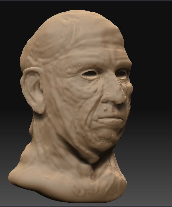
Your ZBrush stuff shows a lot of promise, but the result is fairly awful. You have a ton of detail and little blobby random bits, but minimal definition of form. Think of the larger planes and surfaces you need to sculpt.
You may want to sculpt for a while without ever going past the first few subd levels. Really get used to working on the bigger forms, and then once your model's shapes are perfect, detail it.
As for the rest: That one scene with the fence and the side of the house shows some promise. If you're interested in game art, start paying much closer attention to how environments like that are actually handled in modern games, and see if you can emulate it.
Anyway, welcome to PC, and good luck.
(Sorry if my crits were a bit harsh/brief, in a hurry.)
To SupRore: Thanks for the crits. I didn't think your comments were harsh, mostly because I agree with them...especially on my older stuff. I will be contributing to that post you gave the link to.
[ QUOTE ]
Your ZBrush stuff shows a lot of promise, but the result is fairly awful. You have a ton of detail and little blobby random bits, but minimal definition of form. Think of the larger planes and surfaces you need to sculpt.
[/ QUOTE ]
Exactly my first thought about that was "spoiled by zbrush" e.g. the high level detail is quite nice but the more low level anatomy stuff you actually have to learn when not using zbrush (and of course when using zbrush) really sucks! (you wanted some brutally honest crits )
Edit: my (old fashioned advise) would be to get a application like Wings3D and practise some proper poly-topology modeling.
Thanks, I'm trying...just have too much school work that I don't have much free time.
After looking at the low poly thread, it motivated me to do a low poly model...it came out around 400 poly's...so it didn't meet the requirements, but it was fun...
also messed around with Mental Ray and Different shaders...not sure I like the way it looks where the ice meets the water...and need to up the quality of the shadows. If anyone knows a good tutorial on caustics...it would be appreciated...I was trying to figure it out..but it never seemed to show up....maybe I need an environment for it to show up on or I need to position the lights in a particular way (that's my guess).
yeah I saw that whale boy before, good take, although you should probably give bobby chiu some credit as well since you based yours on his painting of the drawing.. Looks like you did a sculpt of a painting of a drawing..
I have about 30 renders where I just messed with the lighting. ...and particles and such...oddly, the one I show was about the 3rd render!
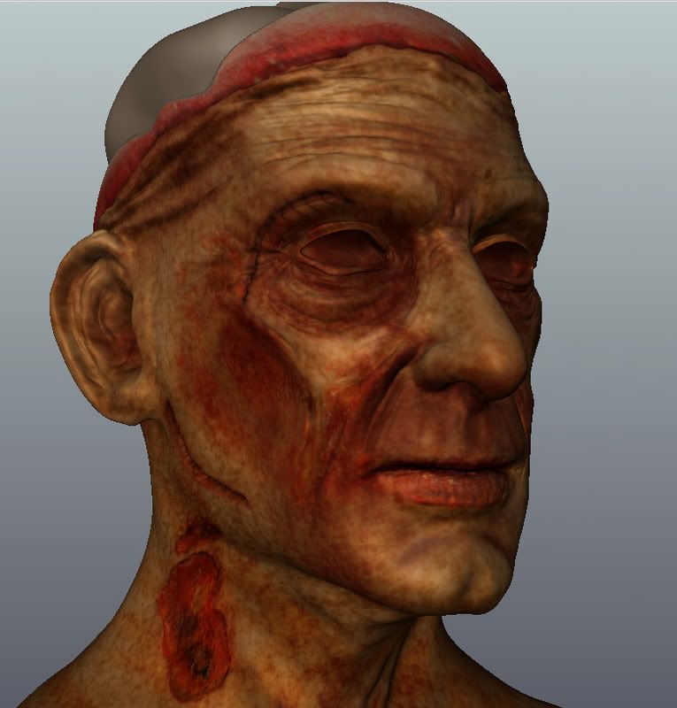
Anyway, I'm still trying to get better at zbrush...so I can move up from being 'awful'...to maybe "so so"! haha. I did two heads tonight, here's the better one:
Are you trying to make these stylized or realistic? Because the in the former case you succeded, in the latter it is utter failure.
And in any case it seems a bit like you did a basic mistake many starting artists do, and that is not starting with the (anatomical) basics, and going into detail and "style" premature.
I was making them stylized because I was trying to work on my 'bigger shapes' and getting into the mentality of accentuating those shapes (might have totally misread what people meant by 'bigger shapes')
My thought process is: In 2d stuff, when you need to work on your bigger 'shapes' (for me) it's best to do stylized, so that when you go back to doing realistic, you will retain some of the mentality of accentuating things, and so your drawing will 'pop' more.
(I thought I replied to this before, but it never showed up....hmm)
i think that style is pretty good , i actually enjoy the silhouette , the eyes in the wax shader seem a bit better than the "painting" thou , something odd there, theres a muscle line near the mouth that is making it not as enjoyable to look at, nontheless i dig !
To 'bigger shapes', specifically, I just meant the larger forms of every part of it. Less lines/details, more forms. I wouldn't really know whether realism or stylized would be easier to practice on, but I imagine either would work.
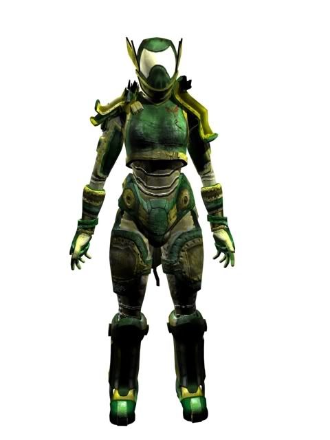
At school, we do this thing called a Game Jam...where we spend all weekend working on a small team (of about 4) and you spend the first day concepting, and coloring the concept, then you model it and texture it and put it into a prototype (there is a separate prototyping team)...and you compete against other teams.
My team worked on a lot of stuff, but this guy is the only that I worked on all by myself. The concept was colored by someone else (also redrawn...I drew one, but it wasn't in 3/4 view...so someone else redrew it). Anyway, here it is:
Also, Should I start a new topic for these things or should I just keep posting under the same topic?
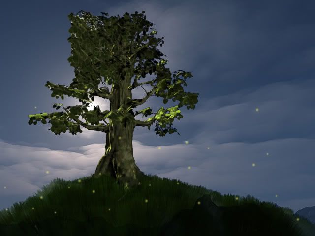
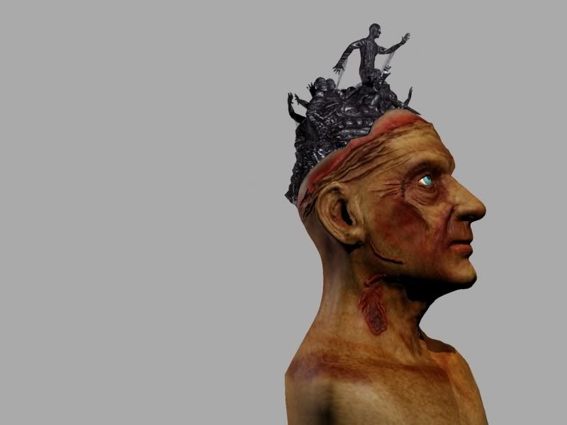
I had to do a medium environment for one of my classes. Had a few problems with my opacity maps on the tree (with my volumetric lighting). The second render, the clouds at the bottom are photoshopped in to hide the bottom of the mountain.
That last one looks mighty ambitious, but I think the composition and lighting could use some work (mostly on that first image). The focal point (which I'm guessing is suppose to be the island and the top figure reaching for it) gets somewhat lost. The figure skewered on the left stands out because it's a dark silhouette over a bright background. Similarly, the light figures on the right contrast with the dark background. The mountain is also pretty equally lit.
Basically all I did was darken the mountain of men. It does lose a lot of the detail you put into it, so why not add some red under light? Always awesome. Maybe consider some some volumetric lighting to seep through? Makes it that much more divine looking. That fog you did on the second image? Yeah, use more of that. It will help place your structure IN instead ON the painting.
It's definitely not perfect, but hopefully it will give you some ideas. In this one I pushed the mountain down into the corner to increase the distance between the figure(s) and the island (gives a better feeling of struggle and tension). Also in this one I set the mountain against the dark background and used the lighting of the island to bring out details, along with some under lighting (though doing too much started to take away from the focal point).
Thanks for the paint over...I will try both of those once I get some more time to work on it. I will post again. Your critiques were pretty on point...thanks:)
Here is some stuff I've worked on for a school project. The class was about working in a team my group came up with an idea...my part of it project was to come up with some alien weaponry...we had mentioned a few styles..one of them being halo's...but originally we were going to go with a more 'insect' like style, but after all was said and done, we ended up with more of a halo style. So my part was to model a giant 'turret' and we thought it was cool if it could walk, so it's sorta like a walking tank/turret. I designed the first one and then I decided to do a few more using the same pieces. A classmate had modelled a bunker as his asset and so I took his geometry and re-unwraped it...re-textured it and used it as extra parts for my turret (in the other versions). Anyway..here is the Original.
Original: about 5000 polys
The Original destroyed:
The Walking One:
The Larger One: (with Runkle's Bunker Geometry on top)
Replies
From what I can see you need to get a bit tighter with your maps and a bit more confident in your shapes, particularly on your sculpts and anything with a normal map.
Good Stuff though. I hope you keep posting.
I will keep posting...from what I've been reading on the other posts, you guys (forum as a whole) seem to be pretty honest...sometimes brutally honest...which is good to get that type of feedback sometimes.
[ QUOTE ]
...sometimes brutally honest...
[/ QUOTE ]Yep, we'll rip your art a new hole, but we do it out of love and a genuine interest in seeing you improve. Fluffy "that looks nice" comments never helped anyone improve. If you want those kinds of comments you there are plenty of other forums around. That's not to say you won't get praise for a job well done, because you will.
You'll hardly get crits without them being constructive. Someone might say something looks like ass but they will also tell the person how to make it better. If someone isn't constructive, we take em out back...
Dig through here (and maybe contribute, a bit:) http://boards.polycount.net/showflat.php?Cat=0&Board=2&Number=176467&page=0&fpart=1
You may want to sculpt for a while without ever going past the first few subd levels. Really get used to working on the bigger forms, and then once your model's shapes are perfect, detail it.
As for the rest: That one scene with the fence and the side of the house shows some promise. If you're interested in game art, start paying much closer attention to how environments like that are actually handled in modern games, and see if you can emulate it.
Anyway, welcome to PC, and good luck.
(Sorry if my crits were a bit harsh/brief, in a hurry.)
like that giraffe creature.Great Idea
[/ QUOTE ]
it was for a comp on a smaller school site.
aldo: add "concept by guild wars" by your model so people don't get upset at you
Your ZBrush stuff shows a lot of promise, but the result is fairly awful. You have a ton of detail and little blobby random bits, but minimal definition of form. Think of the larger planes and surfaces you need to sculpt.
[/ QUOTE ]
Exactly my first thought about that was "spoiled by zbrush" e.g. the high level detail is quite nice but the more low level anatomy stuff you actually have to learn when not using zbrush (and of course when using zbrush) really sucks! (you wanted some brutally honest crits )
Edit: my (old fashioned advise) would be to get a application like Wings3D and practise some proper poly-topology modeling.
About an hour and 30 mins...trying to work on my major shapes before going into detailing. Eye is a placeholder eye and not sure about the hair.
After looking at the low poly thread, it motivated me to do a low poly model...it came out around 400 poly's...so it didn't meet the requirements, but it was fun...
also messed around with Mental Ray and Different shaders...not sure I like the way it looks where the ice meets the water...and need to up the quality of the shadows. If anyone knows a good tutorial on caustics...it would be appreciated...I was trying to figure it out..but it never seemed to show up....maybe I need an environment for it to show up on or I need to position the lights in a particular way (that's my guess).
http://digital-bobert.cgsociety.org/gallery/495164/
I have about 30 renders where I just messed with the lighting. ...and particles and such...oddly, the one I show was about the 3rd render!
Anyway, I'm still trying to get better at zbrush...so I can move up from being 'awful'...to maybe "so so"! haha. I did two heads tonight, here's the better one:
And in any case it seems a bit like you did a basic mistake many starting artists do, and that is not starting with the (anatomical) basics, and going into detail and "style" premature.
My thought process is: In 2d stuff, when you need to work on your bigger 'shapes' (for me) it's best to do stylized, so that when you go back to doing realistic, you will retain some of the mentality of accentuating things, and so your drawing will 'pop' more.
(I thought I replied to this before, but it never showed up....hmm)
Well I am far from an established artist, but I would try to work on realistic anatomy studies first.
What I ment by "bigger shapes" is for example the silhouette of the head, which is very far from anatomical correct.
My team worked on a lot of stuff, but this guy is the only that I worked on all by myself. The concept was colored by someone else (also redrawn...I drew one, but it wasn't in 3/4 view...so someone else redrew it). Anyway, here it is:
Also, Should I start a new topic for these things or should I just keep posting under the same topic?
Hopefully more to come soon....as soon as I get my school work done.
I'm pretty excited about it because it's the first piece that turned out exactly how it looked like in my head:)
Basically all I did was darken the mountain of men. It does lose a lot of the detail you put into it, so why not add some red under light? Always awesome. Maybe consider some some volumetric lighting to seep through? Makes it that much more divine looking. That fog you did on the second image? Yeah, use more of that. It will help place your structure IN instead ON the painting.
It's definitely not perfect, but hopefully it will give you some ideas. In this one I pushed the mountain down into the corner to increase the distance between the figure(s) and the island (gives a better feeling of struggle and tension). Also in this one I set the mountain against the dark background and used the lighting of the island to bring out details, along with some under lighting (though doing too much started to take away from the focal point).
You've got some really fun ideas, so keep at it.
Alex
Original: about 5000 polys
The Original destroyed:
The Walking One:
The Larger One: (with Runkle's Bunker Geometry on top)
The Largest One: about 8000 polys
Big render:
Textures:
Legs:
Base:
Cannon:
Bunker Top: