Demo Reel character (warmachines/ironkingdom char)
Hey everyone Im on my last 2 quaters of school right now and you all will be seeing several updates from me, the last 2 guys I worked on where my last real practice runs (and as you can see I still have alot to go) but I just have to do the best I can . So Im planing on workin 2 next gen characters and 1 ds spec character (3 actually) and A wii spec character (2k polys etc)
SO first on my next gen character list is another favorite table top minuature game called Warmachines
If your unfamiliar check out this site and the concept art these guys freakin ROCK
http://www.privateerpress.com/WARMACHINE/default.php
So my army is called the Cygnar, and Im modelign out one of my favorite units, which I dont really have a picture of other than the REAL one im holding in my hand at the moment (I'll take a photo of it later)
I plan on doing next gen with this guy, all metals hard surface and reflection maps
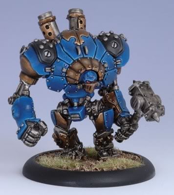
now I have a question for everyone, as far as a character like this goes (see picture reference) What size texture sheet would you guys recommend? I was thinking either 1 2048^2 map or two 1024^2 maps.
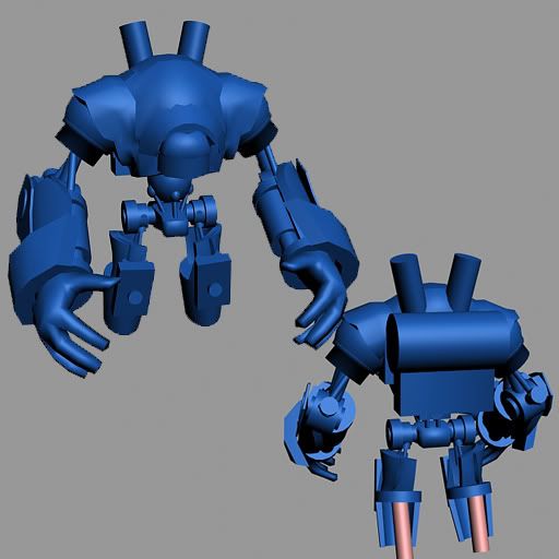
(weapons will have there own shits , not to be confused) , But a honest recommendation would be really awesome, well enough talking, right now I have just base body built, still working on getting sizing and inital shape down, not to be confused with my high poly modeling that I will start tommorrow
for now heres progress
what im aiming for

what I got

Long road to go huh ?
SO first on my next gen character list is another favorite table top minuature game called Warmachines
If your unfamiliar check out this site and the concept art these guys freakin ROCK
http://www.privateerpress.com/WARMACHINE/default.php
So my army is called the Cygnar, and Im modelign out one of my favorite units, which I dont really have a picture of other than the REAL one im holding in my hand at the moment (I'll take a photo of it later)
I plan on doing next gen with this guy, all metals hard surface and reflection maps
now I have a question for everyone, as far as a character like this goes (see picture reference) What size texture sheet would you guys recommend? I was thinking either 1 2048^2 map or two 1024^2 maps.
(weapons will have there own shits , not to be confused) , But a honest recommendation would be really awesome, well enough talking, right now I have just base body built, still working on getting sizing and inital shape down, not to be confused with my high poly modeling that I will start tommorrow
for now heres progress
what im aiming for

what I got

Long road to go huh ?

Replies
Make sure you get the size/proportions correct first! There are many area's that need to be tweaked.
Im building this as a base body before I do anything, much how I model my humanoid characters I have a gumbi mesh that has the basic proper proportions to a human body (well close enough) that I build pieces upon resize or reskulpt.
Since this guy I dont have that luxuary of doing, I am building a initial base body to get the general shape // pieces where they need to be down. after which I will resize move and then after begin my high poly modeling upon that.
After that is done I will probably split this guy into a few pieces but I plan on keeping it as followed, head, body, lower half. And whatever else is needed.
After tonight or hopefully tommorrow I will have this base mesh built and at proper sizings and proportions . I will begin my High poly modeling hopefully tommorrow once I get this guy all in the right sizings and areas.
But again , I have to ask, what does everyone recommend as far as the texture sheet goes? This makes a big issue when im at the normal mapping faze (give or take a week or so) So I really need to hear some opinions!
EDIT: Oh J.W. To answer your question, Yes Im basing it off the reference..of the real model I have....the model I have I converged from 3 different units, because Im stupid and always have done that with my minatures...Im gonna take a picture of it later when I get a chance to show, the upper picture I showed is close to it but the weapons and arms I have to mine are different
well in either case I'll have a update later tonight so keep a eye out
Crits and advice and such are always welcomed
any crits and advice welcomed as always
well heres what I have so far, I plan on making this character split into the following, head,legs,arms,chest,pelvis,piping which will be all on one map, the weapons are there own
heres progress so far
Im going to begin texturing soon! FINALLY!
thats real great man! can't wait to see some colourszz!
I know the original concept your working from looks a bit clean, but it would be cool to see some sprayed blood om his staff, shield and arms
as far as the blood, Im going to do a clean version of the texturing and then a version of texturing with dinks and cuts and scratches, after that I will see if I want to do a layer of blood or not depending on the details.
also the green cage and yellow cage are the same mesh , just seporated because those are all the pipings, the piping Im going to have to build a special bone structure for to make this bend and move correctly,so I decided to keep it different meshes for now but the body is still all 1 giant sheet
still very WIP just Nmaps. and Diffuse, critiqus welcomes as always
Also the head itself actually looks like it is sticking out to far and should be placed deeper into the neck struts.
Maybe you can make the normal map of the rivets stronger or it is just the missing specular that prevent them to pop.
The blue stuff looks very wooden to me!?
You also need to get some lights in there with shadows turned on, or else your normal maps aren't gonna pop as much. Right now it's hard to tell if there is.
There are lots of scratched metal tricks out there, you definitely need more work on your metal texturing. Photo-source, photo-sample...whatever you have to do, you need a lot more work to sell this as metal.
Your modeling and normal maps are good, but this is screaming for some more texture work.
But entire character was lowered a good 1k polys after I was done with it.
Still no spec maps or anything yet, im still painting all my diffuse work, I will do a 2nd pass at the normal maps with crazy bump and clean ups with photoshop plugin once im done with this diffuse, hopefully I will finish this guy up by monday if all goes according to plan
Right now normal maps were in the 2nd faze were dinks and bumpiness where rendered into it
Spec color was added
Spec level as well
Emissive maps for glow
All thats left is the reflection map and the weapons, but I should have those done in a day or 2 tops.
what does everyone think so far?
character itself
normal map
emissive map
spec level
spec color
diffuse
all at 2048X2048
weapons(both shield + spear)
emissive
spec level
spec color
diffuse
normal map
1024X1024 map
here you go guys
Im now starting on my RTS character from warhammer, making a style character thats based off dawn of war character
what does everyone think?
Alex
The normal map on certan areas doesnt seem to be doing much either (ex: the two bars above his head, the wooden clock-thing on his back). You really need to crank up the spec to make the rest of the normal map worth wile too.
One other thing: This is next gen, meaning everything must glow!:
- Paint less shadows and do a lighting bake instead, its just too hard to get shadows right on a UV jumble.
- Things are a touch too dark and contrasty.
- You painted quite a few highlights in the center of the pieces, and got darker toward the edges, normally you want those highlights on the edges.
- Scratches and dents are good to have, but too many makes noise. You want to show the painted material in whole sections with a few battle scratches here and there not really the other way around.
- The scratches you have are more like sand paper marks, millions of tiny scratches. battle damage would be more like big gouges, dents, and a few scrapes.
- It looks like you tried really hard to make it match an actual miniature which isn't a bad thing, but the paint jobs on miniatures are anything but realistic. There are too many draw backs to painting on something that small. People who paint minis have to put the detail in odd places because that is what they can reach. Because you aren't stuck working with a magnifying glass and tiny brush you are free to be more true to the concept art. I would look up some of the WarMachine concept art from Matt Dixon, Matt Wilson.
- With the way the texture is painted right now you're missing a lot of the form each piece gives. The edges of each piece aren't clearly defined and and damage is chaotic. Some scratches go right under pieces that don't have any damage at all? damage reads better if you think about its history, how it got there and what else it would effect around it. Which can be hard to do when working on a tiny UV piece.
Heres a paint over I did.
The good news is you can keep the texture you have and paint up more solid armor pieces by just paint with a solid color over the detail you have, setting that layer to screen, overlay or soft light.
With the glowing textures, take your glow layer, copy it. Gaussian Blur it and set the layer from "normal" to "screen" and use your spec map as a 50% mask. Make that part of your texture and it will go a long way in selling the glow effect. You're fudging the glow effect and baking it into the texture because engines aren't that amazing at doing glows perfectly =P
Also remember while it can be cool to set a paint layer to bevel/emboss and erase bits out, you can over do it, as is the case with the shield.
Good stuff, I look forward to seeing much much more out of you!
(this is really rough and messy, but you aren't really taking advantage of your spec at all, and hopefully this will help a bit.
so Im gonna have to skip these last touch ups until next month, but I WILL do these touch ups and post the progress rest assured!