Home 3D Art Showcase & Critiques

Spartan Warrior

1
Quite new to Polycount(first time posting methinks), big hello to everyone.

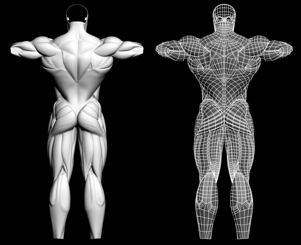
Just started a freelance job making an image of a spartan warrior for a company logo, product logos, websight, posters, for a new nutritional supliment company. Currently i am working on finishing the arms and lower legs then i will make it look human (orriginally it was made as a machine for 3D Total in the Dominace Wars), i am not sure whether i will start the head again from scratch or rework this one, but i recognise that it is a little bit small currently for even a muscular human. Crits would be much appreciated.

Glad to join your community.
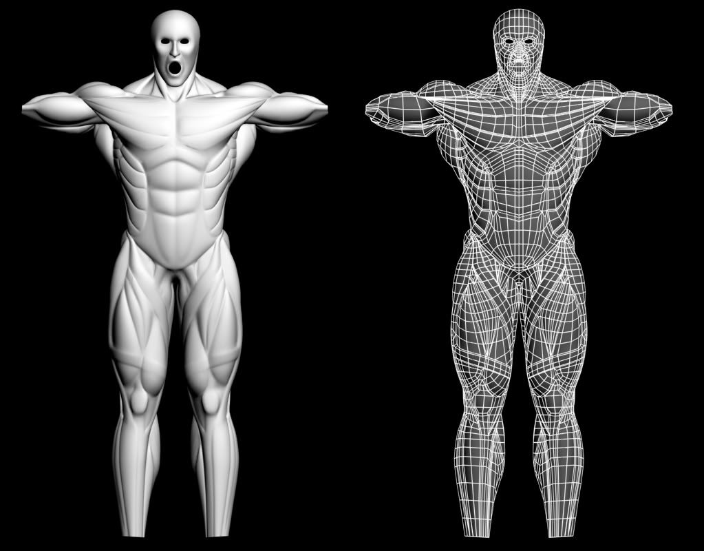
frontboth.jpg

backboth.jpg

Replies

  • rawkstar
    Offline / Send Message
    rawkstar polycounter lvl 19
    this is madness!
  • Joseph Silverman
    Offline / Send Message
    Joseph Silverman polycounter lvl 17
    Doesn't he, y'know, need skin?
  • merlyn
    Lol,yes he does,this model was orriginally made to be a machine based on the human musculature. So yes there are a lot of changes that need to be made to make it look like a human, right now he looks like a skinless Behemoth so i will be needing to reduce the size of his muscularity in areas (and reduce sharpness), but the main difference will be made by adding surface details like skin folds, fat, nipples, vains, e.t.c.
    Really this model was designed so that it would a) be animatable, and b) be quickly adjustable (working the base level of the mesh in Zbrush) so that i could mould it into any kind of male physique and still hopefully look good, for any future projects.
  • JKMakowka
    Offline / Send Message
    JKMakowka polycounter lvl 18
    It is a quite nice muscular anatomy study right now (although really a bit too much to be realistic), but I can't help to think "gay inflatable sex doll" with that face right now tongue.gif
  • Fordy
    Offline / Send Message
    Fordy polycounter lvl 18
    [ QUOTE ]
    this is madness!

    [/ QUOTE ]

    Madness? This is sparta! *kick* crazy.gif
  • conte
    Offline / Send Message
    conte polycounter lvl 18
    spartan indeed!
  • Ruz
    Offline / Send Message
    Ruz polycount lvl 666
    it just seems like a medical illustration, nothing to do with a spartan.did you read the brief properly?
    whats with the o shaped mouth also?its like a male blow up doll?

    I am confused here, did I wander in to a surrealist play:)
    sorry to be rude, but it seems like you thoughtthat a good starting point for a spartan warrior would be to got to the extreme of a body builder, without researching anything about a spartan
  • systmh
    this should be interesting. looks original, for sure. can't imagine what the finished result might be like, i'm looking forward to it. gotta agree though, the facial expression bugs me smile.gif
  • merlyn
    I do appreciate your input but please read my entry comment fully next time guys, this is no where near a finished Spartan, it is simply an old mesh i am going to adjust into a Spartan warrior, orriginally this was made to be part of a machine for my 3D Total Dominance Wars entry.
  • pliang
    Offline / Send Message
    pliang polycounter lvl 17
    Nutrition? Then this might work well but why call it Spartan if it's not going to be one anytime soon ?

    Anyways, for the musculature, I don't like why is his mouth opening...it kinda beats the point having all the muscles displayed.
  • aesir
    Offline / Send Message
    aesir polycounter lvl 18
    i bet a relax modifier would make it look a bit more realistic smile.gif
  • merlyn
    Maybe i should have named this thread differently, for instance...Part of a machine based on human musculature going to be turned into a Spartan Warrior. Then we would have avoided all of the misunderstandings. Was i wrong when i assumed this was also a W.I.P. thread. Anyways thanks aesir and everyone else who is trying to help this project.
  • Ruz
    Offline / Send Message
    Ruz polycount lvl 666
    I think the confusion arose because as it stands it looks so much like a medical illustration, with so much attention paid to the precise musculature of the male body.
    I personally would make a zbrush friendly model in max or whatever your package is and add most of the detail in zbrush/mudbox
    It must have taken you forever to manually cut all that detail in.

    might help you to plan out the design and start putting in the armour/accessories also.
  • merlyn
    Yes the model did take me ages, nearly a month to be precise. I have not used mudbox much and i have not tried the new Zbrush however i am very experienced with the old one and i have to say that i dislike it as a modeling package for human characters in general. Simply put it's modeling tools are rubbish as it is allmost impossible to make anatomies this detailed which look right. Zbrush anatomy models never look clean enough between smooth surfaces, the painted surfaces allways remind me of lumpy custard no matter how much they have been smoothed, so in all honesty i could be there till the end of time trying to make him look good if i was only using zbrush. Armour and accessories shall be started soon, i have to wait for my employer to chose them for me. First of all i will finish the anatomy in the same style so that i can use it for any male model in the future by quickly adapting the bottom level in zbrush.
  • Vitor
    Offline / Send Message
    Vitor polycounter lvl 18
    I agree with the othe guys critics, and i've done this before, when i start learning anatomy at university i also began to over musculate my models. You don't have here any fat, skin, fascias... I know this is just a wip and it was a machine before, it is just to make sure you won't forget about it laugh.gif

    Wront side of this workflow, in my opinion, is that you have little control on the silhuete as soon as you start detailing it. So far the propotions and silhuete still need improvements but with all those vertices around i don't think it will be an easy fix. About Zbrush/Mudbox, probably you look at the wrong examples laugh.gif

    also you got there a new muscle for me, crossing horizontaly the leg quadriceps?
  • Entity
    Offline / Send Message
    Entity polycounter lvl 18
    [ QUOTE ]
    Simply put it's modeling tools are rubbish as it is allmost impossible to make anatomies this detailed which look right. Zbrush anatomy models never look clean enough between smooth surfaces, the painted surfaces allways remind me of lumpy custard no matter how much they have been smoothed, so in all honesty i could be there till the end of time trying to make him look good if i was only using zbrush.

    [/ QUOTE ]

    don't blame the tool if you're not good enough with it wink.gif
  • merlyn
    Thanks Vitor, it will be very easy and quick for me to change the silhuet so fire away with any suggestions. What you have mistaken as a new muscle(my fault i over emphasized it)is not actually meant to be a muscle but the strand that runs on top of the muscles and holds them all together (similar example can be found at the elbow) it should realistically make very little difference to the shape of the leg so i will go back and change that.
    Entity I agree an artist should never blame his tools, i think i was a little bit over Zealus with my criticism (great sculptures have been achieved with Zbrush), however what i was trying to say is that i don't think that this tool is very effective for what i am trying to acchieve as Zbrush models generally look non intentially over detailed in a lumpy kind of way, not specifically my own ones (my fault for not providing any examples),the look of a meshsmoothed surface for a detailed anatomy is far more accurate IMO. I do think however that zbrush is perfect for other things like planned surface details for example, veigns, skin folds, wrinkles.
  • low odor
    Offline / Send Message
    low odor polycounter lvl 17
    Sculpting apps are not magic bullets. They dont give you a better grasp of anatomy, and they don't teach you to sort out your detail levels. That's all up to the artist.
  • Rob Galanakis
    In the month it took you to do that, I could have made a rough model, rough sculpt to get the silhouette and everything correct, and then in the 25 days of February remaining, would have modeled a finely detailed mesh right over the not-overly-detailed zbrush one, then put the new mesh into zbrush and put all the little other details in.

    I think if you try ZBrush or Mudbox some more and try to find research for your claims you're going to end up thinking differently.
  • merlyn
    That is exactly what i have been doing Professor420, except i still have to turn this into a Spartan warrior with the correct muscularity then take it back into zbrush to add the finer details, (at the same time i was studying thousands of anatomy pics). I Believe that you have mentioned the best method for making anatomy models look right. In all honesty the Mudbox results look a lot better, but i am making a general comment based on observations of many zbrush only anatomy models, not specifically my own.
  • Ruz
    Offline / Send Message
    Ruz polycount lvl 666
    well most folks in the industry are using zbrush/mdbox, the cutting in detail method is way too time consuming.
    there is some literally amazing stuff out there that doesn't look like blobby wax
    check out this , one of my favourites
    http://www.kolbyjukes.com/images/work/Hellboy/hellboy_w_rhod.jpg
  • Rob Galanakis
    Ruz, he's got six giant blobs on his stomach.
  • Ruz
    Offline / Send Message
    Ruz polycount lvl 666
    yeah they are tumours:)
  • merlyn
    Thanks for the example Ruz. I think we can both agree that this is a fantastic piece of 3d art and the artist who made this deserves all of the credit they recieve. It is also however a great example for me to use to explain what i am talking about, even the smoothest areas of the model are still a little bit lumpy (evidence zbrush or similar application was used in it's production pipeline), if you look closely at the grooves in particular (circled areas in this close up) you can notice it along there surface, mind you the artist has done a fine job of removing the lumpiness. This model is not a human character but it has got an organic surface so for this kind of character Zbrush is good enough for the job IMO. My character as it stands is a machine so i thought that it should not have a surface which had any lumps, which is why i have cut in all of the detail in Max, which i don't find much slower to model in and along with other similar 3d applications is used more commonly for motion picure cgi.

    hellboy_w_rhod.jpg
  • Joseph Silverman
    Offline / Send Message
    Joseph Silverman polycounter lvl 17
    those lumps are called anatomy, dude, look in a mirror - we aren't completely perfect all quads meshsmoothed.

    Unless you're making mechaspartan, you're going to be moving away from the machine look, so I don't really see the point in bringing it up -- we understand the starting point, and we're offering advice for moving forward.
  • Jaco
    Offline / Send Message
    Jaco polycounter lvl 17
    I wouldn't call that lumpy, i'd call it organic. Straight, hard lines (as seen in your first post) don't look very organic or natural. Anyway it is possible to get that look in zbrush...
  • merlyn
    The only reason i have braught this up is because people were suggesting that i modeled this in max because i did not know how to use zbrush properly, not because i simply thought max would provide a better result for the look i was going for. To make my character look more organic and spartan i will be taking this model into Zbrush, rest assured, so expect some lumpy (organic looking)surfaces on this page in the near future. I take back my comment "Simply put it's modeling tools are rubbish as it is allmost impossible to make anatomies this detailed which look right", it was made with great hast and little thought and was refering to a mechanical looking anatomy, without making that clear.
  • Joseph Silverman
    Offline / Send Message
    Joseph Silverman polycounter lvl 17
    I wouldn't say Zbrush art has to look lumpy, though. If you know how to use it properly (I sure don't) you could quite effectively make an ultra smooth, sharp, unnatural anatomy model.

    Anyway, quit squabbling with us and post some updates. tongue.gif
  • cyi
    Offline / Send Message
    cyi polygon
    What I don't understand is, with the length of time this thread has been around, why hasn't anyone painted a penis on this dude yet??? Anyways, I appreciate this for what it is...the model does look cool, but you've said numerous times that it's supposed to be a machine. Why are you trying to turn this model into something else? I realize you spent a ton of time on it, so want to use it for something, so why not just finish the model you were trying to make in the first place? Let's see a concept or some images you're working off of to make this guy into a spartan instead of a walking anatomy chart with a spear. Hopefully this isn't coming off as harsh, because I dig the model nonetheless... You are just trying to shoehorn it into becoming something it's not, but by all means PROVE ME WRONG! smile.gif
  • merlyn
    Small update to my Spartan warrior project. I have mostly been working on finishing the topology character model but i got the time yesterday to make a quick helmet, i will update this image when the plume is done. My commision has asked me to keep the anatomy the way it is for his logo but i will be reworking it to make it look more like an athletic human afterwards for the portfolio (will show some wip images in the next few days as it is 99% finished for how it will look for the logo). The inside of the helmet has been completely ignored as it wont be visible in the final render. It was been given loads of scratches so that it looks like it has been heavily used on the verge of overly used (invincible look kinda).

    ZGrab01.jpg

    ZGrab02.jpg
  • Joao Sapiro
    Offline / Send Message
    Joao Sapiro sublime tool
    looks really cool ! althout the Small scratches seem that someone was striking him with a miniature adamantium sword.
  • merlyn
    Hahahaha yeah i know what you mean, all in all it has far too many scratches imo, but this is how my commision wanted it.
  • Rhinokey
    Offline / Send Message
    Rhinokey polycounter lvl 18
    Your model is super smooth and bland and you berate the great organic modeling of Kolby by saying its just lumpy when its actually good organic modeling. And then you make the helmet something that should be hard solid smooth metal. Look as if it was molded from putty. All lumpy and crazy
  • merlyn
    I think if you read what i said i did not "berate" Kolby, who is a fantastic artist and an inspiration as i did not say "it's just lumpy", in fact i could not criticize it for what it is in any way. There is absolutely no reason why i can't choose what tools i want to use and then justify why i chose to use them, I have a right as an artist to make art look however i wan't it to look and still appreciate the works of other people. I am glad that you think it looks "super smooth" and "bland" as this was exactly the look i was going for. You would have made my day if you had not been so negative.
  • Joseph Silverman
    Offline / Send Message
    Joseph Silverman polycounter lvl 17
    quality =/= style, merlyn.

    The sooner you learn to accept harsh crits without dodging them, the sooner you'll actually be able to learn a lot from the artists here.
  • zenarion
    Offline / Send Message
    zenarion polycounter lvl 17
    So wait.. you make an mecha spartan, with an organic helmet, totally inverting the whole idea of spartan with helmet?
    I demand concepts!
  • Justin Meisse
    Offline / Send Message
    Justin Meisse polycounter lvl 19
    you get lumpy models in zbrush & mudbox when you import your low poly mesh, subdivide it 5 times, and then start sculpting. The trick is to import the mesh, subdivide it once and start sculpting and only subdivide it when you need more polies to work with.
  • zenarion
    Offline / Send Message
    zenarion polycounter lvl 17
    You can subdivide without getting the smoothing. It is a small checkbox just next to the DIVIDE button. Click it off, and then devide as much as you want without loosing the edge sharpness.
  • Jesse Moody
    Offline / Send Message
    Jesse Moody polycounter lvl 17
    Wow I just read through this whole thing and man I'm gonna sound like a dick here but stop fucking crying and listen to what everyone is saying to you.

    These guys in here know what the hell they are talking about. We don't sit around all day, troll forums and give messed up critiqes because we want to see people make shitty art. Damn. Zbrush and Mudbox are by far a lot faster than modeling every detail in max, maya, xsi.

    And the points you made on the hellboy paint over you did. WTF. Have you picked up a body builders magazine before? Those dudes are all kinds of weird looking with things poking out here and there. Hell Hulk Hogan is "blobby" as what you would call it but it's still natural. The human body is different on each and every one of us.

    Look at these.

    004-016.jpg
    8034.gif
    Hulk_Hogan_02.jpgArnold-756771.jpg
  • Joseph Silverman
    Offline / Send Message
    Joseph Silverman polycounter lvl 17
    Yeah, those 'notches' you pointed out in the hellboy model were quite obviously placed intentionally, and definitely more accurate than a smooth cut (which could be attained with zbrush just fine.)
  • Rob Galanakis
    Every one of those shots have six giant tumors on their stomachs!

    Its no wonder you think ZBrush and Mudbox create lumpy models when you use them to cut away geometry of a hard surface model. Proper use of a sculpting app actually has no residue of what you are talking about; inappropriate use, such as the helmet above, results in high-poly source art that is rank with errors and issues and a blatant example of a poorly utilized toolset.
  • andym12
    Except the last one of Arnie, holy crap.. I think I see a face. There's a nose, a mouth and two eyes and it's saying "kill me".
  • stimpack
    Offline / Send Message
    stimpack polycounter lvl 10
    [ QUOTE ]
    Except the last one of Arnie, holy crap.. I think I see a face. There's a nose, a mouth and two eyes and it's saying "kill me".

    [/ QUOTE ]

    pft! at that age and still be able to have your delts show through is awsome! I hope to look that good at that age.

    any updates on full body? curious to see if you ever got this think lookin like a real person yet? Potential is there.
  • merlyn
    Imo this helmet is done now, some critique would be nice.

    thesilverharone.jpg
  • andym12
    The trim could use some harder lines, as well as the dents, apart from that it doesn't look bad.
  • merlyn
    Ok it has been decided that this will be the helmet used. Working on the sword currently, should be starting work on the torso next weak.

    theone.jpg
  • Joao Sapiro
    Offline / Send Message
    Joao Sapiro sublime tool
    i dont udnerstand, you say you want critics, but you ignore them when they actually are needed. Go figure.
  • Jesse Moody
    Offline / Send Message
    Jesse Moody polycounter lvl 17
    i don't know. it doesn't look done to me. it still looks soft but maybe i'm just wasting time since you aren't gonna listen anyways.
  • merlyn
    andym12- Thank you for the crit i will make these changes asap.

    Johny - Nothing is being ignored as far as i am aware, apart from any rude comments or some irrelevant critique on my musculature topology model which as it stands looks different to how a human anatomy would look as it has no skin or fat or any other surface details, so should not be compared to a bodybuilder.
    I plan on spending a couple of months on this so, naturally i can only concentrate on one thing at a time, the only part of this project that i consider to be anywhere near finished is the helmet, so currently that is what i need crits on. Because of hand ins i have to leave the helmet as it is ATM but i will come back to it in a month or two.

    I would request that if people take offense at anything i have said in the past(mostly regarding why i did not choose to use zbrush) consider that i am not the most effective communicater (I suffer from aspergers syndrome btw).
    I will keep on posting here for crits, i hope that everyone can learn to accept me here as I mean well and would really appreciate any non offensive crits.
  • merlyn
    Ok been doing some work on all kind of stuff. To start with i Changed the plume on the helmet to a black colour to match the helmets from 300. Made a base sword, suggestions for what, where and how much detail i should add to it would be helpful. Also i have been finishing my topology model to the same style (might simplify this base mesh before i take it into zbrush, all muscle scaling and detailing will be done in zbrush), so far i have closed the mouth, modeled a forearm, modeled and shaped a hand, started the feet. Some pointers on whether i should simplify the topology before taking it to zbrush, if so how much and where would be helpful? Going to tweak the head and neck a lot still as well as attach the forearm, hands and feet to the rest of the model. The zbrush hand image just shows the recent shape of the topologised hand, all details will be added later when the whole model is taken into zbrush. Please try to be polite with your crits guys otherwise you are not being helpful.

    theone.jpg

    2.jpg

    fig.jpg

    ZGrab01-1.jpg
1
Sign In or Register to comment.