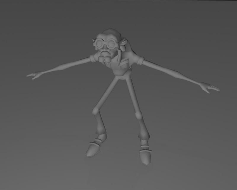
That's great! Love the concept and all attention to detail, especially the spare teeth! The chin looks a bit too squarish, I think it would look better if you add extra edge to round it off a bit. Also the nose looks too wide around the nostrils, it's wider than what you have in your concept. The lips read more like mustache (or are they mustache?). The face would benefit of following the concept a bit closer, I think.
You could add maybe a camping stool, or fishing pole, or maybe a cooler with some food sticking out. Although this guy already seems like he's having trouble carrying all that stuff... so having something to sit on every quarter of a mile would be of great help! The map would be cool (since he's lost), but not sure how convincing it would look without a texture. I'd say pick something that has recognizable shape and doesn't need texture to make it clear what it is. Looking forward to see some colors!
Thanks for the advice, I agree with everything dealing with the face, it needs work.The nose was something that bugged me from the beginning, so I may just rebuild the nose, and chin and adjust the lip... And about the back ground, since it's supposed to be an adventurer, I was thinking of a temple or something, haven't really decided though...
Nice concept, this is turning into a interesting character. I also love the details and equipment, especially the teeth. I can see why he is hunched over now.
I decided to go with a sleeping bag in a sack instead of the rolled mat due to polygon limits... but I still may try to do it and reduce something else, because that doesn't really come across. But there is at lest a hole on the side of it you can't see, so maybe I'll just add string...not quite sure.
Well, I figured it out...
I messed around with a cylinder and then extruded and came up with something I liked. And Vailias, it was your idea that gave me mine, so thanks. I also worked a bit on the face, rounded the chin and tried to fix the nose...but the nose still looks odd.
I'm not competely satisfied with some of the colors, but I'll work on posing before I worry about the perfect colors, because some may need to be changed based on the pose.
um.. from your screenshots it looks like you;ve got 3964 faces but 7570 triangles. The contest limits are in tris. I know its not explicitly stated, but the limits are always triangles not Ngons.
Well...I guess I'll go ahead and throw in the towel...
Come to find out, the base model, minus all extra props(including hat and glasses), was close to 4000 tris... so, the chances of getting the model back to the 4000 tri range and maintaining the character's feel is not going to happen...
But here's my finished model anyways...
I may still try to make another model that actually fits the requirements.
Just a suggestion to those in charge of inventing the challeges: maybe you should be more clear in your requirements so that other people new to the boards aren't met with the same disappointments... Not everyone just assumes contests use tri limits when it isn't stated...
the confusion would be from software naming conventions. Maya and Max have different ways of going about it, in max they are polygons, in maya they are tris. Faces are generally called quads (by the folks who model) in max. A five sided face is considered bad form so not many people get that far, but yes, mathematically speaking, that is still a polygon. Sorry for the kungfusion, then again, maya and max confusion is nothing new.
I use cinema4d these days
Nice entry! I think you should beef up the colour on the teeth so they stand out in that jar, also your final shot looks like it's been re-sampled up?
Really great model... love it. In defense of hawken though as far as polycount goes. I consider this to be game specs and when ever anything is put into a game it is always triangulated. So when polygon is said be it Maya or Max it's normally considered to be triangulated not quads. If it's quads that's when it's usually stated. Again though you did a great job regardless.
It's still a nice finish even though the tri count is too high.
To make the teeth in the jar stand out better you could make the jar more transparent and double sided, and also make a mesh for the water and make it single sided with the faces inverted so more color will stand out in the background area of the teeth.
Thanks for all the tips and support. I may re-render it to make the teeth stand out more and make the whole thing not look so grainy... I may have lost this challenge(by about 3000 tris) but come next challenge, I'll be ready, unless I don't like the topic...
Replies
Major update ahead:
Supplies concepts:
Character Concept:
It currently stands at 3468 polys, so I have some room to play still. Comment and critique please.
I'm gonna try to model a few more accessories, which ones would you recommend?
You could add maybe a camping stool, or fishing pole, or maybe a cooler with some food sticking out. Although this guy already seems like he's having trouble carrying all that stuff... so having something to sit on every quarter of a mile would be of great help! The map would be cool (since he's lost), but not sure how convincing it would look without a texture. I'd say pick something that has recognizable shape and doesn't need texture to make it clear what it is. Looking forward to see some colors!
You might want to keep the curled-up sleeping mat though, because you can't texture in a spiral to it.
I messed around with a cylinder and then extruded and came up with something I liked. And Vailias, it was your idea that gave me mine, so thanks. I also worked a bit on the face, rounded the chin and tried to fix the nose...but the nose still looks odd.
Final polycount:3931
Wires:
I'm not competely satisfied with some of the colors, but I'll work on posing before I worry about the perfect colors, because some may need to be changed based on the pose.
Come to find out, the base model, minus all extra props(including hat and glasses), was close to 4000 tris... so, the chances of getting the model back to the 4000 tri range and maintaining the character's feel is not going to happen...
But here's my finished model anyways...
I may still try to make another model that actually fits the requirements.
Just a suggestion to those in charge of inventing the challeges: maybe you should be more clear in your requirements so that other people new to the boards aren't met with the same disappointments... Not everyone just assumes contests use tri limits when it isn't stated...
-caseyjones
I use cinema4d these days
Nice entry! I think you should beef up the colour on the teeth so they stand out in that jar, also your final shot looks like it's been re-sampled up?
To make the teeth in the jar stand out better you could make the jar more transparent and double sided, and also make a mesh for the water and make it single sided with the faces inverted so more color will stand out in the background area of the teeth.