The BRAWL² Tournament Challenge has been announced!
It starts May 12, and ends Oct 17. Let's see what you got!
https://polycount.com/discussion/237047/the-brawl²-tournament
It starts May 12, and ends Oct 17. Let's see what you got!
https://polycount.com/discussion/237047/the-brawl²-tournament
level design critique....Please
Hi there Doodes
I am workign on this for a project at uni, could anyone critique and highlight any shortfalls. I would like some guidance on tiling too, i have split the wall map into 3rds but would like to know how to get away fro the evident repetiveness of the tiles.
Is it the way the tile is painted?
how can i add individual bits to a tile without it repeating? or should that be done in the game engine?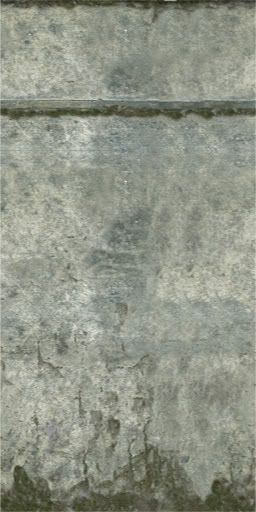
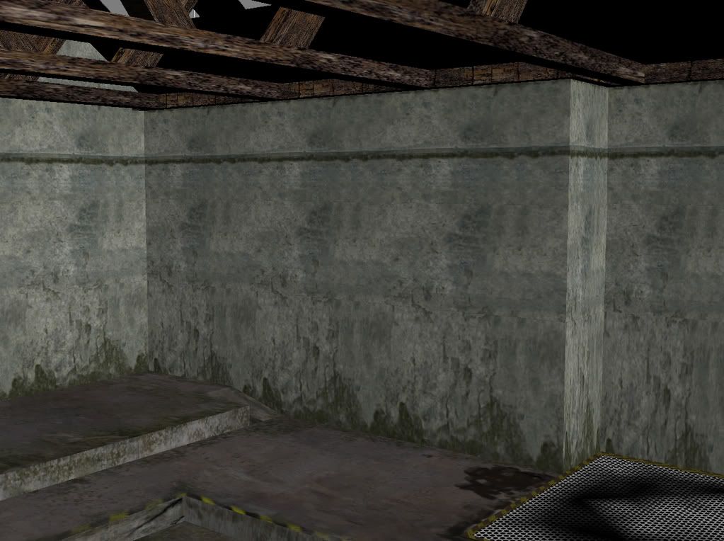
any critique will be much appreciated
ok so for now i see no pictures. it appears i need to put them on a web page that i dont have, doesn't this forum upload?
cheers
I am workign on this for a project at uni, could anyone critique and highlight any shortfalls. I would like some guidance on tiling too, i have split the wall map into 3rds but would like to know how to get away fro the evident repetiveness of the tiles.
Is it the way the tile is painted?
how can i add individual bits to a tile without it repeating? or should that be done in the game engine?


any critique will be much appreciated
ok so for now i see no pictures. it appears i need to put them on a web page that i dont have, doesn't this forum upload?
cheers
Replies
Can't host images off your own hard drive.
-mog!
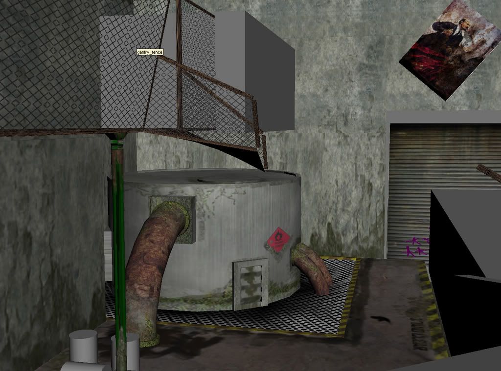
you have placed a fair amount of stains. stains are interesting but you need to think about how and why they are there. you missed some in obvious places like where the pipes connect to the tank. and where you would have obvious oxidization happening like where the fence connects to that wall. i think that the green stains on the bottom of the walls may be a little large, i like how you made that consistent though and carried it across to the bottom of the tank.
the poster above the bay door looks really large and out of place. There are also no objects in the scene so far that give the player a relative dimension so some things like the door look vertically too small. Dimensions really depend on the view that you will be seeing it from, i find in an FPS engine like Unreal you need to make the objects slightly wider and lower unless it is something you want to tower over the character and the doorways and corridors need to be slightly higher and wider than reality.
The graffiti on the door doesn't really look like its on there. I would suggest using a layer mode to blend it and soften the edges and maybe add a few lines where the paint would have run down when it was wet.
with the largest pipes on that tank you have put the rust in the center of the pipe when in reality watter is more likely to settle at the ends.
I think you could use more colors in your textures. I would assume you are going for a first person shooter kind of environment but this grey with rust look has been done so much. personally i think you can get the gritty look you are going for with a more sophisticated color scheme. I really think that would make this more unique as well. try tinting the concrete slightly and adding the opposite color into the shadows and stains. rust can actually be very interesting looking too, it can have violets and oranges, and reds. also you're texture sizes seem to be a bit inconsistent.
I do think you are doing a good job and i hope my critique is useful to you. good luck with finishing this off.
Alex
bring them into photoshop or whatever your are using and make it more tilable, what i do is cut it in half vertically and put the right half on the left, left half on the right, then blend them in the middle together.
[/ QUOTE ]
Another good reliable trick to make tiling textures is to use the PhotoShop > Filter > Other > Offset 100px 100px and clone out the edges and reverse the Offset again -100px -100px when you're done.
1) Slime and grudge on the tank and pipes but the ground, sparking clean. The ground needs the slime/corrosions or it needs to go.
2) I HATE it when people just slap the corrugated door texture on something and place it inside the wall making all mechanical pieces of the door magically disappear inside the wall. These types of doors are on tracks that sit flush with the wall, they roll up into a big drum, there are sometimes hanging chains and a motor. If this shot is inside, shame on you for not putting those details in. If its outside WHY on gods green earth would you put a tank of flammable material outside, unprotected and right by a high traffic door? Where are the safety bumper posts? Think like you work here, what would a safety inspector close this place down for? When you start living/working in your environment you start adding details you would never have thought of. I suggest changing the flammable symbol to something inert, as players will want to interact with this tank in a violent way. Unless blowing up the tank is part of a game mechanic you'll only frustrate players who unload clip after clip into that thing thinking they can blow it up.
3) Lets think about this for a min, if you where going to hang a poster up there you would need a ladder. If you have to spend the time getting a ladder, setting it up and climbing up there would you really just slap the poster at a 45 degree angle and scurry away? What is that a poster of anyway? It looks like a piece of fine art, people who hang fine art take the time to line it up, especially if they climb a ladder to do it. You would expect to see missaligned posters near the ground in easy to reach places. Its pixel density also looks more dense than the wall which makes it look more weird and out of place. How is it stuck to the concrete? Concrete isn't something you can easily stick paper too especially the porous dirty unsealed concrete you have here. How is it stuck up and how long as it been there? Is it starting to peel off or sag, fade or rip? If it rains what happens to it? How does weather effect the poster?
4) Broken walkway dangerously hanging over a vat of unprotected VOLATILE chemicals. If this doesn't scream OSHA violation I don't know what does. Is this place abandoned, is that why the walk way is broken over something so dangerous? If its abandoned why is the poster so new? What damaged the walk way but didn't do anything to the tank? Why did the walkway break so messily on one end but not the other? I would expect to see damage where the walk way was attached at the other side, but I don't.
5) Thats a skinny walkway and is that really how support posts work on those types of cat walks? I would look at some catwalk [url=reference[/url] and rethink that construction to maximize detail. Don't think of it as "I need a box for the floor and a box for the fence texture, done". Its a catwalk put in some detail and check out some reference. Keep in mind that most catwalks are built in modular sections so they can be installed in all types of places and sections can be replaced if damaged.
Lastly, get into your environment and really dig in. Think of a back story and some history. "Remember when Charlie got pissed and rammed the fork lift into Supervisor Kirks office? Or how about the time Jimmy knocked over that can of paint and you slipped and hit your head, I still see your skid mark and the dent. Remember when I found you in your "secret" hiding place which was right on the steam vent and I turned it on? yeah, good times." Instead of having the pipes go into the floor have them go some place, follow a wall or cut a grate covered channel out of the floor so the pipes can be seen and worked on. Have a shut off valve and a monitoring station. If the pipes go somewhere where is it they go? What does that thing do and what systems does it need to help it do whatever it is it does? Do you need a generator nearby? Is it constantly breaking down and there is a tool box there or evidence of many many repairs?
Get into it, because when you do, so will the player.
You know when in police shows when they show you an empty crime scene. Then it slowly fades to earlier in the day when the crime happened and street is full of people walking around doing their normal routine? You need to be doing that with your environment.
the project is based onthe chernobyl area. Ref kidd of speed i am trying to recreate a gritty deserted area which looks like people just left in an instant.
I did have the runners of the roller door but they are not textured yet, i have issues with the tiling and wanted to sort that before i unwrap. The method i used to tile was to create a regimented tile set to make sure things were in the correct place and direction. create a multi sub object material. apply 3 textures to the sub object.
once this was done and i had added the maps at the start of this thread i could see there was issues with the tiling and its apparent repetitivness.
The idea of getting into the place realy helps, it may not be evident in tonights post but i feel the room a lot more than i did before o posted here.
Yes the picture looks crap. Should i raggedy it up with verts or an opacity map
1. i have unwrapped the floor onto a 1024x1024 map, is this the way to do it or should i be creating more pollys on the floor plane and tiling as i have with the walls.
2. if i do stick with an unwrapped floor, how should i blend the likes of the posts concrete block bottom and the new bollards. (they are NOT textures so please dont rip em)
3. the grill under the fuel tank is tiled, how would i dirty round where the tank meets the floor, ( is anothr plane with a grunge map and an opacity map the right way to do it or should i unwrap it and paint
i am finding it realy tricky to differentiate when i should be tiling and when i should be painting.
another query i have is should i bake the textures in or leave as is? i have tried the baking technique and it looks real nice with Mental ray gi. If i do bake in the textures should i attach most objects to prevent max creating a hunderd maps at 128 - 1024. i am not sure when to tile and when to bake, here is an overview of the model so far.
again thanks for the critique, i wanna make beautiful levels ( and have a long way to go)
Go with small tileable textures, 256 or 512's at most. Then add decals overtop of your wall/floor on certain spots, you can add grime, cracks, dirt, posters, hazards with decals.
Your chain link fence also has some real funky tiling going on with one diamond popping out.
1. how do i add a decal.
2. whats the best way to take the stuff into the game engine
A. as texture maps like above or
B. attach loads of geometry and render to texture with GI
2) What engine?
A) See 2...
The reason o wondered about attaching objects before rendering to texture was to try and keep the no. of texture maps in the game engine down. obviousley when i bake in the light ( if this is the correct way ) all the boxes that share a box texture will then have an individual texture so in theory the map count could go through the roof. i will try it however but i suspect it might crunch a bit.
the game engine we are using is Virtools, a realy neat prototyping software package with a realy nice scripting setup, like the unreal 3 building block strategy (unrealkizmet) loops and sequences which can easily be added, also drag n drop shaders and particle shaders. www.virtools.com
cheers everyone for the conversation.
anyhow since my last visit i have hopefully made some improvments to my level, To be honest i am a little sick of it. The product we were supposed to be creating has turned into group members just wanting to focus on portfolio work and not bothering with aspects of the project. Theres some good work come out of it tho, pity the assignments gone tits up.
check them out
i didn't paint or model the train but the rest is me, these are screen dumps from Virtools.
[image]
http://i154.photobucket.com/albums/s249/gideong/virtools1.jpg
[/image]
cheers
total 12239 faces
1. your chain fence still have that weird tiling pattern. Like diamond shapes expanding into each other.
2. The white around your tree. In the color channel, fill the white with green similar to your leaf. And let the alpha channel cut out the shapes.
3. In your last image, I don't think it make sense for that little room on the top left to be placed on top of a tank.
The tank being black give me impression that it's for burning whatever thing inside it. Also the room will weight a ton, if it accidently falls, you really don't want it to break whatever things beneath it. The room should be supported by real beams and/or columns, make it look strong. Unless you're planning to have to fall and blow up stuff.
4. That crack in the wall floating in the middle of no where is really odd. Cracks usually comes out from spot where the wall gets compressed by other things around it. Like, where it meet the door, around the corner, things like that.
I would imagine this to be more spread out with more walking room. The storage tank below the office seems a bit weird, especially to be supported by wooden beams and not steel.
As for textures, they seem to be a a bit of harsh contrast. The wood looks photo ref, but then other parts look partially painted, so its conflicting a bit.
I think that if you have ref. for each asset your placing in there with reference to the texture it will need, that would help out a lot too.
hope it helps, keep updating with that you have!