The BRAWL² Tournament Challenge has been announced!
It starts May 12, and ends Oct 17. Let's see what you got!
https://polycount.com/discussion/237047/the-brawl²-tournament
It starts May 12, and ends Oct 17. Let's see what you got!
https://polycount.com/discussion/237047/the-brawl²-tournament
character
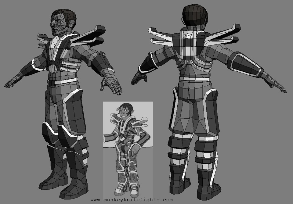
I realized that nothing in my portfolio really shows that I can work in the "mainstream style" of next gen games, so I started this guy. Trying to get closer to the realistic badassery going on in games like gears of war and lost planet. I drew up the concept a bit more cartoonish that I wanted, but I liked the design enough to use it as a base anyway. Took some liberties with the armor to sex it up a bit too. Think he needs a helmet?


Replies
That aside, I'm going to have to agree with Ninjas about the proportions. But if you're just sticking to your concept and having it cartoony, then the model is spot on!
-caseyjones
Proportions need work if you are going for something more realistic looking. Specifically, the head needs to be smaller.
[/ QUOTE ]
Either that, or he's really short! Otherwise, I like him even if he is a midget. Keep it up!
The thigh armor is attached to floating baggy pants. What happened to the straps? This is destroying the outer hard shell, inner soft body look of the concept. I actually think you de-sexified the armor by just extruding a few polys from the baggy pants.
Why change out the boots for something blah when you have something interesting on the concept?
You do know people on this forum who will cut you from asshole to earlobes for using the words "Next Ge... I can't say it. Maybe that was your rouse to drag people in here?
Long story short: Bring back the straps, make the pants and armor effected by gravity and avoid the urge to make your character "mainstream" by encasing them in power armor, especially when your concept does not call for it.
I added straps and some extra baggy detail to the pants. I also updated the arm guards, trying to make them more interesting. His body still seems like it needs something, either around the waist or upper arms, maybe both. The body is still wip, but the head was done so I threw together a head sculpt in mudbox. That's the high poly in the pic by the way, not a normal map. The hair may change too, alpha planes could replace the solid hair clods, depending on how well I can make it work once the color and spec are in.
Are you sure you have your monitor scale properly for your resolution.
I could be wrong but, the head looks to thick from the front and side view for that height and the diameter/thickness of the arms are too big, but could be the right length.
He is corny, but looking interesting.