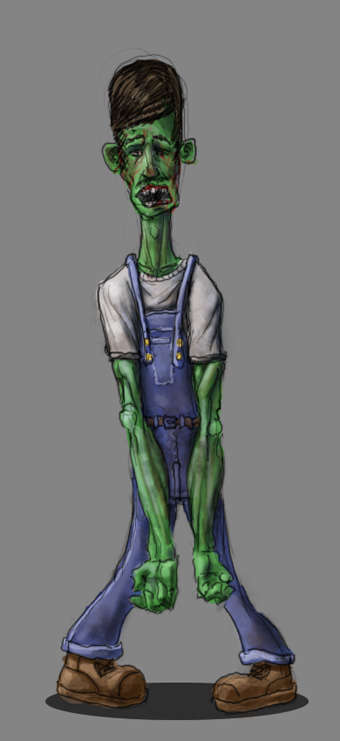
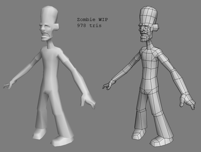
Zombie number two
While I put the final touches on Joe's new weapons, I've started another zombie model. The poly count is a little higher than I'd like it to be... eh. Crits on this guy would be much appreciated, as would any comments about how well he's fitting with the other two characters. At the very least, it feels like I'm gonna have to go back through and unify the color scheme a little better. What about design-wise, do the proportional exaggerations look like they belong in the same world?
Other character links: [EDIT: servers back up, links working again]
Zombo Joe
Zombie 1


Other character links: [EDIT: servers back up, links working again]
Zombo Joe
Zombie 1


Replies
-caseyjones
gotta give a mechanic a chance to use his ZOMBIE brill creme heh...
achmed - I thought about doing that, I still might... luckily thats something I can add later without adding too much extra work for myself.
I had the highpoly about 50% done in mudbox when I realized that I don't really have anything in my portfolio that's "applicable" in the games industry. Sure, zombies are fun, but they don't convince employers that I can handle the more realistic badass type stuff in development right now. So until I can crank out a model or two in a more quake/doom/ut2k7 style... I probably wont work on this again. Mark my words though, I WILL finish this guy, and continue my zombie game project. Thanks for you time and words guys!
As for a crit, I like how his wrists are skinnier in the concept. Maybe consider cutting another loop in each arm to make the wrists thinner but keep the hands the same size.